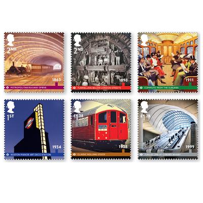
Today the UK’s Royal Mail postal delivery service issues a set of stamps commemorating the 150th anniversary of London’s Underground. While some of the stamps celebrate the construction of the network, some acknowledge the part the Underground has played in the city’s cultural life through good design. Here they are:

Of particular interest to this blog is the 1st Class stamp featuring Boston Manor station, and the £1.28 stamp featuring Canary Wharf station, both of which acknowledge how good quality transport architecture can improve a city and the lives of its citizens. While I wouldn’t argue with the choice of Boston Manor for a moment, I am somewhat more ambivalent about Canary Wharf. Wisely, I think, the stamp features the glass entrance canopy and the escalators down into the station, easily the most inspiring part of the station. Though Canary Wharf was frequently described as the flagship station of the Jubilee Line extension when it opened in 1999, I don’t think it’s one of the best on the line, relying for its brute force impact entirely on its size. But it’s a one trick pony – just a huge, cuboid, underground space. Though the ovoid supporting pillars holding up the slight gull-wing ceiling lend a bit more visual interest, I still find it massive and unsubtle. Without a doubt, the best bits of the station are the wonderful canopies at the station entrances, which let daylight into the huge space underground. Canary Wharf station was designed by Norman Foster, much of whose other work I really admire. Well, you can’t like everything an architect produces. With the possible exception of Charles Rennie Mackintosh, I suppose. If I had my druthers, I would have had the stamps feature either Westminster station (welcome to Gotham City) or North Greenwich (welcome to the aquarium). Even tiny Southwark station’s light well captures my interest more than Canary Wharf.
But back to stamps. These are just the latest in a long line of transport stamps issued by Royal Mail. And this is what I mean when I tell people that transport has a cultural impact unlike virtually any other industry. It seeps into our consciousness in a unique way, which is why it turns up regularly on stamps. I can’t think of a single other industry that features essentially annually on just one country’s stamps (unless you count the Christmas ‘industry’). Royal Mail is many things, but it certainly isn’t stupid. It features transport on stamps because transport stamps sell. And transport stamps sell because transport interests people more than they would immediately admit.
In 2010, Royal Mail issued a set of great British Railways locomotives, commemorating the 50th anniversary of the construction of British Railways’ last steam locomotive. To be honest, as a stamp issue it was an utter muddle because (a) only one of the six locomotives actually was a British Railways locomotive, (b) choosing six “great” locomotives will always be utterly subjective, and (c) the locomotive chosen to represent the Southern wasn’t a Merchant Navy pacific. But it included a streamlined LMS Princess which I’m a sucker for, so I couldn’t really complain.
It kicked off a series that continued in 2011 with Classic Locomotives of England (not to mention a set of Thomas the Tank Engine stamps) and in 2012 with Classic Locomotives of Scotland. You’ll be getting a sense by this point that the commercial department at Royal Mail knows that railways sell better than anything else. You have to go back to 2009 to see a bus: a Routemaster (yawn) as part of the Design Classics set, in which Concorde (hooray!) also featured, as well as the London Underground map (of which more another day). 2003 was a bumper year featuring Classic Locomotives (yes, an earlier set) and Ocean Liners. You have to go back to 2001 for the last time there was a set dedicated to buses, with a beautiful one celebrating 150 years since the appearance of the first double decker bus, featuring beautifully rendered paintings of the fronts of 16 different buses.
What, I wonder, does it say about the United Kingdom that railways should feature so often on stamps, but ships and buses should feature once every decade or less?
I wish the 1898 stamp was for 1st class mail – that’s my favourite!
Mine’s the 1863 stamp, because the lighting is so lovely. I bet it never looked like this in real life; it would have been full of smoke and very dark…
Firstly, thank you for a most entertaining blog. I am regular reader and have always found the articles diverting and interesting.
I am however puzzled by the reference to “Routemaster, (yawn)”. Yes, it has its’ groupies, but surely it remains a handsome example of a design fit for purpose which has survived so long past its’ projected life span because it has not been bettered.
Come on “Beautyoftransport”: open your mind!
And keep them coming!