It might seem a little obscure, but I’ve been mulling on public transport bench design since a recent trip on the London Overground. Benches are one of those bits of the public transport system that don’t actually need a lot of styling work on them to function properly, but on which some companies have chosen to lavish the time to come up with a design that really shows they care.
You might recognise the following as the one-time header image of this blog.

It is a Great Western Railway bench at Leamington Spa station in the Midlands (of Great Britain, for overseas readers). The marvellous thing about it is (obviously) the enormous GWR logo on each foot of the bench. There is absolutely no need for this ornamentation. A bench, after all, is no more than a device to stop your rear end hitting the ground when you choose to sit down. It needs a horizontal surface supported above the ground in some way, and sometimes a vertical surface behind and above the horizontal one, to allow the weary traveller to rest his/her back against (and without which weary traveller falls to the ground when leaning back and yawning expansively). Yet the Great Western railway spent the time and trouble making it more than just basically functional, and cheering up railway passengers by reassuring them that this was a company good to be in the hands of. A company that really cared about its operation.
There are two notable versions of this Great Western bench design. The earlier one features a more elaborate style of GWR monogram on the bench legs, all fussy, intertwined curlicues (you can see one here). It’s still fabulously self confident (“We are the Great Western Railway and THIS IS OUR BENCH! Sit on our works, ye buttocks, AND WONDER!”) but for me this slightly old-fashioned version isn’t a patch on the second design. By this point, the GWR was well into its Art Deco phase, as elsewhere demonstrated on its curvy diesel railcars, though not on its antiquated-looking (or traditional, if you prefer) steam locomotives. The GWR designed itself a very Art Deco circular logo, and slapped it on publicity, especially posters, on some but not all of its rolling stock, on the windows of various buildings at its stations, and also on the legs of its station benches.
Having established best practice in station bench design, the Great Western was swallowed up into British Railways upon nationalisation in 1948. What became British Railways (Western) division/region also tried a bench leg design, but to be honest, it’s clear that the designer’s heart wasn’t in it; it was very plain and unexciting, as you can see here if you wish. Distressingly, the bench leg is obviously a cheap modification of the GWR one. It has the space for the circular GWR logo, but all BR(W) could think to do was to plop down just the bare, unornamented regional identification lettering.
As nationalisation went on, things went from bad to worse, culminating in perhaps the worst station bench ever to grace British railway stations. This is the infamous “cheesegrater” bench (I don’t know its actual title, it’s just what some colleagues and I refer to it as, and I can’t believe we’re the only ones). Freezing cold in winter, like sitting on a griddle in the summer, woe betide the traveller who sits on it wearing shorts and who decides to shift sideways or indeed decides to slide into a seating position in the first place; hence the moniker I applied to it. For your viewing pleasure:
They’re still all over the place, and although this one has been nicely refurbished and painted by train operator Southern, you can only go so far in making a silk purse out of a sow’s ear.
There’s a blog about benches (how marvellous) which features another nationalisation offender at Bicester. Let’s move on to the post-privatisation era though.
It’s interesting that some benches reflect the character of their train operator owner. At first glance, the bench below (though “bench” hardly does justice to this swanky creation) might appear to be in an airport. It’s not, but it does belong to a train operator that half the time seems to behave and feel like an airline: Eurostar. The other half of the time Eurostar is telling you how much better than an airline it is, but that’s another story altogether. These benches were, I’m fairly sure, originally installed at Waterloo International, the original London terminus of Eurostar operations. They were brought down to Ashford International, where this bench can be found, when Waterloo International closed.

If you look closely, you’ll see the bench is in fact a little bit the worse for wear. The middle seat has lost a patch of its leather-effect covering. I told you Eurostar felt like an airline.
The current leading edge in bench design at stations served by conventional domestic British train companies can be seen below. It’s provided by Network Rail at London Charing Cross, and as Network Rail operates a relatively few, very large, stations, it certainly ought to be best in class. This bench is powder coated so it’s a lot more comfortable in the hot summer (though still jolly cold in the winter) and it won’t grate your leg if you’re sliding onto it in a pair of shorts. But how disappointing that it’s so totally anonymous. This bench could be anywhere. There is none of the pride that the Great Western Railway had in its benches. Even if the Network Rail logo wouldn’t mean much to passengers, why not a National Rail double arrow logo somewhere? Something that would say, this is a railway, you are on a railway bench, we know everything there is to know about running railways from benches, through ticket offices, to train operations. Just a thought – and one that applies to practically all franchised British train operators, most of whom have benches which are equally anonymous.

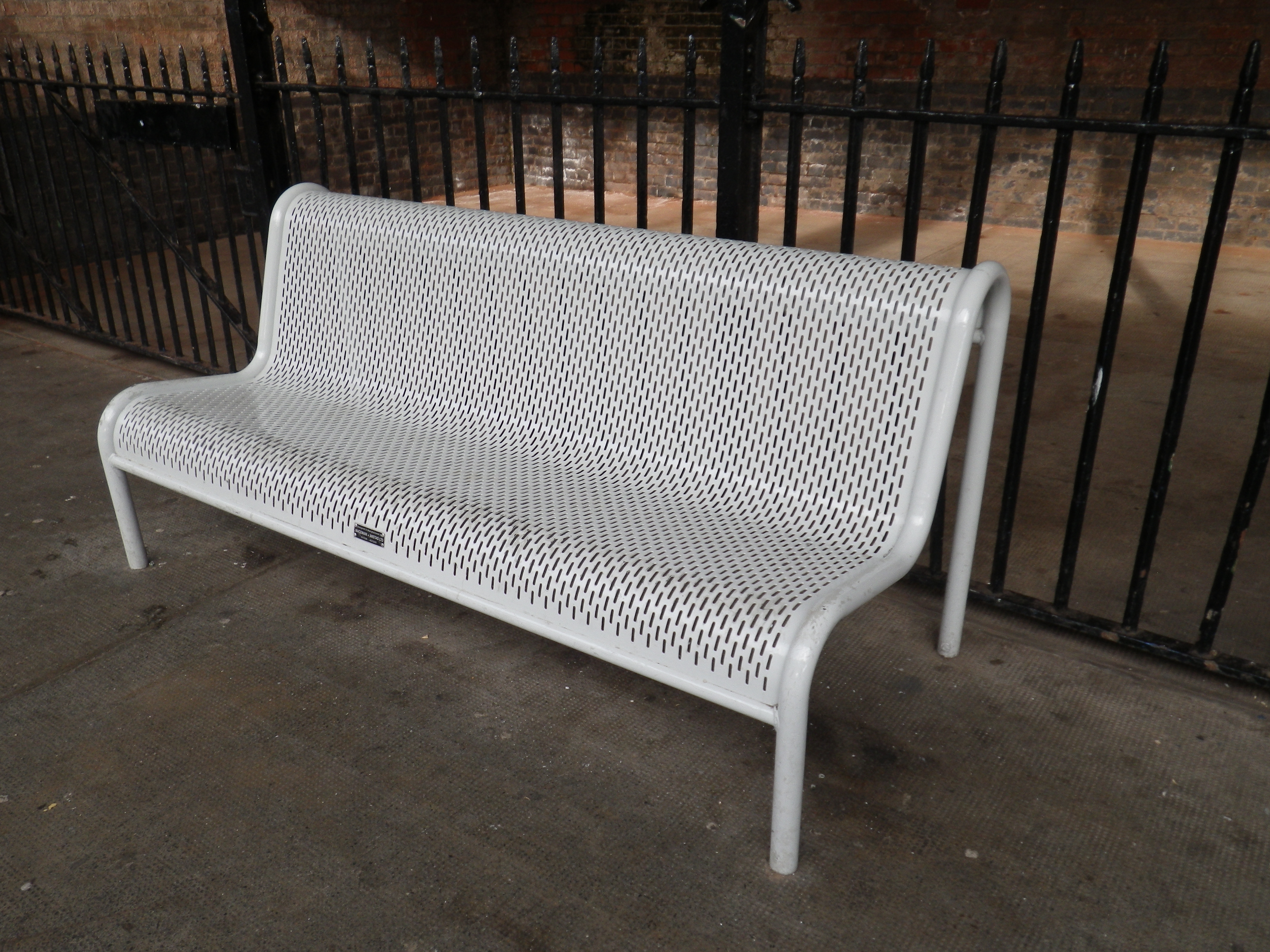
Fortunately, one out-of-the-ordinary franchised train operator has taken just such an approach. Transport for London (TfL) and its predecessors have always taken an active interest in design, styling and corporate identity. Sometimes this interest verges on the stultifying, and TfL’s strict interpretation and imposition of its corporate design guidelines can perhaps crush the joyfulness that great (and maybe anarchic) design can bring. But I’ll tell you what, the attention to detail is just lovely at times. Here’s a station bench on TfL’s London Overground, part of the National Rail network but administered by TfL rather than the national government.

Look carefully at the ends of the rails and you’ll see a little TfL roundel cast into the metal. I’ve also seen similar cast roundels on seats on the Jubilee Line extension. And the orange arms are the corporate colour for the Overground. That’s what I call pride in your operation: all of it, from seats to services.
Meanwhile, the less said about seating at most bus stops, the better. Always assuming there is any, that is.
Nevertheless, the railway industry doesn’t get all the glory. Trams (never over-represented in entries at The Beauty of Transport as mentioned earlier) do get a look in here too, but it helps if your city is the sort of place that gets an architect, an artist, or an international fashion designer on the case when styling new lines. Let’s have a quick look at a tram stop bench in Montpellier, where tram lines have been styled variously by architect Antoine Garcia-Diaz, stylists Elizabeth Garouste and Mattia Bonetti, and French designer Christian Lacroix.
Recalling Guimard’s sinuous station entrances to the Paris Métro, this pair of benches is at Saint Jean de Védas. They’re curvy and oh-so-chic, another bench design which reflects the character of the public transport network it is a part of.


.jpg)
You will find that most the seating is made by Macemain + Amstad and can be found on their website http://www.macemainamstad.com/products/street-furniture
and you can still buy your beloved cheese grater bench,