My youngest nephew (hello!) collects public transport timetables and maps, and the odd ticket. He’s five years old. Transport runs in the genes in my family, you see. While I do like a nice public transport map, timetables generally leave me fairly cold unless I’m using them for their intended purpose. There’s not much in the way of artistic interest in most timetables, after all. Here are the fronts of a few typical timetable leaflets – you’ll see what I mean.
Here’s one from Southern Railway, from a couple of years back:
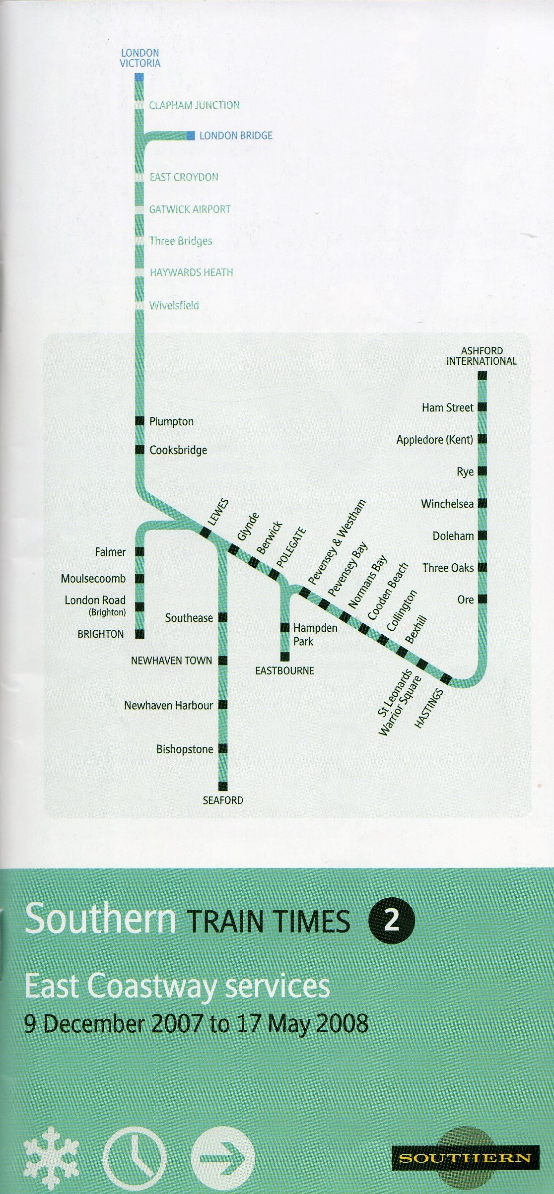
It’s smart enough, very factual and businesslike. It gives the dates of validity (the snowflake in the bottom left corner is a neat touch to show that it was the winter period timetable) and the routes covered (although the geography is so highly stylised as to be positively head-spinning).
Next is a more recent one from Stagecoach buses (just to show I’m not having a go only at train operators):
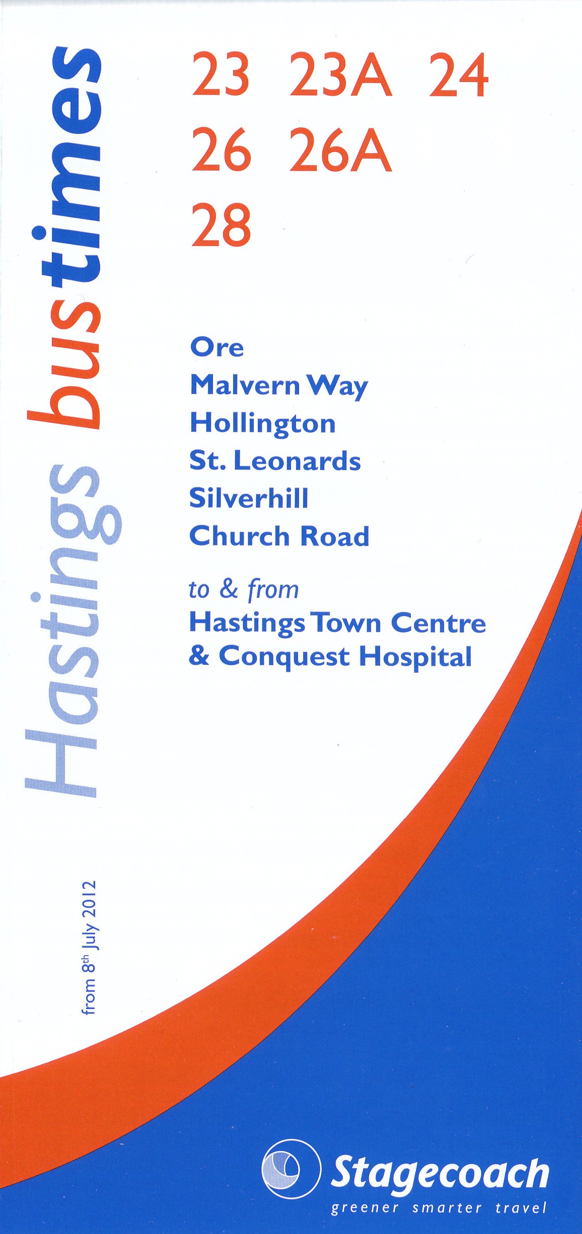
Again, it puts across the basic information necessary, but it doesn’t really clamour for the attention of passers-by. So if you’re an existing passenger who is on the lookout for your timetable then fair enough, but if you’re not a regular bus user, the design probably isn’t going to tempt you to pick up the timetable and become one.
This next one’s by train operator Southeastern:
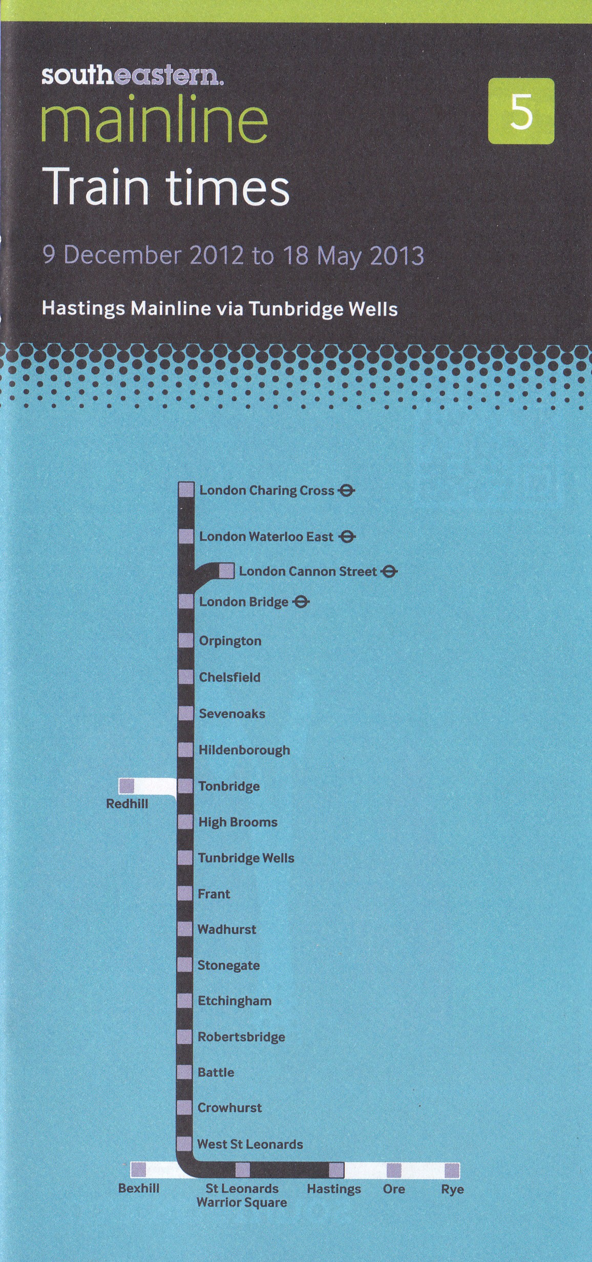
As with the Southern Railway timetable it shows the route, stations, and validity just fine, but as with Stagecoach’s bus timetable it’s not really going to attract attention or interest from people who aren’t actively seeking it. Nevertheless, it has to be said that it’s considerably better than the same company’s output a couple of years back, when timetables featured this minimalist cover:
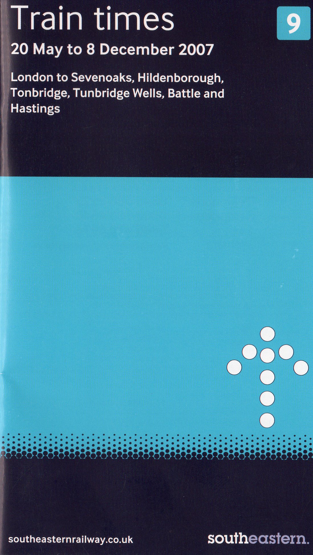
Blimey. You’d have to have been intimately familiar with the stations on the route to know all those which were actually covered by this timetable, as those mentioned at the top are simply the principal stations served. The white arrow on the pale blue background was presumably an indication of the direction in which one’s eyes should be cast when trying to deduce any further information about the contents of this timetable based on its cover.
The above timetables aren’t bad; there’s nothing much wrong with them (apart from possibly the last one). They tell you what they’re for, and which routes/stations are covered by the timetables inside. But they strive to do no more than that basic role, which is a shame really. Despite the shift to internet and mobile means of journey planning, timetable leaflets still have a useful role to play. Many commuters will have, tucked into their bag or briefcase, a timetable leaflet for their regular route. Occasional travellers pick them up for reassurance. It’s good to know that even if the battery in your smartphone dies, or you’re in a wi-fi dead-spot, there’s a way of checking connections and arrival times, especially when you’re not catching your regular train. So timetable leaflets are still a great opportunity for transport operators to not only give you useful information, but also take the chance to sell you additional services, persuade you to take a leisure trip, and inform you about ticket offers.
In short, timetable leaflets are small but significant channels of communication and marketing between transport operators and their passengers, not least because you’re already thinking about transport when you’re looking at a timetable. It’s the difference between a carpet cleaning company coming round to your house and leaving their business card, which happens to mention that they also do upholstery cleaning (do they? How interesting. They’ve made such a good job of the carpets, and we really should get that chocolate stain off the sofa), and an unsolicited telephone call about your double glazing needs when you’re just about to set out on the school run.
Maximising the possibility of a timetable being a means of getting travellers to buy more travel requires as many people as possible to pick up a timetable on their way past the leaflet rack. In order for that to happen, surely it would help if the timetables were eye-catching and attractive, and seemed like something you might want to look at?
I only ask because the above examples demonstrate the considerable lack of enthusiasm for such a concept. And because I know that it can be done, as one UK train operator features some lovely work on their timetable covers. Step forward south of England operator South West Trains. For several years, South West Trains has illustrated its timetable covers, starting off with simple images which have become more detailed year by year. The 2013 collection is the best yet.

Aren’t they lovely?
The detail and perspective on the images is so good (check the perspective of the pier and train on the Island Line one) that I’m fairly sure these have been converted from original photos to graphics via Photoshop or something similar. But that’s OK. It doesn’t make them any less attractive, and anyway it’s just the latest in a long line of optically/mechanically assisted art (Vermeer’s paintings are no less mesmerising for his (probable) use of a camera obscura in creating them).
The inclusion of the pictures doesn’t detract from the basic information that each timetable is getting across (which stations/routes are covered inside) which shows that timetables don’t have to be as plain as the ones at the beginning of this entry in order to convey their scope effectively.
Here’s the funny thing. I’m writing this entry simply because the sight of a rack of these attractive timetables at a South West Trains station was so arresting that I stopped to pick them up. I didn’t even need them on a day-to-day basis. But now I have them I’ve been flipping through them. I’ve been reading the adverts for attractions I can visit by train. I’m reminded that I keep meaning to visit Kew Gardens again: it’s mentioned in one of those adverts. And I see that there is a 2for1 entry deal if I arrive clutching a train ticket. So I will.
South West Trains will get some extra business from me just because there were pretty pictures on the front of their timetable leaflets.
That’s good design, and it’s good business sense. It’s something that looks attractive, and as a result it works much better.
More like this please.

Here! Here!
Nice piece Mr Wright and couldn’t agree more re: South-West Trains lovely fronts!
Hot off the press (well – not even officially published yet!) at Brent Council, we’re proud of our new public/sustainable transport leaflet and – dare I admit it – we’ve spent a reasonable amount of time arguing (sorry – ‘debating’) the appearance of the front cover.
We’re pretty pleased with our “very nearly final draft” front cover – designed from scratch (with a little help from a graphic designer). A sneak preview of which is here: http://postimg.org/image/u2pzt9ynt/
I hope it has The Beauty of Transport seal of approval?!