If you’re interested in good design (not just good styling) in UK passenger transport, it’s not long before you run up against the work of design agency Best Impressions. Under its charismatic founder and design director Ray Stenning, Best Impressions has made a huge impact on the way public transport is branded. If you’ve noticed a stylish bus map, a smartly attired train, or a comprehensible public transport website, the odds are better than even that Best Impressions has had a hand in it. I hasten to add that a transport company’s brand has to be more than just the graphic design of the way its buses and trains, and information about them, are presented. It also encompasses the behaviour of staff, customer relations, the price of journeys, ticketing options and so on. But without a cohesive visual corporate identity underpinning them, it’s hard to imagine how you could build many of those latter factors into a brand.
Ray and his team at Best Impressions have changed the way Britain’s buses and trains look. Before Best Impressions arrived on the scene, buses had horizontal stripes (curves hadn’t been seen since the mid-twentieth century on front-engined buses where the livery curved over flared wheel arches). The most radical passenger train liveries of the nationalised British Rail came towards the end of its existence; Intercity (stripes…but cut off at an angle at the ends) and Network SouthEast (red, white and blue stripes which angled up at the ends, shocking then but utterly run-of-the-mill now). Deregulation of the bus industry, and the privatisation of British Rail, brought many new operators into the industry, and they increasingly sought their own distinctive visual identities. Best Impressions broke the mould (several times over the following few years) with curves and ‘swooshes’ rather than stripes, unusual colour combinations, silvered highlights, and/or large (sometimes tongue-in-cheek) adverts on the sides or rears of buses promoting the bus company which owned those buses. This was a break with traditional bus advertising which could be for practically anything, and all too often was for cars…
You’ll have seen Best Impressions’ work on Stagecoach buses, Arriva’s buses and trains, Southern Vectis, several local authority-led park and ride schemes, trains at the first Midland Mainline train operating franchise, South West Trains, London Midland and the first ScotRail franchise, to name but a few. Best Impressions has gone beyond the UK too, recently overhauling the look of Germany’s Public Express coach operation.
But it’s not vehicle liveries and design today’s entry celebrates. Instead, it’s Best Impressions’ work on public transport mapping, for both trains and buses.
Before Best Impressions got stuck in, rail network maps generally took their lead from the famous London Underground map, originally designed by Harry Beck. The obvious characteristics of that map are that the lines are either horizontal, vertical or at 45º, and that physical geography is thrown out of the window in order to highlight connections between lines, making it easy for travellers to make journeys between one point and another by changing between lines en-route. That makes sense when your network is under the ground, and travellers are already forcibly divorced from surface geography. It also makes sense because railway stations are usually quite widely spaced, so travellers tend to know in advance which station they need to alight at for their final destination.
Bus maps, on the other hand, represent a rather different proposition. Because bus stops, and indeed bus routes, are often found close together, the question is which particular bus stop or bus route is needed to get the closest to a passenger’s final destination. That’s not so easy to tell from a diagrammatic map of the London Underground sort, though it hasn’t stopped Transport for London from producing diagrammatic ‘spider’ maps at its bus stops, in which bus routes dangle into empty and mysterious white space, meaning it’s hard to tell just how far away locations on the route are, or where exactly the bus route is in relation to your actual final destination. Here’s what you might encounter at a typical London bus shelter:
![London bus 'spider' map. By eldan [CC] via flickr](https://thebeautyoftransport.com/wp-content/uploads/2013/09/4692956508_33b0cb17e8_b.jpg)
Ray’s particular genius in the field of public transport mapping was to invent something called “streamlined geography”, which revolutionised the appearance of bus maps produced by his company. I asked Ray if he’d been inspired by earlier examples or whether the idea was totally original, and he said he was always being inspired by earlier work but as far as he knew he was the first person to produce maps of this sort. They work by taking the bus network (either within a town or across a wider area) and identifying key geographical points, which are reproduced accurately in relation to one another. Between them, the bus routes and other local roads are straightened out to get rid of the complicated kinks in the real road network, which aren’t of particular relevance to bus travellers. The overall look of the map still retains a strong sense of the real world geography of an area. However, ‘streamlining’ the fine detail of the bus routes and local road network means it is possible to show several routes, each with a colour of its own, where they run in parallel. The end result is that you can track bus routes through the map very easily, you can work out which bus routes go to the part of town you want to go to, and indeed get a very good idea of how close the bus will get you. It’s the best of both worlds, realistic enough to bear a comforting resemblance to the real world, stylised enough that the information is put across simply and without too many distracting wiggles.
Take a look at the following Best Impressions-designed map of the bus network of northern English town Harrogate. It’s recognisably the same shape as the actual town (trust me) but straightened out a bit to make the bus routes serving it much more comprehensible.

To further assist, individual bus stops are marked on – you won’t find that on most bus maps.
But most importantly (for this blog) such maps are not only incredibly useful, but extremely attractive.
Oddly enough, sometimes it’s a rail map that needs to be displayed with a bit more geographical accuracy than a traditional railway diagram, and Best Impressions’ streamlined geography approach works equally well here.
In a previous existence (a decade ago now), I worked for Surrey County Council’s public transport department. For overseas readers, Surrey County Council is the local government authority overseeing the county of Surrey, which is to the south of Greater London. When I arrived, the map of Surrey’s rail network looked like this:
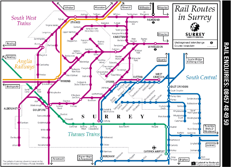
I’m not knocking it. It perfectly well shows all the stations, and how they connect to each other. But at the time I was working at the council, there was a push to encourage local rail travel; using the rail network to make local trips around Surrey. What the map above doesn’t do, because it wasn’t intended to, is show how the rail network relates to Surrey’s actual geography. If we could get a map that did so, it would help potential passengers understand if they were in for a long trip, or a short one. It would show areas where the rail network was genuinely dense, and therefore a viable local transport option, and areas where it wasn’t, and more pre-planning would be needed. We also wanted a map that showed how Clapham Junction could be used as an interchange to get between east and west Surrey, and that it wasn’t actually that far away from Surrey’s northern border.
I had regarded Best Impressions’ Hampshire’s rail map (the county of Hampshire is just to the south of Surrey) with envious eyes for some time. When I finally got permission to ask Best Impressions to redesign the Surrey Rail Map, this is what the company came up with:
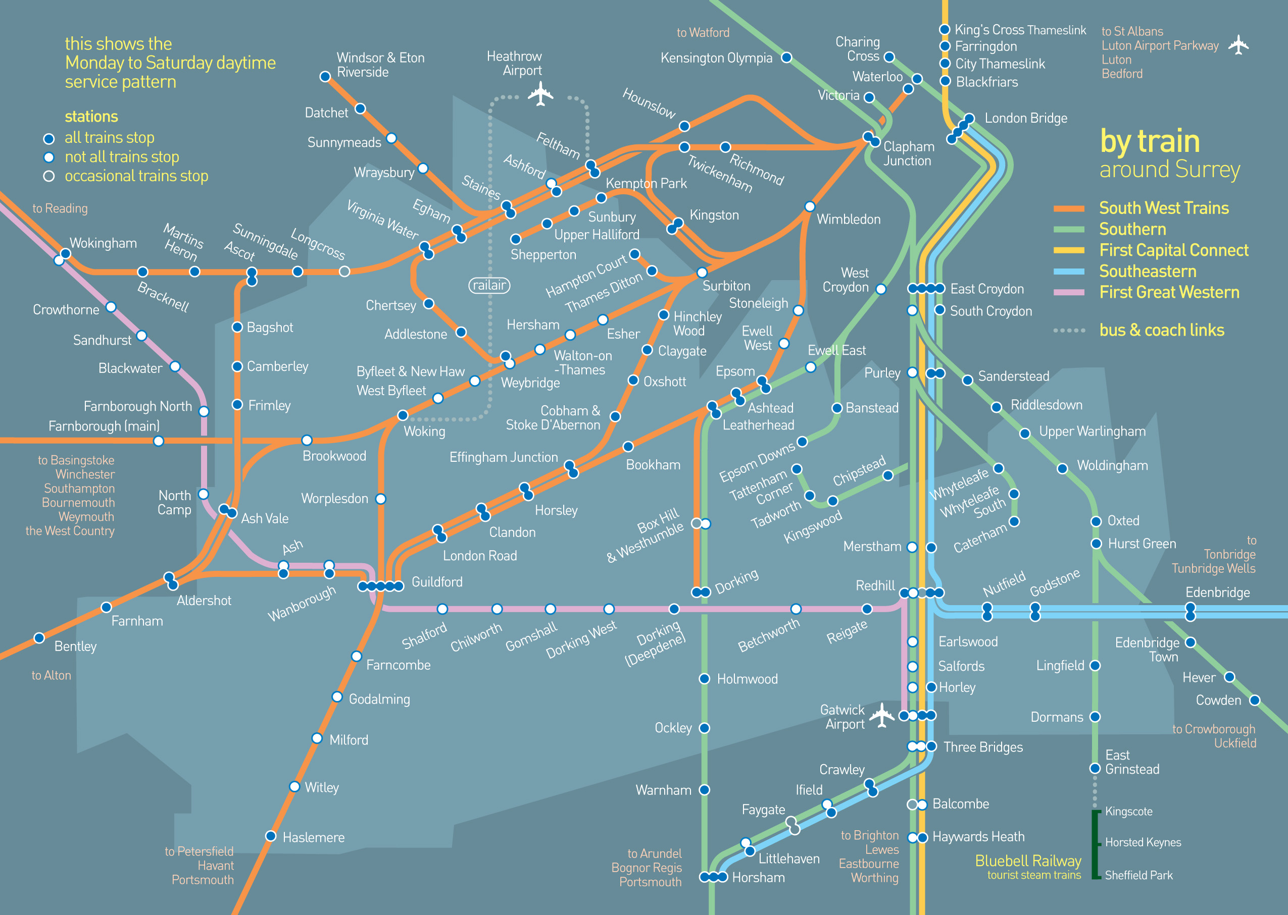
It was an easy-to-understand rail map of Surrey, that actually looked like Surrey. And it’s an enormously attractive piece of graphic design too. The font is trustworthy, but friendly (without tipping over into Comic Sans naffness). The colours used for the different train companies are complementary, but striking, and stay the right side of kaleidoscopic. Light colours on a dark background is a break in tradition for those used to London Underground style maps, but is actually very restful here. While I don’t believe the arguments will ever be settled completely, there is at least a good proportion of people for whom light text on a dark background is easier to read, too. You wouldn’t expect it (well I’m sure Ray did), but breaking away from horizontal, vertical and 45º lines is surprisingly easy on the eye. Best Impressions also worked on several bus network maps for Surrey County Council subsequently, but it’s the rail map that remains a personal favourite. Surrey County Council is still using a rail map derived from the Best Impressions version (as you can see via this webpage), though it’s changed a bit in the meantime, not least because it’s reverted to dark colours on a light background, and is now updated by others.
I’d love to see what Best Impressions could do with the London and South East rail map, or indeed the London Underground map itself. Oh well, I can dream.
Best Impressions’ mapping hasn’t stood still since production of the above, either. It’s still producing good-looking public transport maps by the bucket load, and new technology has enabled clever products like interactive versions on transport operator websites (Southern Vectis used to have a splendid interactive Isle of Wight bus network map, but has since reverted to a non-interactive .pdf version, which is a shame). Even Best Impressions’ printed maps are continually evolving. The latest ones include isometric representations of the city centre rather than just a large-scale map. Readers “are comfortable using them as the interface is similar to that on a lot of GPS devices,” says Best Impressions. Here’s an example:
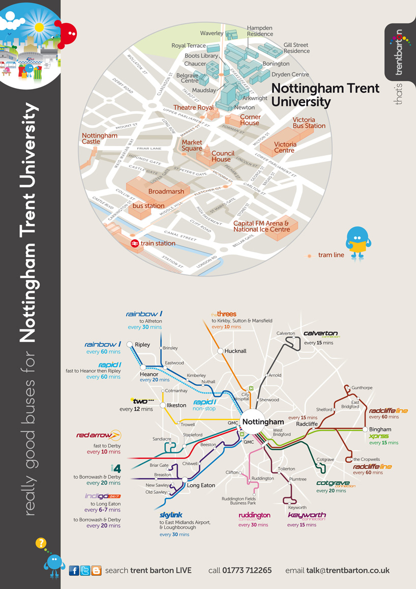
While you’re admiring the map, note the rainbow element in the trentbarton logo top right; we’ll be coming back to that another day.
Best Impressions has comprehensively redefined the appearance of bus and train maps. That’s not surprising. Ray and his team are both graphic design experts and public transport experts (not to mention enthusiasts for passenger transport too). Their products are useful and beautiful. The only surprise is that more bus and train maps don’t look like this.
Acknowledgements
Many thanks to Ray and the team at Best Impressions for their enthusiasm and willingness to provide me with examples of their work, as reproduced above.
For the avoidance of doubt, this entry has not been sponsored in any way by Best Impressions and all the opinions expressed above are mine.
Further Reading
Best Impressions’ website (here) has a portfolio of recent work and you can follow the company on Twitter. I do.

2 thoughts on “Map Me Gorgeous (Bus and Train Maps, Best Impressions, UK)”