Public transport sometimes does grand, sometimes does stylish, occasionally goes for the monumental, and at times ventures into the high-tech. It rarely does sleek. This week’s transport beauty is a rare example of the sort of achingly desirable futuristic gorgeousness epitomised by the work of Pierre Cardin and which electronics company Apple has so successfully converted into a global business model of covetable products. It’s Drassanes station, on line 3 of the Barcelona Metro.
Sleek is a design ethic which is very difficult to pull off effectively. It’s all geometric shapes, smooth contours, bright colours (or dazzling white) and glossy finishes. It requires real attention to detail and an understanding of the use to which the finished design will be put. Apple’s products may be widespread but it’s one of the very few companies that have pushed this aesthetic to its limits, whilst still maintaining enviable functionality, as all good industrial design should. Its products work very well, and everything about them looks gorgeous, not because they are highly decorated, or appear very intricate, but for almost the exact opposite reasons. Apple products are slick, shiny and minimalist. They are the ultimate tactile objects, desperate to be clutched or stroked. There’s not an unpleasant sharp edge or rough patch on them.
When movie director J.J. Abrams unveiled his reboot of the Star Trek films in 2009, that same sleek aesthetic had escaped into outer space, informing the design of the interiors of the starship Enterprise. In fact, one of the major criticisms from long-time Trek fans (see here, for instance) was that Abrams’ Enterprise looked as if it had been designed by Apple. It was all white, shiny, curved surfaces with beautiful display panels and pin-sharp lighting (there’s a picture of one of the sets here). But why would you not want the Enterprise to look utterly gorgeous? Why would it not look like the best technology design of which you could conceive? The alternative, the drab grey fittings and matt metal finishes seen in the last couple of Star Trek TV series a few years earlier, don’t bear dwelling upon. One of the successes of Abrams’ take on Star Trek was recapturing viewers’ desire to join the crew of the Enterprise and hitch along for the ride; the attractive design was part of that seduction. Production designer Scott Chambliss cited French designer Pierre Cardin as his inspiration (here), many pieces of Cardin’s non-clothing design also encompassing dramatic forms in bold colors, with sinuous curves.
In the same year that Abrams unleashed his slick starship interiors on unsuspecting cinema-goers, Barcelona’s metro system unleashed on unsuspecting travellers some of the sleekest station interiors ever seen on such a network. It was enough to make you wonder whether Abrams had visited Barcelona during the construction of Drassanes station’s, but the real reason is simply that Apple had popularised amongst a mass audience an aesthetic which looks like it comes from a better and more beautiful future than most industrial design, and Drassanes represents one of the few occasions that the transport industry has been brave enough to embrace it too.
The work of Barcelona-based architecture practice ON-A, Drassanes station is a masterpiece of simplicity, light and near-seamless tactile beauty. It’s of the same family as Apple’s product design, Cardin’s industrial design, and Chambliss’s production design, but has a character unique to itself which solves several design problems posed by the station.
Drassanes station opened in 1968. In its original form it was dark, and many of the interconnecting corridors had restricted headroom, leading to a claustrophobic experience common to many metro stations. ON-A’s solution demonstrates that clever design can alleviate this sense of oppressively small spaces without undertaking the massively expensive task of making them physically larger. It has completely revolutionised the look and feel of the station, as this ‘before and after’ picture illustrates:

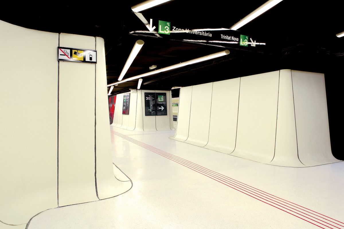
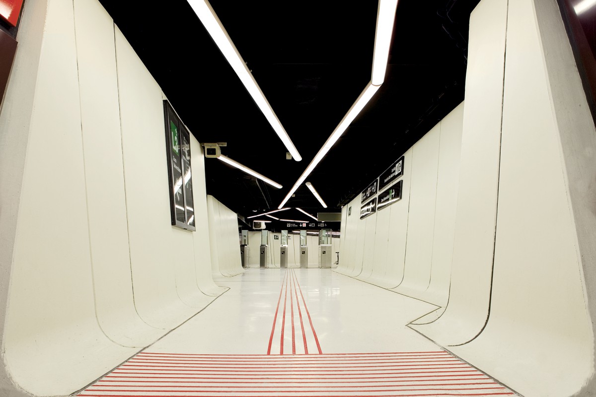
“Continuity of space” is key to the design, says ON-A¹, and is delivered through continuous panelling made of glass reinforced concrete, and finished in bright white. The panels have a C-shaped cross-section on the platform walls, and an L-shaped cross-section on the walls of the connecting corridors. Both convex/inside and concave/outside corners are accommodated by specially moulded pieces for such turns, smoothing out sharp edges in the station geometry which helps make walking through the station a more gentle and less stressful experience:
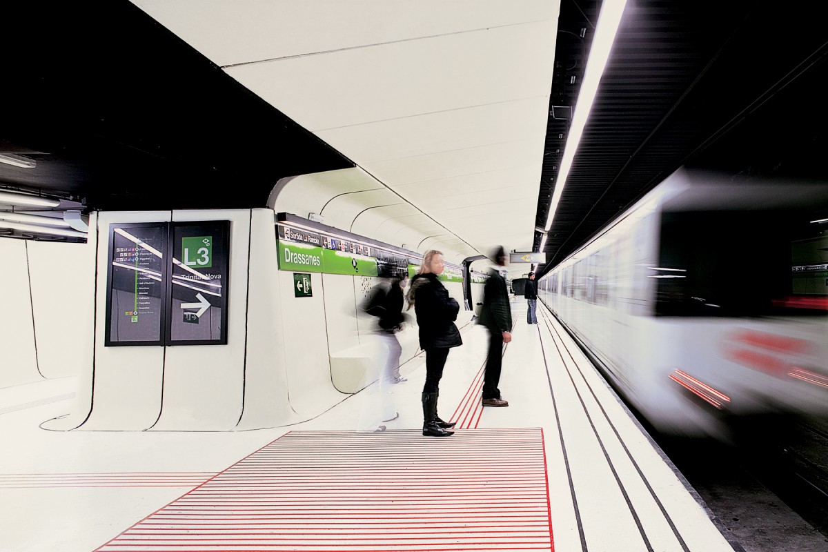
On the platforms, most of the panels also incorporate a seat at the bottom. Arranged in a row, this creates a long bench, but one that has no nooks or crannies to collect dirt, and which is integral to the design rather than being bolted on afterwards. The curve at the top of the panels blends into white ceiling sections, while the curve at the bottom blends into white terrazzo flooring². Running along the flooring are inscribed red lines, which flow throughout the station, drawing passengers along their journey through the station. Black lines help delineate the edges of the platforms, although the visual contrast between the white platform flooring and the dark trackwork alongside is enough on its own to ensure that partially-sighted passengers can identify the platform edge. The C-shape keeps light bouncing around in the platform areas, where it is needed, rather than letting it escape into the track area and tunnels, where it isn’t.

In the connecting corridors, the white panels run up only to ceiling height. The ceilings are painted black, and the strong contrast with the white walls gives rise to a clever illusion that above passengers’ heads, the ceiling disappears upwards into the darkness, promoting a sense of space. In fact, the ceiling is really only just above the top of the white panels. The effect is further enhanced by bright lighting strips, running at odd angles along the ceilings and occasionally crossing over one another.
Throughout the station, passenger information is thoughtfully organised, and is tightly constrained either to carefully placed panels or long horizontal strips at head height along the platforms. Hardly any advertising panels are allowed, and the very few which are in the station have been sited to avoid spoiling the integrity of the station design, ensuring that wayfinding information remains prioritised. Black backgrounds to the passenger information signs means they are easily located against the white walls, and their instructions quickly assimilated.
Very early in the twentieth century, Underground Electric Railways of London’s publicity officer Frank Pick realised that passengers at his stations were being confused by the chaotic mess of contemporary platform advertising, and were overlooking crucial pieces of information. He restricted advertising to a grid of specific locations so as to give passenger information signs room to breathe and be noticed. Drassanes station’s design takes this idea and brings it up to date, showing London Underground and other station operators how passenger information and advertising should be displayed in the twenty-first century. The London Underground might have pioneered visual decluttering, but Drassanes station shows up the Underground’s stations for the messy and distracting poster and digital display sites they have gradually become. Drassanes station, on the other hand, is clean and simple. It feels like a public transport node, rather than an advertising opportunity.
The only part of Drassanes station that doesn’t conform to the sleek white aesthetic is the cross-passage underneath the platforms. Here, there was insufficient space to use the reinforced concrete panels, so steel panelling was used instead². It is cut into a wild pattern of different shapes and finished in shades of red and orange (red being the complementary colour to the green elements used elsewhere in the station design; green is the colour of line 3 on the Barcelona Metro map). The divides separating the panels, not to mention the angle-pattern lighting strips elsewhere in the station, are intended to represent intersecting passenger movements. “Were the passengers comets, their trails would weave together, paths crossing at the station,” says ON-A¹.

Drassanes station manifests as a welcome glimpse into a better future, and one that has the inestimable benefit of actually looking like the future. What more could you ask for from an architect redesigning the interior of a 40-year-old station? It’s a bright and brilliant piece of work.
how to find Drassanes metro station
Click here
references and further reading
¹ ON-A’s project page on Drassanes metro station refit, here
² railway-technology.com’s Q&A with ON-A’s Eduardo Gutiérrez, which covers Drassanes station, here
…and anything else linked to above.

amazed , aesthetic design 🙂
When I look at it it reminds me of Space: 1999. Well, now I have one more reason to visit Barcelona. Brilliant!
I’d not thought of that, but there is something of the Space 1999 about it too. It’s really that all those sci-fi shows want to show a sleek and attractive design. The joy of ON-A’s Drassanes station is that they’ve made it real…