First thing the other morning, straight after breakfast, I caught the PATH train from New York to Hoboken Terminal, on the other side of the Hudson River, in the state of New Jersey. PATH is like a secret second underground network to MTA’s New York City Subway, and is operated by a joint venture between the states of New York and New Jersey. PATH is barely visible on the MTA Subway map, despite paralleling MTA’s Sixth Avenue line for several stations, and its tickets aren’t interavailable with the NYC Subway. There are reasons for this. PATH’s key job is to provide travel between Manhattan and the New Jersey locations of Hoboken, Jersey City and Newark, and New Yorkers have much the same attitude towards New Jersey as they do towards dollar coins. Basically, they can’t see the point of them, accept them only begrudgingly, and wish that they didn’t have to acknowledge their existence in the first place. When it comes to PATH, and its two New Jersey terminals, they are (just as with the dollar coins, which are useful and good fun) making a great mistake.
A long time ago, I told you about the impressive Art Deco station at Newark’s Penn Station. It’s the western terminus for PATH trains on the New Jersey side of the Hudson. Hoboken Terminal, under which can be found PATH’s western terminus in New Jersey, is just as impressive. While Penn Station is all aluminum and Art Deco, Hoboken Terminal is bronze and Beaux Arts.
Its huge waiting hall / ticket hall / concourse (100 feet square and 54 feet tall) is undeniably its most impressive feature. Lovingly restored (more than once…) it is gloriously American railroad. You couldn’t really mistake it for anything in Europe. American railroads were keen adopters of the Beaux Arts style (Grand Central being probably the most famous surviving example) and such stations are always essayed in a uniquely American style; hard to pinpoint but unmistakeable when experienced.
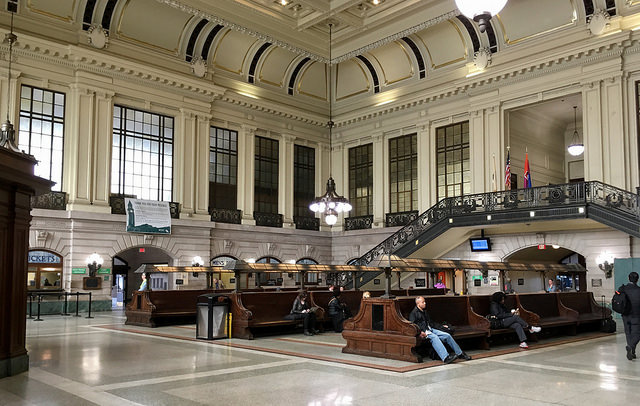
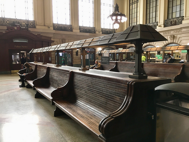
Hoboken Terminal has the typical long benches that can be found, where they survive, at many large American railroad stations. The dominating feature is a double staircase and balcony across one wall. It leads to an upper floor concourse and restaurant serving the adjacent ferry slips, though the staircase is not currently open to the public and neither is the concourse or restaurant. Between the two staircases is an archway which leads directly to the ferry slips at ground level. The footings of the walls are dark green marble, and above that is pale rusticated limestone with plaster on the upper parts. Sculpted keystones decorate the arched windows and doorways. There are copper fittings everywhere – ornate brackets for wall lamps, light fittings running along the tops of the wooden benches, the railings for the staircase, and the chandeliers. But most impressive of all is the ceiling.

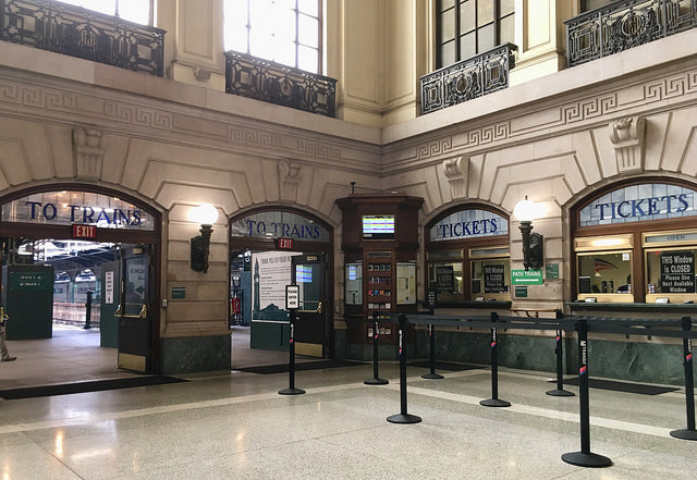
Set in the middle of a decorative plasterwork border, it’s a huge work of beautiful stained glass by Louis Comfort Tiffany (the same Tiffany of the Tiffany lamps). It is largely geometric in pattern, with floral elements towards the centre. It’s not the only piece of stained glass, either. More can be found over doorways and ticket offices, explaining what facilities can be found underneath.
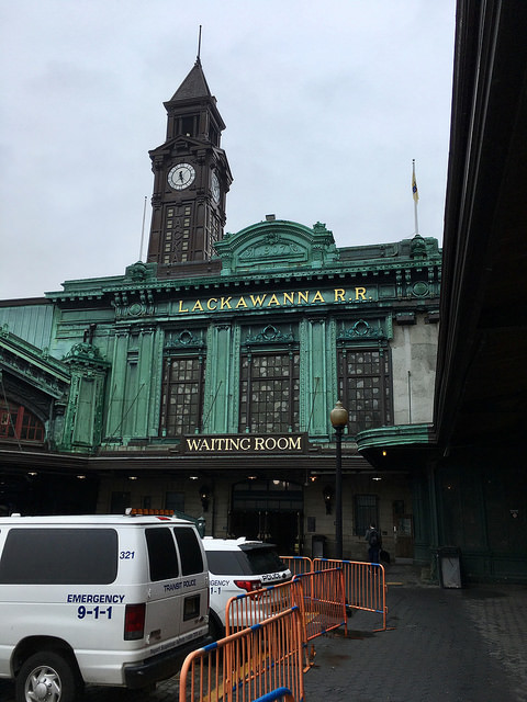
The exterior of the terminal is also a riot of decorative copper. It seems to clad virtually the whole of the outside of the building, formed into various Beaux Arts features; scrollwork, pilasters, swags, pediments, the lot. Rather like Grand Central, it seems to have been a case of throwing everything at the terminal’s design and seeing what stuck. And what stuck was everything. From outside, the building is split into two obvious parts, the eastern section housing the railroad concourse, and the larger western section serving the ferries. The junction of the two is marked with an impressive 69m-tall clock tower, carrying the legend “Lackawanna” vertically, with the letters illuminated at night.
Railroad historian Brian Solomon suggests that the use of these vast quantities of copper came about because it was left over from the construction of the Statue of Liberty at the same time¹. It’s possible, but when I visited the Statue, the information there suggested the statue was constructed in France and shipped over in parts, so there wouldn’t have been lots of spare copper sheet lying around in America.
A large square in front of the ferry building ensured that passengers who had arrived by means other than the railroad were also able to easily access the ferry slips. Sadly, today, what is now known as Warrington Plaza is a bit of a mess, full of portacabins, shipping containers and haphazardly parked road vehicles. There’s a reason for that, though, as I’ll explain in a moment.
The architect of Hoboken Terminal was Kenneth M Murchison. He was hired by the Delaware, Lackawanna & Western Railroad to design the terminal after fire destroyed the pre-existing one on the same site. Murchison’s new station opened in 1907. It was one of a number of stations along the western bank of the Hudson, as close as railroads from the central parts of the US could get to Manhattan. The wide and heavily trafficked Hudson River wasn’t amenable to bridging, and tunnelling had been, until then, out of the reach of technology. All that was about to change, as the new underground (and underwater) Hudson and Manhattan Railroad (today’s PATH Train) opened in 1908, just a year after the new Hoboken Terminal itself, linking Hoboken to 19th Street and 6th Avenue in New York. In 1910 it was extended to its current terminus at 33rd Street, which is where I caught it. It was an immediate success, much faster than the ferries, and although there was significant passenger transfer from the ferries to the new underground railroad, the ferries between Hoboken Terminal and New York ran until 1967.

The Delaware, Lackawanna & Western did very well for itself in the early years of the 20th Century. Passengers were almost a secondary business; its success was built on the movement of anthracite, a clean burning coal also used to power its steam locomotives. The DL&W even invented a character called Phoebe Snow for marketing appearances, her white clothing unmarked by railroad travel due to the cleanliness of anthracite-burning locomotive. Unfortunately for the DL&W, demand for anthracite began a long slow decline after the First World War, taking the finances of the DL&W with it. It merged with the Erie Railroad in 1960 in an attempt to improve its financial position, but it didn’t help very much. The DL&W’s long distance passenger services were withdrawn and although Hoboken Terminal remained open for commuter services, there was no money to spend on the terminal’s upkeep and it went into a speedy decline. By the 1980s it was a ruin, its windows broken and the copper plating coming away. The clock tower had been removed as early as the mid-1950s, having become dangerously unsafe.
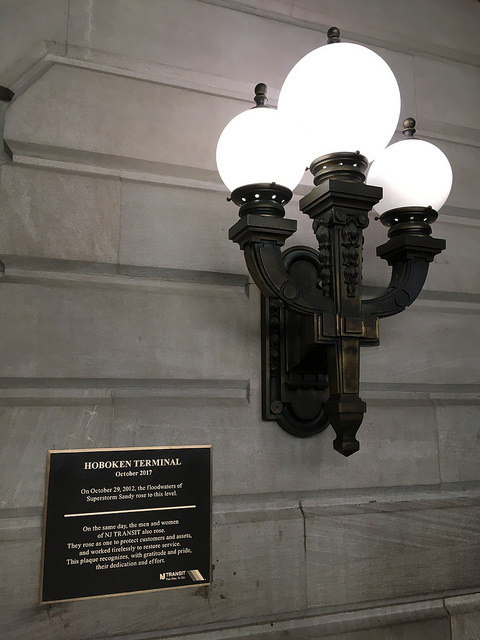
Happily, the railroad station was restored to its former glory in the 1990s by its current owner NJ Transit, though the railroad platforms have clearly not had the same care and attention lavished on them as the concourse interior and building exterior (shades of Newark Penn Station, then). The ferry slips were restored in the early 2000s, allowing the resumption of ferry services to New York. That’s not quite the end of the story, though. Having been through its impressive restoration, Hoboken Terminal was then submerged in a metre and a half of floodwater by the superstorm Sandy in 2012.
Having carefully restored the station once, NJ Transit had to do it all over again. The terminal is now looking almost back to its best, with the exception of the still chaotic Warrington Plaza in front. It’s named for George D Warrington, executive director of NJ Transit 2002-07, who oversaw the restoration of the ferry slips and the construction of a reproduction clock tower, which was installed in 2008.
If there are disappointments in the station today, it’s because it is really too large to handle the number of passengers it currently sees. In particular, there’s no need to use the upper ferry concourse based on current passenger numbers, and the direct entrance from the railroad platforms to the upper ferry concourse is blocked off. Instead, passengers heading for the ferry use what was once the cargo route to the ground level of the ferry slips. It looks like a cargo route too, an overlooked space that feels unloved. A baggage building later used by the YMCA, on the western side of Warrington Plaza, is also out of use. Meanwhile, the number of insensitively designed and located modern directional signs is quite extraordinary; you’ll notice them in some of the photos above.
Nevertheless, it is one of the great railroad stations, and a remarkable survivor. It will be all the better once the post-Sandy repairs are completed and it is back to its prime.
How to find Hoboken Terminal
Click here for The Beauty of Transport‘s map
Bibliography and Further Reading
National Register of Historic Places citation for Hoboken Terminal, here
American-Rails.com webpage on Hoboken Terminal, here
Solomon, Brian (2015): Railway Depots, Stations & Terminals. Voyageur Press, Minneapolis

The ‘hush hush’ line reminds me of the way LT used to publicise the Waterloo and City Line. Blank colouring on the map, and only the odd sign at both ends. Even getting on the trains in the mid 60’s was an exercise in time travel, with the ‘Southern’ motifs over the connecting doors between the cars….. Today’s terminus has a whiff of what the concourse area of Manchester’s Victorian Station might have been like in its Edwardian heydey.
Another interesting fact regarding the Tiffany Glass ceiling at the Hoboken Terminal: it was painted black during World War II as required of all windows. Rumor said they forgot about this and it came as a wonderful surprise during the restoration. As a commuter during the restoration and an avid student of this decorative era, I appreciate the work that was done to bring the terminal back to its original beauty.