Which train prompted railway engineer, journalist and commentator Gareth Dennis to make this bold claim recently on Twitter? This one:

The only drawback? It never existed. The InterCity 250 numbers among a small club of eye-catching public transport vehicles which benefitted from the fact they never had to be built. They live in a perfect world where cutting-edge designs have never needed to be compromised and toned-down by engineering reality. Welcome to the extraordinary world of passenger transport artists’ impressions and mock-ups. It’s a place full of improbable, futuristic trains, buses and planes which would have transformed the look of passenger transport, delivering design icons to roads, tracks and flight paths, if only any of them had ever been built. The Beauty of Transport usually tries to stay away from vehicle design, with a few notable exceptions, because it’s so divisive and subjective (see the replies to Gareth’s tweet, for a start). But when it comes to the artistic flair of designers unshackled from the mundane requirements of actually building something for real, this week I’m making an exception.
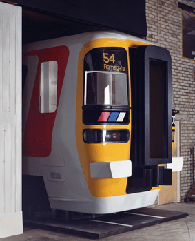
The model of British Rail’s InterCity 250 is one of the few physical remains (apart from a number of brochures and a full-sized front end mock-up at the Midlands Railway Centre) of the train that came agonisingly close to revolutionising the London-Glasgow West Coast Main Line in the late 1990s, long before anyone had ever heard of a Virgin Trains Pendolino.
In the aftermath of the cancellation of the tilting Advanced Passenger Train, British Rail’s InterCity sector was faced with a quandary; what to replace the line’s ageing stock with. A stop-gap measure of new locomotives pulling existing carriages helped somewhat but wasn’t seen as a long-term solution. In the meantime, the London-Edinburgh East Coast Main Line had been equipped with all-new trains, the InterCity 225s (still in use with current operator LNER). For the West Coast Main Line, step forward, InterCity 250. It’s fabulous external styling was the work of design company Seymour Powell. It would have had a top speed of 155mph (or 250kph, hence its name) but without needing to tilt; tilt being a concept the British railway was not yet prepared to revisit. Given that the tilting APT had a maximum design speed of 155mph, and the tilting Pendolinos currently operating on the route were designed to run at up to ‘only’ 140mph, you might wonder how why InterCity 250 pulled off this rather neat trick. The answer is that many of the curvy bits of the West Coast Main Line would have been straightened out; a rather concerning concept if you happened to live in a house by the side of the tracks in such an area, I suspect.
Unfortunately InterCity 250 was under development while the economy took one of its periodic downturns and while railway privatisation was being devised. In light of this double-whammy the government was unwilling to commit funds to the project. InterCity tried various increasingly desperate techniques to progress the plan, including the idea of ordering just two pre-series InterCity 250s, but without success. A subsequent proposal saw the incorporation of some InterCity 250 concepts like 26m-long carriages, in a second batch of InterCity 225s. At a late stage, the government agreed to fund (actually, if memory serves, underwrite BR to lease) either a build of express ‘Networker’ trains for Network SouthEast or the second batch of InterCity 225s, and opted for the former. Intercity 250, already effectively dead, was finally put out of its misery.
The Express Networkers that the government authorised (what are now known as the Class 365s) are a clever and economic bit of engineering in themselves. They re-used the bodyshells developed for the standard Networker suburban train, but were equipped for higher speeds and were fitted with interiors more suited for longer-distance services. Cheap and cheerful is too unkind a phrase to describe this project, but the Class 365s certainly aren’t the Express Networkers that Network SouthEast originally had in mind. Those Networkers, the Class 471s, never progressed beyond the stage of artist’s impressions and a full-sized mock-up. They would have looked like this:
With its curved glass cab windows, a recurrent idiom which the railway is both attracted to, and frequently disappointed by (q.v. Classes 303, 309, 310, 311, and most recently Class 385) the Express Networker looked clean and modern compared to the slam-door trains it was intended to replace. By Networker standards, the design was quite conservative. Network SouthEast had originally planned a whole family of Networker trains across its entire network, and the project coincided with the golden age of British railway artist’s impressions. By the late 1980s and into the 1990s, designers were excitedly producing images of trains that were eye-catching and attractive, following the zeitgeist for more exciting product design across many industries, not least the automotive sector. They were perhaps also influenced by the Post-Modernist architecture of the time which was breaking away from unadorned Modern and Brutalist buildings in favour of a more decorative and less severe approach. The result was some exciting artists impressions of trains, but which often embodied a world of difference with the final products when and if they were eventually built, which tended to be significantly more conservative.
This, for instance, is the initial artist’s impression for Network SouthEast’s CrossRail train, the Class 341:

As design work progressed into something that was actually feasible to build, the train came to resemble something much more like the existing suburban Networker trains, as you can see in this video:
While more practicable, the later mock-up lost the futuristic appearance of the earlier artist’s impression. Famously, the Network SouthEast-era version of Crossrail was canned when a small committee in parliament chucked out the bill authorising its construction, and it is only now that delivery of the project is drawing to a protracted close.
Some Networkers never even made mock-up stage. This is the Class 381:

There remains some confusion over the intended role of the Class 381. Some sources have it pegged as a universal Networker, able to work long distance services on various Network South East routes by being designed to handle either overhead line or third rail electric power supplies (a common concept today, but more unusual back then). Others suggest that it was designed for domestic services on the Channel Tunnel Rail Link, and its streamlined appearance is certainly suggestive of the latter. Clearly, the artist in this case enjoyed producing a streamlined design that looked nothing else on Network SouthEast at the time. Indeed, if it resembles anything, it is the experimental APT-E; they both share the same inset forward cab window.
Running in parallel with the Networker project was the development of Heathrow Express, a project to provide a direct mainline rail link and train service between Paddington station in London, and the nearby airport. Not strictly Networkers, the artist’s impression for the Heathrow Express trains was perhaps one of the most fanciful ever produced for a British railway project. Here it is:

The Heathrow Express trains did at least make it into production. Needless to say, by the time they did, their design had evolved into something a lot less outré and a lot easier to engineer, not all that dissimilar in appearance from the existing suburban electric Networker trains.

Another bold design which failed to make it into production a few years earlier was the Battersea Bullet, a train planned to provide services on a new rail link to a redeveloped Battersea Power Station leisure park in the late 1980s. Running between London Victoria and Battersea Power Station didn’t really require a bullet train, as the total journey would have been less than a mile, but the design was intended to add to the excitement of a visit. Although this artist’s impression from British Rail Engineering shows the train with windows, there was discussion about building them without. Passengers would instead look at video screens emulating the view from a much higher-speed train journey. Plans for the leisure park fell through, and so did those for the pointy-nosed Battersea Bullets.

As British Rail was privatised, the orders for new trains dried up, and so initially did the outrageous artists’ impressions. Visualisations of Turbostars, Electrostars and the like usually appeared fairly conservative and came reasonably close to predicting the appearance of the finished product.
However, Virgin Trains could always be relied upon to push the boat out in the early years of privatisation, and the pre-build visualisations for the Pendolino and Voyager trains it ordered for its West Coast and CrossCountry franchises respectively, were classics of their kind.
This, for instance, is what Virgin Trains thought its Pendolino might look like:

A train front end which curves down continuously from top to bottom, without a reverse curve below buffer-beam level, is an old concept. America’s Union Pacific carried it off rather brilliantly on a couple of its steam locomotives in the 1930s, but on the modern UK railway it has only been successfully produced once: on the small fleet of Class 180 “Adelante” diesel units. While they leave something to be desired in terms of reliability, they look like absolute rocket ships. They were built by Alstom, not coincidentally the builders of Virgin’s Pendolinos, who presumably suggested an Adelante-style front end for the visualisations. But when it came to building the Pendolinos for real, the curved fronts so similar to that of the Adelantes’ was abandoned in favour of this:
Virgin Trains released a pre-build visualisation of its CrossCountry diesel trains too, also featuring a super-streamlined curved front end design:

That came to nothing as well. In the end, Virgin’s CrossCountry Voyager trains, built by Bombardier, looked rather more conventional:
It is notable that the Virgin Trains visualisations were produced as computer generated images rather than the drawn illustrations which had been commonplace up to then. The change from one to the other led to a massive change in the relationship between artist’s impression and finished train. Increasingly, the use of computers as design tools allowed the production of visualisations of new trains directly from the engineering information. As a result, trains delivered today tend to look very similar to their early visualisations. Perhaps the last great British pretend trains were produced for the Thameslink Programme project, some time before train orders were placed, meaning that a fictional design was required.

But when the Thameslink Programme’s new trains were actually ordered, the chosen design’s visualisation was nearly indistinguishable from the finished product. Here is the Siemens Desiro City at visualisation stage:

And here it is in service on Thameslink:

New Intercity Express Programme trains, and ScotRail’s new suburban electric trains from Hitachi have been delivered looking almost exactly like their pre-production visualisations too.
That’s trains, then – what about buses?
Perhaps due to the bus sector’s somewhat lower public profile than the rail industry, there are fewer pre-build visualisations of buses floating around, and they don’t tend to make appearances in the national media (the Pendolino visualisation even made it into a documentary film; you can see a film about it here).
One famous exception is the New Bus for London, later known as the New Routemaster. As part of his programme of perpetual self-promotion, London mayor Boris Johnson ran for election on a ticket of introducing a modern-day version of the Routemaster bus, a bus nobody except for some commentators with a confused sense of London exceptionalism, and certainly no bus operators, had ever actually asked for. Having secured the mayor’s office, Johnson ran a competition for the design of what was then known as the New Bus for London. With the incisiveness and decisiveness that marks Johnson’s political mind, he announced two separate winners of the competition (for the design of one type of bus, you understand).
Aston Martin and Foster + Partners submitted a joint entry. It was a zero-emissions vehicle with solar cells on the roof, a rounded front and streamlined wheels, which looked like this:

Meanwhile, bus designers Capoco took a different approach, producing something which looked more like an original Routemaster reinterpreted in a modern design idiom and with a full width cab. It featured a front-mounted engine as per the old Routemasters but opposed to most current bus design.

In typical Johnson fashion, the hard work of all three companies would end up going completely to waste. Neither winning design would be translated into reality, much to the annoyance of Capoco (as Passenger Transport (10 February 2012) reported). Transport for London instead worked with bus manufacturer Wrightbus and design studio Heatherwick (which hadn’t even entered the original competition) to produce the now (in)famous New Bus for London, destined to blight Londoners’ bus journeys for years to come with its tiny upstairs windows and poor internal temperature control . The final product looks nothing like either the Aston Martin/Foster+Partners or Capoco designs.

There’s something about Routemaster replacements that attracts the outrageous. Really, the New Bus for London was only following in the tyre treads of earlier artists’ impressions for new Routemasters which never came to anything. The New Bus for London managed the not inconsiderable feat of making it onto the streets in some form, however ridiculous it might be. That is more than can be said for London Transport’s 8-wheeled (not a typo) XRM of the early 1980s, a picture of which can be seen by clicking here.
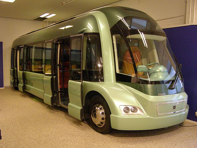
Like car manufacturers, bus manufacturers aren’t averse to the odd concept model. As these aren’t intended to go into series production it might be unfair to include such vehicles in this article, but it’s hard to resist Volvo’s adorable Environmental Concept Bus of the mid 1990s.
There was, however, one infamous example of a UK-built bus which was fully intended to make it into mass production, but never actually did. It was designed and built by bus manufacturer Optare, and it was called the Rapta.
Optare had become famous for its single-deck Solo model at the turn of the century, which won a Millennium Product award and a Queen’s Award for Enterprise in 2000. In November 2008 a restyled version called the Solo+ debuted at the Euro Bus Expo show, but it was completely overshadowed by the surprise unveiling of Optare’s new double-decker, the Rapta. Sharing design cues with the Solo+, it was a cutting edge piece of bus vehicle design. It was shockingly uncompromising in appearance, and still looks futuristic when compared to most buses being produced today, over a decade later.

There was only one problem. It didn’t really exist. The picture above is a visualisation, but that’s not what I mean. The Rapta was certainly phsycially there at Euro Bus Expo, as you can see in this photograph (sadly not shareable here).
The Rapta might have looked the part with its sharp edges and flow of black glass panels up its front and round the sides, but despite Optare’s excitement in having sprung a surprise new bus on the bus industry, it was only a non-functioning shell; a mock-up. Some of it was made of wood, not a conventional structural material for buses. All of this was very much Not The Done Thing at all.
Andrew Garnett, deputy editor of industry magazine Passenger Transport was there at the time, and remembers it well. “The night before [the unveiling], Optare’s then management talked about the Rapta like it was a real thing. It was very much hyped up to the extent I was expecting a real bus. So the next morning when the covers were pulled back on something that was very obviously a wood and metal mock-up, I was fairly baffled”. Garnett wasn’t alone, but it was the reaction from conservative bus operators, which was rather negative, which probably killed off the Rapta. With its stark looks, it was just too radical for many of them. A recent retrospective from Bus & Coach Buyer criticised the “brutal styling” and “flat boxy shape” shared by the Solo+ and Rapta; still upsetting people in 2018.
Neither the Solo+ nor the Rapta made it into production and both were quietly scrapped. Maybe I’m in a minority, but I thought the Rapta was a splendid-looking thing. Now that would have made a good New Bus for London.
But to end this review of the glories of transport concept art, let’s look skywards for my favourite never-built vehicle: Boeing’s Sonic Cruiser. Announced in 2001 and designed to cruise at just under the speed of sound, it looked like no other passenger aircraft before or since.
Embed from Getty ImagesWith its swept back wings, rear-mounted engines, twin tail fins and forward canards, It was the sort of thing you’d expect to see in a sci-fi movie rather than at an airport terminal. Sadly, visualisations were as far as the project ever got. It was cancelled in 2002 in favour of the rather more conventional and slightly slower 787, which would also be cheaper to operate than the Sonic Cruiser. But as a concept it did help to establish the 787’s market segment; smaller aircraft which would be used on point-to-point journeys, rather than ever-larger aircraft operating between hub airports, which Boeing’s rival Airbus took to its ultimate conclusion with the double-deck A380.
All we are left with of these lost buses, trains and planes, are their mock-ups and visualisations. But I like to imagine that in a far more stylish parallel universe than ours, London’s Paddington station plays host to CrossRail Class 341s and futuristic Heathrow Express trains which set off every 15 minutes for Heathrow Airport for the chance to catch a Sonic Cruiser to New York. Outside the station, instead of New Routemaster buses, Raptas ply their trade instead. Well, I can dream…
Bibliography
Anything linked to in the text above
A note on the images
Most of these visualisations and images of mock-ups have been in my files for ages. I’ve tried to attribute them where possible to make a suggestion as to source, but I’m happy to make any corrections.

This virtual train was done as part of a project to explore rail vehicle construction methods.

Brilliant article, thank you.
Really enjoyed your post, thank you for taking the time and effort to put this together.
I agree the NBFL was an absolute waste of time and money, Johnson likes his vanity project, lest we forget millions on a bridge that was never built.
The Solo+ wasn’t scrapped, but rebuilt as a battery-powered conventionally-styled Solo. YJ09 EZR subsequently became T5 EEV for staff shuttle duties for BA at Heathrow, and is believed to exist today in a withdrawn state at Rotala’s Kidderminster depot.
Oh! Thank you. That’s very interesting. Fared better than the Rapta mock-up then.
I too like the Rapta design – apart from one thing. The windscreens wipers look like they belong elsewhere. A truly dignified bus should have pantograph wipers that rest in the ‘at prayer’ position. Generates a greater sense of occasion somehow.
The British Rail Class 93 Intercity 250 in my view looks far better than the IET Class 800 that are now with GWR & LNER and the Class 390 Pendolino on the West Coast main line.
It was ashame it was never built which would have been a great alternative to the Advanced Passenger train which was proved to be workable but was never given a chance.