To ride an escalator up into Reading station’s giant footbridge is to experience a station transformed. Sleek, ribbon-like canopies flow up from the platforms, swooping over the footbridge, which itself links two dramatic concourses, one at each end. Curving steel columns raise the canopies over the footbridge while sculptural concrete ones support the footbridge itself and provide visual drama at platform level.

Now one of the architectural highlights of the modern railway, it is hard to believe that only a decade ago, the station was (for want of a better expression) a basket case. Nightmarishly awkward to navigate for passengers and frequently disruptive to huge swathes of the British railway network, the station has been transformed over the last decade into a stylish, comprehensible and efficient station. The rebuilding of Reading has improved performance on the railway network and provided Reading with a landmark to be proud of.

Rather like Bristol Temple Meads (The Beauty of Transport (8 January 2020)), Reading station is the result of several phases of construction and reconstruction, and if criticism can be levelled at the station today, it is (also like Bristol Temple Meads) in the way its various construction phases relate to one another.
Reading station opened in 1840, its design springing from the fertile mind of Isambard Kingdom Brunel, guiding mind of the Great Western Railway from London to Bristol. Constantly flitting between either side of the bonkers/brilliant diagonal like no other engineer of his time (and very few since) many of Brunel’s ideas were as bizarre as others were sublime. Reading fitted firmly in the first category. He decided that the ideal design solution for Reading station was a single long platform on the town (south) side of the tracks, divided into two halves; one half for westbound trains, one half for eastbound trains. Quite how Brunel failed to anticipate the operational problems and potential delays that would be caused by eastbound trains having to cross over the tracks of westbound trains to reach and leave the single platform seems almost incomprehensible.

It took until around 1899 for a rebuild to provide some additional platforms at the station. The oldest remaining part of the station is generally considered to date from between the opening of the station and this rebuild, in the late 1860s. Historic England thinks it is actually a modification by Great Western Railway chief engineer Michael Lane of the original 1840 Brunel-designed station building, but most other sources (for instance Biddle & Nock (1983) and Parissien (2014)) think it was constructed new. With a “pleasant central cupola” (as Historic England puts it) this well-proportioned Italianate sandstone station building now houses a public house, but nevertheless remains very obviously a railway building in the way that railway buildings indefinably do. It has been Grade II listed since 1976.
Reading gained a second station when the South Eastern Railway built its own premises to serve its line from the south-east. This lasted until the 1960s when trains from this route were moved into some new platforms at the east end of the main station. In the 1980s, British Rail’s InterCity sector, which had inherited Reading station, built a new station entrance combined with a retail mall on the site of the old South Eastern Railway station.

There is room for all tastes in transport architecture and what one person likes, someone else will hate. So while I freely admit that there must be fans of the InterCity entrance, and it might even be a good example of its type, I think it is ghastly. From the outside it looks like a cut-price local authority-commissioned leisure centre or shopping mall (probably with a name like The Pyramids), and the anonymous inside is little better. Slumped in front of the station it lacks the confidence of a bold design, hiding its height behind its ziggurat-style glazed roof, and failing to make a statement about what it is or why it is there. It is neither starkly High Tech, nor campy Post Modern, nor even offensively faux heritage. It isn’t anything, really.

Internally, the feeling of local leisure centre atrium persists, somehow gloomy despite the glass roof. Maybe it was better when it was first built but the glass has become dirty? I blame particulates and poor air quality. The two best things about the inside of the Intercity station were, firstly, a large glass column artwork by Alexander Beleschenko, who would later go on to design the dramatic blue glass wall at Southwark Underground station (The Beauty of Transport (24 April 2013)). Beleschenko’s column was removed and destroyed in 1999-2001 (one of rail privatisation’s more philistinic moments) because of an argument over its positioning within the station. Secondly, the massive Rail Alphabet “Tickets” signage, a remnant of a long-forgotten ticket retail technique from InterCity, but now one of the largest pieces of Rail Alphabet (The Beauty of Transport (13 May 2015)) to be found at a station.

This 1980s building acted as the main concourse for Reading station for a couple of decades, with passengers accessing other platforms via a footbridge built at the same time. This footbridge became notoriously overcrowded for increasingly larger parts of the day as it struggled to handle the number of passengers using the station. It was quite easy to miss even generously timed connections thanks to the crowds on the footbridge. The post-privatisation rise in passenger numbers across the British railway network simply exacerbated the problem, and the concourse struggled to cope with the crowds too.
It wasn’t just passengers who were finding that the station was too cramped to work well. Despite the 1899 rebuild, Reading station never really did have enough platforms. Until well into the privatised railway era post-British Rail, it was possible to stand on what was then platform 4 (now platform 7) for a train to the West Country and see a queue of Intercity trains waiting to get into the station, headlights glowing. The closest analogy I can think of is standing under the approach flightpath to Heathrow Airport and seeing the queue of aircraft with their landing lights on, stretching back into the distance.
The bottleneck nature of the station brought problems with performance and knock-on delays as one late train held up another, which in turn held up yet another, and so on. Because Reading is one of the key stations in the Cross Country train network it was quite easy for delays there (which were not uncommon) to propagate quickly down to the south coast, south-west of England and the south Midlands, affecting passengers whose journeys took them nowhere near Reading at all.
Network Rail’s Great Western Route Modernisation scheme of the 2010s provided the opportunity to address the issues at and around Reading. The electrification of the route attracted the headlines, but the rebuilding of Reading would be equally as important in unlocking the potential of the Great Western Main Line. To the west of the station, new flyovers separated out different railway lines from one another, eliminating many of the conflicting moves across tracks that caused performance issues. To serve the newly untangled lines, four additional through platforms were built at the station plus one extra bay platform serving trains from the south-east, intrinsically useful in its own right but partly justified also by its ability to serve potential AirTrack services from Heathrow; a triumph of hope over realism (catch me in person and I will tell you the whole sorry story).
Just as important as untangling the train movements through Reading station was untangling passenger movements within it, which called for an almost complete rebuild. Architecture practice Grimshaw won the job of designing the station. Until then its most famous British railway works were the international station at Waterloo and The Lawn area with associated works at London Paddington, though apart from extensive use of the colour blue at Waterloo International, there is little obvious similarity between these earlier projects and the new Reading station, which opened in 2014.
The rebuilt Reading station focusses on a vast new footbridge linking the through platforms towards their western ends, and replacing the inadequate 1980s footbridge, which was demolished. In contrast to its predecessor it is hard to imagine this footbridge ever becoming inadequate for passenger movements, and so vast is its scale – some 30m wide and 135m long – that it is usually referred to as a transfer deck rather than a footbridge. Although there are waiting rooms down on the station platforms, the transfer deck acts as a waiting area in its own right, featuring retail units, information points and seating. Despite those inclusions, it has easy and uninterrupted walking routes through its length.

Full height glazing allows views down onto the railway tracks below, and in a lovely touch, seating is positioned such that passengers can sit and watch the trains and platforms below. Over most of the platforms, the transfer deck has two sets of staircases and escalators linking it to the platforms below, helping reduce the possibility of pedestrian bottlenecks at a single set of stairs. Lifts are also provided between platforms and the transfer deck, positioned between the distinctive concrete columns which support it.

The ceiling of the transfer deck features wooden slats, softening the visual appearance of the bridge and also providing acoustic dampening in this large space. The slatted ceiling is not continuous along the length of the footbridge though. Instead, the canopies which run along the platforms rise up over the escalators and staircases which link the platforms to the transfer deck, and then over the deck itself, before swooping down again on the other side as a single unbroken element. Where the canopies rise over the escalators and stairs, they are supported by spectacular v-shaped columns.
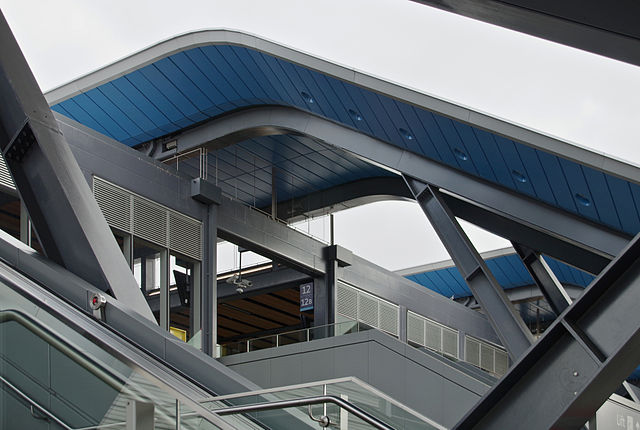
The new platform canopies are an essential part of the success of the rebuilt Reading station. Their blue panelling is a distinctive decorative element, but the panels hide behind them all the services necessary for the station, and include lighting as an integrated element. The end result is a very streamlined and efficient appearance, doing away with the dangling light fittings and cable runs that cause so many other stations to look cluttered and untidy. The canopies are also very long, encouraging passengers to spread themselves along the whole length of the platforms even on rainy days, which speeds boarding onto trains. Because the station was designed with electrification in mind, the equipment for supporting the overhead wires was designed in from the outset and is unobtrusive at platform level, rather than being punched through canopies as has had to be done at some stations which predate electrification.

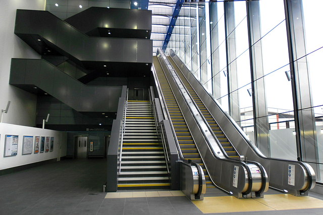
The outer ends of the transfer deck connect down to new entrances to the station. Each one huge expanses of glazing, maintaining a connection between the station and the outside well. Both feature banks of escalators leading between the transfer deck and platform, under ETFE skylights.

They make an unusual impression for a railway station. Grand railway termini might have tall trainsheds, but that height is ultimately outshone by their length as the horizontal becomes their most distinctive feature. Reading station’s entrances, however, are all about vertical energy. The south entrance, which abuts Lane’s 1860s station building, is impressive enough:

The north entrance is arguably even more dramatic, although it is the less busy of the two. Noticeably taller due to local topography, it features some nice extruded lettering on the outside which is omitted from the south entrance. Alongside the bank of escalators, the staircase takes a striking turning form, while the side wall features a decorative (and, I suspect, acoustically dampening) pierced pattern. A trip up the long escalators is quite the experience, with a vista over the north of Reading revealing itself through the glazed wall as passengers near the top. So is a walk up the stairs; I’ve done it, but you have to be feeling fit. The north station entrance is a new addition to the functionality of the station; there was never an easy way in to the station on this side, so the reconstruction of the station has opened up the railway to the north of the town, and vice versa.
The reconstruction has also made strides in addressing the severance caused to Reading by the railway. Not too far from the new station entrances, the old subway between the platforms has been repurposed as a pedestrian link between both sides of the station, its access to the platforms blocked up and its entrances now outside the station proper.
Although Reading station might bear little resemblance to Grimshaw’s earlier Waterloo International or Paddington works, it has a much more obvious relationship with the contemporaneous rebuild of London Bridge, which Grimshaw also designed. The U-shaped beams, wooden ceiling slats, and distinctively-shaped concrete pillars of Reading all have close analogues at London Bridge.
Reading station transferred from its previous operator First Great Western to Network Rail in 2014, as the reconstruction project came to an end. At the time the individual circular logos for Network Rail’s directly-operated stations had fallen out of favour, so Reading did without. However, they have recently undergone a mini-renaissance (as local initiatives rather than because Network Rail is corporately committed to their wholesale national reinstatement) and Reading has gained a logo of its own, based on the architecture of the staircases up to the station’s transfer deck.

It used to be a nightmare to use Reading station; it is now for the most part an absolute pleasure. Spacious, dramatic, easily navigable, sheltered, it is an impressive addition to the estate of Britain’s railway stations.
The only element that lets it down is the retention of the 1980s InterCity entrance and concourse. I’d assumed this would be swept away as part of the station rebuild, but there it stays, squatting stolidly alongside an otherwise impressive vision of the future. The removal of the stairs and escalator linking the 1980s concourse to the now-demolished footbridge has created a bit more space there, but InterCity’s concourse is now a curiously dead area that serves merely as a secondary entrance to the stations, and the more convenient one (provided you are in the know) for trains heading to Waterloo, or along the North Downs line. But the interface between the 1980s building and the new Grimshaw station is awkward to say the least.

The Grimshaw station just sort of stops as though unsure quite what to do with itself having encountered the space frame-supported roof of its predecessor, the blue panelling of the new Reading terminating uncomfortably at a single unadorned column, with one last column standing forlornly a little further on. It looks as though the rebuild was intended to continue here, but money, energy or desire ran out. It is perhaps the only really clumsy piece of architecture in the new station, and like Bristol Temple Meads is an example of where the accretion of railway history means a disjointed appearance and experience. Curiously, the 1860s building complements the new Grimshaw station far better, perhaps because of the greater gap in ages and style.
Reading station has perhaps been slightly eclipsed by Grimshaw’s new London Bridge station, completed just a few years later. Yet it shares with London Bridge many design ideas and the same impressive experience for passengers. If modern railway architecture is for you, then Reading is just as much worth a visit as its London cousin.
Bibliography and Further Reading
Biddle, Gordon & Nock O. S. (1983): Railway Heritage of Britain, The. Michael Joseph Ltd: London
Lawrence, David (2018): British Rail Architecture 1948-97. Crecy: Manchester
Parissien, Steven (2014): The English Railway Station. English Heritage: Swindon
Historic England’s listing citation for the 1860s station building, here
Grimshaw’s project page for Reading station, here
Network Rail’s Reading station page, here.
…and anything linked to in the text of the article.

Unfortunately the new addition is a good example of style over substance. Being solid concrete with entrances open to the elements and no heating, the entire new footbridge is absolutely frigid in cold weather. The escalators may dramatically descend to the platforms, but the swept up canopies mean that all the adjacent platform sections now have zero weather protection, with large effective gaps in the canopies. Unfortunately, everyone gets so dazzled by the dramatic design that they fail to consider the most essential needs of travellers.
This is also the problem with Liège-Guillemins, which is regularly dribbled over by those who are interested solely in the beauteous architecture.
Those who find themselves spending ages in the wind and rain waiting for a delayed train (and, contrary to received wisdom, SNCB is very good at delaying trains) don’t find it quite so wonderful!
Thank you for appreciating Reading station!
Use daily and whilst yep, the elements from the West hitting the stairs and escalators cause problems, it is a lovely station to use most of the year, the shading is great and the bridge doesn’t overheat
Oddly a lot of the glazing from the bridge has recently been frosted, so a lot of the views have been lost. No purpose whatsoever. And the amazing original wide bridge is always (as always) increasingly cluttered with stuff and shops, but that always happens. Lovely to see that original pic.
The view from the bridge end to the North is a great one of Caversham, and the only place in town you can see this.
Watch out for a massive BR double arrow on the car park on North side, which covers what was the entrance from the car park to the footbridge, as well as the floormarks on the bit between the new and sold that shows you the old gateline position.
There were very few absolute closures, so commuting through it daily for the 3 years of rebuilding was fascinating, way being the immense amount of work that went into it.
Each to their own I suppose, but I preferred the canopies and platform buildings of the old station. They had a Great Western country junction feel on a grand scale.
This following comment from blog reader PP who submitted it for moderation at which point it vanished into the ether. Resent to me directly, it says:
I’ve not used the new Reading station but I expected exactly what Iain has described when I first saw photos of the finished building. The current architectural fashion for wavy roofs is a real curse. I say that as a retired architect.
The new London Bridge station is also marred by platform canopies with wavy parts that reduce protection from the elements for waiting passengers. Unlike Reading though, there is not even a technical justification for them; they are just there for style. The predominantly level parts of the canopies seem unduly high anyway, and the edges are also set well back from the platform edges. Given that the platforms are at high level, passengers are therefore often exposed to driving rain, and cold in the winter, so the canopies really spoil what is otherwise a now splendid station. For such a busy and elevated station I think it should definitely have had an overall roof over all the platforms – in a similar manner to say Waterloo.
East Croydon, which I am familiar with, is another busy interchange that had an additional pedestrian bridge installed a few years ago. It has no escalators, just steep steps up to it and, like Reading, these are only partially protected by three quarter height glazing on either side. The walkway bridge itself is similarly inadequately protected and when it rains the floor is awash with water. Furthermore, as the steps face away from, and beyond, the ends of the existing platform canopies, there’s no protection from the elements from the ends of the canopies to the bottom of the steps. Overall it is a truly appalling piece of design. How on earth was it approved by Network Rail?
Another busy station that also has only partialy enclosed glazed sides is Blackfriars, across the Thames. They may provide sufficient protection from driving rain (though I have no personal knowledge of that) but it’s certainly chilly waiting on the platforms especially, I’m sure, when there’s an easterly winter wind blowing up the river.
The view out the north side is somewhat spoiled by the unreconstructed multi-story car park used for railway dropoffs and pickups which were not integrated into the redesign. The ideal response would have been to provision dropoffs/pickups and local buses into a structure that provides some weather protection all the way from motor vehicle of choice into the station building, instead of across an unprotected and sometimes windy open space (which seems to lack any other utility, not even an occasional market–would be a good place for a small seasonal Christmas market)
Would be interesting to have an article contrasting the new “grand stations” vs. smaller, cheaper rebuilds e.g. West Hampstead Thameslink and West Hampstead Overground
And don’t leave us in suspense–would love a posting on why Reading/Heathrow Airtrack didn’t happen, and what might happen with Crossrail instead.
The surface of the bridge is dangerous when it rains or post it’s cleaning. The only reason I got from tje ‘up lift’ to the ‘don lift’ this morning is because a man helped me. Otherwise I would have not tried or would have risked a lip and fall.
The surface of the bridge is dangerous when it rains or post it’s cleaning. The only reason I got from the ‘up lift’ to the ‘down lift’ this morning is because a man helped me. Otherwise I would have not tried or would have risked a slip and fall.