You will remember that my knowledge of football can be transcribed onto the reverse of a postage stamp, possibly with room left over, and that what knowledge I do possess is thanks to my other half’s family being Portsmouth FC supporters; an emotional rollercoaster, it has to be said. I hope this will explain how it is that on stepping out of White Hart Lane station in north London, I was confronted with the sight of Tottenham Hotspur FC‘s football stadium, and only at that point realised why the name of the station had seemed vaguely familiar in some way beyond just being one I wanted to visit and check out its recent rebuild.
Located about half an hour along one of Transport for London’s (TfL) London Overground routes out of Liverpool Street station, White Hart Lane station was rebuilt and reopened in 2019. It replaced a thoroughly underwhelming station which was swamped on match days, itself a replacement for a Victorian station building which remains on site although no longer in railway use.
The station rebuild project was part of a wider scheme for the area which included redevelopment of the football stadium and its surroundings (at which point needless to say I am lost for further information but assume you can find out all about it somewhere else).
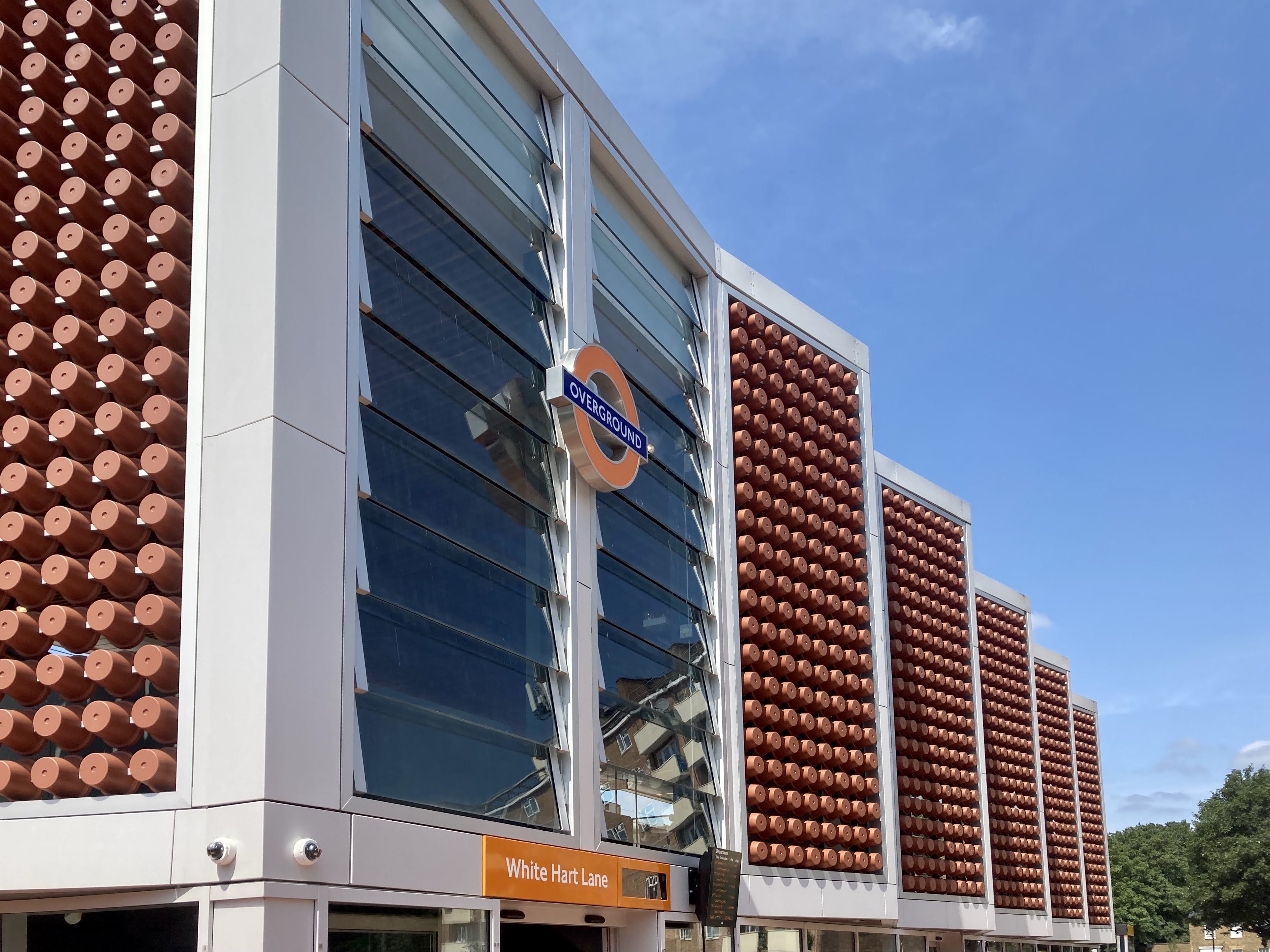
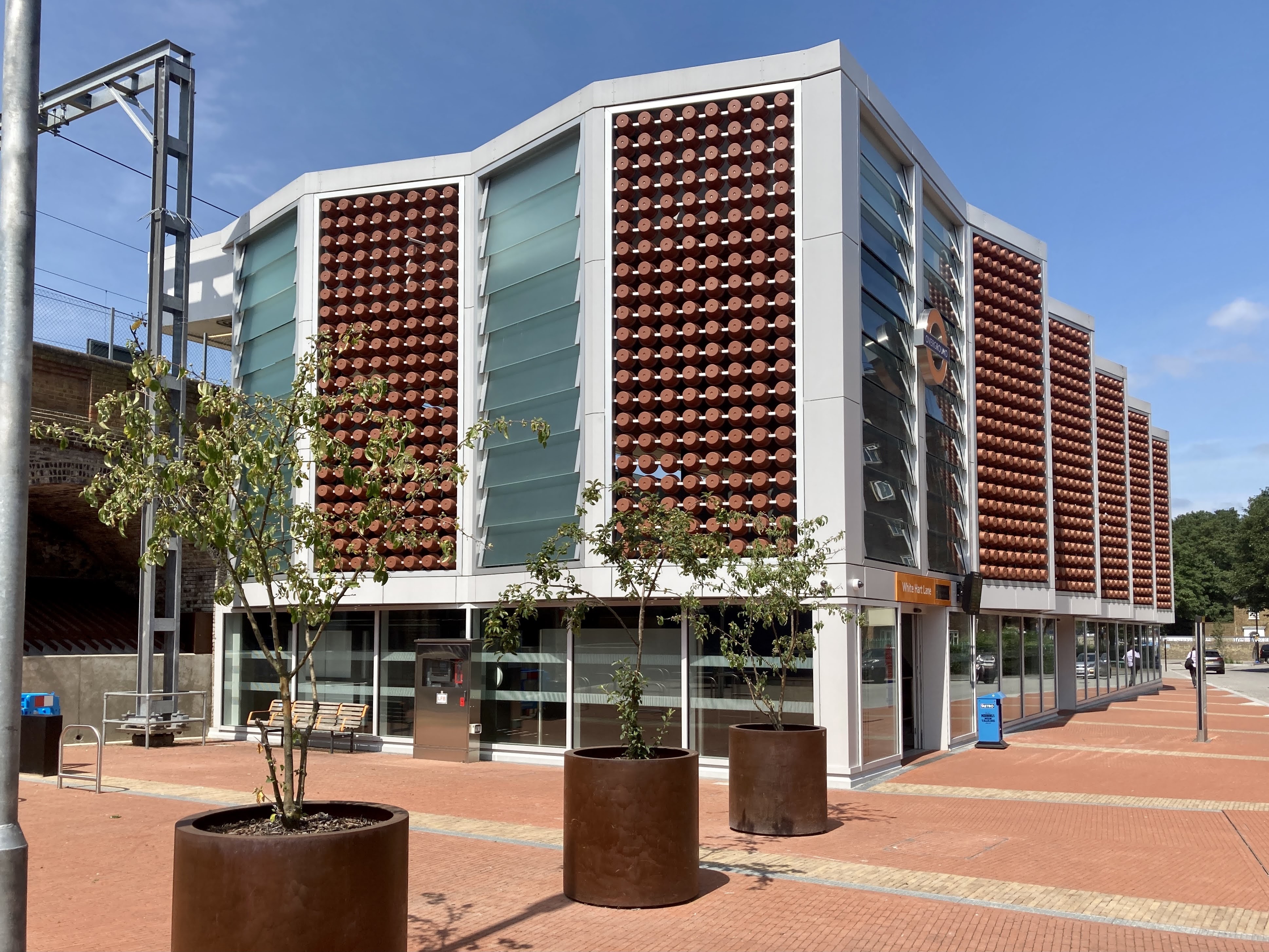
In its architecture White Hart Lane is a station unlike any other on the National Rail network, which is quite the feat considering there are now over 2,500 of them. The rebuild includes new buildings on both sides of the railway track, which runs here on a viaduct. The larger building is on the east side of the tracks, closest to the football stadium. Above a ground floor glass wall, the sides of the building are formed from zig-zag panels along the upper part of the building. The panels alternate between a design comprising glass louvres and a design filled with terracotta clay flower pots, giving the station its unique appearance. The smaller building, on the west side of the tracks, dispenses with the zig zag form on its upper levels, but retains the alternating glass louvre and clay flower pot panels, before switching to weathering steel at the north end. Entrances on both buildings are neatly highlighted by London Overground’s orange roundel and signage.

The explanation for the station’s idiosyncratic appearance lies in its design being strongly focussed on celebrating and commemorating local history. It was originally developed by architects Landolt+Brown working with artist and designer Wendy Hardie. Although hard to imagine today, Tottenham was a centre for horticulture, market gardening and terracotta plant pot-making in the 19th and early 20th Centuries. The terracotta plant pots in the screens on the station facades were designed by Hardie and Landolt+Brown to match those originally produced in Tottenham, albeit strengthened for their use on the building. The zig-zag form of the facades and the overlapping glass louvres meanwhile reference the glasshouse plant nurseries that could once be found in Tottenham.

Though the design was developed by Landolt+Brown and Hardie to the point of achieving planning consent, Fereday Pollard were later appointed to take the design forward to the detail design and build phases. Hardie notes on her website that, “Sadly the project was awarded to another architect … selected principally for low cost. The control of the design and art installation is no longer with us.” It is interesting to note then, that some of the features originally proposed by Landolt+Brown and Hardie – including copper panelled screens with small areas of bronze detailing, and terracotta floor tiling inside the station building, as well as large terracotta planters outside – seem to have been replaced with simpler designs and different materials in Fereday Pollard’s as-built station.
And of course additional clutter is already beginning to accrue around the station, as seems to happen everywhere despite designers’ best intentions.
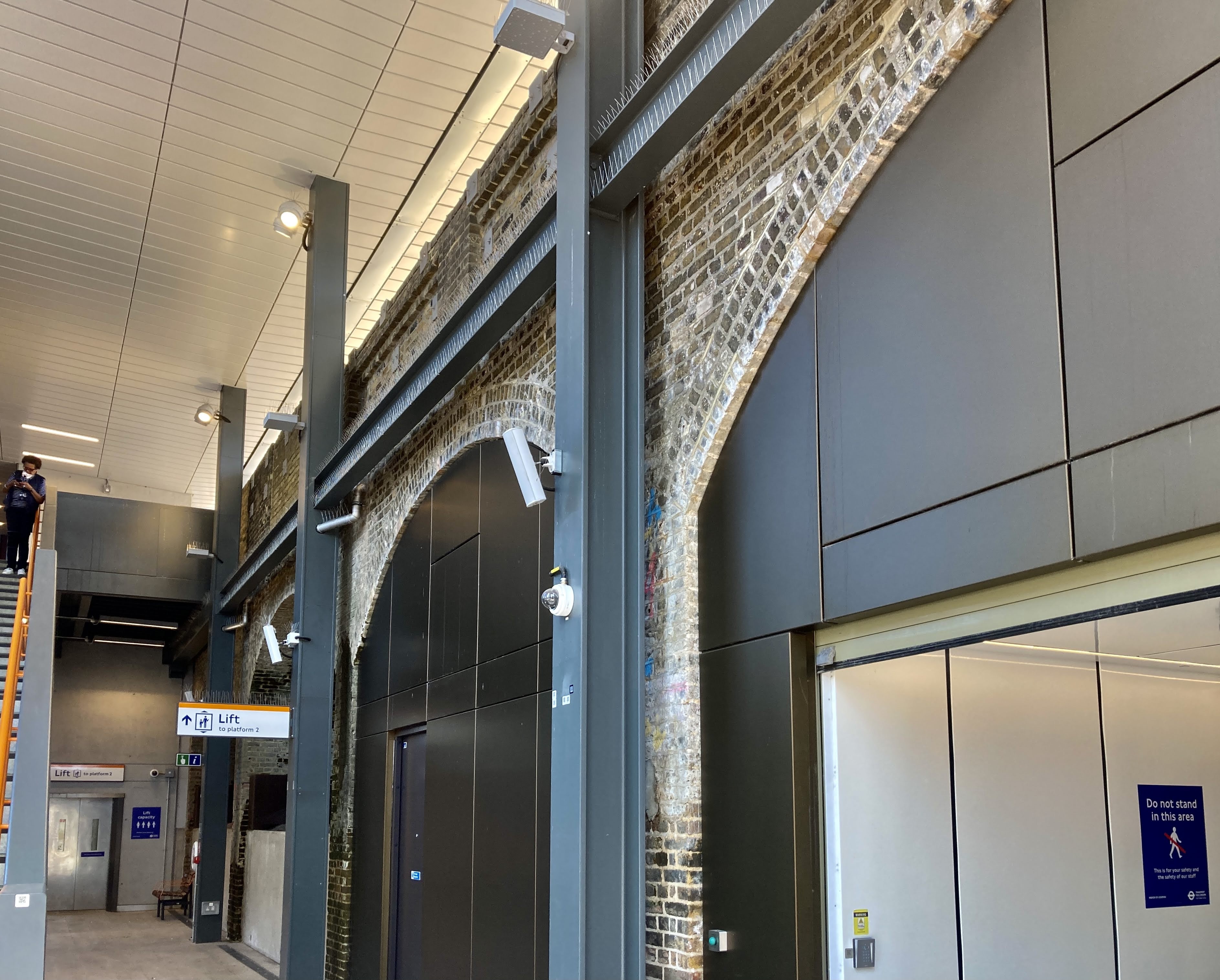
Inside the station, the design is as eye-catching as it is outside. In the east-side building, under a timber joisted ceiling there is a great sense of space and legibility, with clear sightlines throughout. Two staircases lead up to the platforms, one staircase in use only on match days to cope with the increased number of passengers making their way through. The cleaned brickwork of the railway viaduct forms the fourth wall of the station and looks marvellous. This fourth wall is open at its highest level where it opens onto the platform, with the roof of the building extending to shelter the platform and supported on steel I-beams spaced between the arches of the viaduct.

The west-side building is similar though smaller. It has plainer ceiling cladding, and the match-day staircase is outside the new station building and open to the elements. As you would expect, both station buildings include lifts for enhanced accessibility.
I had puzzled over the terracotta plant pot facades on the station buildings when I first saw the pictures of the station, as I couldn’t see how they were embedded into glass to seal the panels. It turned out that that’s because they’re not – air flows between them, which works because the station buildings are open to the platforms anyway, rather than being fully enclosed. It helps in understanding the design of the new station, perhaps, if you think of the station buildings as some of the nicest lean-tos you’ve ever seen, three sided structures butting up against the railway viaduct.

On the hot summer day when I visited, the air flow through the terracotta pot panels of the facades and onto the platform, was just glorious. I’m less sure that I’d enjoy it in the depths of winter.
Most of the arches of the viaduct within the station buildings are now in use for station equipment and accommodation. One, however, has been opened up as a new pedestrian route under the viaduct and through the east side station building on the public side of the ticket gates. In an area which is divided by the railway viaduct, this new link provides an additional walking route and increases permeability of the local area on foot.

In a bid to assist non-football fans like me identify one of the main attractions near the station, the possibility of renaming the station “Tottenham Hotspur” has been discussed by TfL, though the change and the associated “long term brand partnership” under consideration seems not yet have been concluded. TfL and its predecessors have form here of course, renaming Gillespie Road tube station Arsenal, way back in 1932.
While I admire the design of White Hart Lane station, and certainly enjoyed the feel of the station, it’s not one I can say I love. There are many approaches to reflecting the character of the local area in a station building, and that used at White Hart Lane is just a bit too on-the-nose for me. The zig-zag facades and overlapping louvres seem to be there as a built reminder of other historical structures rather than because they are the most appropriate design solution for the needs of the station. And the terracotta plant pot facades don’t really work for me either. The ‘pots’ aren’t really pots at all; on the inside of the station where you should be looking into the open mouths of the pots, they instead have solid tops. They’re truncated cones rather than pots, and if their shape has had to be so fundamentally altered in order for them to work on the station facades, then I can’t help feeling they weren’t quite the right thing to have there in the first place.
Nevertheless, the new station is a positive addition to the local urban realm and a huge improvement on its predecessor. Tottenham Hotspur fans, and those of visiting clubs, now have a station fit and able to deal with match-day crowds – whatever it ends up being called.
BIBLIOGRAPHY AND FURTHER READING
Fereday Pollard’s webpage for White Hart Lane station
Landolt+Brown’s webpage for White Hart Lane station
Wendy Hardie’s webpage for White Hart Lane station
…and anything linked to in the text above.
HOW TO FIND WHITE HART LANE STATION
Get there by train! For its exact location, click here for The Beauty of Transport‘s map

There is also the LondonReconnections take on Gillespie Road’s renaming to Arsenal station here: https://www.londonreconnections.com/2015/its-arsenal-round-here/.
Thank you! Recommended to readers, as ever with London Reconnections.
Great photos, great write up. The one memorable “design item” for this Football team is their timeless 1900s Logo, a 🐓Cockerel on a Football. That could have /should have been incorporated into the station architecture, “The Gateway to the Stadium” See here https://logos-world.net/tottenham-hotspur-logo/. They have had a very interesting evolution/ journey. From Sir Henry Percy, Harry Hotspur, William Shakespeare “Henry VI” all in one sentence. Who knew this football team had such illustrious provenance. Where is the 🐓Golden version today I wonder, which was carefully removed from the stadium in 2017 and placed in storage somewhere https://futbolretro.es/escudo-del-tottenham-hotspur/?lang=en
Take the pots off and this really is a badly executed cheap shed with a load of bits and bobs stuck together. There’s no craft!