It is 1961. At Benson Airfield in south Oxfordshire, a test car driver employed by the Roads Research Laboratory is revving the engine of his Morris Oxford and preparing to release the handbrake. With his car (unbalanced atop due to the addition of a large road sign attached to its roof) aiming towards a small grandstand full of off-duty RAF airmen, all he has to do is drive at them. And then miss.
The exercise at Benson Airfield was one of the battles in a war fought over the way Britain’s roads should look. Even though he wasn’t there, Cambridge-based letter cutter and sculptor David Kindersley was about to lose that war, but accidentally win a different one altogether. This is the story of why so many of Britain’s street name signs look the same. And also why some of them don’t.
The war for Britain’s road signs began in 1958, just before the opening of Britain’s first motorway, the Preston by-pass. The by-pass featured directional and informational road signs designed by Jock Kinneir and Margaret Calvert, which included a typeface called Transport, sans-serif and in mixed case (upper-case letters followed by lower-case letters). It was the first time mixed case lettering had been used on British road signs, which up until then had used all-capitals wording.

Transport (the typeface) would eventually become ubiquitous on Britain’s road signs and beyond. It is now much admired, and has become a global phenomenon – a story this website has explored before (The Beauty of Transport 3 December 2014). In the late 1950s, however, Transport was a lot more controversial.
The designs for the new motorway signs were published publicly for the first time in The Times in 1958. They had been commissioned by the Anderson Committee, a governmental body set up to create new standard signage for the coming network of British motorways. The committee had employed Kinneir/Calvert off the back of Anderson’s admiration for Kinneir’s work on projects like the re-signing of Gatwick Airport and creation of a luggage labelling system for ocean liner operator P&O. Those were the days when government bodies could simply pick the best person for the job, rather than undertaking a wholesale public tendering exercise.
The sign designs revealed by The Times provoked a backlash from more traditionalist designers, led by Kindersley. Over the following years, as Kinneir/Calvert’s motorway signing system was adopted, Kindersley and his supporters kept up a running media battle, promoting an alternative Kindersley design for road signs. This featured all-capital wording, set in a serif typeface based on one that Kindersley had earlier created for the Ministry of Transport for use on street name signs; a typeface now known as Kindersley MOT, for obvious reasons. He had originally wanted this serif typeface to be the single standard for road name signs and so did the Ministry, but the Royal Fine Arts Commission (can you imagine it getting involved in such a discussion today?) disagreed. In the end, a Ministry of Transport circular of 1952 made Kindersley’s serif typeface one of several suggested for use on street name signs, and Kindersley worked on the refinement of all the recommended typefaces.

Kindersley MOT has been described as “using the Trajan idiom with vigour“. This is a reference to Trajan’s Column in Rome, which features examples of Roman lettering at its base which have inspired countless letter-cutters and typeface designers over the centuries. It is an elegant and refined typeface, drawing on literally more than a thousand years of tradition. It is not a direct copy of the lettering on Trajan’s Column (the Q’s tail is a lot shorter) but retains many of its characteristics such as curved letters (C, D, G, O and Q) substantially wider than most of the other letters. The middle arm of the E and lower arm of the F are the same length as those above, rather than slightly shorter as they are in many other typefaces. Nevertheless, it still has its own individualistic quirks, like the odd serif at the bottom of the 7.
The serif typeface Kindersley proposed for use on road signs was based on, but not exactly the same, as Kindersley MOT (but see street sign expert and author Alistair Hall’s comment below the article that it was separate altogether). Kindersley MOT has been redrawn and modified over time by others. It’s what happens when you give a design to the public sector; people start adapting it – usually with the best of intentions – when they can’t make the original work, or they can’t find the original designs one day, and you end up with significant design drift; typography researcher Ole Lund has identified at least two versions of Kindersley MOT. The typeface Kindersley proposed for use on road signs has serifs of rather different, heavier, appearance than those on Kindersley MOT. The typeface as a whole seems more like a bold-type version of Kindersley MOT (as can be seen in this image) and lacks its elegance.
Nevertheless, Kindersley believed his all-capitals serif typeface would make more efficient use of space on road signs, allowing the overall sign size to be reduced, and that his typeface generally looked better and was more legible anyway. It was in an attempt to settle the argument that the Roads Research Laboratory undertook its 1961 trials at Benson Airfield, driving mock-up road signs of no less than four different styles (Kindersley-designed typefaces with/without serifs, and Kinneir/Calvert sans-serif typefaces in two different sizes) towards seated RAF airmen, apparently a more time-efficient process than driving the airmen past stationary signs. The results suggested that Kindersley’s serif typeface became legible at marginally greater distances than Kinneir/Calvert’s but it is doubtful that the difference is statistically significant, not least as Lund details a number of problems with the experimental design which would have rendered the results difficult to interpret fairly.
Kindersley’s attempts to parlay his street name sign typeface into a national road sign standard was, sadly for him, doomed from the start. Neither the Anderson Committee, nor the subsequent Worboys Committee which oversaw the design of road signs for all Britain’s non-motorway public roads, seem ever to have given serious consideration to dropping Kinneir/Calvert’s designs and Transport typeface. Kinneir and Calvert defined the appearance Britain’s road network, and produced the closest thing Britain has to a corporate visual identity. Indeed, a version of Transport is in use today on the British government’s very own website.
Despite this, the arguments promoting Kindersley’s typeface as a better one for road signage rumbled on for years. Yet, almost unknowingly, Kindersley had accidentally won a different war altogether; one which would dictate not the appearance of road signs, but instead the appearance of street name signs. This might sound like a small victory, but it is far from it. For these are the markers of the places we actually live, the typography of our neighbourhoods. Street name signs help us find our way around, making new places legible to first time visitors. They elucidate the layout of villages, towns and cities alike. They welcome us at the end of our journeys, confirming that we have reached the right place. Who amongst us has not let out a sigh of relief after a long journey, on seeing the street name sign at the end of our road? We are home, at last.
Unlike all other road signs, street name signs are not legally mandated road signs. In other words, their design is not specified in The Traffic Signs Regulations and General Directions 2016, the statutory instrument that makes road signs official and dictates their design. To this day the TSRGD continues to use the Transport typeface and (modifications of) the symbols Kinneir/Calvert created. The only time a street name sign appears in the TSRGD is Schedule 11, part 2, item 6, and that’s only because the TSRGD is interested in the ‘no-through road’ sign which is often sited alongside street name signs to reduce the amount of signage clutter on streets. Like so:
As Leeds City Council explains, street name signs are instead required as a result of the The Public Health Act (1925), sections 17 – 19 (amended many times since then, but the relevant sections are still in force). Quite what was in the minds of the drafters of the Public Health Act (1925) I suspect may be lost either to the mists of time or perhaps an academic thesis across which I have yet to stumble. Streets had names long before 1925, but perhaps some of the smaller streets did not, and perhaps not all streets had signs clearly showing their name.

The impact of street names on public health is subtle but important. It would certainly be difficult to collect and analyse public health data without being able to classify it by street, across every street. John Snow would have had a much more complicated time explaining his map of the 1854 cholera outbreak in Soho if the streets on which victims lived were unnamed, along with Broad Street itself, on which the water pump that was the source of the disease was located. The graphics would have been clear, but how would anyone have known exactly where the map was of? So street names have long been understood to have public health value.
Today, Leeds City Council notes many reasons for ensuring that all roads continue to be properly and clearly named. They go beyond just the public health benefits which would have been the concern of the drafters of the 1925 Act and the reasons given today are so that:
- emergency services can find a property quickly
- mail is delivered efficiently
- visitors can easily find where they want to go
- there is a reliable delivery of services and products
- service providers have up to date and accurate records
- internal council departments record the correct address
And if they have to be named, they need name signs to do it with.
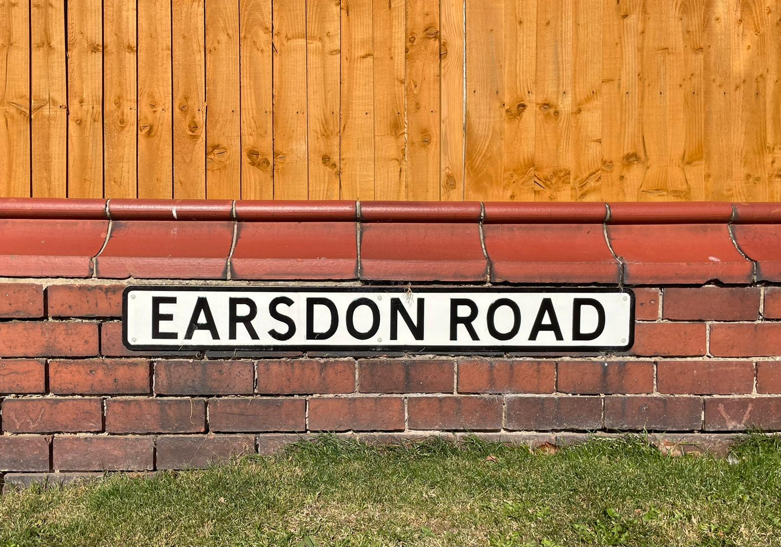
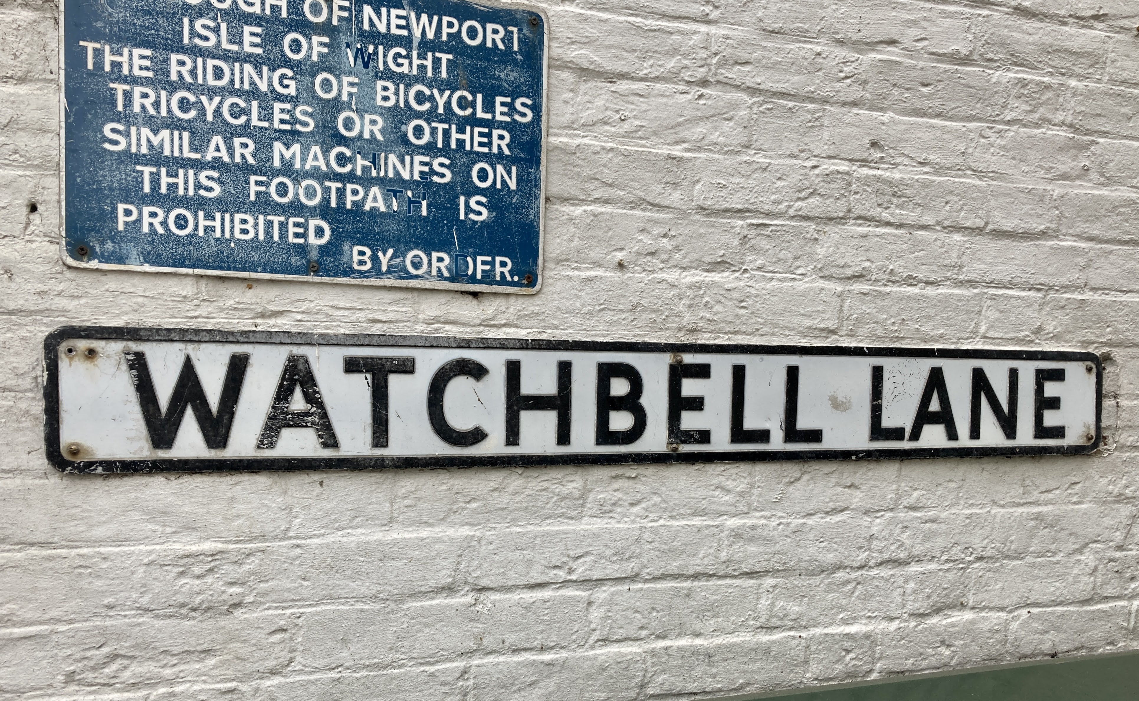
As mentioned earlier, the Ministry of Transport’s 1952 circular on street name signs proposed several typefaces, all of which Kindersley refined. That included the longstanding Ministry typeface, in which many street name signs are still set, like these two:
↓ Watchbell Lane, Newport. Photo by Daniel Wright, CC BY-NC-ND 4.0
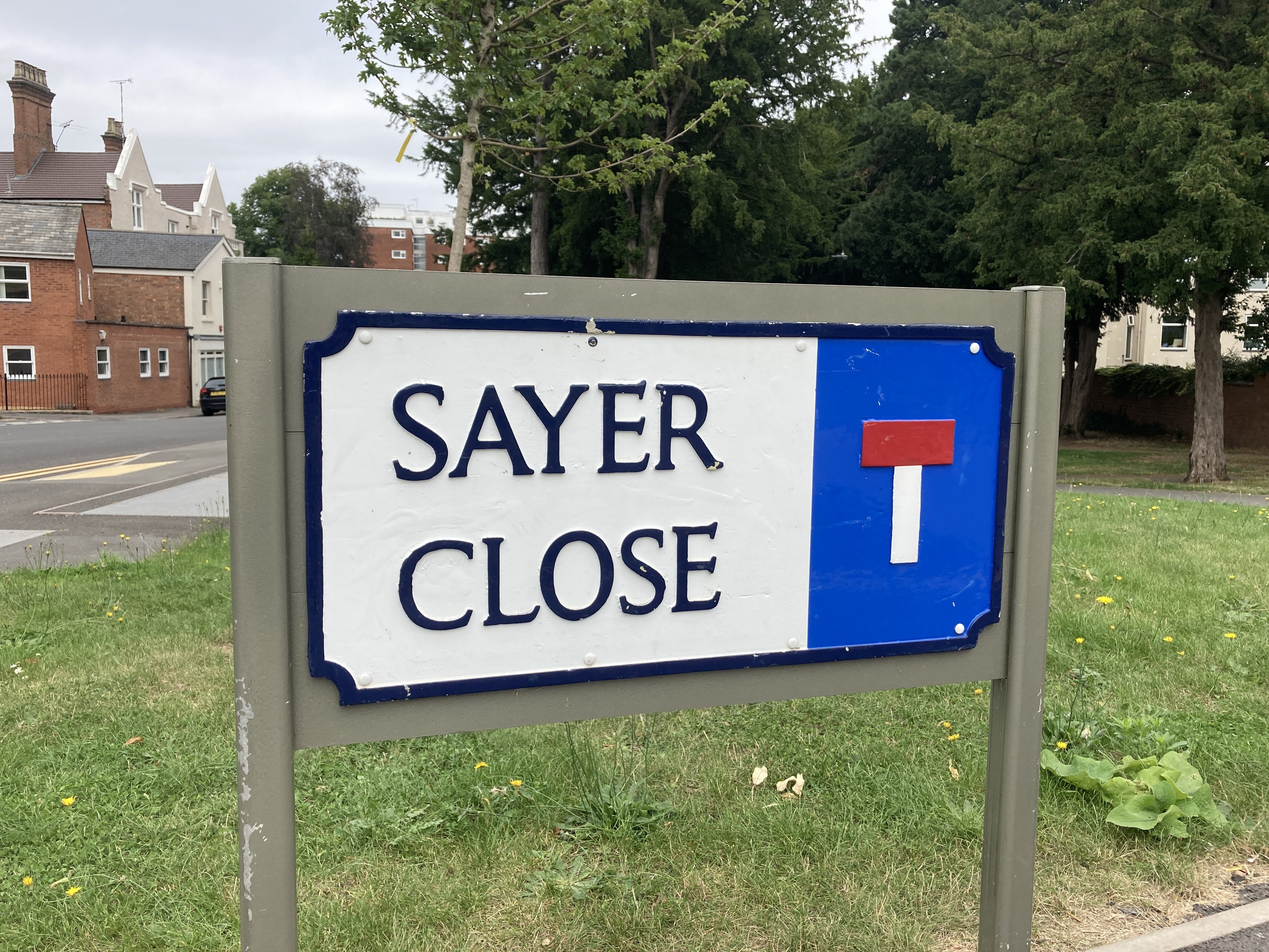
However, the typeface that eventually won out in vast swathes of the country was Kindersley MOT, the serif typeface Kindersley had later hoped would be used on all road signs. Today, most local planning authorities dictate Kindersley MOT as the typeface which must be used on street name signs in their areas of jurisdiction.
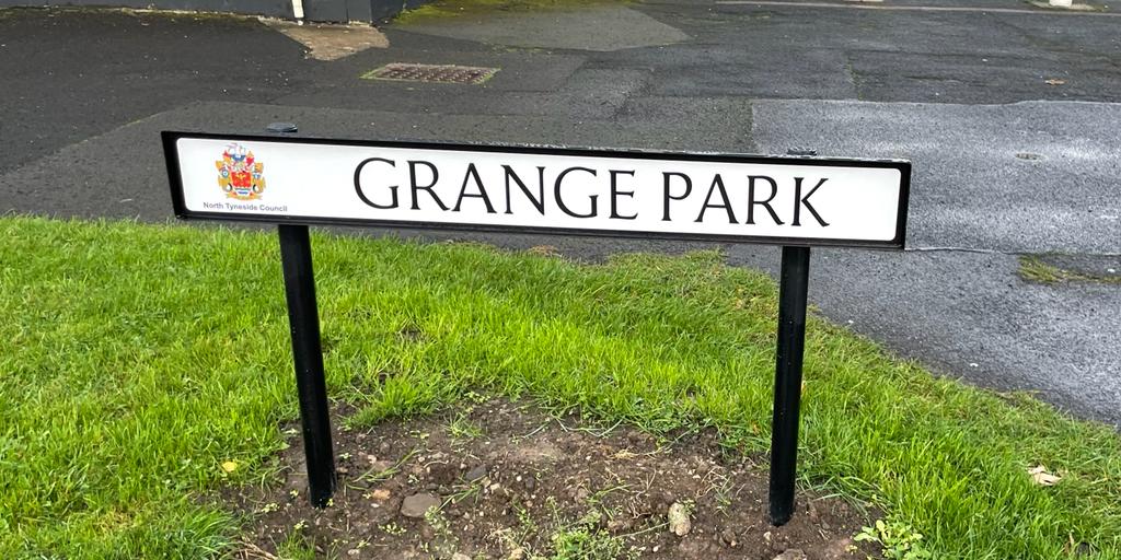
Bracknell Forest Council’s guidelines specify Kindersley MOT but also want reflective backgrounds to the name signs in rural areas, and non-reflective backgrounds in urban areas. Several local authorities specify the inclusion of their crest on street name signs (which seems like visual overkill to me, but then again maybe they are the kind of places where residents derive satisfaction from living there, and such signage reinforces their happiness). Here is one in North Tyneside:
In Mid Sussex District Council’s area, as well as the typical black on white version there is a rather smart white on green option. Which to use where is subject to an additional information sheet, with the green version apparently relating to smaller settlements.
If you grew up on one of the sprawling 1970s, 80s or 90s housing developments on the edge of a large town, Kindersley MOT was the visual identity of your neighbourhood. As new, with all the houses looking exactly the same, front gardens laid to lawn, and footpaths and roads pristine and tidy, the only variety to be found was in the names of the roads and ginnels. Brand new name signs, all in Kindersley MOT, shone out. With new housing estates characterless and featureless at their beginnings, every road looking more or less the same, those signs were sometimes all that prevented people getting completely lost in the cul-de-sacs.
And of course there is something reliable and reassuring about the appearance of Kindersley’s street sign typeface. The latter 20th Century’s property-owning democracy saw the blossoming of the middle class, to which the polite serifs of Kindersley MOT were the perfect accompaniment, an appealing link back to a perceived safer and simpler time.
As an example of just how far Kindersley MOT has permeated into culture as an accidental signifier of middle class suburbia and all its associated cultural baggage, consider the very first shot of the very first Harry Potter film, Harry Potter and Philosopher’s Stone.
The film opens with an owl sitting atop the street name sign for Privet Drive – the road on which the eponymous wizard child has been growing up since he became orphaned – set in Kindersley MOT. A reproduction of the same sign (this one has gained unusual green stripes top and bottom), again set in Kindersley MOT, can be found at the Warner Bros. Studio Tour in Watford.

Kindersley’s victory in typesetting our neighbourhoods has not been complete though. Because street name signs are not prescribed road signs, there is no compulsion to use Kindersley MOT as the typeface if a local planning authority wishes to take a different approach. And because street name signs are not legally-mandated road signs, there has been less attempt to completely replace earlier versions than there has been with pre-Worboys road signs.
So in places like Portsmouth’s residential suburbs, pre-Kindersley street name signs are still widespread. Here, ceramic tile street name signs (one letter per tile), lend a lovely aesthetic to the area; sometimes (but not always) supplemented by more modern street name signs set (of course) in Kindersley MOT.

It is London where you will most likely come across street name signs not set in Kindersley MOT (though many are, especially in the outer boroughs which presumably have better things to be getting on with than designing bespoke street name signage). London’s street name signs also often include the name of the London borough in which they are located. With many such signs lingering on well past the 1950s efforts towards standardisation, this leads to the confusing sight of streets confidently, and often rather beautifully, asserting their location within boroughs which no longer exist.

Sometimes, London roads are apparently in two boroughs at once; one extant, the other extinguished.

↓ …and now in Camden. The sign below is set in something which looks like a modern digital version of the 1950s Ministry of Transport sans serif typeface, but London Borough of Camden’s website is silent on the exact specification of street name signs in the borough today. Photos by Daniel Wright, CC BY-NC-ND 4.0

Some London boroughs have chosen completely different approaches to their street name signs, and this is especially noticeable in inner London. Here, for instance, is one of Lambeth’s street name signs, set in Albertus (otherwise famous for being the typeface of choice within The Village, as seen in 1960s spy/existentialist TV drama The Prisoner).

The City of London (not actually a borough at all, of course) has a socking great crest on its street name signs, and also (I think) uses Albertus.

Arguably the most famous London street name sign design is that used by City of Westminster. Designed by Misha Black (also famous on these pages for his work as a designer with London Transport) in 1967, it is split into two horizontal elements. The upper section gives the street name in black and postcode in red, while the lower section gives the name “City of Westminster”. The typeface used across both sections is supposed to be Univers Condensed Bold (though Alistair Hall explains that the sign in the image below is mistakenly set in the similar Helvetica Bold Condensed).
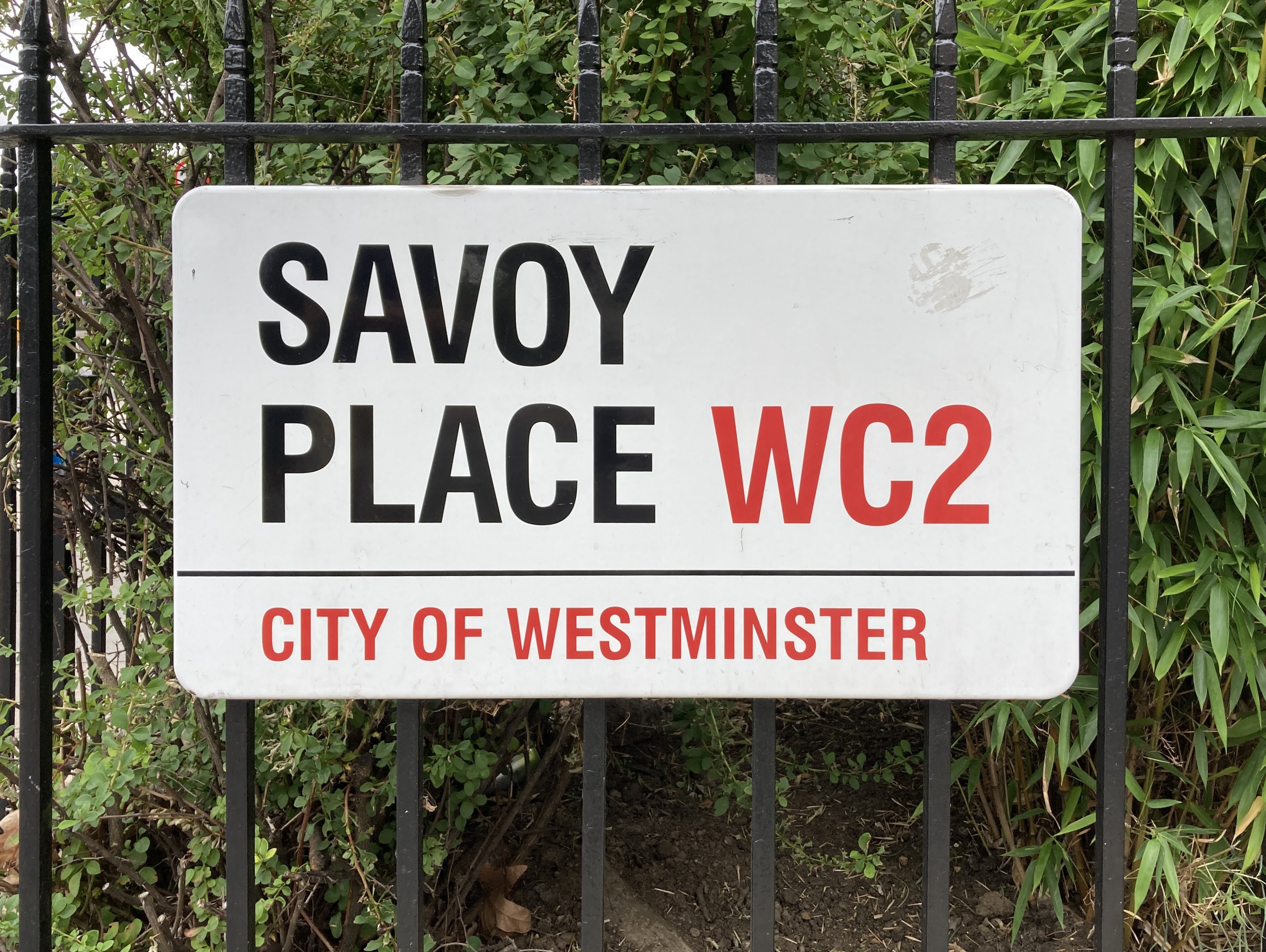
These signs have become so recognisable that City of Westminster bought the copyright to them from the Black estate in 2007, meaning that all those reproduction souvenir signs/magnets/postcards etc need a license from Westminster Council. I suspect that happens more by exception than by practise though.
Outside London the vast majority of new street name signs are set in Kindersley MOT. The occasional historical survivors and recent rogues (especially on privately owned roads) are the exceptions which prove the more general rule that Kindersley MOT has become the national standard for street name signs.
I’m not sure it’s quite the victory that Kindersley (who died in 1995) wanted, while Kindersley and his supporters seem never to have fully reconciled themselves to Kinneir/Calvert’s signage and Transport typeface, to judge by the length of time the arguments went on.
That is what it makes it all the more ironic to find signs like the one below, which marry a street name set in Kindersley MOT with additional information set in Transport, bringing these two warring typefaces together in unexpected truce.
A note on naming
Kindersley’s seriffed typeface for the 1952 MOT circular on street name sign design doesn’t seem to have a consistent given name. The Cardozo Kindersley Workshop refers to it as Kindersley MOT, which is good enough for me, makes sense, and helps in text to distinguish it from Kindersley the person. Most local authorities refer to it simply as “Kindersley” (no qualifications) in their street name sign specifications, where these are publicly available. The example at the beginning of the article is Kindersley Street, a recently digitised version of Kindersley MOT initially intended for use on the Grand Arcade in Cambridge. In an act of incredible generosity, it is freely available from the Cardozo Kindersley Workshop, which explains that Kindersley would be, “…most upset to see the terrible variations of his Kindersley MOT,” which have proliferated since the 1950s. As the closest thing available to the original intention behind Kindersley MOT, I have used it to illustrate this article.
Bibliography and Further Reading
The Kindersley Cardozo Workshop, in particular its page on type design
The Jock Kinneir Library, in particular this page
The best, most comprehensive, most dispassionate history of the road signs / typeface war, correcting some claims/counter-claims by tracking them back to their source and analysing the data which led to them: Lund, O. (2003) The public debate on Jock Kinneir’s road sign alphabet Typography Papers vol. 5. pages 103–126
Marvel at just one manufacturer’s range of street name sign varieties (other manufacturers are available)
This Flickr album from user mikeyashworth. To be honest his entire Flickr account is a treasure trove for transport/typography enthusiasts.
A commemoration of Kindersley in Varsity
I suspect this book would have been very helpful for parts of this article if only I’d been able to get hold of a copy in time. It looks marvellous: Hall, Alistair (2020): London Street Signs. Batsford: London
…and anything else linked to in the text above.

What an interesting article. Thank you. If I’m not mistaken, Misha Black had a big hand in the design of the handsome class 52 Western diesel-hydraulic locomotives.
A brilliant read as always! Personally I find Kindersley a bit spindly to read clearly – I prefer the modern-day Camden street sign which actually appears to be set in all caps Transport (the G, S and 1 give it away).
Fascinating stuff!
A non-street-name usage of Portsmouth’s fine ceramic tiles that I recall vividly from the 1970s was in a public convenience, which had PLEASE ADJUST YOUR DRESS BEFORE LEAVING (or very similar wording) set in those tiles along the wall above the urinal. I certainly did!
The 1970s estate I was brought up in used the Transport font. Though most have fallen into disrepair and replaced, a few remain. https://goo.gl/maps/BGykjhsnD9VX2xo8A for example.
Lovely stuff! But… there are a few errors I’m afraid.
The Kindersley Workshop do refer to Kindersley MOT, but to do so is to rather confuse things. (Naming of the transport alphabets has always been a bit haphazard!)
There is the Kindersley Alphabet, a serif letterform, which was designed by David Kindersley specifically for street signs in Cambridge, but not adopted by the borough initially. This is what has been revised and revived as Kindersley Street / Kindersley Grand Arcade, and is the lettering seen on many street nameplates across the country.
There are the two original Ministry of Transport sans-serif alphabets, a Standard alphabet and a Compressed alphabet, introduced in the 1930s. These were revised in 1950 by Kindersley, with the new alphabet known as MoT Revised. Kindersley tidied up the letterforms and advised on the spacing of the letters. Your Earsdon Road nameplate uses this alphabet. The Warner Street sign is a version of MoT, but not the revised one that Kindersley created.
Separately, Kindersley also designed a proposed set of letters for the motorway signage, entirely different from his Kindersley Alphabet, but I’m not sure that design ever had a specific name.
Current specification sheets from councils often get even more confused, by specifying Kindersley (by which they mean his street name lettering) but actually showing an entirely different typeface – even the Roads Circulars get this wrong in some illustrations.
The current Camden nameplates, such as Langton Close, are set in Transport.
Re. Westminster: Design Research Unit (the agency where Misha Black worked) designed a bespoke block letter alphabet based on Univers. But the Savoy Place sign is actually set in Helvetica Bold Condensed, a mistake that arose recently when the contract for the sign making switched from one manufacturer to another. I’m told they have re-established their copyright protected alphabet more recently.
Portsmouth-style white-on-black street signs also appear in some parts of London, particularly around Hampstead where many have avoided being replaced with the modern Camden type. The most famous was probably the one on the back cover of The Beatles’ Abbey Road, though that has long since been replaced with a standard Westminster sign.
What a wonderful article. You wondered about the use of Albertus by the City of London – it most certainly is Albertus. Lambeth adopted Albertus later, following development work for the council by AtelierWorks. Designed by Berthold Wolpe, a Lambeth resident (Stockwell, to be precise), Albertus was regarded as about as indigenous to Lambeth as a typeface can get. And so it was adopted as the streetname lettering across the whole borough.
Keep up the great work!