A little while ago I wrote about British Railways’ totem signs, which are now highly collectible, as are many railway posters, carriage number plates from London Underground trains, old bus stop flags, and e-tiles (those are the little square tiles with the bus route numbers on – early enamelled ones, especially London ones, are much sought after). These now all fetch good prices at specialist transport auctions.
The problem is you can never tell which bits of transport are going to be collectible in years to come. On the UK railways I have a sneaking suspicion that the station nameplates used by south of London train operator Southern might well become collectible as they are beautifully enamelled and many feature the traditional “Southern” logo too. The Isle of Wight’s Island Line has fitted retro-style totem (or hot-dog sausage-shaped if you really must) signs to its stations, and these might become collectible too, as a later take on an iconic classic.
Please note that the beauty of transport blog cannot give investment advice and should not be relied upon in any way for the purposes of financial planning. Examples of transport memorabilia featured in this article might never achieve collectible status. The value of transport memorabilia can go down as well as up, and it’ll be just my luck if the orange APTIS tickets I threw out the other day turn out to be highly valuable in 40 years’ time. So, disclaimer out of the way…
I suspect that another type of station sign, assuming that any survive, will also become collectible: those featuring the station identities for Railtrack’s major British railway stations. I only recently realised that Network Rail (Railtrack’s successor as the British rail infrastructure operator and operator of the busiest stations in the country) no longer seems to use Railtrack’s series of rather wonderful station logos for its major stations. They’re still featured on signs around the stations, but no longer feature on paper publicity materials at the stations, and I fear that at some point they will disappear from the station signage, when the next round of replacements come along. So let’s celebrate this lovely, and clever, set of designs while we still can.
It’s fair to say that Railtrack isn’t much lamented. A publicly-quoted private sector company (rather than Network Rail’s status as not-for-dividend company limited by guarantee), Railtrack got itself a reputation for placing the interests of its share price before that of the railway itself. There is more than a little truth in that, but there is a more complex story too, and a full assessment of Railtrack’s failings (and its successes) will probably have to wait for a bit more temporal distance. But one success was its early focus on its major stations. For reasons that have become somewhat cloudy, Railtrack became responsible for operating the busiest British railway stations. At most other stations Railtrack remained the owner but one of the train operators ran the stations on a day-to-day basis, a situation which remains to this day. And as a profit-making private sector company with shareholders to placate and reward with dividends, Railtrack swiftly set about commercialising its major stations, laying the groundwork for the “station as destination” model which is now best seen in Britain at St Pancras International.
As part of that process, Railtrack’s stations were given a visual face lift through new signage, which began to appear from 1999. To design the new major station signage and visual identity, Railtrack had called upon brand communications consultancy Lloyd Northover (check out its website – you’ll recognise a lot of its work). The company was set up in the mid 1970s by designers John David Lloyd and Jim Northover, and worked on many famous brand images (including Hong Kong’s Mass Transit Railway, and the-then British Airports Authority, to name but two transport-related ones), winning numerous international awards along the way.
Lloyd Northover developed a new typeface and set of pictograms to be used on station signage throughout Railtrack’s portfolio of major stations. The photo below shows the four-sided suspended information points which became a common sight. Examples are still visible at Network Rail’s major stations, and the typeface and pictograms remain those developed by Lloyd Northover. The project as a whole was overseen by Design Research Unit, the company which developed British Rail’s corporate identity and associated double arrow symbol (The Beauty of Transport 18 March 2015).
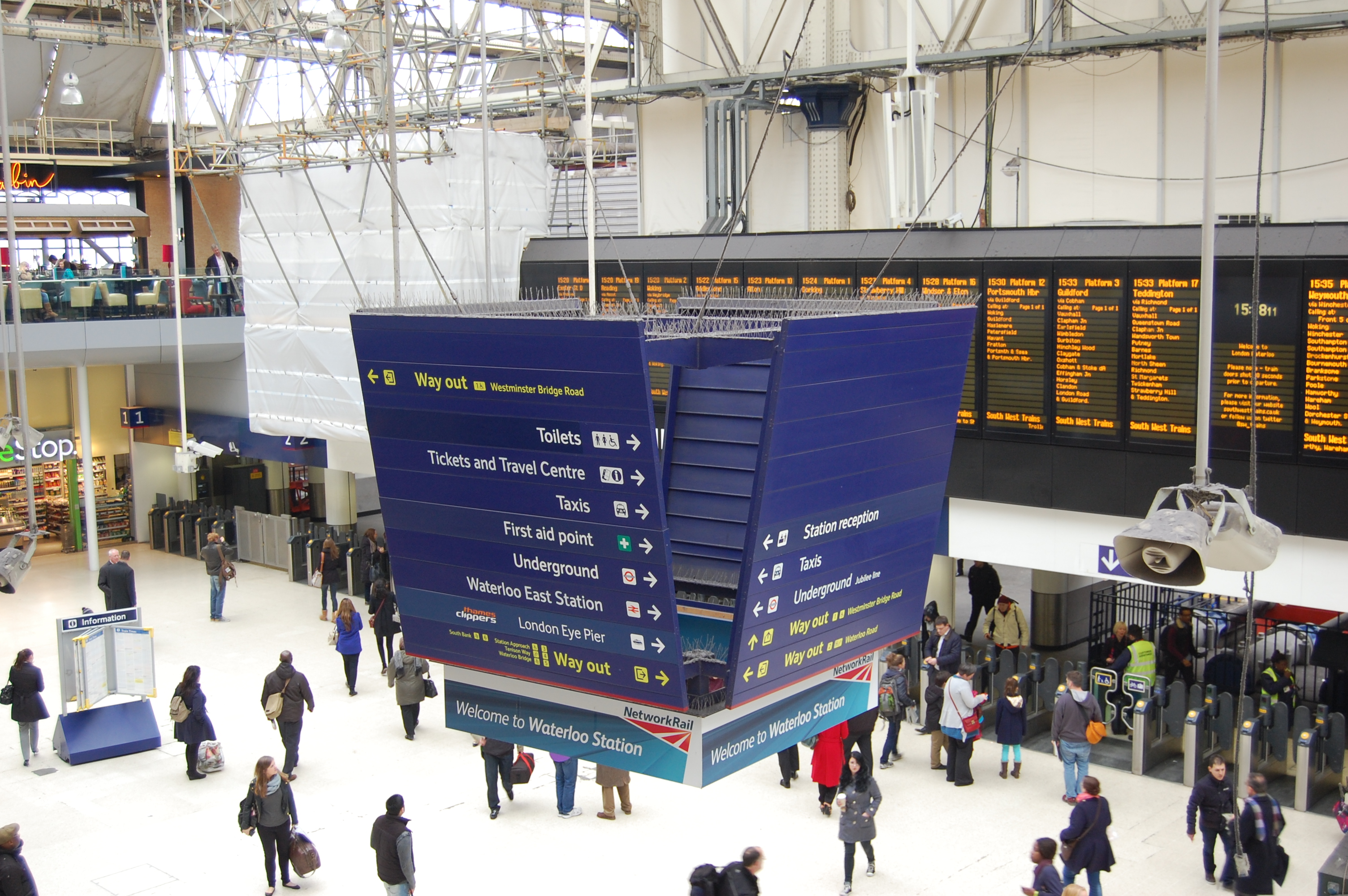
The new brand image was quite controversial at the time. For its signage, the nationalised British Rail had used black text on white backgrounds since 1965. Lloyd Northover’s designs for the privatised Railtrack’s new signage instead used white (or sometimes yellow) text on a dark blue background. The actual typeface is Brunel, developed by The Foundry; a typeface at one time planned to become the standard for railway station signage nationwide (The Beauty of Transport, 13 May 2015). White text on a blue background was said to be easier to read for partially sighted passengers. But not everyone liked it. Some people said that light text on a dark background was actually worse for partially sighted people (I suspect that actually both light on dark, and dark on light, pose different problems for people with different sorts of partial sight). And some people just didn’t like something which was different to black text on white, which they’d gotten used to…having apparently forgotten that the pre-1965 British Railways totems used white text on dark coloured backgrounds, and that Railtrack’s new signage was in effect a return to that earlier standard.
Meanwhile, Lloyd Northover delivered one extra, rather special, element. As well as the standardised signage, each major station got its own unique identity logo, based on its architecture, its history or the local area. The logos were circular, and appeared on relevant signage around the station and on associated publicity. And they were quite lovely. They were so simple in concept, but so clever, and so beautiful. Each was in a particular colour which was then repeated as accents on the station signage too (in fact, if you look carefully at the photo above, you can see there is a maroon stripe along the bottom of the hanging sign, just above Network Rail’s later “Welcome to Waterloo” banner; Waterloo’s logo was on a maroon background).
Here are eight of the logos from Lloyd Northover co- founder John David Lloyd’s archive website:

- Gatwick Airport’s G reflects aviation.
- London Victoria’s logo has a silhouette of the young Queen Victoria (after whom the street on which the station stands was named).
- London King’s Cross is a visual pun.
- London Paddington’s P reflects the form of the screens at the end of Brunel’s trainshed roofs at the station.
- The lion on London Waterloo’s logo used to be outside the station before being moved a bit further down the South Bank to near County Hall.
- Glasgow Central’s G is based on the typography developed by local boy (not that he was really appreciated at the time) Charles Rennie Mackintosh.
- Leeds City’s logo features the white rose of the Royal House of York.
- Edinburgh Waverley’s logo is based on Edinburgh Castle.
Here’s Glasgow Central’s at a larger size, just because I’m a great admirer of Mackintosh’s work, as I’ll explain another time:

As well as the eight above, Railtrack operated several other major stations…
London Bridge (the design being based on London Bridge itself):

Charing Cross (the cross from the replica Eleanor Cross outside the station):

Manchester Piccadilly (based on one of the viaducts near the station, though I don’t know which one for certain, and with a stylised image arguably it’s hard to say for sure):

Birmingham New Street (to my shame I spent several years at University there but still can’t work out what the New Street logo is based on):
![By Sunil060902 (Own work) [CC-BY-SA-3.0 or GFDL], via Wikimedia Commons](https://thebeautyoftransport.com/wp-content/uploads/2013/04/birmingham_new_street_eastern_entrance.jpg)
![London Euston station signage. By Sunil060902 (Own work) [CC-BY-SA-3.0 or GFDL], via Wikimedia Commons](https://thebeautyoftransport.com/wp-content/uploads/2013/04/euston_station_mainline_signage.jpg)
![London Liverpool Street station signage. By Sunil060902 (Own work) [GFDL or CC-BY-SA-3.0], via Wikimedia Commons](https://thebeautyoftransport.com/wp-content/uploads/2013/04/1024px-liverpool_street_stn_information_board_signage.jpg)
During its time as infrastructure operator, Railtrack occasionally inherited extra stations, which were passed to it from train operator management, on the basis that Railtrack’s commercial division was better placed to maximise value from this real estate. It gained Fenchurch Street (the logo being based on the adjacent Tower of London):
![By Sunil060902 (Own work) [CC-BY-SA-3.0 or GFDL], via Wikimedia Commons](https://thebeautyoftransport.com/wp-content/uploads/2013/04/fenchurch_street_stn_signage.jpg)
![By Sunil060902 (Own work) [CC-BY-SA-3.0 or GFDL], via Wikimedia Commons](https://thebeautyoftransport.com/wp-content/uploads/2013/04/1024px-cannon_street_mainline_stn_signage.jpg)

As I mentioned, Network Rail doesn’t seem to be using these logos as widely as Railtrack once did (there’s no sign of them on Network Rail’s major station information website pages, for instance, and the signage at the new King’s Cross western concourse omits that station’s logo altogether). Although Network Rail has stuck with the Lloyd Northover signage, I suspect the individual station logos are being phased out, though they remain on many of the signs at the stations for now. If they are indeed being phased out, they will slowly disappear as signage which features them is updated, refreshed or replaced. Those at Gatwick Airport station look certain to disappear sooner rather than later. In an unusual move, responsibility for its operation has passed from Network Rail management to that of train operator Southern – so expect the Lloyd Northover major stations branding to disappear from there before too long, along with the Gatwick Airport station logo.
If these clever pieces of design are being lost from the stations, I for one will miss them. Until, I suspect, some years down the line, an example of Lloyd Northover’s Railtrack major stations identity signage line turns up at auction, station identifier logo and all.
Bibliography and Further Reading
Portfolio of Railtrack major station identities at John David Lloyd’s website, here
Creative Director Alistair Fowler worked on the team at Design Research Unit on the Railtrack signage project, portfolio page here

Beautiful, the sort of work that has no place in an increasingly automated society.
Presumably New Street’s will be the next to go, the old concourse closes this coming weekend
Yes, they really are little pieces of beauty that don’t have to be there (as evidenced by the fact that they seem to be disappearing) but by being so, bring something special to the stations where they’re found. The sad thing is that there’s no particular reason to get rid of them. They could have been included on the new Western Concourse at King’s Cross, but clearly Network Rail has decided it doesn’t want them. Oh well – make the most of them while they last!
Having spent years in Birmingham (studying transport, as it happens) I can’t say I’ll miss the old concourse, but I will miss the New Street station identity pictograms if they aren’t included in the new concourse (which I might cover as a topic one day as well). Not sure if you’re local, but if you are, perhaps you could check out the new concourse at some point and let us all know. If the station identity pictogram is missing from the signage, we’ll know it’s Network Rail policy to phase them out.
Thanks for finally talking about >virtuous circles (Railtrack major station identities, Lloyd Northover, UK)
| the beauty of transport <Loved it!
I think this blog CAN easily give investment advice 🙂
I believe there are a few replacement signs at Leeds which haven’t got the logo on them, which is a shame. Plus some of the signage is in a different, non-Brunel font which I imagine the regular passenger won’t even notice but it jarrs every time I see it.
Oh and apologies for being a pedant but you mention Leeds Central but Leeds Central was closed in 1967, I believe you mean Leeds City? The original signs within the station had Leeds City but these were phased out in later years for just “Leeds”. I took a photo of a trolley point with with “Leeds City”present and uploaded it to the Wikipedia page.
And your blogs have kept me captivated for hours now, they are absolutely ace!
Thank you! I’ll sort out the Leeds City / Central confusion ASAP. What can I say? I’m a Southerner; absolutely no expert on Leeds’ stations and happy to be put right.
The Victoria logo has returned as part of the new uniform for staff at London Victoria…
It’s lovely to see these Station identities being celebrated. I was lucky enough to work at Lloyd Northover for over 10 years and work on some of these. Whilst there was a designated team for the Railtrack client, any designer in the agency could have a go. The Glasgow station one was actually first sketched out by a student who was on work placement at LN. He must have been delighted that it made it onto the station. It seems impossibly old fashioned now but the master letters for the Brunel font were all hand cut at a very large scale on red Lith film before being digitized. I did a fair bit of work on the background colours and ensuring accurate translations into Ral colours. I drew the final Charing Cross mark and tidied up the Queen Victoria outline. Very happy memories of my years at LN which was run by two of our greatest Graphic designers. Both Jim and John were (still are) passionate about the craft of Graphic Design and could see how technology was removing basic skills of draftsmanship from the design process. These symbols all started off as ink on paper and I think that’s part of why they work so well.
Birmingham = Spaghetti Junction?
Despite (or because of?) a career in the rail sector in the U.K., progressing from British Rail to the multifaceted parish structure, I wasn’t aware of the Railtrack major station identifiers. Railtrack had a curious attitude to association with any assets – I was involved in applying an identity to infrastructure inspection fleets. Railtrack did not want a unique identity/livery. The closest was a follow on streamline … working with Railtrack.
Whilst there may be some benefit to a local identifier, this should be secondary to a stronger unifying identity that promotes a consistent, uniform network throughout Britain. Station identifiers are not high on the list of shortfalls and priorities.
RA2 signage including the Reading R is now up…