When we last looked at the story of British Railways’ corporate identity, Dr Richard Beeching had arrived on the scene. As chairman of British Railways from 1961 to 1965, he remains a controversial figure to this day. He left Britain’s railways much reduced but with several great inheritances; for a start he developed InterCity services of the modern version which we understand today, with regular, hourly express services between major cities, a concept which would eventually prove to be one of the railway’s most lucrative businesses. To some, he remains unforgiven for the axe he took to Britain’s lesser-used branch lines in the 1960s. To others, he remains the saviour of British Railways, forcing it to face up to hard economic realities. Perhaps his longest-lasting legacy as far as this blog is concerned was the long overdue creation of a cohesive corporate identity for British Railways. That identity included an all-new appearance for every aspect of the company, a logo that remains one of the most instantly recognisable both at home and abroad, and even a new name.
As a brand, British Railways had become completely toxic by the early 1960s. Thanks to the fiasco of the Modernisation Plan which had wasted billions of pounds, it had become a byword for financial incompetence, and the government viewed it as a financial money pit. It was against that background that Beeching took his axe to loss-making branch lines. Though much of the economic justification remains highly suspect, and several of the line closures were obvious mistakes even at the time, he was undoubtedly telling the government what it wanted to hear.
Beeching understood that turning around British Railways would require not only better financial management and business practices, but also a corporate identity that focussed it on the future, instead of the past. Unlike previous chairmen, he was an unapologetic moderniser, no fan of the heraldic devices and steam railway colour schemes British Railways used for its trains (latterly maroon with black and yellow lining-out). For all their attractiveness, the hot dog sausage-shaped station nameplate totems, replete with the Gill Sans typeface which had been bequeathed to British Railways by the pre-war London & North Eastern Railway, also drew their inspiration from the past. As James Cousins, director of industrial design at British Railways in the 1980s, later put it (Cousins, 1986: p5), “A reversion to past idioms in design is also a fashionable vogue. The popular pastiche of past styles is often a form of cultural vandalism that makes no contribution to the present or future of environmental design.”
![Ben Brooksbank [CC BY-SA 2.0], via Wikimedia Commons](https://thebeautyoftransport.com/wp-content/uploads/2015/03/1024px-farington_junction_geograph-2401785-by-ben-brooksbank.jpg)
Not only was British Railways’ corporate identity old-fashioned, but it wasn’t even consistent. Different regions of British Railways had by the early 1960s started painting their trains in apparently whatever colours they fancied, giving the (probably accurate) appearance of a company that wasn’t in control of itself. All of this would have to go, and some of it is mourned to this day. But in 1964, thanks in no small part to Beeching’s personal drive to create a modern-looking as well as modern-behaving company (Jackson, 2013: p97), the future arrived: all 12 carriages of it.
XP64 was a demonstration train. It featured the first appearance of what was recognisably the corporate identity which would spread across the whole of British Railways over the next few years. It also featured a rake of modified British Railways standard “Mark 1” carriages featuring prototype passenger facilities to be considered for installation on the new fleet of “Mark 2” carriages. In a typical British Railways muddle, however, the Mark 2 carriages had already gone into production and the new XP64 features that passed the testing process wouldn’t get onto the Mark 2 carriages until later versions (Jackson, 2013: p113-114). This was exactly the kind of ridiculous mismanagement that Beeching hated. Beeching’s corporate identity intiative also led to the shortening of the company name from British Railways to the more modern-sounding, less fussy “British Rail”, though away from the public gaze, British Railways remained the company’s legal name.
So what was British Rail’s new corporate identity like? Well, despite the 1960s’ reputation as the Swinging Sixties of Carnaby Street, flower power, hippy drop-outs, free love, long-haired Beatles, wing collars and flares, the new corporate identity was nothing like that. Partly that’s because the somewhat portly figure of Beeching with his neat little moustache and short hair was about as far from the hippy image as it was possible to get, partly because the more extreme excesses of the Swinging Sixties didn’t really come until later in the decade, and partly because the new corporate identity drew on an alternative 1960s milieu, that of the cool, clean-lined modernism of Terence Conran’s Habitat, Alec Issigonis Mini car (Jackson, 2013), and Robin Day’s furniture for home, office and commercial spaces.
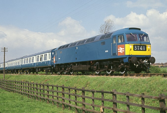
British Rail’s new corporate identity was created by Design Research Unit, one of the leading design agencies in Britain at the time. It was based around a palette of just a handful of colours: rail grey (a light grey), rail blue (a dark blue which you’ll also see referred to as ‘monastral’ blue in some sources, and which was slightly darker than the blue on the XP64 train) and rail red (a bright red which you’ll also see called ‘flame’ red), plus black and white; the yellow ends of British Rail’s trains were mandated by safety regulations, not corporate image concerns. Printed documents used slightly different blue and red shades (Cousins, 1986: p20) which reproduced better on paper.
Locomotives were to be painted in all-over rail blue, while passenger carriages were to be rail blue with rail grey upper parts around the windows for express trains, or all-over blue for non-express trains. There was to be no old-fashioned steam railway-style lining out of carriages. The only decorative concession was a white border with rounded corners around the grey area, almost invisible except close up. Rail red, in practice, was rarely used. There had been an idea that the new British Rail double arrow logo should be displayed on a rail-red background (per XP64) but this was abandoned in favour of applying cheaper white transfers instead. Rail red was seen as bands of colour along the top of carriages, denoting buffet facilities, and later, on carriages with closed compartments that lone travellers might wish to avoid. Freight wagons were brown or grey.
![Blue train with blue/grey express train behind. Monument Lane, Birmingham, 1978. Photo by Steve Jones [CC 2.0] via this flickr page](https://thebeautyoftransport.com/wp-content/uploads/2015/03/6029902122_a92557a5c9_z.jpg)
Most importantly, British Rail’s new identity included the deployment of a brand new logo to represent it, the double arrow. It remains an extremely powerful image, born very much of the hard-edged, sharp-cornered style of the 1960s. It has yet to be surpassed by any UK rail industry logo for impact and recognisability, and even worldwide it has few competitors. It was plain, and apparently simple, a world away from its predecessors, the heraldry-inspired lions and wheels.
The double arrow logo was the work of Gerry Barney at Design Research Unit, who came up with it after various other symbols were tried out and rejected (there’s a great interview with Barney here). Though apparently simple, in its details it is more complicated than it first seems. The proportions are very carefully thought through, as you’ll know if you’ve ever tried to sketch one and it’s not looked quite right. The diagonal arms at the top and bottom flare outward at the ends to counter an optical illusion that made them appear to narrow when drawn with parallel sides. Although Barney was careful to avoid dictating exactly what it represented, the top arrow points rightwards because trains drive on the left, and the double arrow can be read as railway tracks seen from above with the directions of travel superimposed. Cousins said, “BR’s symbol, designed by Design Research Unit, has arrows in it, if you care to find them there; but it has a wider integrity too. As well as motion, the symbol connotes reliability.” (Cousins, 1986: p18)
The double arrow’s complicated detailing explains why it can be found facing back to front, or drawn not-quite-right, on road signs dotted around Britain to this day. There were a few situations where the back-to-front version of the double arrow was permitted. One was on flags, where the instruction was given that the arrow at the top must always point towards the flag pole (as you can see here). The second illustrates the reach of British Rail’s new corporate identity. The most powerful engines fitted to a British Rail vehicle could be found not on its trains, but rather on its ships, which belonged to British Rail by virtue of it inheriting train ferries and other shipping lines from its steam railway forbears. British Rail’s ships, operated under the “Sealink” brand name, were given the British Rail corporate livery of rail blue lower parts and pale grey uppers (a shade called ‘marine grey’ in this case), while the rail red funnels on top featured the double arrow logo in white. For what are now obscure reasons, but likely to do with maritime traditions and the fact that ships have a definite back and front, unlike most trains which can be driven in either direction, the logo on the funnels always had the top arrow facing towards the front of the ship. On the port side, therefore, the double arrow was displayed back to front.
![By Barry Lewis (A Focus On Ferries - 3) [CC BY 2.0], via Wikimedia Commons](https://thebeautyoftransport.com/wp-content/uploads/2015/03/sealink_ferries_horsa_and_maid_of_orleans_dover_1973.jpg)
Even British Rail’s tiny remaining fleet of three steam locomotives and their coaches, on the narrow gauge Vale of Rheidol railway in Wales succumbed to rail blue, although the locomotives did at least get a cast version of the double arrow logo:
![Locomotive no. 8 at the Vale of Rheidol railway in 1980. Photo by Barry Lewis [CC BY 2.0] via this flickr page](https://thebeautyoftransport.com/wp-content/uploads/2015/03/8656039010_77747ec0ef_z.jpg)
At stations, the colourful and much-loved hot dog sausage shaped totems, which featured white text on coloured backgrounds, were replaced by white signs with black writing and a range of new standard pictograms. This was probably as noticeable a change for passengers as the trains being painted blue/blue and grey, so much did it affect the character of stations. Indeed, when Britain’s privatised train operators mostly opted for white text on coloured backgrounds for their signage at the turn of the 20th and 21st centuries, many passengers objected on the basis that black text on a white background was more legible, as demonstrated by the fact that such a colour scheme was the way things had always been. In fact, black text on white had been the standard for only a little over 30 years, but had made an indelible impression.
At a stroke, British Railways’ corporate identity had been transformed from something which lagged way behind the chic and classy modern image seen at other transport companies like BOAC, to something that actually made the (admittedly gorgeous, but slight 1950s-ish) BOAC corporate identity look a little long in the tooth.
The striking thing about the British Rail corporate identity was just how all-encompassing it was. The corporate design manual was massive. It’s been recreated on this website, and it ran to hundreds and hundreds of pages by the time regular revisions are taken into account. Everything that might possibly be touched by a British Rail employee or customer got the treatment, it seemed. From windows to wine glasses, serviettes to signs, trains to trucks, cutlery to carpets, the corporate identity ranged over all. Most modern British companies are content to buy in at least some standard sundries. Not British Rail. Everything was bespoke to some extent, and everything had to conform.


That’s not to say that British Rail’s corporate image was completely unchanging. Details were refined as new products were launched, or to keep abreast of design trends. This, for instance, was an early British Rail uniform, complete with double arrow logo on the hat and buttons, and a silhouette which clearly leans on older uniforms:

In what was perhaps British Rail’s only concession to the swinging sixties and early 70s, later uniforms featured blouson jackets sporting embarrassing giant wing collars (in rail red or blue, naturally). If Jason King had been a train driver, this is the jacket he would have wanted:
Embed from Getty Images[If you can’t see the picture above, which is British Rail chairman Sir Peter Parker and two very stylishly-dressed members of British Rail staff at Euston station in London, you’ll need to head to the web version of this blog, here.]
Nevertheless, the place most British people saw British Rail’s corporate identity was at stations and on trains. From 1966, blue and grey paint swept over the train fleet (the decision was eventually taken in the 1980s to paint even non-express trains in blue and grey), while white and black signage redefined the look of stations. Ironically, Beeching left British Rail in 1965, just before his impetus for a new corporate identity bore fruit. By the mid-1970s the rail blue and grey corporate identity would see its best use, on one of the very best trains British Rail ever had. I’ll tell you about that next week.
references and further reading
Boocock, Colin (2000): Railway Liveries BR Traction 1948-1995. Ian Allen: Shepperton, Surrey
Cousins, James (1986): British Rail Design. Danish Design Council: Copenhagen
Jackson, Tanya (2013): British Rail: The Nation’s Railway. The History Press: Stroud, Gloucestershire
British Rail corporate identity manual recreated as a website, here
Creative Review interview with Gerry Barney, April 2011, here
Rail blue website: lots of pictures of British Rail blue trains, here
The elegance of Modernity. NRM blog on the rail-blue corporate identity, here

As a masterpiece of all-encompassing corporate design it is pretty unequalled. It’s unfortunate that some elements were fudged to a degree once bureaucratic influence became involved in the process. It always seems to my eye that the blue that was formally adopted is a little less vibrant than that of the original XP64 concept.
Whilst the adoption of a common corporate identity was laudible and probably necessary if a true modern and professional image was to be portrayed, it is sad that in the early days, as subsequently happened with the HST and later livery developments that some more bespoke livery applications (whilst retaining the basic standard elements) were not made.
I personally think that the then new Class 50s would have looked superb if turned out in they style of D1733, complete with red backing to the ‘arrow’ emblems.
It’s a shame that this application of red was subsequently omitted as it added life to a livery that could look cold and sterile at times.
My own preference regarding the yellow would be for a continuation of the small panel.
In fairness though, safety of personnel was the main driver here, rather than aesthetic considerations.
I agree. Next week I’ll pick up on the HST variation, not to mention the reversed Pullman colours. There’s always a tension between maintaining a strong corporate identity, and tailoring it to suit individual traction types or marketing initiatives. I reckon on the modern railway South West Trains has it about right, with three different versions of what is clearly the same livery.
Very thoughttful blog
Excellently written. Many thanks for this!