You know a transport design has really made it when it crosses over from its original use into the world of domestic decor. London’s Underground network has achieved the feat several times over. Many homes in the UK (and, for all I know, beyond) are decorated with a reproduction London Underground poster. There’s a booming business in soft furnishings decorated with moquettes (bus/train/tram fabric seat covers) from London’s various transport modes. Most recently, in August this year home interiors company Fired Earth launched a range of products to celebrate this year’s 150th anniversary of the London Underground, featuring modern reproductions of several classic tile designs which can be found at its stations.

Prominent amongst them (accounting for two of the four tile collections) are recreations of designs by Leslie William Green (1875-1908). If you like Art Nouveau and Arts and Crafts, you’ll love Green’s Underground stations.
Green is one of the big two when it comes to London Underground architecture. He has been somewhat eclipsed by later London Underground architect Charles Holden, who was responsible for those classic Art Deco Underground stations reproduced in pictures all over the place (not least on some UK Royal Mail stamps produced earlier this year).
But while Holden was more interested in form (and was essentially a proto-modernist in that respect), Green was all about the decoration, which makes his work eminently suitable for reproduction and retail as a home decor product today. Always assuming that everyone in the house is happy for it to look like a London Underground station (I wouldn’t mind, but you know…).
Green worked on the Underground before it really became the Underground, at a time when today’s network was under development by several different private companies. He was employed as architect in 1903 by Underground Electric Railways Limited (UERL), owner of three deep level “tube” lines in London which at the time were under construction, and which would eventually come to own several more and the sub-surface District Railway as well.
The scale of UERL’s construction programme meant that there was a lot of work which needed doing on station design. In fact Green ended up working on some 50 station buildings, spread over 43 sites.
Green employed what was then a new method of building for his surface buildings, the use of a load-bearing steel frame as the major structural component (it had already been used on another tube line which would eventually become the Underground’s Central Line). It was done for speed of construction, but it meant that the visible materials used for the building were no longer anything to do with what was keeping it upright. The strength of the steel frame also allowed for the construction of offices above the station buildings, and the sale of these “air rights” was rather helpful in funding the stations. But once the visible part of your station is nothing to do with its structure, you can go to town on the decoration, and that’s precisely what Green did.
Green was strongly influenced by Art Nouveau and the Arts and Crafts movement. He studied in Paris at the end of the 1800s, at a time when whiplash curve-style Art Nouveau was at its zenith. As such, he probably kept an eye on what was happening over there, and it’s possible to detect some influences from Guimard’s famous Paris Métro entrances (installed from 1900 onwards) in Green’s work.
Like William Morris, the great prophet of the Arts and Crafts movement, he found the dichotomy between its desires (beautiful objects made by craftsmen on an artisan basis) and reality (the need to produce such objects cheaply so that they are affordable to the masses you wish to wean off their ‘ugly’ factory-produced objects) impossible to reconcile. Morris settled for small-scale production according to his beliefs, with the result that his products were far too expensive for most people. Green accepted the need for mass production. With so many stations to fit out, he could do little else. So although Green’s designs feature many Arts and Crafts elements, they certainly aren’t Arts and Crafts in their ideology.
He developed a standard station exterior design, featuring wide arches in the wall (again possible because of the use of a steel frame rather than masonry construction), with the exterior walls clad in ox-blood red tiles. The reason for this choice is still debated, but it’s very distinctive, which would have helped promote the new railway system to the local populace. It was also easy to keep clean, so the distinctive design would stay prominent, rather than fading into the background over time. The station name was included, moulded into the tiles themselves, and picked out in contrasting colours. If you’ve spent any time in London, you’ll recognise such stations instantly. The basic parts of the station were essentially standardised, although they could be combined in whatever arrangement was necessary to suit the particular station site, and none of his stations are exactly identical.
Have a look at the cartouches decorating the outside of Green’s stations at first floor level, and you’ll find clear echoes of the floral cartouches on Guimard’s Metro entrances.
The excellent 150 Great Things About the Underground blog has a bit of a downer on Leslie Green’s stations, on the basis that they’re a bit same-y and dull. But the standardised ‘kit of parts’ design was the only way the work was going to get done on time.
Green’s reputation is perhaps not helped by the fact that some of his more distinctive designs have been lost. In particular, his most extravagantly Art Nouveau exterior at Knightsbridge carelessly got lost in the 1930s when escalators were installed at the station and a new surface entrance constructed (the London Transport museum has a photo of the original entrance). In any case, it’s not actually the exterior of the buildings that is the best bit. It’s the inside of his stations. Green was the first to give London Underground stations a consistent corporate identity, from the street, right down to the platforms. While Guimard’s entrances gave a distinctive visual identity to the Paris Métro at street level, the design wasn’t carried down on the platforms, where white tiling was used, and station names were in plain white text on blue backgrounds, dispensing with Guimard’s Art Nouveau lettering.
Green’s ticket halls are just as distinctive as his station exteriors, and also feature extensive areas of tile cladding. But while the outside of his buildings are warm red, inside all is cool green with lots of Art Nouveau details. To enter a well-preserved Leslie Green ticket hall is to enter a lush jungle, exotic and slightly mysterious. How much more so it must have been to early twentieth century travellers. The dado rail friezes are the first thing to catch the eye. Green produced two designs, an acanthus leaf and a pomegranate, both wearing their Arts and Crafts influence heavily on their sleeves. It’s as though Green has taken one of William Morris’s floral patterns, and rendered it in three dimensions. Below the dado rails, deep green base tiles shimmer. These Green tiles (the acanthus leaf design) are at Regent’s Park Underground station:
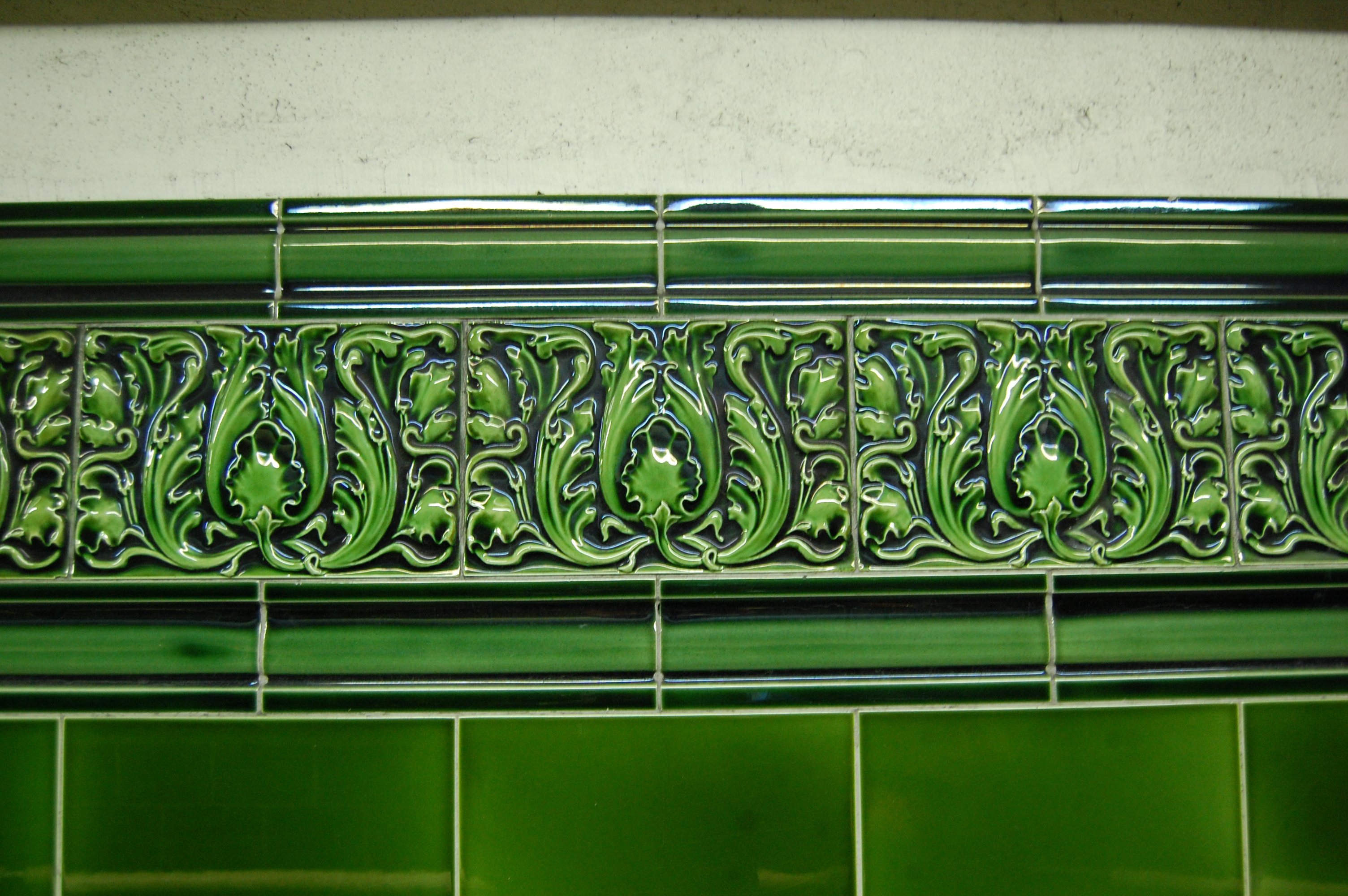
The pomegranate, acanthus leaf and plain green tiles are the first examples of Green’s work now available as modern reproductions from Fired Earth, in its “Edwardian” collection. Just the job for a porch on an early twentieth century house, I would have thought.
Meanwhile, in Green’s typical ticket hall it is time to turn your gaze to the extraordinary ticket office windows.
![Ticket window at Holloway Road Underground station, London, UK. By James Cridland [CC BY 2.0] via this flickr page](https://thebeautyoftransport.com/wp-content/uploads/2013/09/526568923_3636733dcb_b.jpg)
A dramatic pediment tops the window, while lettering is moulded into the tiles themselves. Although the “OUT” and “IN” are condensed, it’s the same typeface as can be seen on the exterior of Green’s stations. The overall shape of the window is also a design element which can be found repeated elsewhere in Green’s stations.
It’s one of Green’s claims to fame that he was the first to impose a comprehensive brand identity on tube stations in London. It’s not the one you associate with the Underground today, but he was the first to demonstrate that a unified appearance could be carried throughout the station. Tiling is used throughout for decoration, and signage and typefaces are distinctive and intentionally consistent. As such, he is one of the pioneers of transport brand identity.
Green’s stations originally used lifts (and emergency stairs) to get passengers down to platform level. This was a time before the introduction of escalators to London’s Underground network. Green considered even the lift signage as worthy of his attention, and he designed Art Nouveau wrought iron grilles to cover the lift machinery and display the lift numbers. Like this:
![Grille for lift no.2 at Mornington Crescent station, London, UK. By Chris Sampson [CC BY-] via this flickr page.](https://thebeautyoftransport.com/wp-content/uploads/2013/09/5462475916_5afddbe713_b.jpg)
This one, at Mornington Crescent, is actually on the outside of the building, but similar examples can be found on the inside of several of his ticket halls (and there’s one in the collection of London’s Transport Museum).
Leaving the lifts at the bottom level, down in the passageways, the tiling carries on. Wayfinding information is given in the same typeface used in the rest of the station, of course. The most important pieces of information (“Way Out” and “No Exit”) are emphasised by setting them within a design which is similar to that of the ticket office windows – it’s all of piece in Leslie Green stations, you see.
![Signage in the passageways at Russell Square station, London, UK. By Emerson Povey [CC BY] via this flickr page.](https://thebeautyoftransport.com/wp-content/uploads/2013/09/4421056540_dc25b42eb1_b.jpg)
If the gorgeous Art Nouveau ampersand above isn’t one of the most beautiful you’ve ever seen, I’ll eat my hat. The curves on the “S” and the arrows are really something, too. Green’s delicately seriffed standardised (taking into account manufacturing variations) typeface provides the inspiration for the second of Fired Earth’s tile collections, the “Signage” collection. “Mind the Gap” and “Way Out” (not contained within the ticket office window-inspired graphic element though) are two of the patterns available. Bespoke signage will also be available, the company says.
Back on Green’s station platforms themselves, the station name is designed into the tiling.
Meanwhile, bands of coloured tiling stretch from the platforms over the roof of the station tunnels. Green ensured that each station had its own unique colour scheme as well as a unique platform tile pattern. No-one’s really absolutely sure why, although the general consensus is that was helpful in a society considerably less literate than London today. If you couldn’t read the station name, you could tell whether you were at your station from the colours and patterns of the tiling on the station platforms. It’s a brilliant piece of design even today. A quick glance up from the inside of a train is enough to tell you which station you’re at, without needing to locate a station name sign. It can be very useful when the platforms are crowded and signage obscured. As so often, a design feature intended to assist travellers with an impairment (illiteracy) helps everyone use the transport network more easily.
![Caledonian Road station, London, UK. The station's tiles are based around salmon pink and dark pink, while the unique tiling pattern is a pair of lozenges. By diamond geezer [CC BY] via this flickr page](https://thebeautyoftransport.com/wp-content/uploads/2013/09/8794215103_28bddddfb7_b.jpg)
If you’re interested in the subject, and want to know much more about the various different station tile designs of Leslie Green, information designer and technical illustrator Douglas Rose has written a book (it’s a labour of love, actually) on the subject (details here; strongly recommended). Over the years, many of the original tiling schemes have been lost, damaged, painted over or re-clad in new materials, though Rose has painstakingly reconstructed their original appearance from on site investigations, including at closed stations. According to Rose, Holloway Road and Caledonian Road remain the most intact survivors.
Green’s incredibly strong graphic identity for his stations was both a boon to UERL, embedding it firmly in the public consciousness, and then later on, a problem. As UERL subsequently developed the word UNDERGROUND (with larger first and last letters) as a name and corporate identity, it proved quite difficult to incorporate it into Green’s designs. It doesn’t sit comfortably in Green’s Art Nouveau milieu, as you can see here:
![Russell Square station, London, UK. By Jeff Stvan [CC BY] via this flickr page.](https://thebeautyoftransport.com/wp-content/uploads/2013/09/4712466767_ee43c7bf82_b.jpg)
At the time Green was working as architect for UERL, Frank Pick had been employed as assistant to UERL managing director George Gibb. Pick would eventually rise to the position of publicity officer in 1908 and commercial manager in 1912. Working with calligrapher Edward Johnston (1913 onwards) and later with architect Charles Holden (1924 onwards), he would take the visual identity of the Underground in a completely new direction. It’s their identity which is still the one that springs to mind for many people when they think of the London Underground, based around the sans-serif Johnston typeface, Holden’s Art Deco/modernist architecture, and the Art Deco advertising posters commissioned by Pick.
Green’s Art Nouveau curvy serif typeface and Art Nouveau/Arts and Crafts detailing was completely at odds with that new identity. But physically built into the stations themselves, it proved jolly difficult to erase at first, though the loss or damage of many of Green’s designs over the subsequent decades reduced the number of locations where it could be well seen (his exteriors have generally survived better than his interiors). Thankfully, the surviving Green decorations are now afforded the recognition they deserve, and are looked after much better.
One can only imagine what would have happened if Green, or at least the corporate identity he invented, had continued as the standard as the Underground system expanded. London might today have an Underground more Art Nouveau than Art Deco. But it wasn’t to be. Green’s extraordinary output took its toll on his health. He contracted tuberculosis and died in 1908, aged just 33.
His contribution to the visual identity of London’s Underground might have been overshadowed by the later work of Johnston and Holden, but Fired Earth’s tribute to Green’s designs brings to the wider world some of the recognition his work surely deserves.
Bibliography and Further Reading
Ovenden, Mark, 2013. London Underground by Design. London, Penguin Books.
Rose, Douglas, 2007. Tiles of the Unexpected Underground. St Leonards on Sea, Capital Transport Publishing.
Taylor, Sheila, 2001. The Moving Metropolis, A History of London’s Transport since 1800. London, Laurence King Publishing.

I get the impression that until recently Green’s work was unappreciated and not treated with sufficient respect in subsequent upgradings and refurbishments.
This was lovelly to read