With the exception of the smallest and newest operations, it is all but impossible to implement a truly consistent and cohesive corporate appearance across a public transport network. Even relatively modern systems like the Docklands Light Railway give away the phases of their construction through different architectural styles at stations. And no matter how hard they try, when system operators bring in a new visual identity, they always overlook at least one or two pieces of signage from the previous regime, either by accident or design.
London Underground has British transport’s most consistent visual identity, based as it is around its red and blue roundel, and specially commissioned Johnston typeface. That’s the widespread perception, anyway, but it’s not really true. By the time the roundel and Johnston were implemented in the 1910s, much of the Underground had already been built, and the Metropolitan Railway would remain independent for some years to come. As a result, there are bits and pieces of pre-roundel, pre-Johnston design everywhere, especially at stations constructed to the designs of Leslie Green. Even the implementation of Johnston varies significantly. There is a world of difference between early Johnston signs with upper case-only lettering, and later signs in New Johnston and Johnston 100, with their mix of upper and lower case lettering.
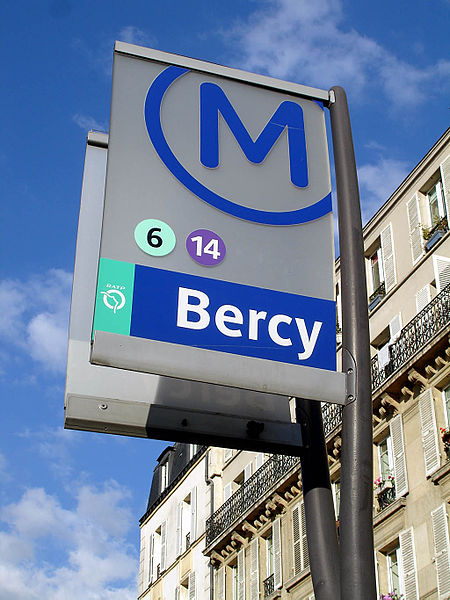
But that’s nothing compared to the Paris Métro, where multitudinous typefaces jostle side by side. It’s either a glorious reflection of the Métro’s complicated design history, or a cauldron of visual chaos, depending on your point of view. It has taken much longer for Paris to pin down its equivalent to Johnston. At long last, however, the city seems to have found a transport typeface which will do the same job as Johnston does in London, effectively acting as the handwriting of Paris. It’s called, appropriately, Parisine.
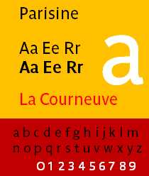
Parisine was introduced in 1997 and is the creation of typeface designer Jean Francois Porchez, who was commissioned by Parisien public transport authority and operator RATP. The reason it has taken so long for RATP to produce an equivalent to London Transport’s Johnston are complicated. In the inter-war period, when Johnston really started making an impact in London, it was an unusually forward-thinking approach, and not something which was immediately emulated elsewhere. Then the Second World War, the occupation, and post-war rebuilding in France meant that for RATP (created in 1948), a cohesive visual identity wasn’t top of the agenda. So the Métro carried on with tiled platform name signs (generally white text on a blue background) in varying styles depending on whether the station had been built by the CMP or the Nord-Sud, and a collection of slightly newer two-tone brown signage introduced as part of a station refurbishment programme. One of the factors mitigating against a standardised approach to lettering even on the newer brown signs was that some of the Métro’s station names are very long, so a lot of varyingly condensed lettering was used, on what seemed like an ad-hoc basis.
The construction of the first RER lines in the 1970s meant more thought was given to signage. The colours of station signage on the RER reverted to white text on a blue background, using Univers as the typeface. But RATP wasn’t completely satisfied with the RER Univers signage, and asked Univers designer Adrian Frutiger to draw a special version for the Métro. He did, though it was decided to use Métro Alphabet only to replace damaged signage, or signage which carried out-of-date information. This distinctive all-caps signage can still be found all over the Métro.
A bespoke, rounded typeface called RER Alphabet was subsequently developed for the RER lines. In the 1980s, Neue Helvetica was introduced for RATP’s buses and Métro station signage, for the first time introducing a mix of upper and lower case lettering, and thereby presenting a less forbidding appearance than the all-uppercase Métro Alphabet signs. New circular logos for RATP’s various transport modes, introduced in 1992, saw the use of the RER’s rounded font across all versions.
All of these typefaces, to a greater or lesser extent, can be found on the Métro to this day, along with unique ones introduced for specialised stations refurbishments. It is RATP’s late start to the process of finding a suitable typeface for its operation, and its continual search for something better than it already had, that has led to the somewhat disjointed appearance of the current Métro.
It was the construction of Métro Line 14 in the 1990s, and its need for all-new signage, which caused RATP to commission Porchez to develop what became Parisine. And at long last, RATP seems to have found a typeface that has really stuck. Now 20 years old, it has lasted for as long as Métro Alphabet, and shows no signs of going anywhere soon. Although not completely replacing older signage on the Métro, it is certainly now widespread across it.
With its mix of upper and lower case lettering, it has the friendliness that intimidating upper case-only typefaces like Métro Alphabet lack. It is a distinctly svelte-looking typeface, with some stylish touches that seem appropriately Parisien, such as a looped ‘g’ rather than the simple curved descender of a Helvetica ‘g’. Indeed it is Helvetica with which Parisine is compared by typeface company Typofonderie (which Porchez founded); not surprising given that Parisine was designed as a superior replacement for Neue Helvetica. Compared to Helvetica, Parisine has stronger terminals, better proportions and more legible numerals, says Typofonderie. Its letters are fairly narrow, and this helps fit in some of the longer station names.
Parisine is now pretty well ubiquitous across RATP’s RER, bus and tram operations, although the mode logos continue to use the rounded RER typeface.
Parisine was followed by Parisine Office in 2005, for use in RATP’s written communications. Twenty years on, and the Parisine family really has started to seem like Paris’s handwriting. It is recognisably its own thing, as widespread and as distinctive in its own way as Johnston is in London. It contributes to the ‘feel’ of Paris as much as Johnston does to London. But in neither city have these typefaces spread over the whole of the public transport network. The mainline railway networks in both cities present a rather different appearance. Although TfL-operated railway stations use New Johnston on their signage, many stations are not operated by TfL. Instead they remain with one of the many franchises that provide train services in the south-east of England. With UK transport secretary Chris Grayling setting his face against transfers of London commuter services from these franchises to TfL Overground operation, apparently for no better reason than he simply has the grumps about the idea, this looks set to continue until more sensible minds prevail at the DfT. Most UK franchises use their own individual typefaces, so there is a bewildering array of typography to be seen on the London commuter railway network.
In France, SNCF retains its near total monopoly of train operations, including Paris’s Transilien (greater Paris commuter area) operation. This at least means that Parisien railway stations not operated by RATP sport just the one visual identity. SNCF uses a bespoke typeface called Achemine, developed by Bruno Bernard and introduced in 2008.
Parisine, meanwhile, continues to evolve. My favourite application of Parisine is on the bus network, and more specifically bus destination displays.
Parisien buses, like they do in practically every sensible town and city in the entire world, use digital destination displays. The older ones are flip-dot style with mechanical flaps showing either black or flourescent yellow, while the newer ones are LED-based as is becoming increasingly standard on most buses. But how would RATP import the legibility and distinctiveness of its bespoke Parisine typeface onto LED destination displays? Such displays are inevitably somewhat limited in resolution due to the number of LEDs per square centimetre, which makes easy reproduction of a typeface’s distinctive elements a challenge.
RATP could have followed the approach used by Transport for London in ensuring that bus destination displays use New Johnston signage. Unfortunately, the way TfL does this is by pretending that the LED revolution simply hasn’t happened. It continues to specify that buses used on its contracts employ roller-blind destination displays (with the lettering in the Johnston family, of course). This overlooks LED displays being more flexible (you can type in absolutely anything to reflect unexpected circumstances, rather than being restricted to the choices on the roller blind fitted to your bus), brighter (LED displays are much easier to see at night than a roller blind display) and less susceptible to jamming (because there’s nothing to jam). It’s something worth bearing in mind in the debate over whether the public sector should or shouldn’t specify local bus networks. While commercial bus operators have spotted the commercial advantages of LED displays, TfL as a public body is able to continue specifying a less flexible alternative, depriving Londoners of nice bright destination displays. I keep assuming that TfL will eventually catch up with, well, practically the whole of the rest of the world, but there’s no sign of it introducing LED displays on its buses so far. It has them on its Underground, Overground and DLR trains, and its trams, though. Very puzzling.
RATP took a different approach. In 2013, RATP commissioned Porchez to design Parisine Giroutte, a version intended specifically to reproduce effectively on LED displays. And it works really well, as you can see:
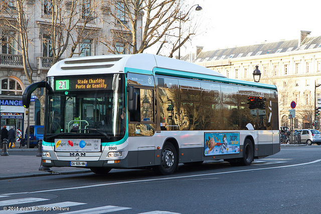
Not only is it is easily legible, but it is clearly part of the Parisine family – and therefore the Paris public transport network – despite being tailored for the properties of LED displays.
Parisine is not only embedding itself in the visual milieu of Paris, but has also spread its wings outside the city. It has recently started appearing on the Osaka City Subway in Japan, where a re-signing programme has seen Parisine used to give Latin-character versions of the information on some of its signs.
Le #métro d’Osaka a choisi le #Parisine pour sa signalétique en anglais, une #police créée à l’initiative de la #RATP il y a 20 ans ! pic.twitter.com/nu7wrcgfa7
— Song™ (@SongPhanekham) May 14, 2017
//platform.twitter.com/widgets.js
It’s a testament to the quality and innate character of Parisine that it is instantly recognisable on these Osaka City Subway signs. There is another interesting contrast of approach with London here. Parisine is being used in new locations outside Paris, arguably with a chance to become one of the world’s great transport typefaces. Johnston and its successors are forever bound to London, jealously guarded by TfL and its predecessors. It makes Johnston unique to, and cherished in, London; as a result it has never had the chance to conquer the world. Maybe that’s for the best, maybe not. But Parisine looks like it has its sights set on even loftier goals than revolutionising the look of the public transport network in the city it was originally invented for.
Bibliography and Further Reading
Ovenden, Mark (2009): Paris Underground – The Maps, Stations and Design of the Metro. London, Penguin Books – from which much of the history of pre-Parisine Metro and RER typefaces in the article above was drawn.
Creative Review article on the introduction of Parisine Giroutte, here
Typofonderie’s Parisine typeface webpage, here, and Parisine Office typeface webpage, here
Bruno Bernard’s Achemine typeface webpage, here

I am not so sure about the advantages of LED displays. They are hard to read when the sun is shining on them. They are also difficult to read if you have cataracts ie by a lot of older people. The bright spots of the LEDs spread out and create a blurry block of light.
More work needs to be done on this subject. The future might be OLED screens, but they do not work in bright ambient light. Another option could be the electronic paper used in the Kindle.
Really interesting article, thank you.
I’d always understood that LED displays on buses were for the convenience of the bus operator, not the passengers. TfL continues to specify roller blinds because they are more legible in a wider range of lighting conditions and allow more information to be displayed. I certainly don’t think it’s right to assume that it’s done just so that Johnston can be used on the front of buses.
You’re very welcome. Personally I find LEDs more legible across various light conditions and distances than roller blinds, and that was reflected in my comment in the article. That doesn’t of course mean that is a general rule.
LED legibility is badly under-researched in a transport context. As a local authority transport planner I once asked if anyone had done any research on which of red or orange LED displays (both common on bus stop displays) were more legible. Not a single person could find any research on the most legible colour, including the display suppliers I asked. Now there are white LED bus destination displays too, instead of the more traditional orange, presumably with additional legibility variations.