If you’re a forward-thinking sort of bus operator, you can extend your product offer and identity to even the most overlooked parts of the travel experience. And they come little more humble than bus stop flags. This is the story of why bus stops in Britain look like they do, why some of them look a lot nicer than others, and the overwhelming influence of one company on bus flag appearance. It’s perhaps one of the most niche subjects this blog has ever covered, which is saying something, and it was this bus stop flag that got me thinking it was time to cover the subject:

Road signage in Britain is the responsibility of the public sector organisations which look after the public highway. You can’t have private companies directing traffic for their own purposes, and you need someone without a commercial interest to set and sign speed limits and the like. Mostly, the responsibility lies with local transport authorities. In two-tier areas that’s the upper-tier county council (rather than the lower-tier borough/district council), and in one-tier or ‘unitary’ areas it’s done by the relevant council, which can be called pretty much anything. Motorways and the most important A-roads are looked after by the national trunk road agencies rather than local transport authorities. London is a further exception, as most roads are looked after by the London borough councils, Transport for London (TfL) is the local transport authority and looks after the TfL Road Network of key roads, while the Highways Agency retains control of motorways and main trunk roads. If all that makes your head spin, you can at least reflect that it gives people with transport degrees plenty of opportunities for a varied career, even if they only ever work in highways departments.
The traffic signs such organisations can use are strictly prescribed in the Department for Transport’s Traffic Signs Regulations and General Directions (TSRGD). The latest full edition dates from 2002, though there’s a new one due this year. The TSRGD has been in use since the beginning of 1965, when the Worboys Committee’s recommendations of 1963 were enshrined in law. You remember the Worboys Committee – it decided to introduce standardised signage with an approved set of pictograms and the Transport typeface by Calvert and Kinneir. The TSRGD makes sure we don’t return to pre-Worboys signage chaos by illustrating the official, acceptable, design for each traffic sign, which must be used by local transport authorities.
Unfortunately, just to confuse matters, one type of traffic sign largely escaped the strictures of the TSRGD and the clutches of local transport authorities: the humble bus stop sign, or flag.
There are many misconceptions around bus stops. For a start, this:
![Bus stop at Wey Hill, Surrey. Photo by Daniel Wright [CC BY-NC-ND 2.0]](https://thebeautyoftransport.com/wp-content/uploads/2016/02/image2-e1455654716156.jpg?w=768)
…is not a bus stop. A bus stop is the point on the road where a bus stops. Sometimes, but not always, that’s indicated by a yellow bus stop ‘cage’ marking on the road. In fact, if you want to nominate that bus stop cage as a no-parking clearway stretch of road (handy if, you know, you want to actually get your bus up to the kerb so that passengers can access it from the pavement), you have to have the yellow markings on the road. The bus stop flag (the square-ish sign often found on top of a pole, and sometimes above a timetable case on that pole if you’re lucky), is actually just a traffic sign telling road and pavement users where a bus stop is. It’s not a bus stop any more than a T-junction warning sign is the actual T-junction. And that’s why bus stop flags are in the TSRGD.
In the early part of the 20th Century, bus stop flags were installed by bus companies. Do not underestimate the appeal of vintage bus stop flags, like this one installed by Birmingham City Transport, to transport design enthusiasts.
![1950s/60s bus stop sign by Birmingham City Transport. Photo by Petecollier (Own work) [CC BY-SA 3.0], via Wikimedia Commons](https://thebeautyoftransport.com/wp-content/uploads/2016/02/768px-birmingham_city_transport_bus_stop.jpg?w=600&h=600)
Come the Worboys Committee and the TSRGD, bus stop signs got swept up into the standardised road signage. They’re still there to this day, in diagram 970 (for bus stop signs outside London) and diagrams 973.2. and 973.3 (for bus stop signs served by Transport for London buses). The non-London sign features Calvert’s standard bus vehicle pictogram, and uses the Transport typeface.
The thing was, very few local authorities seemed to notice that bus stop signs had become their responsibility along with all the other signs in the TSRGD. Because bus stop signs had historically been installed by bus companies, that was mostly what continued to happen, outside of London anyway. In London, where bus deregulation didn’t apply, the long-established existence of a transport coordinating body meant that bus stop infrastructure remained under the control of London Transport and its successors, and a very neat and tidy job it has been making of it ever since.
![TfL bus stop at Canary Wharf. Photo by Daniel Wright [CC BY-NC-ND 2.0]](https://thebeautyoftransport.com/wp-content/uploads/2016/02/image-e1456855871927.jpg?w=768)
While the nationalised National Bus Company (NBC) ran most of the buses in the country outside London, and installed bus stop signs which were pretty much exactly diagram 970 reproduced in metal, I don’t suppose anyone really minded. Come 1986 and bus deregulation, however, suddenly most of the bus companies were in private hands. And that meant the bus stop signs were too.
The bus companies might have been responsible for the bus stop pole, flag and timetable case, but the local transport authority was responsible for the height of the kerb (a vital if often overlooked part of allowing easy access on and off low-floor buses), and whether parking restrictions were imposed at the bus stop. There were even further complications where a bus shelter was provided because these were often provided by the local planning authority (i.e. the borough/district council in two-tier areas) rather than the local transport authority. The result was that it was difficult to upgrade bus stops to make them attractive, or at least not actively dissuasive, places to catch a bus, because there were so many parties involved at any one site.
Meanwhile, when the NBC ran the buses, you only needed a single bus stop flag. Come deregulation, you could find plenty of towns and cities where each local bus operator wanted to affix their own bus stop flag to the bus stop pole. In areas with several bus companies this led to a sort of totem-pole effect. Not only was this confusing, but just on aesthetic grounds it was absolutely offensive, and added to the already over-cluttered street scene in British towns. Here’s a photo taken in Oxford in the early 2000s:
![Bus stop on Offham Road, Lewes. Photo by Editor5807 (Own work) [GFDL or CC BY 3.0], via Wikimedia Commons](https://thebeautyoftransport.com/wp-content/uploads/2016/02/lewes_prince_edwards_road_bus_stop_flag_in_september_2013.jpg?w=600&h=338)
At this point, I will stop for my usual diversionary aside to consider whether people even care what bus stop signs looks like, or whether the only thing they care about is whether their buses run to time, a variation on the punctuality v branding argument (read more about it here) which runs endlessly and will probably never be resolved. Well, as I always reply, I’m sure the most important thing to passengers is that their bus turns up on time, but I doubt that bus stop signs like the one above lend a great deal of confidence to the idea of travelling by bus, and I’m sure they do nothing to attract potential bus users who haven’t even got to the stage of worrying about the punctuality of the local buses. A sign like the one above (and they are still everywhere around Britain) says that buses are a distress purchase only and if you can find any other option for travel at all, you’d be better off pursuing it.
It was concerns over bus stop signage like the examples above, and the positive example of the clear and effective bus stop signage used by Transport for London, that led to some local transport authorities eventually taking over the bus stop signage from their local bus operators. This was quite within their rights as local transport authorities responsible for road signage, not to mention that many bus operators didn’t care anyway. In some cases there was a peppercorn purchase fee involved just to prove the transfer of ownership.
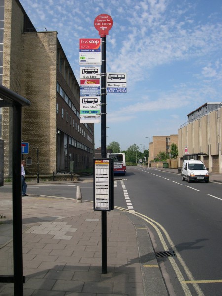
And that’s where I come into the story, because I arrived at Surrey County Council in 2002, shortly after it had taken over responsibility for the bus stop poles, flags and timetable cases from local bus operators, and I worked in the passenger transport department that now looked after them. There were lots of advantages for us. For a start in Surrey’s big towns, or along Quality Bus Partnership corridors, where there was the opportunity to promote modal shift from car to bus (oh, the heady days of the early 2000s…), we could upgrade all the bits of bus stops at once. You would be surprised what a difference we could make to the profile of local buses with a series of bus stops featuring raised kerbs, a smart new aluminium pole, an uncluttered bus stop flag with key bus information including route numbers and the ‘towards’ direction of travel, and – revolution! – a waterproof timetable case. We replaced shattered concrete poles and rusty metal ones where decades of dog wee had corroded the base of the pole. We retrieved bus flags hidden in hedges for years, and replaced them with new ones that people could actually see. We knew we’d made an impact because residents used to ring us up to harangue us for installing ‘new’ bus stops outside their houses without consulting them. The Wey Hill bus stop pole/flag/timetable case I showed you earlier in the article is a typical ‘improved’ set of Surrey bus stop kit.
Before you get the idea this was all my doing, I should note that I was actually the department’s rail development officer at the time and this was the result of my colleagues’ efforts. But I did work on the development of Surrey’s ‘interchange’ bus stop flags, which tell you when you’re at the bus stop closest to one of Surrey’s railway stations. It’s not always as easy as you’d expect because some bus route go near to stations without those stations being clearly visible from the bus.
![Interchange bus stop at Horley station, Surrey. Photo by By Arriva436 (Own work) [GFDL or CC BY 3.0], via Wikimedia Commons](https://thebeautyoftransport.com/wp-content/uploads/2016/02/640px-horley_railway_station_bus_stop_a_flag_in_january_2011.jpg?w=600&h=338)
It was in the process of developing these interchange bus stop flags that we came to understand the importance of the TSRGD to our traffic signs colleagues. I don’t know if they kept it on a velvet cushion in a glass case in a specially designated part of their offices, but it certainly felt like it. When we explained our idea for the interchange bus stop flag, they drew a deep breath and very reverently went off to consult the TSRGD, later concluding that they weren’t sure it actually permitted such a sign. This would be bad, they pointed out, because if your traffic sign doesn’t adhere to the standards in the TSRGD it’s not official. And if it’s not official, and it causes damage or injury to someone, then the council would be liable. In other words, as far as I could tell, you could headbutt a traffic sign not specified by the TSRGD and sue for any damage you caused yourself, simply on the basis that it shouldn’t have been there to headbutt in the first place [note however, that I am not a lawyer and The Beauty of Transport should not be relied upon for legal advice]. Anyway, you might find that the sign, although not in the TSRGD, had been given special dispensation for use by the Department for Transport, which is what we had to obtain for the interchange bus stops. It took ages.
It was just about the same time when Surrey County Council got busy improving its stock of bus stops (my only sadness is that the inevitable shortage of money in local government means that it still hasn’t finished replacing all of its several thousand old bus stop poles, flags and timetable cases), that some of the more forward-looking private bus operators in areas where they remained responsible for bus stop infrastructure, realised that bus stop flags could play a part in promoting the overall brand and experience of their operations.
While in Surrey our traffic signs officers encouraged us to stick as closely as possible to the bus stop sign detailed in TSRGD diagram 970, ensuring consistency across the county, once private bus operators realised that bus stop flags could help promote brand identity, they didn’t feel nearly so constrained, and came up with some much more dramatic-looking designs. And actually, the TSRGD gives considerable flexibility in the design of bus stop flags. The notes to diagram 970 allow the use of a typeface other than Transport; omit the bus symbol; use any colours for text and background provided they have sufficient contrast with each other; add additional panels with route numbers, the name of the bus stop, and/or a telephone enquiry number; and finally, have a curved face to the sign.
When, as an aside in our discussions about Surrey’s interchange bus flags, I mentioned to my traffic signs colleagues that in other local authority areas it was bus companies which were putting up bus stop signs, and decorating them however they wanted, I swear they went a weird shade of green and had to go have a lie down. Amongst their concerns were that: (1) traffic signs were being used as advertisements for bus companies, which apparently was frowned upon, if not actually taboo; (2) that private bus companies were using their own staff to maintain traffic signs which ought to be the responsibility of the local transport authority, with who-knows-what insurance and public liability implications; and (3) that there would be no consistency between the bus stop signs, exactly the situation which the TSRGD is designed to prevent. And I sort of see what they meant, particularly regarding the last point. Suppose the major employer on any particular stretch of road had all the speed limit and directional signs produced to feature their own corporate identity and typefaces. It would be chaos, yet that’s more or less what private bus companies get to do with bus stop flags in areas where the local authority doesn’t take responsibility for them.
What I do know is that local authorities are nothing if not risk-averse, and have hot-shot legal people whose job comprises almost entirely the prevention of said local authority doing anything that might expose it to legal action. So whatever the concerns of Surrey’s traffic signs people about other local authority areas, I’m fairly sure the other authorities would have ensured that their local arrangements wouldn’t get them into any trouble. Not to mention this was all a few years ago, and the legal situation might have changed by now. As I said, don’t rely on this blog for legal advice…
Amongst the earliest companies to realise the potential of using the whole of the bus stop flag as part of its branding, rather than just applying a company name/logo sticker in a strip across a conventional flag, was Stagecoach. Stagecoach’s corporate identity was revised in 2000 by London-based transport design agency Best Impressions, and the ‘swooshes’ it featured sat very nicely on a bus stop flag. At first these flags featured a very cute-looking bus pictogram, later ditched in favour of its replacement with the Stagecoach logo.
![Photo by Lydia [CC BY 2.0] via this flickr page](https://thebeautyoftransport.com/wp-content/uploads/2016/02/3044177294_d1bba51fcd_z.jpg?w=450&h=600)
In fact, in terms of what the TSRGD says about what ‘ought’ to be on a bus flag, they’re actually pretty good. Although the flag is in Stagecoach colours, the text contrasts with the background as required. These flags use an alternative to Transport as the typeface (which is OK) and omit the standard bus pictogram (also OK) but I’m not sure the TSRGD says anything about replacing it with a more modern bus pictogram. And the TSRGD certainly doesn’t say anything about including the logos of private companies. Never mind. These flags were so different from the black-on-white conventional bus stop signs that they must have attracted attention from car drivers passing bus stops. That’s got to be a good thing. They were far from Stagecoach’s only essay into bus stop flag design. The company’s premium Gold services also benefit from their own brand identity being extended to bus stops, with these coolly glamorous efforts:
![By Arriva436 (Own work) [CC BY-SA 3.0 or GFDL], via Wikimedia Commons](https://thebeautyoftransport.com/wp-content/uploads/2016/02/640px-farnborough_kingsmead_b_bus_stop_flag.jpg?w=600&h=338)
This is where the more conventional and consistent approach in Surrey might be argued to be less successful, because bus stops served by Stagecoach Gold services in Surrey don’t have these posh flags. Stagecoach also deployed some super coach stop signs (again designed by Best Impressions) for its X5 Cambridge to Oxford coach service, featuring an even more radical departure from the standard bus pictogram, an illustrated X5 coach demonstrating its rapid journey offer:

Southern Vectis changed the entire look of the Isle Of Wight’s road network with its smart new bus stop flags in the late 2000s. These had a very real unifying effect on the island. Its traffic signage is the same as used in the rest of Britain, but these bus stop flags, and the visual identity of the buses which serve them, are something specific to the Isle of Wight. Southern Vectis’s corporate identity was again designed by Best Impressions, and these lovely flags feature route numbers on diamond-shaped (Isle of Wight-shaped) lozenges. The two-tone green of the flags has a layout which evokes the rolling hills of the Isle of Wight. Arguably, they comply with the TSRGD, but look about as far away from diagram 970 as you could imagine. The effect was only spoilt by the fact that these nice new flags were attached to a rather motley selection of old poles.
![Southern Vectis bus stop flag. Photo by Editor5807 (Own work) [Public domain], via Wikimedia Commons](https://thebeautyoftransport.com/wp-content/uploads/2016/02/ryde_west_street_cemetery_bus_stop_flag_in_march_2009.jpg?w=547&h=600)
Meanwhile, the bus stop flags for Southern Vectis’s open top tour routes were gorgeous slices of retro-chic on a sunburst blue background. That was an idea that Best Impressions returned to on the other side of the Solent with its bus stop flags for Wilts & Dorset’s Route 50 Purbeck Breezer, which conjured up the sun, sea and tang of salt in the air to be found on this coastal service:

On the other hand, back with Go-Ahead in Brighton and Hove, the refined bus stop flags are personal favourites. Featuring Best Impression’s take on Brighton & Hove’s long-standing corporate identity and colours, you can read many things into the resultant curves, from the onion domes on top of Brighton’s Royal Pavilion to the crest of a wave on Brighton’s seafront.
![Brighton & Hove bus stop flag. Picture by Daniel Wright [CC BY-NC-ND 2.0] via this flickr page](https://thebeautyoftransport.com/wp-content/uploads/2016/02/brighton-hove-bus-flag-old-steine-stop-d-29-feb-16.jpg?w=399&h=600)
FirstGroup, meanwhile, has until fairly recently seemed somewhat graphically challenged, and not much interested in redesigning bus stop flags in particular. Its short-lived and much lamented Greyhound coach operation had a go:
![Southampton Town Quay bus stop, where a messy arrangement saw a Greyhound flag attached underneath a local bus services flag. Photo By Arriva436 (Own work) [CC BY-SA 3.0 or GFDL], via Wikimedia Commons](https://thebeautyoftransport.com/wp-content/uploads/2016/02/337px-southampton_town_quay_bus_stop_flags.jpg?w=768)
…though I’m quite sure the TSRG has nothing to say about chrome-effect racing dogs on bus stop signs, and the lettering in the dark brown band is incredibly clumsy. FirstGroup’s slightly longer-lived and somewhat less lamented (in areas from which it has vanished) ftr also had a go, but somehow ended up replicating the multi-flag totem pole effect in Swansea with an ftr flag sitting above a regular bus stop flag, which wasn’t very impressive, however futuristic the ftr brand identity was itself.
![By Vouliagmeni (Own work) [CC BY-SA 4.0], via Wikimedia Commons](https://thebeautyoftransport.com/wp-content/uploads/2016/02/ftr_metro_bus_stop_sign.jpg?w=450&h=600)
Recently, following the lead of other groups, FirstGroup has introduced local identities for some of its operations like Buses of Somerset, and the bus stop flags there sport a local brand. I’m sure by this point you’ll be able to work out which design company came up with the design. It’s a corker, a friendly and approachable identity playing on the apple-y joyfulness of one the traditional industries of the local area, cider apple growing.

Best Impressions has most recently been waving its magic wand over Transdev subsidiary Blazefield’s trend-setting Route 36. In January this year, the route had a relaunch with new buses (sporting glass roofs and interiors better than the first class sections of most British trains). The corporate identity Best Impressions came up with is based on a black and red palette and parallelogram shapes, all business-like precision, sophistication and aspiration. It’s the latter especially that informs the bus stop flags along the route where the flags have been cut into parallelogram shapes too, as in the first image at the top of this article.
What has been the public sector response to this outbreak of graphic excitement on bus stop flags over the past couple of decades? Well, not much particularly notable, I’m afraid to say, perhaps because local transport authority traffic signs officers have been keen to cleave as closely as possible to the TSRGD. You might expect the Passenger Transport Executives and their successors to have come up with something interesting, but they have mostly contented themselves with replacing the bus symbol in diagram 970 with their own logo. Merseytravel, the Liverpool PTE, took a particularly clumsy approach by placing its logo either alongside or above (see here) a standard bus pictogram on the upper part of the flag, as did Metro (the West Yorkshire PTE).
Greater Manchester PTE, or more accurately its successor Transport for Greater Manchester, has meanwhile taken bus stop flag design to a whole new level of inscrutability. Not only has it done away with the bus pictogram, but also the words ‘bus stop’.
![A Transport for Greater Manchester bus stop flag (TfGM is the successor to Greater Manchester PTE). I find it particularly intriguing that it doesn't feature the words "bus stop" at all. Photo by By The Laird of Oldham (Flickr: Transport for Greater Manchester bus flag) [CC BY 2.0], via Wikimedia Commons](https://thebeautyoftransport.com/wp-content/uploads/2016/02/transport_for_greater_manchester_bus_flag.jpg?w=450&h=600)
It doesn’t really look like the kind of thing that’s going to attract new users to the local bus network. In a recent issue of Passenger Transport (19 February 2016), passenger watchdog Transport Focus was reported recounting to the UK Bus Summit some research in Milton Keynes showing that, “lots of people didn’t know what a bus stop was and they couldn’t recognise one.” I seriously doubt a cryptic bus stop flag like the TfGM example above is going to do much to help.
On bus flags in its area, West Midlands PTE Centro has replaced the conventional bus pictogram with the logo and typeface of the Network West Midlands brand it has developed. As pieces of design, these flags are nowhere near as eye-catching as those developed by some private sector bus operators. Whatever the other merits of potential bus franchising in city regions, if it ever happens, I think we can conclude it’s unlikely to generate much in the way of visual flair.
![Network West Midlands bus stop and Martineau Place in Bull Street, Birmingham. Photo by Birmingham Retail Quarter [CC BY 2.0] via this flickr page](https://thebeautyoftransport.com/wp-content/uploads/2016/02/5227219099_bb09cc021e_z.jpg?w=600&h=450)
However, there have been one or two beacons of hope. The public sector has been able to come up with something genuinely unusual and attractive when the circumstances have been right.
But before we get to that, let’s take a brief diversion into the third sector, simply because I can’t work out where else to put this one. The National Trust, a heritage and landscape charity, has extensive land holdings some of which are served by public bus services. Box Hill in Surrey is one such, linked to Epsom and Dorking by the 516 bus. Because National Trust land is privately owned, the roads are not part of the public highway, and the TSRGD does not apply. That’s how the National Trust gets to install these beauties, wooden flagged wonders with engraved lettering and National Trust logos, which are thoroughly appropriate for the areas of natural beauty in which they are situated. With their rough finishes, they look almost as if they have grown out of the ground:
![National Trust bus stop pole and flag at Box Hill, Surrey. Photo by Arriva436 (Own work) [CC BY-SA 3.0 or GFDL], via Wikimedia Commons](https://thebeautyoftransport.com/wp-content/uploads/2016/03/640px-box_hill_national_trust_visitor_centre_bus_stop_3.jpg?w=600&h=338)
But back to the public sector, and two of its better efforts. Hampshire County Council specified a very smart brand, developed by local design agency The Escape (see here), for its Eclipse busway service which runs between Gosport and Fareham. That identity included the bus stop flags. They work as part of a purple and gold-based visual identity, which plays on Portsmouth’s star-and-crescent from its coat of arms, to create an image of something high quality, which challenges public perceptions of what bus travel is.
![Wych Lane bus stop. Photo by Spsmiler (Own work) [CC0], via Wikimedia Commons](https://thebeautyoftransport.com/wp-content/uploads/2016/02/eclipsebrt-atwychlanebusstop-p1290242.jpg?w=600&h=450)
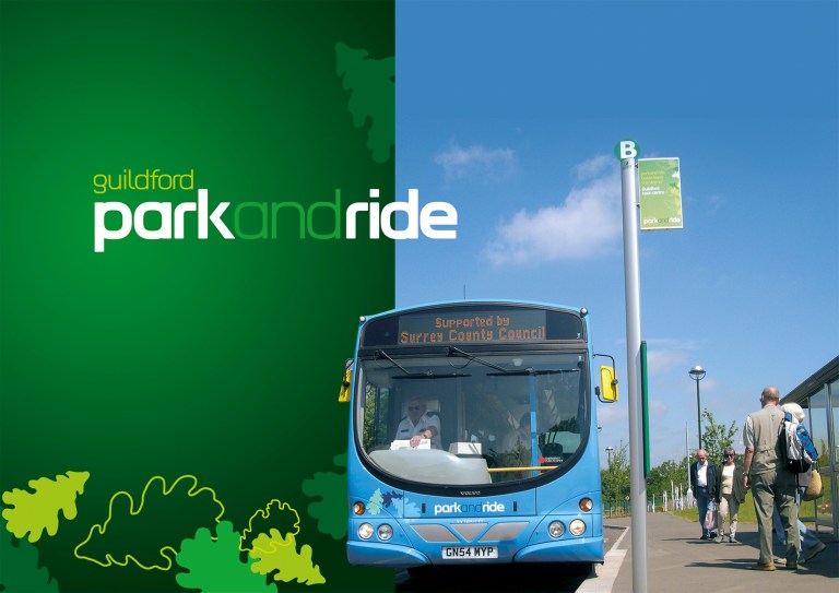
And back at Surrey County Council, we might have been tightly constrained on the design of our bus stop flags on the public highway, but we didn’t have to behave nearly so well off it. When the Guildford Park and Ride network was relaunched in 2004, my colleagues turned to – you’ve guessed it – Best Impressions, which designed a typically fabulous brand identity based on the idea of leafy Surrey; it’s going strong to this day, currently in a pink colourway. The good news was that the car parks at the outer ends of the various routes were on private land, so we got Best Impressions to draw us up a matching leaf-design bus stop flag. It’s my favourite bus stop flag of them all, and here it is working as part of the overall branding:

So, there you are. Bus stop flags are the traffic sign that got away. They show the most local variation of any traffic sign in the country, even though the TSRGD is designed precisely to avoid such a thing happening. They can also be tiny palettes for talented designers to utilise their skills upon, brightening up our streets and helping promote the image of bus travel in a small but significant way.
Further reading
The following companies (probably not an exhaustive list, drop me a line if I’ve missed you off) supply bus stop furniture – poles, timetable cases, flags and the like:
Externiture, see here
Halsall Signs, see here
Trueform, see here
And in terms of flag design, Best Impressions. Its website is here, and I’m very grateful to the company for supplying so many of the images used above.

Lovely post and indeed blog. Only one, terribly minor correction: Trentbarton isn’t part of the Go-Ahead Group as inferred. It’s a part of the Wellglade group.
See, I actually knew that. I’ve written about trentbarton many times. What was I thinking? The lesson there is not to write a giant article late at night. Article now corrected, and thanks for keeping me on the straight and narrow. I’m off to find a proofreader now…
I had never thought about bus stop flags before, and so I have spent much of the last week keeping an eye open for them. As a result, I have further information and speculation about the situation in Greater Manchester.
The image of the TFGM flag you have in the blog only shows what it looks like on one side — the ‘wrong’ one — that is, the side shown to drivers looking at flags on the other side of the road they are driving on. On the ‘right’ side, the flag displays the regulation ‘bus stop’ image and text in addition to a small version of the TFGM logo.
At a guess, this may be a pedantic resolution to the argument between the traffic signs officials and those at TFGM responsible for branding. I think it can be argued that the purpose of the sign is to inform traffic (all road-users, not just bus drivers), so the regulations need to be adhered to so that the information can be properly conveyed. However, traffic has no interest in the signs carrying information for the benefit of oncoming vehicles, so the regulations may not apply to the reverse of the sign. As a consequence, the brand can prevail on that side of the flag, but not on the one facing the flow of traffic.
(I am no more a lawyer than you are, and also completely inexperienced in matters of transport design and policy, so this may be complete balderdash.)
That’s a really interesting point about the “reverse” of bus flags. It’s yet another thing that sets them apart from most other traffic signs, which don’t need reverse sides at all. A lot depends on whether one thinks bus flags are entirely for the benefit of road users (car drivers, to warn them not to park at bus stops; bus drivers, to show the, where the bus stop is) or whether they are also for the benefit of pedestrians, to show them where to catch the bus. If it’s the latter, then both sides of the flag should be used to alert them to the existence of a bus stop, and by extension to a local bus network. The TfGM flag seems to me to manifestly waste the opportunity to promote the local bus network, but I can see that others might disagree with my suggestion that bus stop flags should be used in that way.
Interesting post.
Instinctively, I prefer the idea of local authorities providing the flags, for consistency and to avoid the messiness you get in areas like Bournemouth where multiple operators result in two or even three flags at each stop.
However, the Manchester and Birmingham PTE examples (and others like this ugly thing from Poole: https://www.flickr.com/photos/alexmartin81/16487532004/ ) do not inspire confidence!
On a related note, I see Centro tendered for a new brand for the West Midlands rail network last year. Is it too much to hope that the Network West Midlands branding might be on the wane? (Source: https://centro.bravosolution.co.uk/esop/toolkit/opportunity/opportunityDetail.do?opportunityId=26394&oppList=PAST )
Sadly, I suspect the Manchester ‘M’ is probably more politcally driven, the idea of developing a similar iconic identity as the TfL Roundall. It’s yet another a rather crude (and slightly arrogant) attempt at elevating the status of the city above it’s contempories and as the UK’s second capital without too much consideration of useability for the end user.
Whilst the ‘M’ logo is certainly well known, it will never ever have the same international recognition as the TfL roundall. The TfL roundall is always very well executed and nowadays goes well beyond a simple ‘logo device’. How else do designers signify a tube station on a map, for example?
However, this isn’t the worse example on here. (What is going on with that Goldline flag, who on earth could even read that?!) Like others, I much prefer a clean neat local authority example than some overblown design over function effort like so many of the examples shown. After all, any design that fails on it’s primary purpose is very bad design!