Either from home, or from abroad, national government contributions to the appearance of the British rail network have generally been a bit hit and miss, with the emphasis strongly towards miss, as we explored a few weeks ago. But the contribution of local government, through Britain’s seven Passenger Transport Executives (PTEs), has had a better record. If there have been some ‘misses’ there too, at least they have been colourful attempts at something interesting, rather than grey or white trains of no aesthetic merit whatsoever.
In fact, you can trace the changing fortunes of the PTEs through their influence on the visual appearance of the railway networks in their areas.
The PTEs were the invention of transport minister Barbara Castle (one of the good ones) and legislated for in the 1968 Transport Act. They were an attempt to tackle chronic problems of transport planning in Britain’s biggest cities outside London (which already had London Transport as its transport planning and delivery organisation). Castle’s original vision had been for “all transport” authorities also including highways functions, but that proved too big a step, and there was anyway an urgent need to sort out the non-integration of public transport in these cities.
On the political side, Passenger Transport Authorities (PTAs) would set transport policy and be populated by elected local councillors. The PTAs powers would include the ability to take over the municipal (council-owned) bus operators within their areas, make agreements with or take over other bus operators, decide on train service levels and create integrated ticketing schemes. The actual day-to-day delivery of the policies would be undertaken by the PTEs, staffed by local government civil servants. Decades late, arguably, Britain’s biggest cities would get public transport planning organisations to match London’s. In fact, thanks to their ability to fund and specify train services through Section 20 of the Act, they were even more omnicompetent than London Transport, which had no such powers over British Rail’s suburban services.
The first four PTAs (and their respective PTEs) opened for business in 1969 and 1970. They covered Merseyside, Tyneside, the West Midlands, and South East Lancashire and North East Cheshire: SELNEC (or Greater Manchester really, and a more 1960s technocratic name it would be hard to imagine). Initially, the focus of work was biased towards the PTE area bus businesses, where there was a lot of work to do to bring together many disparate bus operators into a single bus network. In terms of coverage and passenger journeys, the bus networks were dominant too.
On the railway side of the equation, Section 20 agreements allowed the PTEs to tell British Rail what services to run while the PTAs/PTEs thought about the long-term future development of their local railway networks. It was this process that led to Liverpool’s “Loop and Link” underground train tunnels, and the conversion of Newcastle’s diabolically run-down suburban rail network into the Tyne and Wear Metro, at which point Tyneside PTE hit some (perhaps unsurprising) friction with BR. “Get your tanks off our railway,” would, I imagine, have been about the size of it. It was sorted out in the end, with the PTE rather than BR ending up responsible for operations on the new Metro network.
Greater Glasgow got a PTA and PTE in 1973 and West Yorkshire and South Yorkshire soon followed. Alongside a local government reshuffle in 1974, some changes were made to the names and boundaries of the PTEs, so SELNEC became Greater Manchester PTE (GMPTE), Tyneside became Tyne and Wear, and over the following years Greater Glasgow’s boundaries were modified and it was renamed Strathclyde PTE.
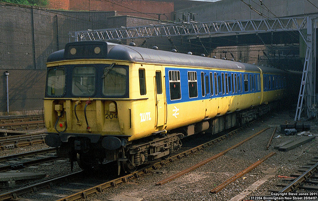
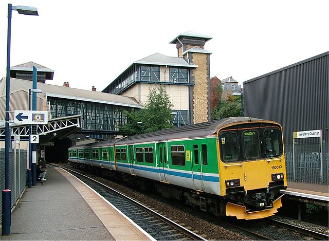
The first major visual recognition of PTEs’ contribution to train services in their areas was by the application in the 1970s of logos or wordmarks to trains running in the otherwise standard rail blue corporate identity of British Rail. Here’s a Merseyrail train, that being the operating name used by Merseyside PTE for its train services.
![Merseyside PTE logo on a preserved Merseyside PTE bus. Photo by Pimlico Badger (Merseyside 1054 FKF933G) [CC BY-SA 2.0], via Wikimedia Commons](https://thebeautyoftransport.com/wp-content/uploads/2017/01/640px-merseyside_pte_bus_1054_fkf_933g_2009_merseyside_transport_trust_running_day.jpg?w=768)
In the 1980s, British Rail’s Rail Blue corporate identity unwound itself, having achieved its aim of presenting a unified and forward-looking company. Its various component sectors (InterCity, Railfreight, London & South East and Provincial, the operator of the PTE services) began to develop their own individual corporate identities as British Rail increasingly ceded decision-making to its sectors. It was at this stage that the PTEs began to make a more significant difference to the visual identities of the rail networks in their areas.
It was obviously to the PTEs’ advantage to show their role in specifying and funding train services. If you’re a public sector organisation, it’s nice if you can show your local residents and passengers where their tax pounds are going, and that’s a lot easier if your trains aren’t lost amongst the standard blue/grey of British Rail. Given the relaxing of corporate identity rules, and Provincial’s desire to keep up good relations with the PTEs (public sector bodies always love it if another public sector body chips in to the costs of something, trust me), individual visual identities for trains operating PTE services, and stations in the PTE areas, was an obvious way forward.
Perhaps unsurprisingly, the colour schemes initially chosen by the PTEs generally reflected to a greater or lesser degree those of their bus companies, and which themselves were often (though not always) based on one of the corporation bus companies the PTEs had taken over and which formed the core of their bus operations. As for why those were the colours that were used on the pre-PTE buses, I suspect the reasons are generally lost in the mists of time.
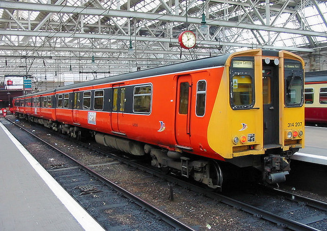
Stratchlyde PTE was the first to see its trains painted in a PTE colour scheme. It wasn’t the first time that Glasgow’s trains had gained a unique identity. In the 1960s its electric suburban services gained a Caledonian Blue colour scheme and a unique logo. In 1983 its PTE-supported trains started to appear in an bold orange and black colour scheme. Orange has long been a Glasgow public transport colour, appearing on the city’s trams, buses and the ‘Clockwork Orange’ underground system. It’s a problematic colour for some parts of the city’s population though, and for diplomatic reasons it soon (despite remaining exactly the same) became known as Strathclyde red; shades of Stroudley’s Improved Engine Green.
The logo applied at the time was a masterpiece of 1980s design, all angular and very literal, viz:
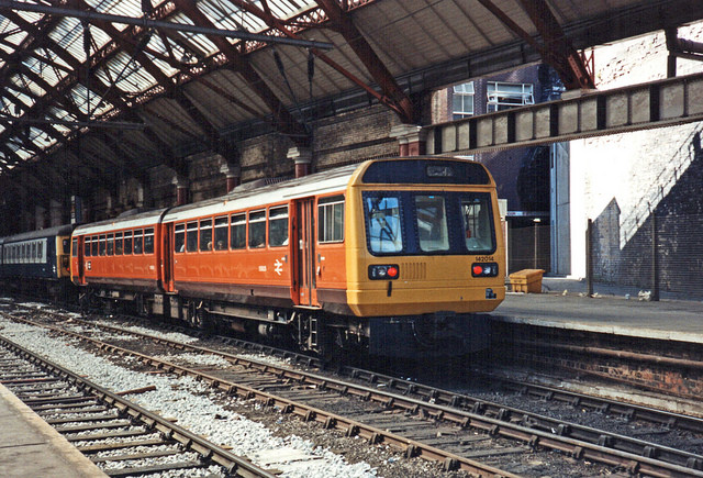
GMPTE’s trains started appearing in brown and orange from 1984, again matching the colour of its buses, a colour scheme SELNEC had chosen as a break with the past of any of its constituent predecessor bus companies. While it smartened up the appearance of its ageing slam door trains no end, when applied to the Pacer railbuses it had the unfortunate effect of making them look even more like buses than they did before, and it would eventually be replaced:
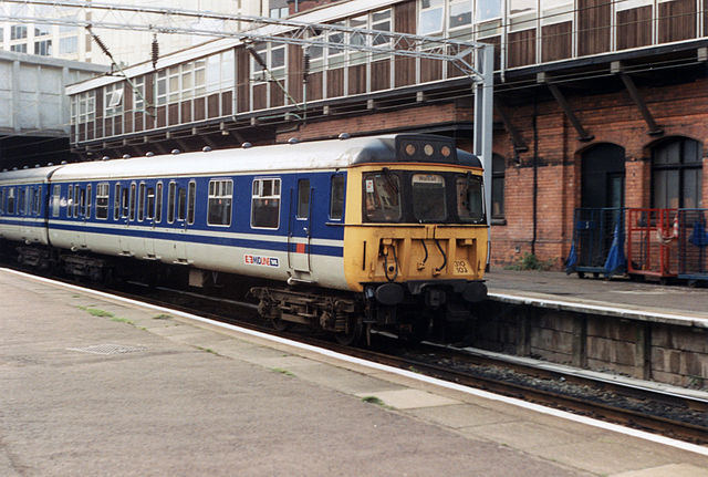
West Midlands PTE (WMPTE) tried out several new colour schemes with Provincial and never seemed to settle on any of them. A blue and yellow train appeared in 1985, with an appearance similar to trains operated by Netherlands state railway operator NS, though the colours didn’t look quite right on an ageing British slam door train. Next was a three-tone blue colour scheme with “Midline” branding, which perhaps drew some inspiration from the colours used on WMPTEs bus fleet, blue and ivory. A third attempt resulted in a two-tone blue colour scheme with red highlights on a base of light grey; colours which ended up looking very similar to the revised visual identity of West Midlands Travel, as WMPTE’s bus operation were known once it had been turned into an arm’s-length company and was (ironically) no longer under the PTE’s direct control.
At this stage, Tyne and Wear PTE and Merseyside PTE were content to leave their trains in BR blue and grey. Tyne and Wear, having overseen the conversion of much of its suburban railway lines into the Tyne and Wear Metro network, had relatively few supported train services anyway.
South Yorkshire PTE has always been the PTE least interested in its railways, with its passenger transport market heavily weighted towards its bus services. It concentrated on bus initiatives, like freezing bus fares year on year until they were eventually expected to cost more to collect than the fare itself, at which point bus travel would have become free (a fuller version of the story can be found here). It also trialled a modern trolleybus, though this experiment didn’t make it into public service; trolleybuses would also prove unsuccessful for a different PTE years later. A single train was repainted into a brown and cream colour scheme to match SYPTE’s bus colours in 1985. It looked terrible, like an incompetent knock-off of a Great Western Railway carriage colour scheme. What? You want to see it anyway? Oh, go on then:
That was the first and last example of any significant SYPTE influence on the way trains looked. SYPTE’s blue and yellow T logo (why a “T”?) found its way onto stations (see here), but otherwise SYPTE has had little impact on the appearance of its railway network.
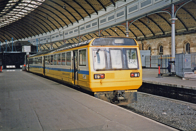
Just up the road, as it were, West Yorkshire PTE was a lot more active in its promotion of the local rail network, through the “Metro” brand it developed. It’s not perhaps the most imaginative of brand names (the state sector doesn’t do out-of-the-box thinking terribly well) and a bus/rail operation isn’t what most people think of when they hear the word Metro, but it has stuck firmly. When the new Class 141 railbuses were introduced in 1984 (the first production fleet of the widely disliked Pacer trains) to operate Metro services, they arrived in white and green, a colour scheme based on the West Yorkshire PTE bus fleet livery.
They suffered from the problem all white trains do unless there is a rigorous cleaning regime (not one of Provincial’s strengths at the time) which was that they dirtied quickly. White and green clearly wasn’t practical, and wouldn’t be repeated. Change was coming to the PTEs anyway, which would force the issue of colours based on their existing bus operations.
I think it’s fair to say that PTEs fit more into 1960/70s Labour Party views of the world in general, and transport planning in particular, than they fit into Conservative Party outlooks. They were a bit public sector top-down planning for free-market Conservative governments elected from 1979 onwards. The Conservative government’s Transport Act (1983) gave the transport secretary powers to lay down the maximum amount of money PTAs could spend to subsidise public transport in their areas. This was either a sensible restriction to avoid tax-payers’ cash being spent to keep fares ridiculously low and continue heavily loss-making services, or an attempt to curtail socially useful alternatives to private car use, depending on your point of view. No more SYPTE-style ever-declining bus fares then.
This was swiftly followed by transport secretary Nicholas Ridley (not one of the good ones) deciding to deregulate the bus industry outside London, which took place in 1986. This move was to prove disastrous for the ability of PTEs to plan integrated public transport networks in their cities and the legacy of that decision is still with us today. It’s why so many of the PTEs today are desperate to re-regulate, or franchise, the commercial bus networks in their areas. And, as they’re often heard to point out, if it’s good enough for London…
Bus deregulation saw PTE bus operations vested in arm’s-length companies, over which the PTEs had no direct ability to dictate routes, frequencies and fares. These arms-length operations were then privatised over the following years. The new owners had their own ideas about corporate identity and colour schemes. The PTEs still played a crucial role in providing comprehensive timetables, publicity, information, inter-available ticketing products, and in funding socially necessary bus services (to be operated by the private sector rather than directly by PTEs though). Somehow, all the PTEs managed to retain area-wide multi-operator bus ticketing, albeit with some hiccups along the way, and usually a version which included local train travel too. Now, however, the bus operators were free to offer their own ‘rover’-type tickets, undercutting the price of the PTE-led product, and available for use only on their own buses.
The PTEs also retained control of on-street bus infrastructure: bus shelters and bus stops. That meant that comprehensive bus timetable information was provided at bus stops, which was fortunate for PTE-area passengers, to judge by the many examples of seemingly abandoned bus stops in areas outside PTEs or London (more on that unfortunate time in this article).
Perhaps unsurprisingly then, the focus of most PTEs (apart, seemingly, from South Yorkshire) increasingly began to shift to the improvements they could make to their local rail networks. Working with the private sector is fraught with tension for local authorities, as investment timescales and social goals aren’t always well aligned, and relations between PTEs and the private sector bus companies could get rather fraught. Working on rail network improvements with Provincial, still a part of the state-owned British Rail, would have been much more comprehensible for the PTEs.
The chaos of the early deregulated bus industry caused a fall in patronage (that’s a generalisation, but bear with me) but as PTEs got involved in improving railway stations, promoting the local rail network, working with Provincial to refurbish local trains, and reopening stations and sometimes even whole railway lines, patronage on their local rail networks shot up. Don’t forget that this was against a background of governmental expectation that the railways were in long-term, inevitable decline.
You might also argue that this loss of bus operations pushed several of the PTEs towards the development of light rail networks, emulating the earlier success of Tyne and Wear PTE’s Metro. These would be urban transport modes which would be under the control of the PTEs themselves, unlike the now-privatised buses. Rail – both heavy and light – was clearly now the main attraction for the PTEs.
This change in emphasis from bus to rail could also be seen in changing visual identities at several of the PTEs. Metro (WYPTE) ditched its green and white colour scheme in 1988. What, after all, was the point in painting trains to match buses it no longer operated, and which were now being repainted into the colours of new private sector owners? WYPTE switched to maroon and ivory, a colour combination it had used earlier on its MetroCoach road coach services, an operation a bit more like a train service. A circular logo formed of repeated W and Y letters (in the shape and colour of the White Rose of Yorkshire; or am I being too fanciful?), used on the green and white trains, was replaced a white “M” in a red circle. As with GMPTE’s “M” this has ended up having greater longevity than that of WYPTE’s various colour schemes and is still in use today. Solid, if somewhat unimaginative, it has become ingrained in the West Yorkshire public transport scene, on timetables, at bus stops and at railway stations. It suits the down to earth psyche of the local area.
Metro became one of the most pro-active of the PTEs regarding its local rail network. PTEs were required to fund the provision of extra trains if needed to meet their desired service frequencies, and usually did this by allowing BR to procure the trains, and then paying BR back through the yearly Section 20 funding agreement. Thanks to an unusual financial situation at the PTE, Metro found itself with some capital funds available. Instead of funding BR’s purchase of new trains, it went out and bought its own trains to meet rising passenger demand in its operational area, the only PTE to do so. While the maroon and ivory livery layout now looks rather 1980s public sector, it was an overlooked classic of its time. A few years later, British Rail’s express Class 158 trains were delivered in a fussy livery comprising rather murky colours, but a small fleet of West Yorkshire PTE-owned Class 158s looked absolutely resplendent in maroon and ivory, as did other trains painted similarly.
In the late 1980s, BR’s Provincial sector finally realised that ‘Provincial’ was a somewhat low-rent name. It had apparently come from a column in British Rail’s accounts years earlier and never changed. Provincial decided to match the increasingly independent InterCity, Network SouthEast and Railfreight sectors by introducing a revised corporate identity. It started appearing in 1990/91, along with a new name, ‘Regional Railways’. Design agency Lloyd Northover created a corporate identity which would give some coherence to the operation. The colour palette used was similar to the existing blues of Provincial, but shifted towards slightly cooler shades, which produced a very no-nonsense look. A new serif typeface – Joanna – was introduced for the Regional Railways logotype and promotional literature, backed up by Helvetica for information. Joanna looked very 1990s, and very different to the Rail Alphabet that Provincial had used (and would continue to use on signage), but it was in fact much older. It was designed by Eric Gill in the 1930s, and so came from the same hand that had gifted British Railways Gill Sans, the closest it came to a corporate typeface in its early days. There was even a brand new moquette, Spot, for train seating.
![Penzance station sign. Photo by Paul Miller [Attribution], via Wikimedia Commons](https://thebeautyoftransport.com/wp-content/uploads/2017/01/600px-sign_at_penzance_railway_station.jpg?w=768)
The most notable graphical element was the “linking device” or “fleximark”, a set of blue and white horizontal stripes that appeared all over Regional Railways: at the end of trains, on literature, on signage and so on. It was intended to “stamp itself indelibly on the mind of the customer” (see here), a slightly regrettable statement that more than one commentator has since suggested tended towards the brainwashing.
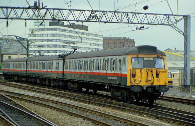
But for all that, the new Regional Railways visual identity was very smart, and succeeded in freshening up the look of British Rail’s ‘other’ train services in a sector where there wasn’t much money about for such initiatives. Even very old trains looked fairly respectable in Regional Railways colours.
![Regional Railways Class 117 at Birmingham New Street in 1991, looking rather smart in its new colours. Photo by Daniel Wright [CC BY-NC-ND 2.0] via this flickr page](https://thebeautyoftransport.com/wp-content/uploads/2017/01/11071802365_88ea22a949_z.jpg?w=768)
The only disappointment in the process was the murky colour scheme applied to the express Class 158 trains described earlier, which were designed just before the Regional Railways corporate identity had been developed. Regional Railways’ services included, of course, those specified by the PTEs, and an attempt was made to create new visual identities for trains running those PTE services. The plan was to match the layout of the Regional Railways livery, minus the linking device which was exclusive to Regional Railways, but with different colours for each PTE (as explained here).
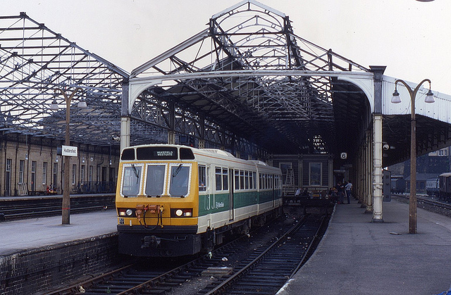
At precisely the same time as Regional Railways was rebranding itself, so was WMPTE. It invented a suitably Midlands-sounding replacement name, “Centro”, which came with a fabulous new logo, first seen in 1990 and which took the place of the clunky WM logo you can see on the yellow train at the beginning of this article. Though its crossed green and blue bus and train wheels looked a little like a school textbook diagram of an atom, I thought it was great.
![]()
Although the PTEs had lost direct responsibility for buses in their areas, that’s not to say the PTEs were uninterested in the sector. As well as publishing comprehensive timetable information covering all the different bus operators, and looking after bus stops, they also led on various other bus initiatives. Early experiments with guided busways and real-time information systems were just two innovations that the PTEs can take a large share of the credit for. And were it not for the PTEs, there would be many fewer proper bus stations in Britain’s biggest cities.
But there was little sense in the PTEs continuing to use bus colours as the visual identity for trains they sponsored, as Centro demonstrated. Greater Manchester PTE changed in 1992 from its bus-based orange and brown to an extremely smart colour scheme of dark grey, light grey and red which in terms of layout again matched that of Regional Railways. The groovy M logo stayed, of course.
Metro (WYPTE) on the other hand, presented a diplomatic problem for Regional Railways in its quest to have PTE liveries with matching layouts to its own. Not only did Metro make serious financial contributions to its local railway, but it owned a good number of trains outright, so it was in a position to make the final decision on what colour they should be. It was always unlikely to change the way its trains looked just so they matched the new Regional Railways layout. And indeed, Metro’s existing maroon and ivory colour scheme stayed the same until privatisation.
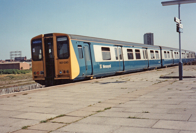
Merseyside PTE was rather late to the game, but in the early 1990s eventually settled on a mainly yellow colour scheme for trains on the Merseyrail network, with white around the windows, and grey and black stripes under the white area. It’s not entirely clear why the colours were chosen. I like to think they pay homage to the song “Yellow Submarine” by Merseyside’s favourite sons, The Beatles. Perhaps more pertinently, there was a distinct resemblance to the bus colours of Wallasey Corporation, one of the constituent companies taken over by Merseyside PTE at its formation. In any case, the layout of the new Merseyrail colours, as per Regional Railways’ plans, matched that of the Regional Railways livery.
Merseyrail trains also started wearing a new M-in-a-circle logo at this point, not to be confused with the M-in-a-circle logo of WYPTE’s Metro, nor the M-not-in-a-circle of GMPTE (I did warn you about the limits of the public sector’s imagination). The M on Merseyrail was that of Merseytravel, as Merseyside PTE had renamed itself, and was a yellow M in a grey circle. It has lasted until the present day. No more Merseyside Vortex, sadly…
![Merseytravel's logo, seen here on a sign at Birkenhead Park station. Photo by Redvers at English Wikipedia [CC BY 3.0], via Wikimedia Commons](https://thebeautyoftransport.com/wp-content/uploads/2017/01/640px-birkenhead_park_station_sign.jpg?w=768)
Strathclyde PTE, or SPT as it was calling itself by that point, had the largest rail network of any of the PTEs. The organisational heft this gave SPT meant that, like Metro (WYPTE), it was much less amenable to changing its on-train corporate colours to match the livery layout of Regional Railways. It stuck with its orange and black colours until the time of rail privatisation. And that’s where we’ll leave it for this time, I think, if only because the colour scheme SPT came up with next was one of the more extraordinary ideas to grace the modern railway, and will make a good start to the next article in this series.
Bibliography and Further Reading
Boocock, Colin (2001): Railway Liveries Privatisation 1995-2000. Ian Allen: Shepperton, Surrey
Jackson, Tanya (2013): British Rail: The Nation’s Railway. The History Press: Stroud, Gloucestershire
Lawrence, David (2016): British Rail Designed 1948-97. Ian Allan: Addlestone, Surrey
Pettit, Gordon and Comfort, Nicholas (2015): The Regional Railways Story. Oxford Publishing Company: Addlestone, Surrey
A history of the first 25 years of the PTEs via the Urban Transport Group, here
…and anything linked to in the text above.
Enjoyed this article?
It’s one of a series looking at the way that the changing appearance of Britain’s railways illustrates their history. Here are the others:
- Lions and Wheels (British Railways’ lion emblems, 1949-1964)
- The Full XP (British Railways’ Corporate Identity 1964-1986, part 1)
- The Decline and Fall of the Rail Blue Empire (British Railways’ corporate identity 1964-1986, part 2)
- Three Shades of Grey (Railfreight 1987 corporate identity, Roundel Design Group, UK)
- The Rolling Art Galleries of Network SouthEast (Edward Pond murals and NSE route badges)
- The Train on Kaleidoscope Lines (British Passenger Railway Post-Privatisation Visual Identities)
- Along the Line, Blue and Gold (GNER’s corporate visual identity, Vignelli Associates, 1997)
- Papering Over the Cracks (Railtrack’s Corporate Graphic Design and Annual Reports, UK)
- They Used to Shout our Name, Now they Whisper it (Railtrack’s Corporate Graphic Design and Annual Reports, UK, part 2)
- The Dead Hand of State Design (State-Sponsored Visual Identities on Britain’s Railway, 2000-)

%2C_2009_Merseyside_Transport_Trust_running_day.jpg)
.jpg)
I remember telling a rather naive London friend that SELNEC was the name of a lost Saxon Kingdom in the Greater Manchester area. I think she believed me.
Reminded me of the WMPTE mascot “Wumpty” which I’d entirely forgotten about until now…
The very latest incarnation of the GMPTE (now “Transport for Greater Manchester”[1]) logo has finally lost the serifs. It still is the longest lived of all the PTE logos though.
I don’t think the linked-to photo of the bus in SYPTE livery is actually such, rather it appears to be painted in one of the previous operators’ “heritage” liveries (the heavily-serifed fleet numbers are the giveaway – no self-respecting PTE would be seen using anything other than sans-serifed numbers!). The actual SYPTE was very similar to the one-off train livery you depict, three brown bands against cream.
[1] Why does Greater Manchester always ape Greater London? Not long before Thatcher abolished it, Greater Manchester Metropolitan County Council adopted an identity that was a direct copy of the GLC’s, Their logo was “GMC” (“Greater Manchester Council”) in the same typeface as the GLC’s “GLC” logo with the slogan “Working for Greater Manchester” (vs “Working for London”) below.
Will pick up the newer TfGM logo in the next article in the series. Thanks for the info on SYPTE bus – will look into it and find suitable alternative so the link should eventually point somewhere more relevant. Not really my area of expertise.
I always throught early Centro green was one of the best liveries ever applied to a train. Really eye-catching the first time I ever saw it.
Re-read this fantastic article after reading your most recent article about GBR. Absolutely fascinating, thank you!