If you want my nomination for Britain’s most literate public transport network branding, I’d put forward Tyne and Wear’s without hesitation. Eschewing the pictures, pictograms, graphics and icons relied upon by many other public transport networks, Tyne and Wear’s instead puts typography at its heart. But if your typeface was distinctively your own, and had been designed by one of the most talented transport information designers of the 20th Century, then you would, wouldn’t you?
Like all the best transport network visual identities, it has become integral to the entire look and feel of the Tyne and Wear area. It belongs to Nexus, the transport planning arm of the North East Combined Authority. It’s taken quite a while to get the visual identity to the place it now occupies, and the process began with the opening of the Tyne and Wear Metro in 1980. But the story of its typeface starts nearly a decade earlier. In France.
In 1971, the French new town of St Quentin-en-Yvelines called on the considerable talents of Jock Kinneir and Margaret Calvert to advise on communication. You’ll recall Kinneir and Calvert; they have an exalted place in British transport design. They designed the standard British road signs still in use to this day along with the typeface (Transport) used on them, as well as British Rail’s Rail Alphabet typeface and signage for British Airports Authority. That didn’t cut la moutarde with St Quentin-en-Yvelines though. The town planners there rejected Kinneir and Calvert’s proposed typeface for the new town as being “too English”. I’m not quite sure what they were expecting, having employed two English designers. But France’s loss turned out to be England’s gain, and the typeface finally found a home nine years later when it was used for the station signage on the Tyne and Wear Metro, a light rail network developed by Nexus’s predecessor, Tyneside (later Tyne and Wear) PTE.
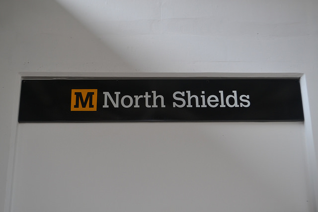
As far as I can tell, the typeface didn’t originally have a formal name. When it was issued in 1981 by Monotype as a commercially available font, it was called simply “Calvert”. Though Calvert herself modestly says she would “never have chosen that name“, it was perhaps long-overdue recognition of her contribution to civic signage and typefaces. The typeface is a slab-serif, which Calvert considered was appropriate to the architectural quality of Newcastle itself. It is Calvert in playful mood, with the serifs sometimes not acting as you’d expect. The outer ones on the A and M are only half serifs, while the C has just the one, rather than two. Calvert’s letterforms are solid without being stolid, and reliable without being dull. In other words, they’re a perfect fit with Newcastle and the wider area served by the Metro.
The Calvert lettering was most dramatically seen on the platforms of the Metro’s various sub-surface and underground city centre stations. The Metro’s new stations (as opposed to the existing ones inherited from a run-down British Rail suburban network) were designed by Faulkner-Brown, Hendy, Watkinson, Stonor, a north-east based architecture practice, now slightly more manageably called FaulknerBrowns. The stations featured inverted trough-shaped ceilings above the platforms to reduce noise, a design feature pioneered in the practice’s own offices. The back wall of the platforms was clad in full height white vitreous enamel panels, decorated with the station name in huge Calvert lettering.
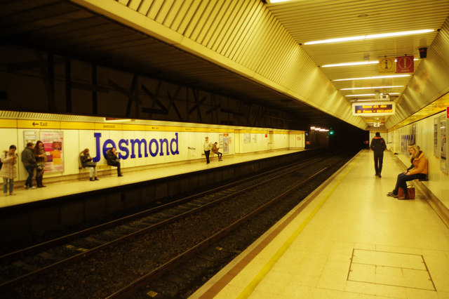
The colour of the lettering varied between stations, blue at Monument and Jesmond, red at Manors and Central, green at Haymarket and Gateshead. Along the top of the panels was a band of yellow panelling with the station name repeated along it in black Calvert lettering. Surface stations had nameplates which were yellow with black Calvert lettering.
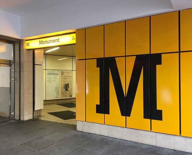
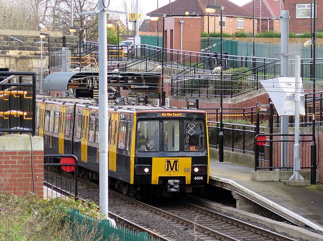
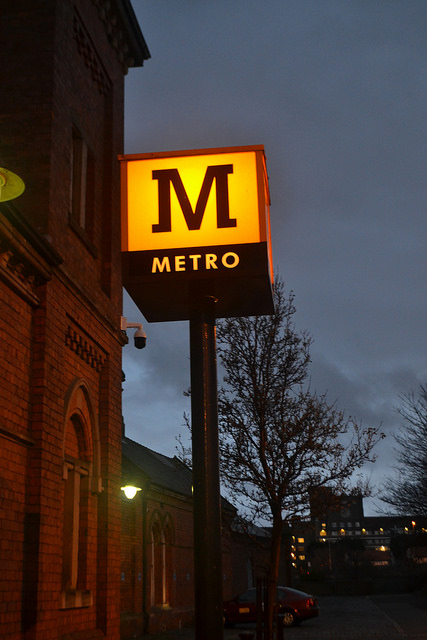
Calvert envisaged extruded yellow ‘M’s being used as the signifiers of Metro station entrances. In the end, that idea wasn’t taken forward, and a black Calvert typeface M on a yellow background would become the Metro’s logo. It’s difficult to work out to what extent this was a deliberate rejection of the common approach of having a graphical logo, not least because the M was not initially widespread on the network. At first, the M didn’t even appear on the Metrocars, which instead carried Tyne and Wear PTE’s double-loop logo. Then Tyne and Wear PTE dropped the double loop and went for a slightly underwhelming “TW” in blue and yellow, which looked more than anything else like the branding you might expect to find on the idents of one of the less well-off ITV companies of the 1980s.
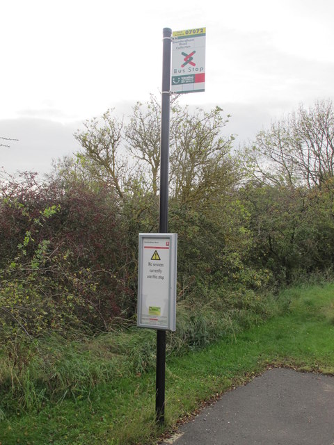
Meanwhile the Metro increasingly adopted the black M as its logo, and it soon came to adorn the front and sides of the Metrocars. The Calvert typeface, and in particular the black M on yellow background, became as locally distinctive markers of the Metro as the London Underground roundel is for Londoners. Outside Metro stations, you’ll now find totems with a yellow box at the top, each vertical side displaying a Calvert “M”. The instant and enduring popularity of the Metro with local people, and visitors, cemented a link between the colour yellow, Calvert lettering, and decent local transport.
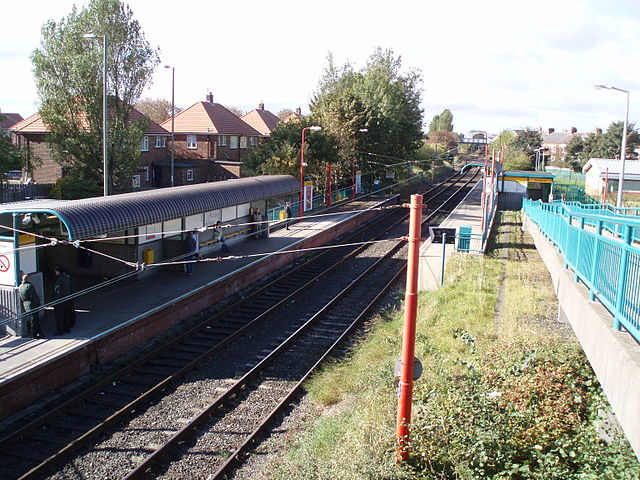
The Metrocars themselves were initially painted yellow with white uppers, matching the colours of Tyne and Wear PTE’s buses. Those buses were lost to the PTE after bus deregulation in 1986. After a few years, somebody somewhere realised that the Metrocars didn’t really need to look like Tyne and Wear PTE buses if the PTE didn’t actually have any, and mostly by accident, the Metro headed off down a path towards a somewhat uncoordinated visual identity. The mid-1990s saw the Metrocars painted either red, blue or green. The stations slowly found themselves being painted all sorts of colours. Shiremoor, for instance, would eventually end up with yellow signs, turquoise platform furniture and red lamp-posts; the latter escapees from Network SouthEast, possibly.
On the technologically trend-setting Sunderland extension (light and heavy rail trains sharing the same tracks), station name signs lost a lot of the impact of the Metro’s visual identity by being finished in white with dark blue/black lettering (I can’t quite tell). Fortunately, the Calvert typeface remained firmly in place on station name signage, and in the form of the yellow/black M on the front and across the side doors of the Metrocars.
Away from the obvious station name signs, the look of informational signage across Metro stations has often been slightly muddled.
Directional signage is usually set in Calvert, but other signs use Calvert or Futura, that perennial transport operator favourite, without much apparent logic as to which typeface is used where. Nexus also uses Futura for the text in its printed publicity for all modes except the Metro, for which Calvert is used throughout (and very nice it looks too).
It was in 1996 when Tyne and Wear PTE officially rebranded itself as Nexus, with a logo formed of interlinked red and green tubes. This new logo was applied to the PTE’s bus stop flags, and although this was still a graphical device it was abstract and didn’t relate directly to buses at all.
It made for an interesting comparison with practice at PTEs like Merseytravel and Metro (West Yorkshire PTE) where the flags carried the logo of the PTE alongside the traditional roadsign bus pictogram. Nexus’s willingness to break away from literal representation of modes of travel on signage would eventually turn out to have prepared the ground for its current public transport branding.
Nexus’s red and green corporate colours landed on its LinkUp demand responsive transit buses. Unfortunately, the LinkUp branding on the buses wasn’t the PTE’s finest hour, designwise, with an awkward muddle of colours, shapes and text.
In fact, what with the multi-coloured Metro and the red/green buses and bus stops, everything had got a bit out of hand, branding-wise.
Happily, if a little belatedly, Nexus realised what it actually had in the Calvert typeface on the Metro; a unique and very distinctive typeface which (thanks to the usefulness and popularity of the Metro) had become the local personifier of public transport. With a bit of thought, it could form the core of something which would represent the wider ambitions of Nexus, and tie together various transport modes into a more unified network.
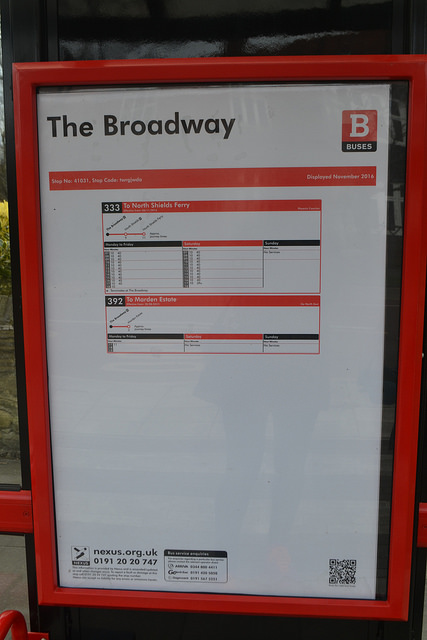
An early move in this direction came in 2006 with the creation of the B-for-buses brandmark (as p92 of this document explains). Matching the layout of the M-for-Metro brandmark, but substituting a Calvert “B” for the “M” and using a red background instead of yellow, it was designed with “the intention of simplifying operator-neutral bus information across Tyne and Wear”, at which it succeeded brilliantly. Not least, I suggest, because it was standing on the shoulders of giants in so doing, by being a direct translation to a different transport mode of a brilliant existing brandmark with a high degree of local comprehension and awareness.
The particular masterstroke of what is now Nexus’s area-wide transport branding was in realising that the Calvert ‘M’ had become such a local signifier of transport that it had become a transferable concept. If residents understood that M meant Metro, they would also understand that other letters could mean other transport modes. That insight laid the ground for what is now an extremely distinctive and unusual approach to denoting various transport modes typographically, instead of graphically. It was a brave move, requiring Nexus to place its faith in local people understanding a transport network represented by letters, not logos. But as I said at the beginning, if you had Calvert to use for the exercise, then you would, wouldn’t you?
But before this Calvert-based visual identity could really be knitted into a coherent whole, there was a tidying up job to do, especially on the Metro.
In 2009, as part of Nexus’s “Metro – All Change” investment programme, Newcastle-based design agency Gardiner Richardson was employed to overhaul the Metro’s branding. As director Darren Richardson told Design Week, “The marque had also been a bit mistreated and it needed some care and attention to create more elegance and sophistication.”
Gardiner Richardson restored the elegance and sophistication it believed had gone missing by stripping back the Metro’s branding to its most basic elements: the colour yellow, and the Calvert typeface. Pretty much everything else on the Metro would be black, white, or grey, allowing the yellow to stand out as the only colour. It sounds drab. It isn’t. It’s quite brilliant. It keeps Calvert’s Calvert typeface front and centre, but presented in a clean and crisp manner that meets modern expectations.
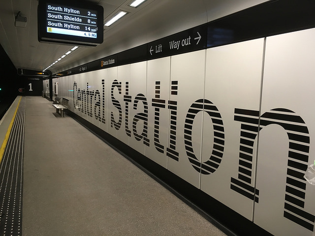
The original colours of the Metro’s underground stations with their yellow panelling strips, and station names in a variety of colours, had begun to look a bit dated; a bit well, 80s. Now that the underground city centre stations have been refurbished, the genius of Gardiner Richardson’s reinterpretation of the Metro visual identity is clear. The laser-like focus on the Metro branding’s core elements is fabulously dramatic. The platforms retain their full height lettering, but now in black stripes on white. The yellow which is the Metro pops out of the background as sparingly-used highlights here and there. At the top and bottom of the wall panels are black strips. The top ones carry directional information, and repeats of the station name, in white Calvert lettering alongside a Metro logo.
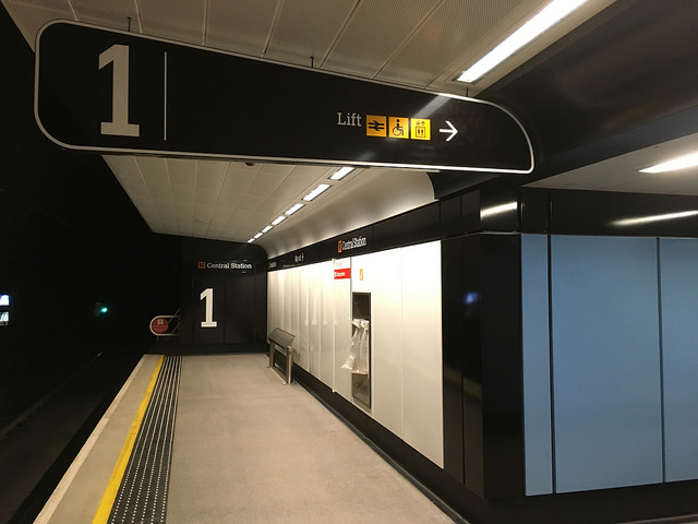
Oversize Calvert numerals at the end of the platforms are a nice touch, and even the tactile paving is black with silver bumps. After the colourful chaos of the early 2000s, the level of refinement in Gardiner Richardson’s revised visual identity is simply astonishing. You just don’t expect to see visual design this good on a British light rail system. The only additional colours to be found are in some decorative surfaces or artworks, and to be honest, I think they end up slightly distracting from the effect.
On the open-air sections of the Metro, the multi-coloured mish-mash of stations like Shiremoor is gradually being swept away. Black is the new order of the day for platform furniture, again with yellow highlights here and there.
Signage is black with white lettering (in Calvert), and the station names are once again given alongside a Metro logo.
The metrocars have also been rebranded inside and out as part of the reinterpreted visual identity, as part of a refurbishment programme. Externally they are dark grey, with black around the windows (front and side), yellow doors and a yellow block on the front, on which the M-for-Metro brandmark is placed.

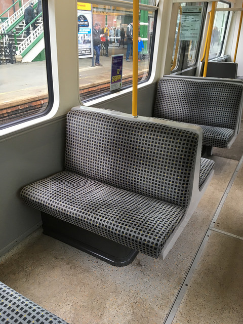
Inside, a smart moquette is mostly grey and black with yellow highlights (replacing the splotchy blue effort seen in this photo). Grey panelling within the vehicles is the unobtrusive background for yellow grabhandles and poles.
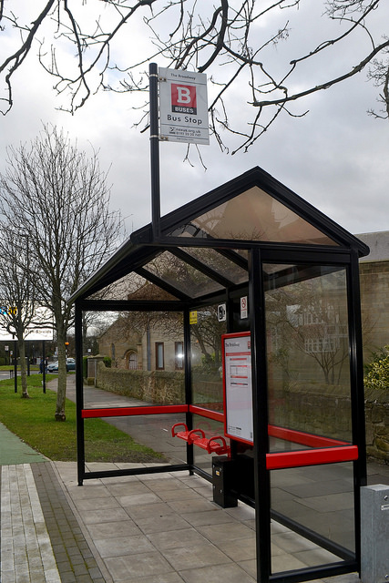
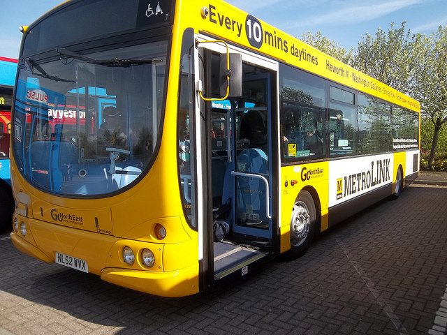
Following its work on the Metro, the next stage of Gardiner Richardson’s work was to apply it consistently across the parts of the bus network for which Nexus is responsible, to match that of the Metro. The bus network in Tyne and Wear is, like in the rest of the country except London, deregulated. As such, private sector operators can paint their buses whatever colour they like. That makes it more difficult to present visually a unified and coordinated bus network. However, where Nexus specifies socially necessary bus routes, it requires operators to paint their buses in the Nexus Buses visual identity. These buses, like the Metrocars, are dark grey with black around the windows. But they have red highlights instead of yellow, because red is the key colour for the bus network, as seen on the B-for-buses brandmark. Just as Metrocars display the M brandmark on the front and sides, so these buses display the B brandmark.
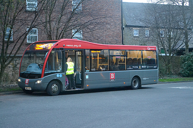
Bus stops are the responsibility of Nexus, not the private sector bus operators. On the bus flags, the Nexus logo has now been demoted to a small black and white version, its place taken by the B brandmark. Where bus shelters are new or refurbished since the Gardiner Richardson makeover, they are black with red highlights, just as the Metro surface stations are black with yellow highlights. Nexus has, however, reserved the use of Calvert lettering for signage to the Metro, and the words on bus stop flags and timetables are set in Futura, Nexus’s other typeface of choice. Frankly, I think that’s a shame and I’d rather have seen Calvert throughout.
The Nexus Buses branding might have been seen even more widely if Nexus had been successful in its attempt to set up an area-wide regulated bus network, with Nexus setting prices, timetables and branding, but an inquiry into the proposal ruled against it in November 2015. Several different variations of the existing Nexus Buses branding were illustrated in an appendix to Nexus’s proposal document (see it here).
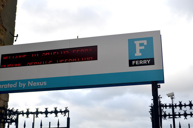
Once the idea of using Calvert initials for transport in Nexus’s area had proved itself on the Metro and bus networks, there was no stopping it. Next up was the Shields Ferry, gaining an F brandmark on a pale blue background. Disappointingly it’s not applied to the ferries themselves – I could really go for grey ferries with a blue F brandmark – but makes appearances on the Shields Ferry signage.
There are other brandmarks too, although they are much rarer. They are found chiefly on Nexus’s website or on printed publicity. An R brandmark with a violet background is used for information about mainline rail services. As Nexus has no direct responsibility for these, it’s unsurprising that it doesn’t appear more widely, although there’s a good argument for it to appear on station signage, just as the logos relating to other PTEs do in their areas. Perhaps the new Northern franchise with greater input from local authorities via Rail North will be an enabler of this in the longer term.
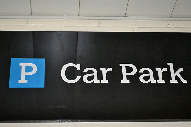
A P brandmark on a dark blue background (a similar shade to the standard roadsign) is used by Nexus on its website to promote Park and Ride opportunities. Unlike many local authorities, Nexus doesn’t operate bus-based dedicated park and ride services, instead preferring to promote use of existing car parks at Metro/bus stations to enable people to access city centre locations via onward public transport. As such it doesn’t appear widely, but can be found on directional signage at Metro stations.
On an orange background, a C brandmark is used for cycles, again seen most often on Nexus’s website (as here) and printed publicity. Nexus has recently been installing smartcard-activated cycle lockers, which would appear to be ideal locations for the installation of physical “C” signage, but as far as I can tell this hasn’t happened so far. The instruction leaflet for the smart cycle lockers carries its C brandmark proudly, however (see it here).
It’s such a cohesive branding exercise, that it passes the test of whether you can imagine how any other mode of transport (any other business, actually) would appear if it was branded by Nexus. If Nexus actually was responsible for specifying local trains on the National Rail network, I know what they would look like inside and out.
Taken as a group, the variously lettered brandmarks are fabulously dramatic pieces of graphic/typographic design. Here they all are, with the logo of brand-holder Nexus:

Beyond Nexus itself, Calvert has further asserted its local connection to public transport. Such was the strength and recognition factor of the Metro branding that it was used for a time by commercial operator Go North East on its MetroLink-branded M1 bus route. That gave the Calvert typeface another outing on public transport, until the M1 was rebranded in 2013 as Connections 4.
Nexus is an executive arm of the North East Combined Authority (NECA), and NECA’s traffic feed on Twitter uses a similar brandmark to those of Nexus, this time with a Calvert T on a lime-green background, although it’s not styled quite so well as Nexus’s brandmarks.

It’s clear that Gardiner Richardson and Nexus both absolutely love Calvert (the typeface, but quite possibly the person too; she’s certainly on my list of transport design heroes). As such, I am flabbergasted that Nexus does nothing to exploit it commercially. It’s got such a strong presence that the PTE ought to be mining it as extensively as TfL does with its own corporate identity. There should be mugs for sale; M, B, F, R, C and P ones. The brandmarks should be adorning coasters, keyrings, badges, cuddly toys, ticket holders, maps, posters and tea trays. I want to buy cushions, chairs and iPad covers made of Metro moquette. I want replica Metro station nameplates available to buy. There are so many transport and typography geeks out there that products featuring Nexus’s public transport visual identity – the perfect collision between the two – would sell like hotcakes.
In the meantime, I thought I’d ask some local residents what Nexus’s public transport branding means to them. And then I decided it would be quicker and easier to ask my nephew (aged nine) and niece (eight) what they thought of it, because I was visiting them anyway, and they’re local residents too. I also tapped up my nephew to take some of the photos in this article, which was handy.
“It means quick, local transport,” he said after some thought. “It’s like a buzzy bee,” added my niece, after particular consideration of the latest Metro visual identity. Nexus, Margaret Calvert and Gardiner Richardson have all contributed to an identity for local transport that is distinctive, sells itself, and instills positive feelings in its youngest riders, who will be the core customers of its future. You can’t say fairer than that, really.
Oh, and one last thing. Did I mention that those distinctive yellow boxes that mark the Metro station entrances are illuminated? There can be few more reassuring pieces of transport signage than Calvert’s M for Metro, silhouetted against a glowing yellow background as night falls. And few more stylish ones, either.
Bibliography and Further Reading
Roberts, Lucienne (2005): Drip-dry Shirts: The Evolution of the Graphic Designer. AVA Publishing: Lausanne
Baines, P. (2003) The Time of the Signs. Frieze.com (issue 77). Available at: https://frieze.com/article/time-signs [Accessed 16 April 2017]
Walters, J. L. (2009) Britain’s Signature. Eye, (issue 71). Available at: http://www.eyemagazine.com/feature/article/britains-signature [Accessed 16 April 2017]
Anon (2014) Grand Designers – FaulknerBrowns. Living North. Available at: http://www.livingnorth.com/northeast/people-places/grand-designers-faulknerbrowns [Accessed 16 April 2017]
Design Week news story from 2009: Gardiner Richardson rebrands Tyne and Wear Metro. Available at: https://www.designweek.co.uk/issues/may-2009-online/gardiner-richardson-rebrands-tyne-and-wear-metro/ [Accessed 16 April 2017]
Gardiner Richardson website project page on Metro rebranding. Available at: http://www.gardiner-richardson.com/our-work/nexus.htm [Accessed 16 April 2017]
Nexus corporate website. Available at http://www.nexus.org.uk/ [Accessed 16 April 2017]
…and anything else linked to in the text above

Question is… would you want an illuminated calvert M in your living room?
Oh, I might. I don’t think my partner would be very happy about it though.
SPT (featured in one of your previous articles) tried this branding of each mode of transport… shortly before they were stripped of a few of their powers. I don’t know if the turquoise bands influenced the logo or if the logo was influenced by the random turquoise bands on the ‘juniper’ 334s. I shall post a link shortly…
http://members.madasafish.com/~dysgraphyk/156/class156_liv-spt.htm
Bus was a blue line/logo
http://www.ttcdiecast.com/northcord-ukbus3012-mini-pointer-dart—spt-bus—strathclyde-pte–avondale–pre-owned–15660-p.asp
And red for ferry
http://www.donaldstirling.me.uk/Ferries/Renfrew-Ferry/
Subway was of course ‘strathclyde red’ but here i found the diagram with all of the brands together
http://www.thedrum.com/news/2009/12/10/spt-looks-appoint-litho-print-and-digital-framework
Apologies for spt overload… lol
No need for apologies. Loved it – thank you.
Good article. I’m afraid I’m not keen on grey and black Metrocars and contracted Buses. Tyne and Wear will always be yellow and white to me having grown up watching the Metro being built and the integrated network put together and then smashed to bits by bus deregulation. I confess I had not really spotted the obvious use of “Calvert” for other modes despite regularly visiting the Nexus website so you’ve made me take pause.
Oh and years ago the PTE did exploit the Metro identity. Pretty sure I have a nice white and yellow Metro mug in the cupboard. I do agree, though, that with some thought and care Nexus could generate some decent sales of branded goods. I just hope they’d avoid what TfL have done with the outrageous pricing of so many items nowadays. There’s paying a bit extra for something nice and then there’s extortionate pricing.
Fantastic post. I didn’t realise Nexus had its own typeface, but it makes sense.
There is also Q for Quaylink, the electric buses to the Quayside
https://en.wikipedia.org/wiki/QuayLink
Question is… would you want an illuminated calvert M in your living room? I shall post a link shortly…
Fantastic article – however from memory, St. James station had the name in black, rather than red as outlined in your piece. This was before NUFC branded the station (using Gill Sans) in the late 90s/early 00s.
Thanks – now corrected.
I recently did a little FOI and managed to get the original style guide for the Metro. It seems Calvert was originally called Quasar!
The giant lettering in the underground stations was the thing that first got me interested in branding so it’s amazing to see some of the original work. The white on green panels for exits was something I never noticed but it’s a great touch.
https://www.whatdotheyknow.com/request/metro_design_guide
Thank you for sharing. Fascinating stuff and a really interesting addition to the story.