The work of Margaret Calvert, creator/co-creator of some of the most recognisable and admired typefaces in Britain is being celebrated at an exhibition hosted by the Design Museum in London. Calvert’s transport-related typefaces (and beyond) have done nothing less than revolutionise the visual appearance of the entire country. “Woman at Work”, which is supported by Network Rail, opened in late October 2020. It closed shortly thereafter as the dismal Covid-19 pandemic forced a national lockdown in November, re-opened in early December and then closed again later the same month. In other words, you’ve had to be really lucky to have seen it. The original closing date was January 2021, but its run has been extended to August. With lockdown restrictions easing, hopefully there will be enough time for everyone who wants to see it to book a visit. Let’s hope so, anyway.
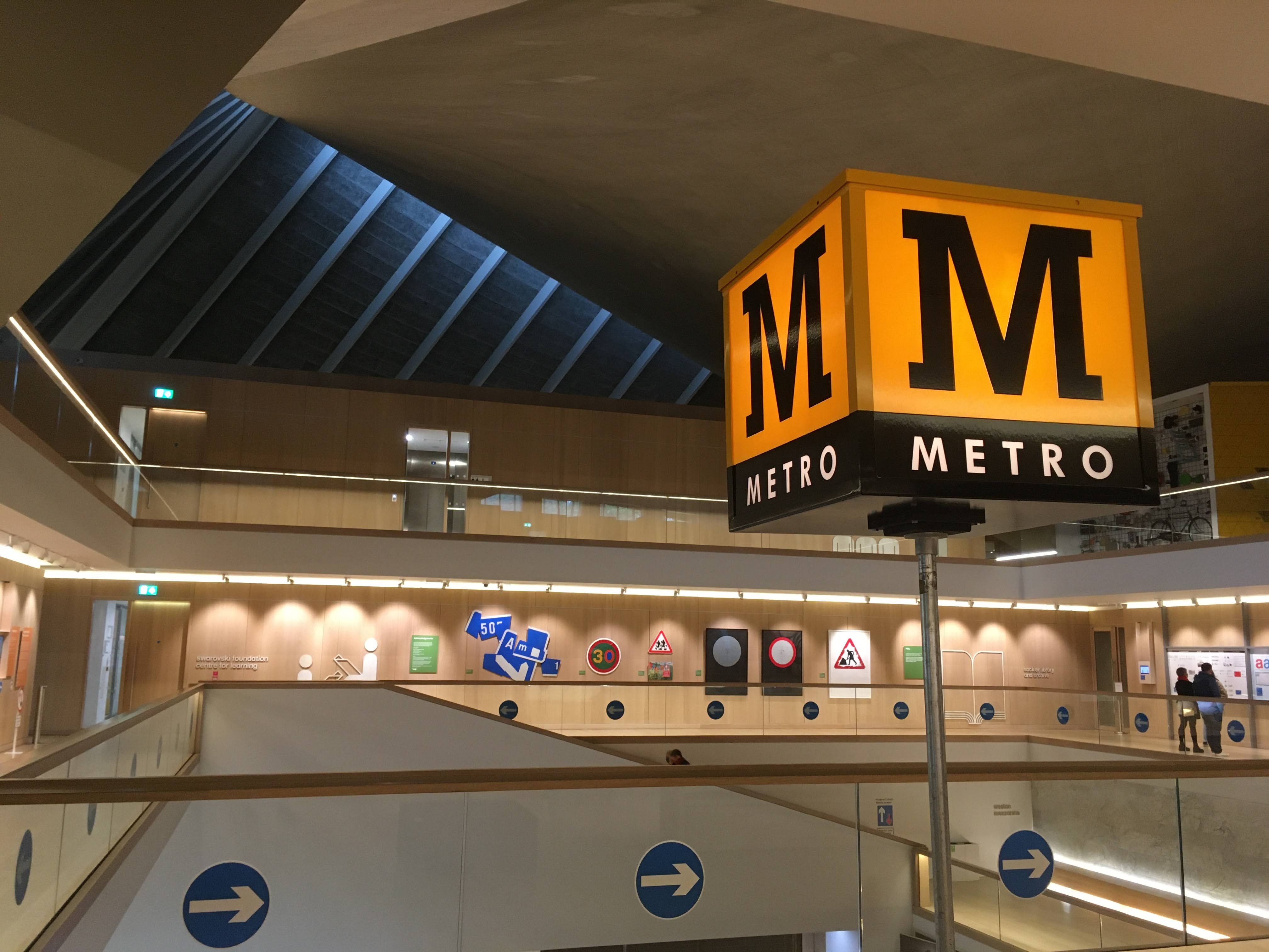
The exhibition’s disrupted run is a real shame, because Calvert’s body of transport-related typeface work is entirely worth celebrating – this FT.com review is a good write up. It also features a genuine yellow M cube totem from the Tyne and Wear Metro, my favourite transport totem of them all and a demonstration of the singular power of a good typeface.
The “Woman at Work” exhibition does a fine job of celebrating Calvert’s career (yes, I was one of the lucky ones who somehow squeezed in a visit during one of the narrow windows when it was possible to do so), but I was particularly interested in one notable element. This blog defers to no-one in its admiration of the transport typefaces Calvert produced, firstly with Jock Kinneir and later Henrik Kubel (The Beauty of Transport 3 December 2014, 13 May 2015 and 19 April 2017) but it was the exhibition’s other purpose, beyond celebrating the totality of Calvert’s work, that particularly interested me.
“Woman at Work” is also the official launch vehicle of Rail Alphabet 2, Network Rail’s new signage and built environment typeface, and Calvert’s latest commission in close collaboration with Henrik Kubel. It’s not often that Britain’s national railway infrastructure operator launches a new bespoke typeface. It’s not often that the launch of a new typeface will lead to a change in the way Britain’s biggest railway stations will look and feel. But here we are. And it’s a rare and wonderful thing.
In January 2020, Network Rail chair Sir Peter Hendy whipped the railway typography corner of Twitter (yes, it’s a thing) into a minor frenzy with this tweet…
It was the first proper public hint that Network Rail had commissioned a new typeface, and was intending to replace the signage at its portfolio of Britain’s largest railway stations. Having said that, visitors to Network Rail/RIBA Competitions’ Footbridge Design Ideas Competition exhibition during Spring 2019 at the RIBA in London had unwittingly had a preview of developing ideas for the new signage, as it was used to direct visitors around the exhibition.
Sir Peter’s comment that it was “the rail alphabet” that was being revisited was the primary cause of the Twitter excitement. Rail Alphabet is lauded by transport typhophiles, and in fact typophiles generally, as a modern design classic (The Beauty of Transport 13 May 2015). It dates from the 1960s corporate rebranding of the British Rail, and was at one point ubiquitous across the network. Rail Alphabet has worn so well that it is still to be found on some parts of the railway network, despite privatisation bringing a bewildering array of new typefaces to trains and stations subsequently. It also appeared at around the same time at British airports, on signage at National Health Service buildings, and later across the Danish State Railway network.
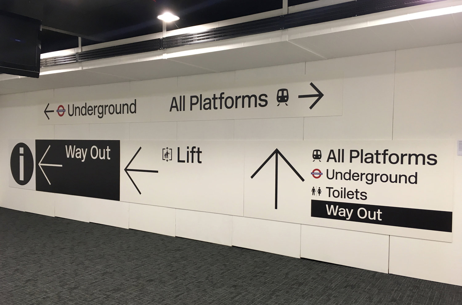
But although it is the launch of Rail Alphabet 2 that has created the headlines for understandable reasons, Rail Alphabet 2 is in fact part of a larger project and a larger story that hasn’t had quite the same level of attention. As well as launching Rail Alphabet 2, “Woman at Work” also marks the launch of an important piece of work, Network Rail’s new wayfinding signage design manual. Wayfinding is the term for all the signage that tells you where you are, what you might want to find, and how to get to where you want to go.
It is these new standards into which Rail Alphabet 2 fits, and which explain why Rail Alphabet 2 is what it is; more than a simple re-use or re-tread of the original Rail Alphabet. It is also a story which hints at other directions in which the wayfinding signage could have developed, which would have left Network Rail’s stations looking very different.
“Rail Alphabet 2 is only part of the endgame,” explains Network Rail technical head of buildings and architecture Anthony Dewar. “Because there hasn’t been a mass implementation of the new wayfinding signage, it’s difficult for people to understand the scale of what we’re proposing, and how Rail Alphabet 2 fits into it.”
Network Rail started to think about overhauling the wayfinding signage at its railway stations in 2016, and today it seems obvious that it was to Calvert that the company would turn for its new typeface. But in fact, Rail Alphabet 2 wasn’t always an inevitability…
I recently had the chance to communicate with (I’d normally go and interview people for a piece like this but, you know, pandemic) some of the key people responsible for the upcoming revolution in the way passengers will see directional information presented at Britain’s largest stations. I wanted to find out what drove the project and how some talented designers arrived at the solution to Network Rail’s wayfinding problem.
Why change?
For some time, Dewar and his team have been revitalising Network Rail’s commitment to high quality architecture and design. It is a programme (still ongoing) which has covered design competitions for footbridges, benches and most recently small-to-medium sized stations; the development of a multi-part Design Manual for the company; architecture champions being embedded within Network Rail’s Regions, and the introduction of a Design Panel, to list but some of the projects underway (The Beauty of Transport 4 March and 11 March 2020).
The current signage at Network Rail-managed stations dates from the days of Network Rail’s predecessor Railtrack, and features blue signage with white text, set in a proprietary typeface called Brunel, designed by David Quay and Freda Sack of The Foundry.
That signage system is now well over two decades old. When Dewar took on his current role at Network Rail in 2017 the project to revise station wayfinding signage was already underway, and moving it forward was one of his first jobs. I asked him what he thought was wrong with the blue wayfinding signage in the first place, and he explains that there were a number of concerns from across the company. “I felt that the current signage looked dated and complicated, and was also a bit soulless. The retail team thought that the existing wayfinding design guidance wasn’t sufficient and was leading to clutter and conflict between wayfinding and retail signage. We know from the experience of shopping centres that when good wayfinding signage is put in, it encourages people to move more efficiently. So it’s really important to people in large buildings, but we hadn’t been giving the wayfinding signage at stations due care and attention for quite a while.”
Dewar tendered for an external company to bring specialist expertise to the job of reviewing Network Rail’s existing wayfinding signage and coming up with a new design manual that would meet contemporary best practice.
Taking stock
Architecture and urban design practice Weston Williamson successfully bid to manage the project, bringing on board wayfinding, design and environmental graphics studio Spaceagency, as specialists in this field. I asked Spaceagency founder and director Sarah Manning to talk me through her company’s involvement.
She begins with her impressions of what Network Rail wanted, and its commitment to the project, at the beginning of Spaceagency’s work. “I found Anthony and his team inspiring,” she recalls. “They wanted us to go back to first principles and not just perform a cosmetic touch up, as well as taking account of best practice around the world.”
The Spaceagency team looked at railway station signage from networks around the world. In Japan’s signage they liked the diagrammatic representations of the railway network. In the Netherlands they found that information was presented first and foremost by pictograms, with less reliance on text than in many other countries. In Switzerland they were impressed by the discipline and clarity of the signage.
Back home in Britain, Spaceagency found a less happy picture and confirmed Dewar’s concerns. The Railtrack-derived blue signage represented thinking from some 25 years ago. When Spaceagency’s team toured the stations, they found that the signs lacked clarity compared to today’s passenger expectations. The guidelines associated with the signs allowed for a lot of text, which itself was quite small. “So passengers didn’t read the signs, they asked station staff for information instead, and staff put up more signs to try to provide the information they were being asked for,” Manning explains. The signage was not always well placed on sightlines through the stations, nor at key decision points where passengers have to make a change of direction.
“The signage wasn’t really owned by anyone as an asset, and ad-hoc repairs and additions had been made, with extra bits of vinyl added,” she adds.
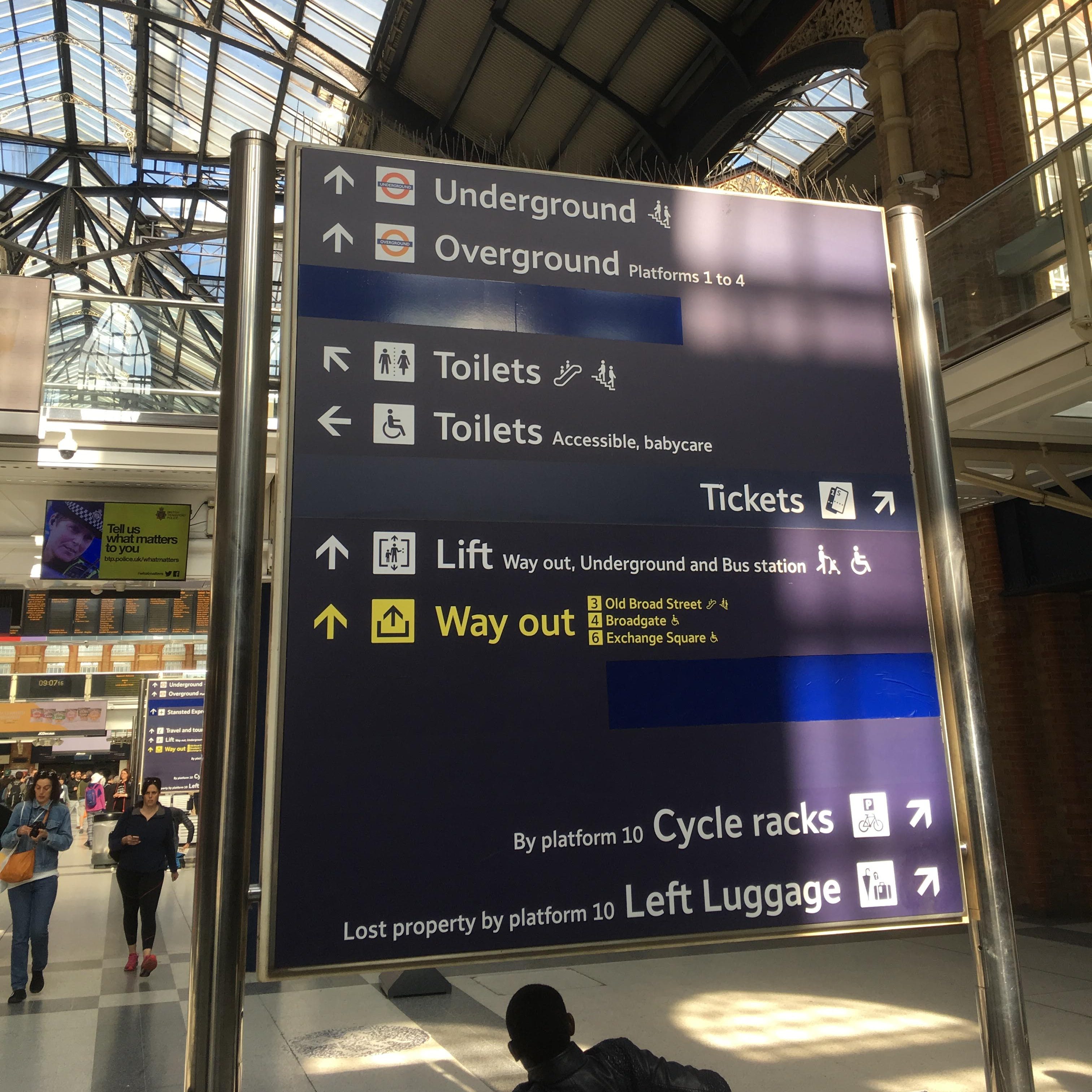
Dewar, meanwhile, draws attention to the line-by-line nature of the signage, with arrows at the end of each line, and the fact that thanks to piecemeal changes, lines with arrows pointing in the same direction are not always grouped together, giving a confusing appearance.
Summing up, Manning says, “In the latter years of British Rail, the company was really a world leader in visual design, but we felt that over the past 25 years, other countries had moved ahead.”
The first step to tackling the problem was to understand signage at Network Rail’s stations in the round. “There was a great deal of visual clutter both in terms of the wayfinding signage and other advertising or retail signs,” Manning explains. “We looked at a passenger’s journey through one of Network Rail’s stations, taking photos and blocking out in different colours the various types of signage to show how much was directional and informational signage, how much was advertising, and how much was retail. It turned out that advertising was taking up the majority of the space, and that all three types of signage were mixed up with each other.” Dewar notes that the recently rebuilt London Bridge station, completely re-signed as part of its reconstruction, had much better signage separation and clarity than longer-established schemes such as those at Liverpool Street, demonstrating that ad-hoc changes and additions over time had degraded the clarity of wayfinding information.
Towards a new wayfinding approach
Developing a solution required rethinking how signage at stations worked. “We proposed separating out the three types of signage as much as possible into clearly defined areas,” explains Manning, “and having a series of different products, not just hanging signs, for use in different locations within the station.”
The next issue to tackle was selecting the most effective colour for the new wayfinding signage. I am constantly surprised by the lack of agreement in the privatised railway as to whether dark text on light backgrounds is best for signage (like British Rail’s black Rail Alphabet on white signs), or whether light text on darker backgrounds (like the British Railways Gill Sans totems or Railtrack’s blue signs) is easier to read.
Spaceagency approached the problem by undertaking a colour study of Network Rail’s stations; taking pictures of station interiors and then pixellating them so that the fine detail vanished, leaving behind blocks of colour. The study found lots of dark neutral colours, with an occasional bright retail colour standing out. The “Woman at Work” exhibition features some of these colour palletes, collected from Network Rail’s stations, and they make a fascinating record of the feel of each station (and, I think, a great merchandising opportunity; but I digress). The new wayfinding signage standards would need a colour scheme which stood out against all the different palettes, and one idea which was considered could have led to a very different appearance for Network Rail’s stations.
“We even looked at neon colours: pink, yellow, and orange. It would have been a hard sell,” Manning admits, “but we were agnostic on the final colours.” I’m not sure what traditionalists would have made of neon-coloured station signage, but in the end Spaceagency found that white and black backgrounds for signage both worked well, with white-background signage standing out slightly better against the typical station colour palette.
At the same time, Spaceagency was developing graphic concepts and a design language for the new wayfinding signage, often drawing on various elements of railway history.
Options and previews
In late 2018, Spaceagency and Weston Williamson showed off three different wayfinding and signage concepts at the Building Centre in London. An invited audience of stakeholders from design experts, through passenger groups to transport users with impairments was asked for their opinions.
Option 1 refined the existing Railtrack/Network Rail signage offering. It retained a blue background (albeit several shades darker) but changed the typeface from Brunel to Akkurat. It took some inspiration from the grid design of Swiss Railways’ signage with information grouped and ordered by direction of travel. Instead of each line of information having its own directional arrow, a single arrow pointed the way for each group.
Option 2 was the ‘Minimal Design Option’ and was possibly the most radical of the three. The signs were all-white with black text, as per the findings of Spaceagency’s research with station colour palettes. The idea driving the design of this signage option was to focus users’ attention on information, by using the concept of ‘progressive disclosure’. This means that signs show only the information needed at each decision point. Significantly, it used New Rail Alphabet (a 2009 digital revival of Rail Alphabet, in multiple font weights and styles by Henrik Kubel in collaboration with Margaret Calvert, though with some detail differences) as the typeface. As with Option 1, one of its key innovations was to group together destinations in the same direction and use a single large arrow to indicate that direction.
Option 3 was ‘Meandering Tracks’, described by Manning as a “playful and creative” approach. Tab shapes, not dissimilar to those on web browsers, highlighted important information. The typeface was New Transport, a digital adaptation of Kinneir/Calvert’s road sign typeface Transport. New transport is published by A2-TYPE.
Visitors to the viewing event were surveyed for their views and option 2 – the minimal design option – emerged as the winning design. Dewar himself, given the choice between evolution and revolution, was keen to take things in a new direction. “If we’d just tweaked the signage, we would have ended up leaving a lot of the signage as it was, in the jumble that Spaceagency found. Revolution clears the way for a new and better approach.”
To be continued…
In the second part of this article the revolution continues as Margaret Calvert and Henrik Kubel are brought on board the project and Rail Alphabet 2 is drawn into life. See you next week.
Acknowledgements
With grateful thanks to Network Rail for arranging introductions to the various interviewees in this article, and to them for their time.
Bibliography and Further Reading
Network Rail Buildings and Architecture Design Hub
Network Rail Buildings and Architecture Design Hub – Registration for New Users
Spaceagency Network Rail wayfinding project webpage
Woman at Work exhibition webpage
…and anything linked to in the text above

How interesting. Although I have found myself so accustomed to seeing those awful blue signs though. They aren’t easy to read and do fade into the background against the clutter of advertising at stations.
None of the three sample revamps excites me. Option 2 is the best of an unexciting bunch to me but even this is too playful and ‘arty-farty’. many travellers are in a hurry and need to ready a lot of information while on the hoof.
Widely varying sizes of lettering are a no-no. So is lettering that looks spindly. The Rail Alphabet (and its updated version Rail Alphabet 2) has a solid Bold version that is highly legible and easy to read at a distance.
Speaking as someone whose eyesight is deteriorating, I need bold lettering to see where I am going. As do the growing number of over sixty year-olds.
Eric Gill was well aware of legibility factors around 1930, when the LNER asked if they could license his Gill Sans font to use on station signage and the side of locomotives. He refused — unless they would allow him to redraw the letter forms to make them fully legible at a distance.
As we all know, the LNER did agree. However, the need to emphasise lettering that needs to be read rapidly from a distance is something that has never occurred to the firms who cut sticky vinyl lettering to go on the side and rear of the big white vans that ply the motorways of Britain. Standard Gill Sans letters that have been simply blown up from 12pt to 3 feet tall look emaciated and have no visual impact!
In my opinion, option 1 was too much like the present signage and option 3 was mannered and likely to date; option 2 is the right decision.
Pity about the over-styled and in some cases downright inefficient design of the current generation of new trains, but there is no design panel to get stuck into the problem as there was in the 1960s. The aerodynamics of the Hitachi high speed trains must be horrendous, with the wide gaps between the carriages and all the clutter on the roofs.
Bit of a Goldilocks situation with the 3 options in my opinion – Option 3’s arrows are too small, Option 2’s are way out of proportionally large, and Option 1’s are just the right size. But there is too much clutter in Option 1. I concur with other commentators here that Option 2 (otherwise) has the clearest direction, with minimal text. But fix the arrow size.
I really take issue with the idea that destinations should be grouped according to their direction. Sure, it allows one bigger arrow – but it can impose a much longer processing task on the reader.
Remember Department Stores? As you entered, there would be a list of departments and the floors on which you could find them.
Very often, the list would be grouped by floor. So the sign told you everything that was on the ground floor, then everything on the first floor, and so on.
Which is the perfect answer to a very rare question: “I have already decided that I will visit the second floor today – please tell me what I will find when I get there”.
For anyone with a specific need, the floor-by-floor arrangement required you to scan through each floor until you found that “TV and Audio” was on the fifth floor. Perhaps that was deliberate: maybe they had decided that it was worth clogging up the entrance lobbies in order to inspire me to plan additional side-trips.
But that shouldn’t be the tradeoff at a railway station. As I arrive at St Pancras, I have already decided that I want a train to Derby – and the job of the signs is to help me get there. If I entered the station at a point where Eurostar and SouthEastern were to the right, and East Midlands and Thameslink straight on, I would find it easier to be offered a sign that offered Eurostar first (right) then a “Domestic” heading with the three sub categories then each getting their own arrow.
Coming from a GDS perspective, all the options have inconsistency of capitalisation – some are title case, some are sentence case, even differing in the same option (Way Out and Way out in option 1 for example).