Oftentimes transport comes to represent something important about life and politics where it operates. It could be free fares regimes, or the opposite; deregulation or the opposite; nationalisation or the opposite. In 1997, the fallout of a major British transport company’s rebranding programme perfectly illustrated why, 19 years later, Britain would vote to pull out of the EU. In fact, if you had remembered the episode, you’d probably have been able to predict the EU referendum result.
British Airways is Britain’s flag carrier and was state-owned for many years, but was privatised in 1987 under the prime minister-ship of Margaret Thatcher, a keen advocate of the privatisation of state-owned industries. At that time, its corporate identity as used on its aircraft was based on a stylised version of the Union Flag displayed on the tailfins, a white upper body and a dark blue lower body containing a red ‘speedwing’ graphic. This latter was a just-about-recognisable development of the ‘speedbird’ which was a key part of the visual identity of British Airways’s predecessor BOAC (covered in this article).
The version of the British Airways corporate identity in place when the company was privatised had been around since 1984, and was developed by brand consultancy Landor Associates. Above all else it was terribly, terribly British, in the sense that it was very conservative and intended to project the values of British high-quality service, albeit of a slightly stand-offish sort. It was a development of an earlier, similar corporate identity, but Landor Associates’ 1984 version darkened the colours and added the British Airways’ coat of arms to the top of the tailfins. It was British Airways’ perceived stuffy and stiff upper lip approach which Virgin Atlantic reacted against when it launched in 1984 with its bolder, more exciting, and more informal branding and brand proposition.

By the late 1990s British Airways’ visual identity was looking increasingly old-fashioned and staid in the global but more customer-centric marketplace in which the airline was competing. It had already had to drop its marketing slogan “The World’s Favourite Airline” when it lost its place at the top of the list of airlines carrying the most passengers. For its new corporate identity it turned to design agency Newell and Sorrell. If you’re interested in transport branding you’ll recognise the name. In 1987, Newell and Sorrell had reworked the visual identity of British Rail’s Intercity sector with the introduction of a slightly more severe colour palette, new swallow logo and italicised INTERCITY wordmark. In feel, it was actually remarkably similar to Landor Associates’ British Airways corporate identity.
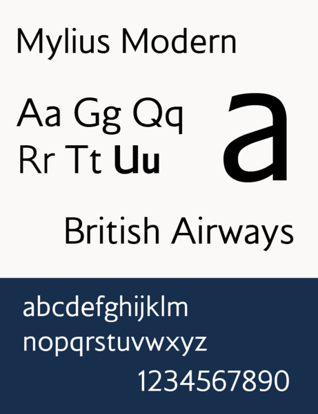
For British Airways, however, Newell and Sorrell went for something a lot brighter, and somewhat less formal. The corporate typeface was changed (to the “warmer, more human” (Holston, 2011) bespoke Mylius font drawn up by type designers Monotype)…
…the dark blue lower bodies on the aircraft became a brighter blue, and the tick-like ‘speedwing’ became a ribbon-like fluttering red and blue ‘speedmarque’. All this, however, went almost unnoticed thanks to the other big change Newell and Sorrell introduced, a series of different tailfin graphics.
British Airways was a global airline, and slightly over half of its customers weren’t British. Cultural diversity was being increasingly recognised as valuable in British society. So, Newell and Sorrell mused, why not reflect that fact on the tailfins of British Airways’ aircraft?

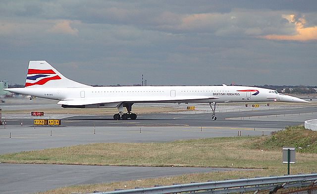
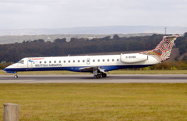
Developed by Newell and Sorrell’s Piers Schmidt, the plan was for a total of 50 different ‘World Image’ tailfins, commissioned from artists around the world. Some of the designs were intended to represent destinations served by British Airways. For instance, there was a tailfin featuring Dutch Delftware, and another featuring Chinese calligraphy. Others were commissioned from artists in countries served by British Airways, from the UK to Australia via the rest of Europe, Africa, Asia and the Americas. Meanwhile the flagship fleet of Concordes, those beautiful aeroplanes that always seemed more dream than reality, all sported tailfins with a fluttering variant of the Union Flag (thus matching the new speedmarque), based on a flag stitched at the naval dockyard in Chatham.
The idea of a range of different tailfin designs was incredibly daring for the time. Today it’s become less unusual for companies to apply differentiated versions of a corporate identity across the business, tied together with some underlying design consistency. As just one example, consider the various South West Trains visual identities for its trains, varying according to service type. At the time of the World Image tailfins however, corporate identities were generally applied in exactly the same fashion across the whole of a company.

British Airways didn’t just risk it, in fact. It flew straight into it and the ridicule and the criticism from certain sections of society and the media never let up. All kinds of nonsense was talked. In fact, it started even before the new tailfins were unveiled, thanks to leaks that suggested British Airways would be playing down its Britishness in favour of a more globalised approach. The fact that it was Britain’s flag carrier made British Airways’ new corporate identity all the more difficult to digest for some.
The popular press went into full-on swivel-eyed crazy mode, all but accusing British Airways’ management of being traitors to Queen and country. With the rebranding costing some £2m in design work and £60m to implement, there was a ‘British Airways wastes millions on unpatriotic new look’ story which all but wrote itself.

Air traffic controllers in charge of ground movements at airports were allegedly incensed that they could no longer instruct taxi-ing aircraft to ‘follow the British Airways aircraft’ because (apparently) the differing tailfins on British Airways planes so confused the pilots of other aircraft that they could no longer tell which ones the British Airways planes actually were. This sounds highly unlikely to me. Pilots are highly skilled, and I don’t think they’d have much trouble recognising the relatively few designs of tailfins British Airways had introduced, nor the fact that they sat above an easily recognisable corporate colour scheme which was the same on all the company’s aircraft.
Cheekily but cleverly (what else would you expect?), Virgin Atlantic took the opportunity to add Union Flags to the wingtips of its aircraft. It might generally have positioned itself as the informal upstart to British Airways, but Virgin Atlantic was never going to miss a trick in piling the pressure on its rival.
The most famous piece of opprobrium, however, came from (by then ex-) prime minister Margaret Thatcher. Attending the 1997 Conservative Party Conference, she spotted a model of a British Airways plane sporting a World Images tailfin. She promptly draped a piece of tissue paper / fabric handkerchief (sources disagree, and it’s not clear in the video) over it, and said it was “absolutely terrible”.
Perhaps if she hadn’t privatised the company, she and her successors might have been better able to dictate British Airways’ corporate identity.
Essentially (and as per usual) the issue of British Airways’ tailfins had divided the British into two camps, along lines drawn deeper even than the traditional divide between Conservative voters on the right and Labour voters on the left. The schism was between those who saw Britain’s place as being in the world, participating cooperatively in the global community with which it wished to do business; and those who wanted as little to do with the rest of the world as possible. If we were going to do business with it, it would be on our own terms, in as purely British a manner as possible, with as little compromise as possible.
The British have a particularly complicated relationship with the rest of the world. Many have never quite got over the end of Empire, an arrangement with the rest of the world which suited them just fine; i.e. large parts of the world were run by Britain along as British lines as possible – the foreign made domestic, if you like. People in this group simply don’t understand why other countries wouldn’t want to be like Britain. Ideally, they would like the rest of the world to recognise Britain’s inherent importance and be grateful for the opportunity to trade with us on our terms, and if they don’t want to, well, we can manage jolly well on our own.
If, on the other hand, you liked the World Image tailfins, you were probably one of the people who wanted Britain to be involved in the world in a cosmopolitan spirit which recognised and learned from the diverse views of others (rather than, you know, invading their countries and telling them what to do, and be grateful while they were at it).
This division remains a festering sore that has never healed since the end of Empire, and it was there for all to see in last year’s referendum which saw the UK vote by a slender margin to quit the European Union in favour of going it alone. It bitterly divides Britain, as Remainers continue to argue against Brexiteers.
All I know is this. I’m interested in graphic art, wherever it comes from. I don’t have to like all of it. Much the same applied to British Airways’ World Image tailfins. I thought all of them were interesting, even if I didn’t actually warm to every single one. Many of them were quite super though, and not long before I finished university, I wandered down to the British Airways shop in Birmingham city centre and bought a model Boeing 747 featuring a ‘Colum’ tailfin, an attractive Celtic design.

The question at the time was, would British Airways hold firm in the face of domestic criticism, or would it cave in?
The World Image tailfins were championed by chief executive Bob Ayling. After long-lasting criticism (the tabloid press in particular was like a dog with a bone on this issue) and in an effort to mollify those who thought he was betraying British Airways’ heritage, he announced that some of the British Airways fleet would be repainted with the Chatham Dockyard tailfin that the Concordes already displayed, while others would retain their World Image tailfins. Looking back, it sounds like a sensible compromise, and only about 30 of the planned 50 World Image tailfins were ever applied. But back then, only the complete expunging of all World Image tailfins would satisfy those who had taken against them.

Ayling left British Airways in 2000, to be replaced by Rod Eddington. The change of chief executive was the perfect opportunity to execute a policy u-turn. In May 2001, British Airways announced that the World Image tailfins were to be scrapped, and all British Airways aircraft would receive the Chatham Dockyard tailfin graphics instead.
“Britishness has been at the core of BA and that view is held worldwide,” A British Airways spokesman was quoted as saying. “In motoring, BMW is associated with quality and makes no bones about its being German.” Which is true enough, but overlooks the fact that while BMW is proudly German, it’s confident enough in its own identity that it doesn’t need to turn out every one of its cars with a black, red and yellow bonnet.
To this day, British Airways’ aircraft still wear Chatham Dockyard tailfins and the rest of the corporate identity remains basically unchanged. Twenty years on, you can argue that Newell and Sorrell’s redesign has been highly successful, given how long it has lasted. The Landor Associates version lasted for just 13 years.

British Airways’ corporate identity remains nice enough with its consistent approach, but it’s nowhere near as interesting as the brave idea that Newell and Sorrell originally conceived with the World Image tailfins. Maybe it was one which was too bold for its time, or which British Airways wasn’t quite steadfast enough to see through. Perhaps it was simply always doomed to failure in a Britain that has never quite resolved its relationship with the rest of the world.
Bibliography and Further Reading
Holston, David (2011): The Strategic Designer. Simon and Schuster; Avon (MA)
The Campaign magazine article on the launch of the 1997 British Airways corporate identity is a must-read, here
Logopedia was very helpful in keeping me straight on various British Airways rebranding dates, here
A comprehensive database of British Airways World Image tailfins can be found here
…and anything else linked to in the text above.

.jpg)
.jpg)
.jpg)
_MAN_06JUL02_(8237680866).jpg)
.jpg)
I think you’re trying to analyse too far.
It was far too bold a redesign in the first place for an essentially staid organisation which was seen internationally as the representative of an essentially staid nation, and in any case the redesign simply didn’t work: of those tailfins, only the Chatham Dockyard variant appeared to be part of the same livery as the rest of the aircraft; all the World Image designs appeared to have been plonked on as an afterthought and, however good they were in isolation, as part of the livery they simply didn’t work, which made the whole thing look like a mess – and a livery that looks a mess never says anything positive about the operator.
The whole thing struck me as suffering from “architects syndrome”: the tendency to try to do something clever which will impress your peers and win you awards, regardless of how unusable it may be for the end user (who often isn’t your paying customer, but rather the customer of your customer). Graphic designers, like architects, do sometimes seem to forget who they’re actually producing their work for.
(Parting thought: I never liked the World Image tailfins; I thought they cheapened the whole BA brand and were absolutely a negative change. I campaigned for and voted Remain. What does that say about the conclusions you choose to jump to?)
Sorry, but I still much prefer the proud, clean, unmistakable, classic lines of the 1984 design compared to the bland, feminised, wimpish, dumbed-down, castrated version we have to endure now !
I also much preferred the SMALL CAPS lettering. But at least they haven’t followed BP et al in mangling the language by calling themselves ‘ba’ or ‘british airways’, although they came perilously close to it with the ugly ‘British airways’ version, IIRC pre-1984. For a while they also had a ghastly grey colour for the upper fuselage which made it look like Mum hadn’t used Persil…
Whatever you thought of the images themselves, the way the new identity was applied across the whole organisation was excellent, from the bag tags to the monochrome versions of the patterns on lounge walls and check-in desks.
I also think there is a wider corporate context that has been lost in history. When this scheme was commissioned and planned BA was on a shopping spree, collecting airlines around the world. They owned Air Liberte and Deutsche BA and were keen to leverage large stakes in US Air and QANTAS into control; variants of this scheme could be applied to airlines across the globe without putting noses out of join in the way that sticking a Union Jack on the tail of a QANTAS 747 would. Indeed, didn’t Air Liberte use a version featuring the Louvre Pyramid on tails?
Of course, by the time the scheme was revealed, US Air was suing for divorce and the operations in France and Germany were burning cash.
As an aside, were you aware that, prior to being bought by BA, British Caledonian’s management had approved a new corporate identity that included tails in different tartans?
http://www.british-caledonian.com/BCal_The_Livery_that_never_was.html
No, I wasn’t! Airlines are a bit out of my comfort zone (which is why they don’t crop up very often on this site) and I don’t know nearly as much about them as I’d really like. Thank you!
You should do a post on Braniff though – possibly the finest re-imagining of a corporate identity/personality ever. Happy to explain why, at length, any time!
Didn’t court line also have various shocking pastel coloured bac 1-11s and gloriously bright tristar?
>>> Perhaps if she hadn’t privatised the company, she and her successors might have been better able to dictate British Airways’ corporate identity. <<<
This – exactly what I thought at the time. The irony was obviously totally lost on her.
I agree with Rory Maxwell. I was working for BA at the time and our boxes of business cards came with 5 different designs on the back. When people tried to make fun of the new designs, I would just whip out some cards and invite them to pick the design they liked the best, whereupon they immediately ‘got it’. As I recall, one serious problem was that Robert Ayling took a very hard legalistic line with the Cabin Crew in a dispute around the same time, thereby provoking a strike (which many managers felt was unnecessary). This meant that an advertising campaign to promote/explain the idea of the new livery was cancelled. I guess the concept really was too complicated to work, but this didn’t help
Bring back the landor livery! Be great to see a retrojet. Maybe a B787!