The look of Birmingham’s biggest bus company contributes just as much to the appearance of the city as traditional red buses do in London. After many years in the design doldrums, National Express West Midlands (NXWM) is two and a half years into a radical overhaul of the presentation of its buses. It promises to transform the way the streets of Birmingham look, and significantly for the better, as a new crimson-based visual identity sweeps across its bus fleet.

The new look is not only very attractive but also very clever, and impressively it’s also a project where almost the entirety of the work has been done in-house. For NWXM’s head of customer experience Adam Rideout and senior graphic designer Blake Cotterill, the new visual identity is the culmination of a much longer project to completely transform NXWM’s brand from something staid and formal into a more human, customer-oriented business. They lived and breathed the rebranding exercise for about three years, and recently they were kind enough to talk me through the process.
To understand just what a revolution Rideout and Cotterill have wrought, it’s instructive to look back over the series of less-than-happy series of NXWM’s earlier visual identities. Back when I started at university in the mid-1990s, West Midlands Travel’s ubiquitous buses ran in silver/grey with blue and red stripes. Although there were other bus operators in the city, none of them came close to making the impact that WMT’s huge fleet – the ex-West Midlands Passenger Transport Executive (WMPTE) bus operation – did.
This is how I remember Birmingham’s buses:
While I was studying, the management-owned company merged with National Express and was rebranded Travel West Midlands. The name change was accompanied by a wider rebranding which saw the buses painted mainly white with red on the upper parts at the front (light blue on the buses serving Coventry) and dark blue on the lower parts at the back. You could see the thinking in terms of using colours similar to those of National Express’s existing and well-recognised long-distance coach branding, but it lacked the subtlety of some of its competitors.

In 2008, short-lived chief executive Richard Bowker decided to introduce a single corporate image across National Express’s coaches, buses and trains, and Travel West Midlands became National Express West Midlands, as it remains to this day.
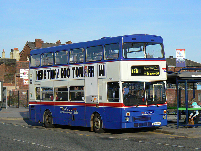
Bowker’s unfortunate solution for vehicle colour schemes was the “connections” device of diagonal grey stripes on a mostly white base. It suited the coaches, but looked dreary on the trains, and made NXWM’s buses look even plainer than they already did. The blue parts of its buses vanished and they ended up being mostly white with a large block of red (or light blue) around the front and the thin grey stripes at the back.

When Bowker left less than three years after joining National Express, the unloved grey stripes vanished from NXWM’s buses too, leaving them plain white and red. Somehow, despite being one of the biggest bus operations outside London, NXWM had wound up with a visual identity that didn’t engage passengers, had zero appeal to tempt non-passengers on board, and wasn’t even very practical because white gets dirty so easily on wet roads. The brand had wider problems, sounding stuffy and old-fashioned in its communications with passengers and the wider world.
If you’re the kind of person who thinks that passengers neither notice nor care what colour their buses are, provided they turn up on time, then you might not think all this matters very much. But when Adam Rideout arrived at NXWM in 2012, initially as head of marketing, he found a company with an ethos that had, he says, “a very corporate feel, lacking in personality, which the livery complemented.” And he thinks it absolutely does matter what the buses look like, just as much as whether they are punctual.
“We’re no different from any other business, we have to keep innovating and moving forward. Look at what McDonald’s is now doing with games in store and their customer environment, compared to the way it used it to be. Branding is part of product delivery, and if you don’t work at it you’ll be left behind, with people voting with their feet” he contends.
One of Rideout’s early moves was bringing into the company Cotterill, who was already doing some outsourced design work for NXWM. Apart from some early input from London-based transport design agency Best Impressions, it is Cotterill and Rideout who have developed the entirety of NXWM’s new look. But first, they concentrated on a change of culture within NXWM. One of the reasons that poor vehicle branding is a bad idea isn’t directly connected with customer perceptions at all, but staff engagement.
We all like to feel challenged in our jobs, to have the satisfaction of a job well done. But there was little about the NXWM red and white buses that encouraged garage staff to go the extra mile to turn them out smartly. Thanks to the various subtle changes in livery over the years, there were two slightly different shades of white in use on the buses, and when panels needed replacing, garages had got into the habit of replacing the panels with the first one to hand, rather than one in the correct shade of white. It wasn’t deliberate, but the drab corporate identity sent out the message the NXWM didn’t care very much about its appearance, and garage staff responded accordingly; who can blame them? The result was pie-bald buses, which sent a message to people in Birmingham that NXWM didn’t really care about attention to detail. That’s hardly an enticement to get on board.
More widely, Cotterill challenged the corporate and sterile feel in the way NXWM conducted itself across the business, which could be found in the style and language the company used both internally & externally, for instance. He changed this in favour of communications with the public that used language slightly more like the way people actually speak.
With that work underway, by 2014 it was time to turn his attention to the way the buses looked. A new look would help move NXWM’s brand into the more friendly and vibrant sphere that Rideout wanted. The question was how radical to be. “On the positive side, the existing livery was two-tone,” recalls Rideout. With a fleet of 1600-odd buses to paint, there’s a lot to be said for keeping the number of colours down. And with a five-year paint cycle to get through the whole fleet, the idea of a new livery which was similar to the existing one was attractive, especially as NXWM had finally got round to putting all its buses in the latest (admittedly not ideal) white and red livery. The first idea was to re-introduce blue, in the form of a skirt at the bottom of the white area, but to keep the existing red and white paint lines the same. “But we didn’t feel this was the right approach and it didn’t really move the brand forward enough,” says Cotterill.
The pressure was on Rideout and Cotterill because National Express was due to place a huge order for new buses for NXWM, and there was a strong desire from the top that they should be delivered in the new colours. There was an intense period of thinking-up, trying out, modifying and then rejecting many ideas for revising the NXWM bus livery. One idea was to use the existing paint lines, keeping the red front, but having the back of the bus blue instead of white (which would have looked a little like morebus or Transdev’s ‘Red Express’ does now). Several other colour pairings were tried out too. Then various different layouts, curves and graphic devices between the colours were trialled to see which suited the buses best, and projected the new image and feel that Rideout and Cotterill wanted.
Conscious of the need to consider the work of garage staff, Cotterill kept any complicated paint lines or vinyls away from the panels which are most often replaced due to the rigours of day-to-day bus operation in a busy, congested city; the ones at the corners. “That’s why the stripe leading back from the front wheel seen on the new NXWM livery, stops short of the back of the bus,” Cotterill explains.
At this stage, a cream and blue colour scheme was being considered, colours used historically by Birmingham City Transport, an early ancestor of NXWM. Although an interesting approach, it didn’t quite work as a modern-looking bus, as the visualisation proves.
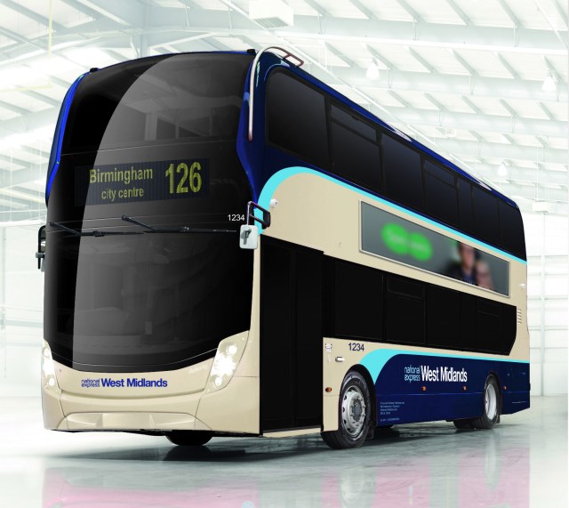
In fact, no livery idea was quite getting the buy-in from senior managers that Rideout wanted. “And then I had a dream about London,” he adds, sounding (unnecessarily, I think) almost embarrassed. “And I wondered, could we do a new classy version of the classic red bus?” The front of NXWM’s buses were already red, so there would be a familiar look to passengers as the bus approached; not an unimportant consideration.
Since the first time I saw a crimson NXWM bus, I’ve wondered why the company settled on crimson/red. I couldn’t quite square it with the idea that it was based on the old Midland Red colour scheme (a completely different West Midlands bus company now mostly in the hands of Arriva and Stagecoach), which some commentators suggested, but it turns out that it’s a combination of the fact that NXWM’s buses were already red, and because of inspiration from a dream.
A bus was painted up in a new two-tone red livery, with paint lines very similar to the final version, and using the red that NXWM already employed on the majority of the current buses. But it still didn’t look quite right – it was missing the retro-modern flavour that was now so desired.
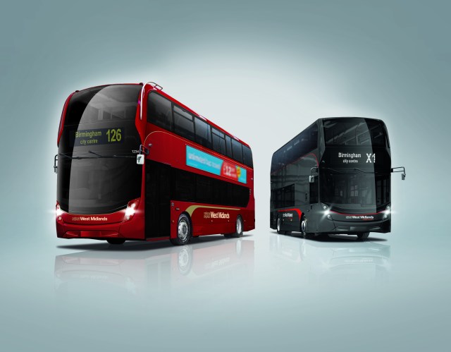
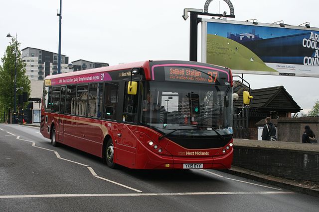
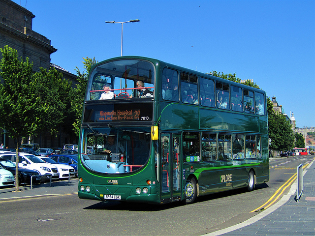
A change to two slightly darker shades of red, verging on crimson, was the answer, along with old-gold pinstripes under the upper-deck windows and under the front windscreen, along with a wider stripe leading back from the front wheel arch. Job done, and only about 1,599 buses to go…
But the crimson buses weren’t actually the first ones the public saw.
As you’ll know from previous articles, the PTEs lost their bus operations in 1986 and often give the impression that they have regretted it ever since. Following then-chancellor George Osborne’s decision in 2014 to grant Greater Manchester various powers including bus franchising, in return for a directly elected mayor, bus franchising has come back onto the agenda. Through years of successful cooperative work, WMPTE’s successor Transport for West Midlands (TfWM) prefers to work in alliance with local bus operators. But that’s not to say that will always be the case if those operators don’t deliver the bus offer that the West Midlands needs.
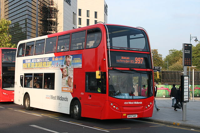
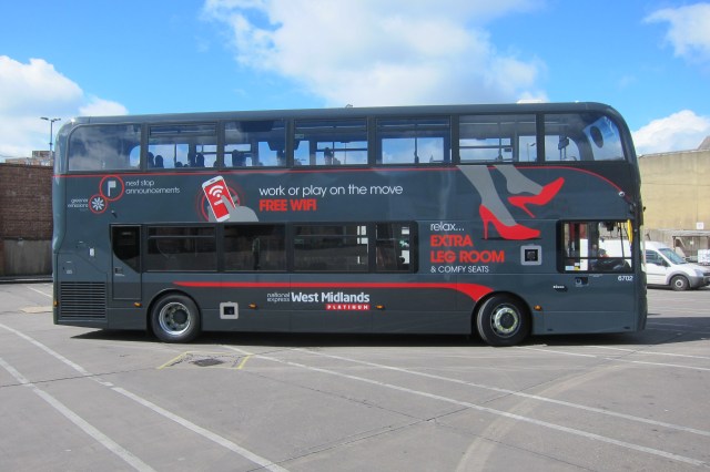
Rideout knew that NXWM had to prove that its buses had a continuing relevance to, and future in, Birmingham, especially with HS2 due to arrive in the city in 2026 to show what the latest in public transport can offer. Earlier in his career, Rideout had helped deliver Stagecoach’s first enhanced-quality Goldline service, and he built on this experience to develop what became NXWM’s “Platinum” bus offer, with a higher quality interior (and features like free wi-fi and USB charging points) and high-profile exterior. Whilst not a new idea in the industry it was certainly something new in the West Midlands. It was designed to target car drivers especially, but also to create a buzz in the city; NXWM are serious about growing the market. He and Cotterill rejected metallic colours, which are difficult to maintain, and went for a two-tone grey. “Greys are colours that sell well in the luxury car sector,” he notes. The paint lines are the same as for the crimson buses, but with grey instead of red, and red instead of old-gold for the highlights.
The Platinum bus went on a tour of local events in 2015 and was paraded in front of local politicians, demonstrating NXWM’s commitment to its West Midlands bus offer, but in so doing it’s become widely assumed that the crimson buses were based on Platinum’s paint scheme, rather than the other way round. The crimson buses, invented first, hit the streets shortly afterwards.
In visual terms, Rideout and Cotterill have hit on a unique solution to the presentation of National Express’s buses, rejecting the idea of a single corporate image across all its operations, as Stagecoach and Arriva generally employ, but also rejecting the approach of letting each subsidiary bus company create its own unique look (as Go-Ahead does). Instead, the company now has a single family branding with colour variations used to mark different parts of its bus operations.
Two further colourways round out the new look.
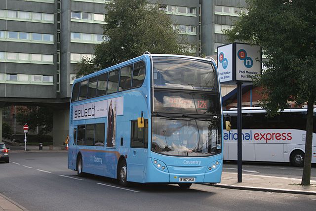
NXWM has long branded its Coventry operations separately from those in the rest of the West Midlands, although with a common feel. The sky-blue colours of Coventry’s football team have provided inspiration in the past and have done so again, with a two-tone blue version of the latest visual identity applied to the buses in Coventry.
National Express’s other bus operation, in Dundee, used red and white just as NXWM did before its makeover. It was renamed ‘Xplore Dundee’ in 2015 and given a two-tone green colour scheme designed in partnership with students at Dundee and Angus College.
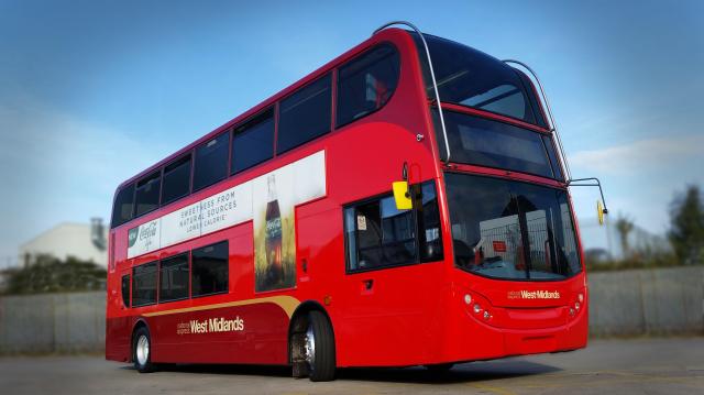
You only have to look at the way the newly re-liveried buses are presented to see that the garage staff have responded to the rebranding exercise, and take pride in turning out the buses in best possible condition. They’ve obviously bought into the rebranding. That adds to the perception of NXWM as a quality operation, rather than one that doesn’t care about the details. Whenever routes are given dedicated route-branding, all the buses on that route are reliveried in the new colours. With existing buses repainted, and new ones entering the fleet in the new colours from the off, around one-third of NXWM’s buses are now sporting the new visual identities.
Although the colourful vehicle exteriors are the part of the rebranding that has got bus industry commentators the most excited, there’s more to the exercise than that.
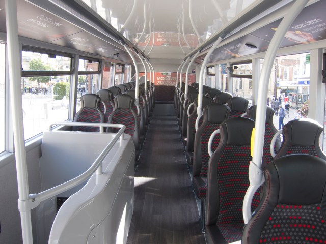
The interiors of the buses are just as important to passengers as the exteriors, if not more so. If you can tempt a non-user on board for the first time, there’s no point in them being put off travelling by bus ever again because the interior is so far removed from their expectations of quality. For the existing fleet of buses there was a limit to what Rideout and Cotterill could achieve. Panelling and flooring were too expensive to replace, so a change in moquette (the fabric covering the seats) would deliver the biggest difference. A variety of moquettes were in place across NXWM, the newest being a pattern comprising rows of grey dots that had little of the warmth Rideout was seeking for NXWM’s new look and feel. This was revised to include red dots, instantly making for a more friendly interior.

On brand new buses, there was more opportunity to add character inside. Side panels have a linen/brush-stroke appearance unlike any other bus I’ve come across. The floors are grey and have two-tone red flecks, picking up on the crimson exteriors. Interestingly, the interiors are standardised across NXWM’s buses (both the crimson ones and the Coventry blue fleet) and those of Xplore Dundee. It’s a pragmatic solution to the fact that buses sometimes transfer around between the three parts of the business. This way, the exterior can be repainted without a mix of interior colour schemes resulting.

The Platinum buses have bespoke interiors. Rideout is particularly proud of the two-tone flooring, which subtly divides seating space from circulating areas, and the seats themselves.
While other large bus companies have gone for all-leather seats on their premium routes, Rideout isn’t convinced that passengers like it, believing they find them too hot in the summer and too cold in the winter. Instead, the Platinum seats have dark grey leather headrests and sides featuring red stitching, with moquette centres. The moquette is a modified version of that found on the regular NXWM fleet, with darker red dots, and more of them.
The other interior change that Rideout was able to deliver was to the on-bus signage. Although hardly given a second thought by most passengers, those signs that tell you not to smoke, not to stand on the stairs, that CCTV is in operation, that this is the emergency exit, all contribute to the ‘feel’ of a bus journey. Rideout developed an exhaustive list of signage and its positioning, and ensured that the language used had personality and sounded modern, without becoming unprofessional. They are all set in the Neo Sans typeface, matching that of the ‘West Midlands’ or ‘Coventry’ part of the ‘National Express West Midlands’ / ‘National Express Coventry’ wordmark which acts as the company logo. The previous version of the wordmark used Helvetica. “We felt Helvetica was dated and lacked any personality,” says Rideout. “Neo Sans is softer, more friendly, yet still easy to read.” It’s a favourite of Rideout’s too, having used it in his previous job at Stagecoach.

The wordmarks were redesigned as part of the new look for the buses. Look carefully (on the sides of buses, on websites, and on publicity) and you’ll notice that the colours used in the logo subtly push back the ‘National Express’ words in the wordmark while emphasising the ‘West Midlands’ or ‘Coventry’ words, a deliberate choice to communicate with the local market.
There’s one area of the operation that falls outside NXWM’s sphere of influence, and that’s the roadside infrastructure. In some areas of the country, bus operators attach their own flags to bus stop poles, strengthening the brand of their operation – you can see it in action in towns like Taunton (FirstGroup’s Buses of Somerset), on the Isle of Wight (Southern Vectis), or along Transdev Blazefield’s Ripon-Harrogate-Leeds 36 route.
In NXWM’s area, TfWM uses its Network West Midlands branding on bus stops. “It’s neat and tidy,” Rideout says, “and avoids the situation where each bus operator puts their own flag on the bus stop pole, but it doesn’t really sell our product.” To an extent that’s deliberate. As a publicly-funded organisation, TfWM has to be scrupulously aware of the need not to favour any one private sector bus operator over another. But Rideout says discussions are always ongoing through TfWM’s Bus Alliance which might yet allow bus operators a greater opportunity to promote their brands at bus stops.

The proof of the value of the kind of rebranding exercise Rideout and Cotterill have put National Express’s bus operations through is in passenger numbers and passenger satisfaction. If they go up, then it means that people are indeed influenced by the way buses look and not just by their punctuality. Of course, if NXWM staff have also bought into the rebranding and have a greater pride in the operation than they did before, you’d expect the buses to be turned out of the garages in a more timely manner, and for the drivers to translate their increased pride into better customer service. Everyone’s a winner.
And that’s just what Rideout has found.
“Any rebranding exercise is fraught with risk in whatever industry you look at but we were confident that what we were doing was more than just a paint job and logo tweak. Satisfaction scores from both our own and TfWM’s research support that we are really heading the right direction,” he says. “For overall satisfaction we are seeing scores as high as 96% on some Platinum routes with things like comfort on the bus coming out at 98%. Satisfaction with the driver was also coming out at a very high 96%, proving that the company’s new direction was having a positive impact on the staff involved.
“Most importantly these scores were not just coming from existing customers; they were coming from brand new ones too. The holy grail of ‘modal shift’ was happening with people not only considering the bus but actually choosing it over their car. It was clear to see, and the research reinforced our belief that new customers were being attracted to using the bus by what they were seeing or had been told by other people.”
Rideout sums up the rebranding of National Express’s buses as, “Changing the business and customer expectation with a livery.” It’s been a project encompassing much more than just a livery, but the improvement in the presentation of buses, and the increases in passenger satisfaction with NXWM (not to mention more passengers getting on board) suggests he and Cotterill and have done just that.

.jpg)
.jpg)
.jpg)
.jpg)
.jpg)
There was an intermediate version – between the TWM and NX colour schemes – that, if I recall rightly, used the TWM palette but had curved stripes so was less angular than either its predecessor or successor. Or maybe that was an experiment? Certainly not a huge proportion of the fleet was done, leading to a mess of at least three NXWM bus liveries once the NX version started to be rolled out.
What has been cut out from the pole in this photo?
yes i’ve heard it refered to as the tooth paste livery
I don’t know. You’d have to ask National Express!
Iff the Blue/Cream livery attempt had been in original colours then the finish would have been much more outstanding and more in keeping with Birmingham as a whole ….bearing in mind Coventry has its own Blues….The crimson smacks if the old Midland Red and of course having different liveries for different areas cause a supposed headache with resale when moving the older buses on….The identity of Bham is gone because as with the blue/cream which would have been beautiful and practical iff done in the proper colours …It’s all down to dumbing down in general across all the liveries …The individual identities of each county etc have now sadly gone and the “seen one seen them all “syndrome is now in place …The pride of each county is now gone as quite wrongly every bus has to have the same look as any other one …Shame that a certain amount of pride can’t be put back into the liveries countrywide instead of this …coverall…problem we all have ….The National Coach problem that sprung up in the 70s with a one all colour still hangs over the nation’s buses and it needs to stop …Iff you want people to use buses then give them a sense of identity and pride to have proper liveries for each county or city….We are not robots we are people and perhaps the liveries iff done with thought and identity might just tempt them back on the buses ….The people at the top in these bus companies tend to live in a bubble and wrap everyone in cotton wool ….Be individual …be brave ….be an instigator not a follower and give the buses some proper colours and not the same the same the same just cause its easy to do …….
Blimey.
“Be individual …be brave ….be an instigator not a follower and…” paint everything the same way it’s always been? Er…
But there’s the bigger picture and the West Midlands as a whole – it always irked me a bit that Birmingham City Transport’s blue & cream was imposed upon the rest of the region! Despite my Wulfrunian roots the Walsall Corporation paint job (mid-blue plus yellow lining, not unlike that of Glasgow’s 1960s EMUs) seemed, aesthetically, to be the best of the bunch from that era.
All buses should be red
I was shocked and in awe the other day when i passed an x13 near to the NEC . It was painted in the old deep blue and cream of birmingham city transport. Im an ex glaswegian brummy convert .ive always loved brum and that bus made me feel as though i had passed into another dimension and suddenly arrived in the real birmingham. Those bct liveried buses were one of the things that gave Brum its identity. Same as Glasgows green and orange buses. I went to Glasgow a few years back but it wasnt the real Glasgow because now the streets are full of pink and lilac buses. Yuk!!!! Those red and crimson buses now cruising Brummie streets just dont belong. This is Brum so give us back our identity. Brum should be Brum.
Spot on, bring back BCT livery of blue and cream. Give B’ham back some of it’s lost identity!