A few weeks ago I was taken to task for suggesting that Arriva replace the diffident visual identities of its various British trains and buses with that of its parent company, German state railway operator Deutsche Bahn (DB). This was a response to me saying I didn’t like plain blue trains. Why, my commenter asked, would I instead want plain red trains and buses? It was an entirely fair point, albeit I’m always amazed that any of my somewhat cheeky comments are ever taken with any degree of seriousness. I suppose that aside from being wilfully contradictory, I just prefer DB’s bright red to the dark blue of British Rail and Southeastern (the trains I was discussing at the time), and I’m also swayed by being a big fan of Germany and its public transport operations.
DB’s corporate identity certainly has a reputation for being plain red, but this isn’t really the case at all. It’s actually one of my favourite transport company corporate identities. There’s a lot more to it than meets the eye at first, and it also extends well beyond the visual. So this week, we’re going into the red to explore the way DB presents itself to the world.
DB’s corporate identity is one of those which is restrained and solid rather than flashy, and it presents a very German appearance of organisation and efficiency. Admittedly that’s occasionally at odds with DB’s actual performance, but then so it is with pretty much every transport company ever, at some stage in their history. DB’s corporate identity looks like it has been around for decades, carefully tweaked here and there to keep it up to date, but that’s not the case. In fact, the current version is only a little over a decade old, although it incorporates some elements with a somewhat longer history which have been melded into today’s look.

It’s easy to forget that DB itself is a young company, incorporated only in 1994 following the reunification of East Germany and West Germany. The DB logo was inherited from the West German railway operation, and was subsequently modernised by graphic designer Kurt Weidemann, losing the serifs on the letters in the process, though they remain in a rectangular box with rounded corners. Until the mid 2000s, however, DB operated with a bewildering range of additional logos covering its various subsidiary operations, and also had a virtual kaleidoscope of different train colours. “Transferred to humans, corporate identity would describe the nature, the character of a person,” says DB’s corporate design manual. It was essential that that character, previously a confusing muddle, was turned into something coherent to fulfill DB’s desire to “make DB unmistakeable“.
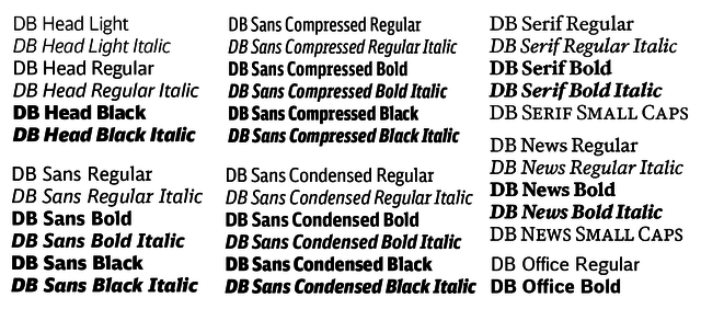
At the heart of DB’s current corporate identity, as is so often the case with the great transport corporate identities, is a typeface. The DB family of typefaces was designed by Christian Schwartz and Erik Spiekermann in 2004-05. It is bespoke to DB and not available for use outside the company. It encompasses a range of styles and weights for use in different environments, and has some neat little touches like scooped terminals on some of the Sans letters and over-emphasised rounded serifs on letters like the seriffed ‘r’. This helps avoid confusion between ‘rn’ and ‘m’ when reproduced at small size, explains Schwartz, but also lends functional character to the typeface, “like a window in the face of a watch that proudly displays the works inside.”
It was Schwarz’s collaborator Erik Spiekermann and his company Edenspiekermann (formerly United Designers Networks and then SpiekermannPartners until a merger with Dutch firm Eden Design and Communication) who would go on to oversee the development of the rest of DB’s visual identity, and the company continues to look after it today.
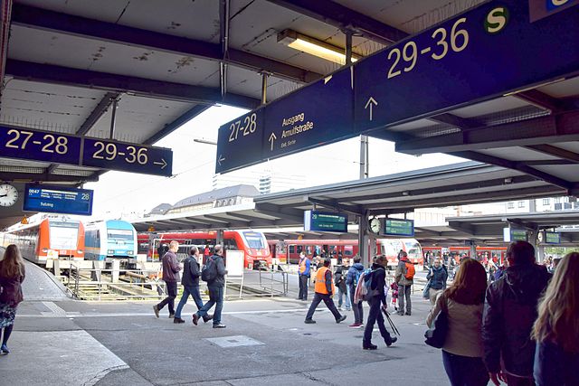
The mid-2000s, then, saw the full roll-out of DB’s current visual identity alongside the introduction of the new DB typeface. The many earlier subsidiary logos were done away with, replaced by an emphasis on the main DB logo. For passengers, one of the most notable changes was to station signage where yet another DB typeface – DB WLS – is used in white on a blue background. DB has (as you might expect) a comprehensive set of instructions regarding standards for signage design within stations, including layout and pictograms. Notable elements are oversized platform numbers, and the distinctive directional arrow (with a break between head and shaft) which is tightly specified, and is intended for use only on station signage.
At the same time, a confusing range of printed publicity, using countless different templates, was totally redesigned using just a handful of standard templates. The colour palette was stripped back to focus on white, with red highlights. A rackful of timetables and brochures suddenly gave the impression of a single, guiding mind somewhere in the background, subtly sending a reassuring message about DB’s operational competence.
Meanwhile, what was previously an extensive collection of different train colours was reduced to just two variants for passenger trains. Both strongly feature red, chosen by SpiekermannPartners as the key colour for passenger services. This was no doubt influenced by the fact that DB’s high speed ICE trains already had bold red highlights as a key part of their visual identity. Blue, meanwhile, was selected as the key colour for DB’s freight/logistics operations while grey is for network operations (although maintenance trains are generally painted yellow, for safety reasons while operating alongside track workers).
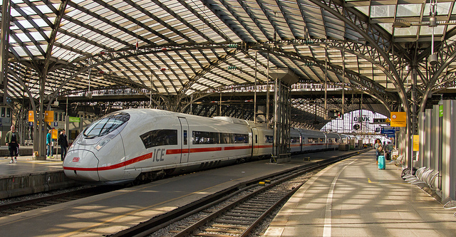
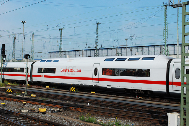
DB’s ICE trains have always been painted white with a red stripe along the lower bodysides, since their introduction in 1990. Rather than throw away this recognisable identity, the basic visual image was retained, and extended to IC (conventional intercity) trains, with the new DB typeface used for lettering. In reality, these white trains aren’t white at all, but a very pale grey that simply appears white against most backgrounds.
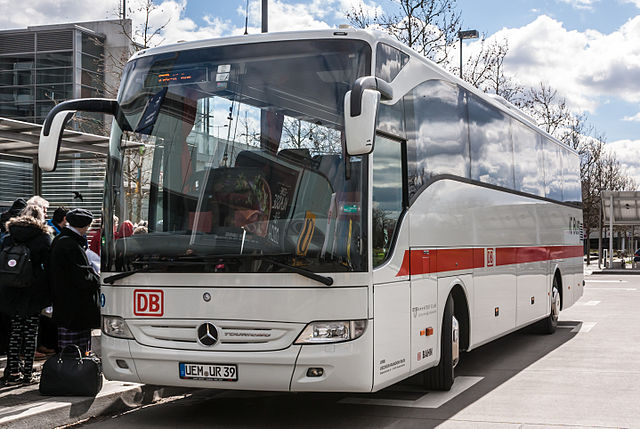
Until the mid-2000s, the IC trains were mostly red with white lower bodies, so the new corporate identity brought together IC and ICE trains, and provided a single visual identity for DB’s Fernverkehr division, which operates both types of train. DB Fernverkehr also operates a number of long distance ‘IC Bus’ coaches, and these too are finished in the same very pale grey with a red stripe.
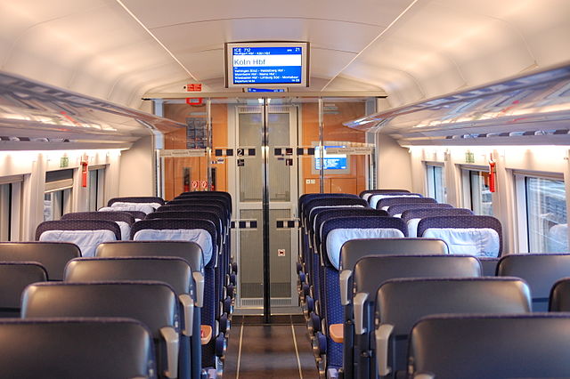
The visual identity isn’t restricted to the outside of the trains; DB’s corporate identity is very much a ‘whole journey’ experience. There is a standard interior specification for the ICE trains, with a surprising emphasis on natural wood finishes. Seating is dark – leather in First Class, dark blue moquette with a pattern of small squares in second class. Signage and pictograms are, of course, also standardised with one of the range of DB typefaces used throughout. The result is a consistent and very sophisticated passenger accommodation across the ICE fleet, incomparably better than short-haul air travel.
For IC trains, DB notes that due to their long histories, a uniform approach to interiors has proved impossible to achieve. At least, it has so far. There’s such a note of Germanic disappointment about this disparate range of interiors that I wouldn’t be surprised if DB eventually sorts out a standardised interior here too.
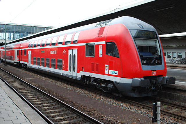
Away from the inter-city sector, DB’s Regio division operates regional and local train services on behalf of the powerful states which make up Germany. After previously wearing a variety of colour schemes including green/cream and blue/white, SpiekermannPartners settled on mainly red, not dissimilar from one of the existing regional train colour schemes.
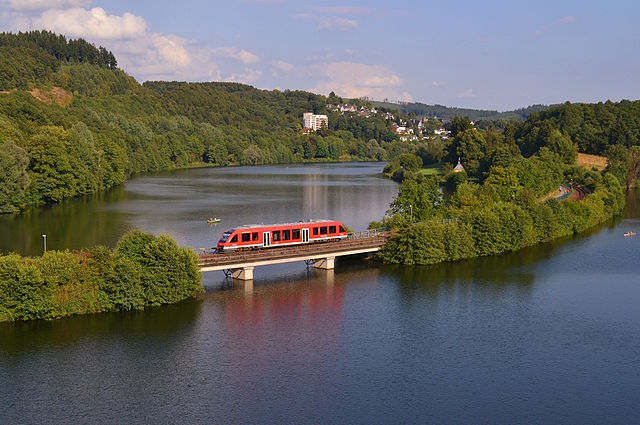
As with the Fernverkehr visual identity, there is more to it than at first glance. There are (usually) two ‘white’ stripes on the trains, one below the windows and one above, though the upper one is omitted on some of DB Regio’s smaller trains. On double-deck trains, the upper stripe runs between the upper and lower windows (except for first class carriages, where it changes to yellow). Doors are in white and there is a stripe of grey along the lower body. Again, however, the ‘white’ stripes are actually very light grey. Although there are detail differences, DB Regio trains essentially wear a reversed version of the DB Fernverkehr colours.
It is in DB Regio’s market sector where DB’s previously ubiquitous visual identity is most threatened as the states look to other transport companies to operate their regional and local services. UK transport group National Express has already made some inroads into this sector and the look of Germany’s rail network is beginning to change as new entrants bring their own branding and visual identities into the market.
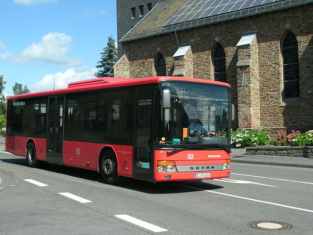
It is on DB Regio’s extensive bus fleet (buses and trains together form integrated local transport networks specified by the states and local transport partnerships) where DB’s visual identity is reduced to its most basic element. The buses are finished in plain red with dark grey/black around the windows, with only the application (the positioning being very tightly specified) of DB logos and local operation logos providing any relief. It’s perhaps these vehicles that have given rise to the misleading impression that DB’s visual identity is plain red.
Buses aren’t DB’s only passenger-facing road vehicles either. One of the most interesting aspects of DB’s corporate identity is how pervasive it is, reflecting the fact that DB is increasingly positioning itself as a mobility company, rather than simply a train and bus operator. It’s a measure of the company’s visual identity’s adaptability that it works across so many transport modes.
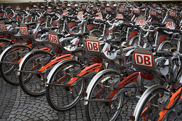
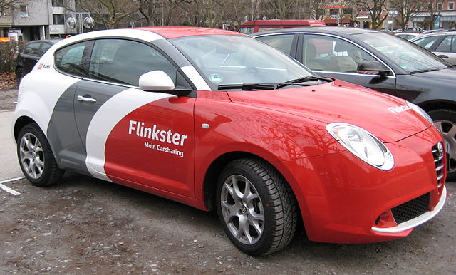
DB has a bike-hire operation – Call a Bike – with silver bikes sporting red highlights and DB logos on the luggage rack, and it also has a car-sharing operation in which silver or white cars feature red and grey highlights.
One of the joys of DB’s visual identity is its sheer comprehensiveness and consistency. Fans of British Rail’s Corporate Identity Manual (available here – a kickstarter-funded labour of love by Wallace Henning worthy of your support) will enjoy the fact that DB has put its entire corporate design manual on the web for everyone’s enjoyment. It’s an incredibly detailed piece of work in which it is possible to lose yourself for hours.
DB’s visual identity is an entirely German affair; comprehensive, fastidious, unshowy yet possessing great impact. Even so, there is still room for individuality. Not everything has been captured in the corporate design web, with operations like the Kielius Airport Bus, central Germany S-Bahn and Qixxit (a door-to-door multi-modal trip planner) having their own unique looks. Qixxit’s was designed not by Edenspiekermann but by German branding design company wirDesign. Many of the states now specify bespoke visual identities for their regional transport operations, though DB says that this comes at the expense of passengers being able to navigate their way round such networks as easily as they could with DB’s branding in place.
DB’s visual identity is not a static entity either. It continues to evolve. The latest initiative is improved wayfinding on ICE train exteriors, a change made under the watchful eye of Edenspiekermann. It’s a small but noticeable alteration, with vertical yellow stripes to the side of doors serving first class areas, larger logos indicating quiet areas and accessible carriages, and seat number details on the outside of carriages.
DB’s corporate identity is so thorough that it doesn’t stop with the visual, either. Just as SNCF has its own specially composed jingle, so does DB. It was developed by specialist audio branding company why do birds, using the rhythm of DB’s operations (a train passing over a set of points, if you ask me) and the notes ‘D’ and ‘B’ (of course).
Karsten Henze, DB’s head of corporate identity and corporate design, had this to say (in this interview). “I generally believe that there’s no way around multisensory branding anymore. It’s not just about sound – if you have great audio, but the other senses are neglected, your brand will suffer. What I would like to achieve is for our customers to get off the train and say, “I like Deutsche Bahn” – but they can’t specifically tell you why.” The key word here is multi-sensory. While DB has a highly developed visual identity, and now a sonic identity too, I don’t think I’ve ever noted a transport company with its own olfactory identity before.
It’s a measure of the extent to which DB has put thought into its corporate identity that it extends as far as smell. The artificial scenting of businesses isn’t as uncommon as you might think, from supermarkets which somehow smell of fresh bread even when they’re not baking anything, to the casinos of Las Vegas, each of which has its own scent (no doubt scientifically designed to encourage you to spend money there). Take a deep breath next time you pass through Berlin Hauptbahnhof because it has its own special DB smell, developed by branding company Iconic and air design studio Aoiro. You’ll also find the same smell at Berlin Ostbahnhof, and the main stations at Göttingen and Hamburg.
DB subsidiary Arriva has been attracting comments from transport design enthusiasts in the UK with a recent rebranding exercise on its buses and an under-designed visual identity for its Northern train operating franchise. The Chiltern Railways franchise, bought by DB before Arriva but now managed by the latter, has a silver-white visual identity which looks surprisingly dated despite its quite recent introduction. It was to sort out this visual muddle that I suggested DB should bring over its corporate colours to the UK, and I could really go for a Chiltern Railways or Northern train in DB Regio red (see a mock-up here), or a Cross Country train in ICE/IC white (see a mock-up here). It will never happen, if for no other reason than I’m sure DB is keen to stay out of the debate about foreign state-owned railway companies taking over bits of UK transport and pocketing the profits back home. But I hope that now you’ve had a chance to look at DB’s corporate identity in a little more detail, you’ll agree that it’s a much more sophisticated piece of work than plain red trains and buses.
Bibliography and Further Reading
DB’s visual identity design manual, with page after page of highly organised transport design geekery and gorgeosness, here
A 2005 presentation by DB’s head of corporate identity and corporate design Karsten Henze, explaining DB’s new corporate identity and typeface, here
Edenspiekermann’s project page for DB visual identity, here
Christian Schwartz’s website has several pages on the DB typeface design and development, here
whydobirds’ project page for DB’s audio branding, here
wirDesign’s project page for DB branding, here
Iconic’s project page for DB olfactory branding, here

.jpg)
While I accept it’s a sophisticated body of work, I still don’t like it that much. Too much block colour which the stripes don’t relieve. And the DB logo really doesn’t work on those bikes…
Great article. It would be interesting to know the reasons for DB to make the IC and ICE have almost the same look.
Great article! I came upon it looking for the reason why most railway companies in Europe prefer red as their corporate identity… Any idea why? There must be some convenience reason to it, right?