Previously, on The Beauty of Transport…
National Express: How Not to do it
Long-distance coach operator National Express decided to expand into other forms of public transport in the mid 1990s, and as well as buying up West Midlands bus operator West Midlands Travel, it successfully secured several train operating franchises as the British railway network was privatised. It gained several more when Prism Rail collapsed in 2000 and National Express snapped up its franchises too. Prism Rail had been founded by several leading figures from the bus industry, although it was a new venture in itself rather than an existing bus operating company. But it was further proof that the bus industry, which had been deregulated for a decade or so, had identified the newly privatised railway as its next great opportunity for expansion.
At first, National Express took a rather Go-Ahead-like approach to the branding of its various rail franchises. Midland Mainline had one of the best visual identities at its launch (as you can read in this earlier article), while ScotRail, Silverlink and Central Trains all had bold visual identities too. Taking over the Prism Rail operations added some proper basket cases when it came to visual identities. LTS Rail/c2c had modified the Network SouthEast livery on its inherited fleet of trains, and quite attractive it looked too. But when its new trains arrived, they were white with green doors and green lower bodies, with no apparent thought given to style whatsoever. WAGN, meanwhile, had a Best Impressions-designed striped colour scheme for its refurbished trains, but seemed to have no idea what to do with the rest of its trains.
National Express put Silverlink, c2c and WAGN under the care of a single management team (called “London Lines”, if you’re interested). Leaving Silverlink well alone (it was ultimately destined to be broken up between the new London Overground concession and London Midland franchise), London Lines developed a new family of visual identities to replace the mish-mash of colour schemes at c2c, WAGN, and WAGN’s Stansted Express sub-brand. c2c came first, and featured iridescent two-tone blue-purple bodies and a distinctive typeface, in pink (still in use at c2c to this day), for the c2c logo. Although c2c used Interstate for the lettering on its station signage, it’s not quite the same typeface as used in the logo.

Stansted Express came next, using bright blue (still iridescent) as the main colour, and the same logo typeface as c2c, but this time in orange.
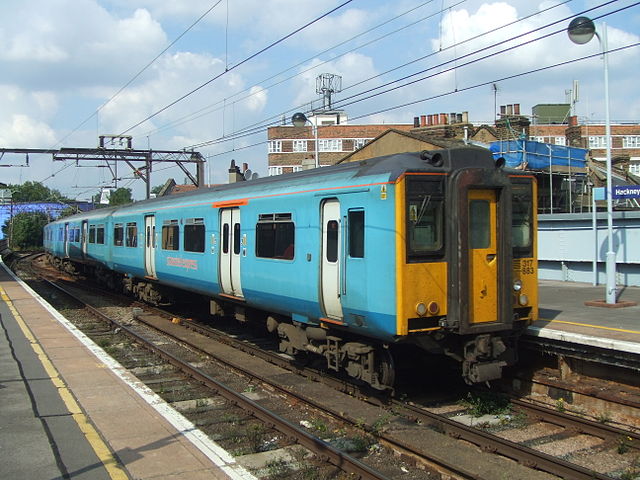
WAGN (rebranded as wagn) followed, with deep metallic purple as the main colour.
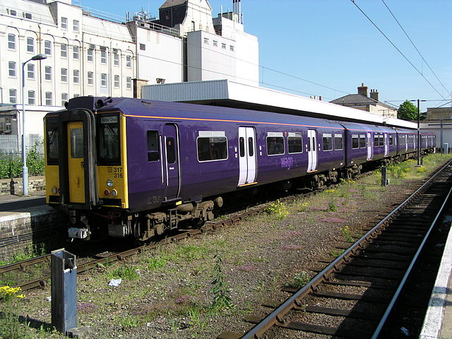
On a sunny day any in this family of visual identities could look positively jewel-like, though they were a bit plain. That said, you can imagine how this family of visual identities could eventually have been expanded to cover all of National Express’s train operations, if the company had so wished, using a different base colour each time.
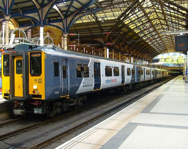
Circumstances intervened however, in the shape of the new Great Eastern franchise which began its life in 2004 with National Express as operator. Thanks to some franchise re-jigging, it comprised all services out of London’s Liverpool Street station. WAGN/wagn’s West Anglia services were included, while its Great Northern services were hived off to became part of First Capital Connect. Also included in the new Great Eastern franchise were the ex-First Great Eastern services and the intercity and East Anglian local services ex-of Anglia Railways. To mark the occasion, the new Great Eastern franchise was branded by National Express as One, indicating the unification of all the earlier operations. As a branding exercise I confess I loved it, not least because it was quite, quite mad. The trains were metallic blue with adorable rainbow Pride flag-esque panels at carriage ends, the One logo was squared off and 1970s futuristic, while the name itself made basic conversations about the train service nigh-on impossible:
“How do I get to Ipswich on the train?”
“You should catch One at 13:05.”
“Yes, but which one?”
And so on.

The fun was about to come to an end though. Enter, stage right, Richard Bowker, appointed chief executive of National Express in 2006.
Ex-chief executive of the unloved Strategic Rail Authority, Bowker wanted great things for National Express with international expansion on the agenda. He also masterminded a very aggressive bid for the Intercity East Coast franchise (the one that had killed GNER, which a few years earlier had also made a very aggressive bid for it). He was a great believer in centralisation and after two years had come to the same conclusion Brian Souter and Moir Lockhead had come to at Stagecoach and FirstGroup respectively. He felt that National Express’s operations needed a single corporate identity and that all of them should carry the National Express name. This would show the size and power of the company, which was otherwise disguised by the myriad of different visual identities of its bus and train companies.
If you’re going to go for a single corporate identity, you’d better make sure (as Stagecoach did) that it was a good one. No such luck. Bowker’s big idea for National Express was to revise the existing and well-established white coach livery with the inclusion a set of thin diagonal grey stripes at the rear called the ‘connections device’, and then roll that look out across the rest of the company.

The trouble was, while the change to the white coach livery wasn’t too drastic, it was a much more significant change for National Express’s buses and trains. And what was worse, it didn’t actually suit them. It was also applied in a completely incoherent manner. The buses of Travel West Midlands (renamed National Express West Midlands), which had red fronts and blue rears over a white base, lost their blue rears in favour of the connections device, but retained their red fronts (the sorry tale is recounted at the beginning of this earlier article). At the new National Express East Coast franchise and at National Express East Anglia (as One was now called), the trains got the connections device, but also large angled blocks of silver/grey towards the end of each carriage/power car. Both connections device and grey blocks appeared on National Express’s Heathrow Airport-based Hotel Hoppa buses, the only buses on which it was applied as such. Bus operation Travel Surrey wasn’t even rebranded, while National Express sought to divest itself of the operation (which it eventually did, to Abellio).
At c2c, the colourful blue trains were transformed into plain white ones. But no National Express connections devices nor grey panels were applied, only the National Express logo. The trains looked as though they’d been left in basecoat, and that’s how they remained ever afterwards.

National Express’s was a single corporate identity that in reality wasn’t one at all, because its application was so variable. The only thing that unified the different applications was that they were all worse than the visual identities they had replaced.
East Coast would end up all but killing National Express’s presence in the UK rail industry. Falling victim to exactly the same mistakes its predecessor GNER had made, National Express had wildly overbid for East Coast and simply couldn’t afford to keep running it when revenues fell below those forecast. Bowker soon left National Express, and the company gradually lost all of its rail franchises except c2c, which it sold to Italian state railway operator Trenitalia earlier this year. National Express’s UK coaches still wear Bowker’s version of the corporate identity (mostly), but its UK buses have recently dumped it, in favour of rebranding in colourful manner, to great effect. Trenitalia doesn’t seem bothered about rebranding c2c for now (as discussed on other occasions, foreign state-owned railways do love their graphically under-designed mostly-white trains). But funnily enough, National Express has now got into train operations in mainland Europe, and there its trains continue to display the connections device.

Arriva: Late, Nearly Great
Arriva was late to the railway party. It took until 2000, and the collapse of Merseyside-based MTL, for Arriva to buy up MTL’s bus business and its two train operating franchises – Merseyrail and Northern Spirit – thereby entering the privatised rail industry. At that time, thanks to a long and complicated history, Arriva not only had a large bus operation but also a car sales subsidiary (it was disposed of a few years later, just as a vehicle hire business had been just before the MTL takeover). Looking back now, that seems to make about as much sense as Go-Ahead’s airport ground handling business. But I digress.
Arriva wanted to put all its trains in its corporate colours. It already had a very attractive visual identity for its buses, with a stone-coloured scoop at the front, and turquoise bodies set off by a thin yellow stripe low down. Like Stagecoach and FirstGroup, Arriva believed that a national brand gave it more marketing heft than the local identities employed by Go-Ahead. (I do wish someone would settle this argument for good, with some actual data…)

Arriva’s national bus visual identity translated extremely well to the railway. But although one Merseyrail carriage was given Arriva colours as an experiment, local Passenger Transport Executive Merseytravel somehow persuaded Arriva to leave the trains in the existing, locally well-understood, Merseyrail colours. That left just Northern Spirit, renamed Arriva Trains Northern, which saw its trains given Arriva’s corporate visual identity.

Its single carriage trains didn’t get the cream scoops, which would have looked a bit odd at both ends of a single carriage (Arriva Trains Wales subsequently applied them anyway and it does look a bit strange), and instead got stone-coloured doors. Otherwise, the trains had the same stone scoops, turquoise bodies and yellow stripes as the buses, and Arriva ended up with a remarkably consistent corporate identity across both its train and bus fleet.
When it added the Wales & Borders franchise to its portfolio in 2003 as Arriva Trains Wales, Arriva once again outshopped its trains in the standard Arriva visual identity. The only initial exception was a small fleet of nearly-new Class 175 trains. Modern trains are given ‘two-pack’ paint finishes, in which a hardener chemically reacts with the paint to create an extremely durable finish. Such finishes usually come with a paint guarantee, not to mention that stripping off two-pack paint to allow a repaint creates potentially toxic dust. Both factors mitigate against the early repainting of new trains. Arriva used vinyls to relivery the Class 175s, at first choosing an unhappy variation of its corporate colours which faded to white at the train ends. It soon put them into the standard Arriva colours.
In 2007, however, Arriva took over the CrossCountry franchise from Virgin. Here, the problem of nearly-new trains with two-pack paints reared its head again. Except this time, pretty well all the trains in the CrossCountry fleet were nearly-new Voyager trains (along with some nearly-new Turbostar trains, and a handful of older HSTs). It would have been possible to completely re-vinyl the Voyagers in standard Arriva colours, but also expensive and very time-consuming. Instead, Arriva strategically placed new vinyls over the Virgin-red sections of the Voyagers. With the addition of new logos and removal of the Virgin shield from the nosecones of the Voyagers, it was – just about – enough to indicate the change of ownership.

As a consequence, it meant that CrossCountry didn’t look like an Arriva operation. That was probably, to some extent, deliberate. For various reasons, neither Arriva Trains Northern nor Arriva Trains Wales had enjoyed wholly positive public profiles, and they were very much local railways at heart. Arriva carefully kept its name and logo off its new long-distance intercity CrossCountry franchise, perhaps partly as an attempt to make a fresh start without some of the baggage that came with the “Arriva Trains X” approach. Its previous commitment to a single corporate identity had been sacrificed though.
Another change to the appearance of Arriva’s trains took place when the bus division updated its branding in 2009, using what had previously been described as an “inter-urban” version of the Arriva bus colours as the new standard to be applied to all its buses. This version did away with the stone scoop in favour of a stone ‘cow horn’, and added a dark blue skirt.
The trains followed suit (in 2011, unless anyone can tell me it was earlier). The revised visual identity used the same colours as the new bus visual identity, but was less closely related than first time round. Arriva Train Wales trains (by this time Arriva no longer operated Northern) gained dark blue bodies with turquoise scoops at the ends, not to mention the logo of the Welsh government, which is jointly responsible for the franchise alongside the Department for Transport (DfT). But to a great extent, a reasonably consistent visual identity still applied across the whole of Arriva’s UK bus and train business.

The Arriva Trains Wales colours probably represent the last great hurrah for the idea of a single bus/train corporate Arriva visual identity. A year earlier, in 2010, Arriva was bought by Germany’s state railway operator Deutsche Bahn (DB). DB has shown little interest either in applying its own (rather good) corporate identity to Arriva’s operations, nor in continuing Arriva’s one-time commitment to a single corporate identity – the Arriva Trains Wales rebrand presumably having been planned before DB’s purchase. Chiltern Railways, purchased earlier by DB but subsequently absorbed into Arriva’s operations, has retained its white and silver-based visual identity, just as CrossCountry retained its own unique branding. So too did another DB purchase, Grand Central, also folded into the Arriva business.
As mentioned last week, the DfT is encouraging franchisees to create franchise-specific brandings that can be transferred to the next operator if required, which probably rules out any more corporate Arriva colours on the rail network. Having lost its Northern franchise to Serco-Abellio in 2004, DB/Arriva regained it from 2016. This time it is branded not in Arriva’s turquoise and blue corporate colours, but in that favourite colour scheme of overseas state railway operators when branding UK rail franchises: mostly-white. This time, there are dark blue ends, and some coloured circles dotted about. It’s all rather underwhelming. Maybe I’m missing something, but if so, I don’t think I’m the only one.

In Arriva’s UK bus division, there has been an erosion of the single corporate identity, notably with Yorkshire Tigers running in bespoke colours, along with several other Arriva operations. Yet Arriva seems to be holding on to a single corporate identity as much as it can, and has recently announced a rebrand that will be rolled out nationally – but only for its buses, rather than its trains. If I was in charge, I’d put everything into DB’s red/white corporate identity, trains and buses both. But that’s just me. And it’s possibly why I’m not.
Goodbye, Company-wide Corporate Identities
It’s possible to make an argument that hubris was the undoing of FirstGroup’s, National Express’s and Arriva’s attempts to create a single branding for their transport operations. In attempting to look like unified, multimodal companies, they tried to impose a single corporate identity which was always doomed to failure. Such identities appeared too remote, too detached from the series of local markets that most UK public transport often is. That’s certainly the case with FirstGroup and to an even greater extent National Express, which also made the cardinal error of imposing a single corporate identity across all its subsidiaries that just wasn’t really very good. Sometimes subsidiaries accumulate some unfortunate baggage which damages the brand as a whole. But then again, Stagecoach successfully deployed and maintained a consistent visual identity for its train operations (the ones it wholly owned, anyway) and one which was clearly related to its bus corporate identity, which proved that sufficient determination could get the job done.
Thanks to a combination of factors then, the corporate identities of Britain’s Big Five transport operators are increasingly vanishing from the privatised UK railway. It was the privatisation of British Rail that turned the Big Five into true public transport companies. Building on their experience in the UK they’ve gone on to expand into trains, buses, school transport and paratransit in countries round the world. And now they’re increasingly leaving Britain’s privatised railway behind, forced out by more aggressive low-margin bids from the commercial arms of overseas state railway operators. With several franchises held by such operations, which seem to have no apparent interest in attractive visual identities, the look of Britain’s railways is becoming increasingly unexciting. To add to these woes, where our own governments (UK, or devolved) have got into the game, the results haven’t been exactly ground-breaking either.
So, where are the Big Five now when it comes to branding the British railway network?
National Express has quit British railways completely, concentrating on overseas operations which it believes are less risky and offer more reliable returns.
Go-Ahead has never had a single corporate identity, and its presence has just been reduced following the loss of London Midland to an overseas state railway. The look of its huge Thameslink, Southern, Great Northern franchise is mostly dictated by the UK government, which is doing about as good a job of branding as you’d expect (i.e. not at all a good one). And Southeastern looks a bit plain.
Arriva is now an offshoot of an overseas state railway. It seems not only to have given up on its one-time desire for a single rail corporate identity, but also on interesting design at all, to judge by its latest Northern franchise branding. Chiltern Railways and CrossCountry plod along but their visual identities look increasingly dated. Grand Central is a bold exception though.
FirstGroup has moved to individual visual identities for its train operations, like Go-Ahead. GWR (despite my reservations) and TransPennine Express have the virtue of being interesting and clearly the subject of considerable thought. It’s too early to tell regarding South Western Railway, not least because it is replacing such a long-standing visual identity in the shape of its predecessor, Stagecoach’s South West Trains, and the shock of change can sometimes overwhelm rational analysis at first.
There’s always the Stagecoach/Virgin joint venture to show some style and design swagger. I can’t wait to see the final version of the branding for its new Azuma trains at Virgin Trains East Coast, which ought to be spectacular given the personalities involved. But Stagecoach itself has seen the number of franchises it operates halved this year. The visual identity which shocked the railway out of visual design complacency will soon be seen only at East Midlands Trains.
The visual chaos of the early years of rail privatisation is now just a memory. It was confusing, wonderful, disruptive, brash and terrible in about equal parts. The industry has matured, at first with the attempted introduction of generic corporate visual identities by several of the Big Five and latterly into visual boredom at many franchises. I don’t know about you, but I kind of regret that. The chaos was fun while it lasted.
Bibliography and Further Reading
Boocock, Colin (2001): Railway Liveries Privatisation 1995-2000. Ian Allan: Shepperton, Surrey
Cable, David (2009): Lost Liveries of Privatisation in Colour. Ian Allan: Hersham, Surrey
…and anything linked to in the text above.
Enjoyed this article?
It’s one in a series looking at the way that the changing appearance of Britain’s railways illustrates their history. Here are the others:
- Lions and Wheels (British Railways’ lion emblems, 1949-1964)
- The Full XP (British Railways’ Corporate Identity 1964-1986, part 1)
- The Decline and Fall of the Rail Blue Empire (British Railways’ corporate identity 1964-1986, part 2)
- Three Shades of Grey (Railfreight 1987 corporate identity, Roundel Design Group, UK)
- The Rolling Art Galleries of Network SouthEast (Edward Pond murals and NSE route badges)
- The Train on Kaleidoscope Lines (British Passenger Railway Post-Privatisation Visual Identities)
- Mainlining Style (Midland Mainline visual identity 1996-2004)
- Along the Line, Blue and Gold (GNER’s corporate visual identity, Vignelli Associates, 1997)
- Papering Over the Cracks (Railtrack’s Corporate Graphic Design and Annual Reports, UK)
- They Used to Shout our Name, Now they Whisper it (Railtrack’s Corporate Graphic Design and Annual Reports, UK, part 2)
- The Dead Hand of State Design (State-Sponsored Visual Identities on Britain’s Railway, 2000-)
- Local Heroes (PTE Mainline Rail Visual Identities 1970-1994)
- Don’t Give in to Their Goodbyes, Northern Stars (PTE Mainline Rail Visual Identities 1995-2017)
- Corporatisation, and its Undoing, Part 1 (Visual Identities of Britain’s ‘Big Five’ Transport Operators on the railway, 1997 – )

.jpg)
.jpg)
.jpg)
.jpg)
.jpg)
I did prefer a time when you at least knew who was pulling the strings and paying your train driver.
And I don’t want to see anymore DB red!
No reference in the section on Arriva CrossCountry to the roof grey being coincidentally the exact shade that Virgin red turns when exposed to diesel fumes and left unwashed? (Although having committed it to the written word it sounds slightly unlikely, not least because it would imply different cleaning regimes at Central Rivers depot with no error ever having been photographed.)
I find it slightly intriguing that you deride BR for using unrelieved Rail Blue, but want Arriva to replace its current livery with DB’s unrelieved verkehrsrot. That’s “Transport Red”, if you prefer it translated, and it makes buses and trains alike look just as boring as plain white does.
In the mean time, you should get used to “boring” liveries on trains. After Virgin Group attempted to screw Arriva for lease fees for the Virgin badges which Virgin XC hadn’t removed from their Voyagers before the end of their franchise, and the rush job livery change that ensued, all TOCs are now being forced to use easily altered liveries. So you’ll get lots of the white you deem so boring and none of the jazzy stuff you love so much. Maybe the management time freed up from thinking about snazzy new liveries and image changes will be spent on actually running the trains, which would be a nice change.
I’d also suggest that you don’t get your hopes up for East Coast. There’s now such a huge hole in their bank balance that they may soon not be able to pay for a corporate image beyond the current range of pathetic “humorous” hectoring posters which infest the staff facilities – oh, and painting everything (offices, mess rooms, staff toilets) as red as if they’d been blood-sprayed by a suicidal member of staff [but only if they can get someone else to pay for the repainting, mind].
Just found this page today while trying to (now successfully) find information on East Coast’s livery description (to ensure my flickr captions are correct). Your Page and the other articles listed are all excellent, informative, entertaining and very readable. Congratulations. Alistair Fyffe.