Shipping containers have been getting a bad rap recently, in terms of railway architecture. The rectangular steel boxes might have revolutionised the whole way that goods are transported around the globe (in the process rendering finally obsolete the traditional railway station goods shed), but they are purely utilitarian objects, with no thought given to their appearance beyond the colours in which they are painted.

So when train operator GWR and its architects unveiled plans for a new station building at Reading West in October last year, and its appearance was condemned as “leaving a shipping container on the pavement” as well as being “cheap and ugly”, it was clear that the station’s proposed design hadn’t won any friends.
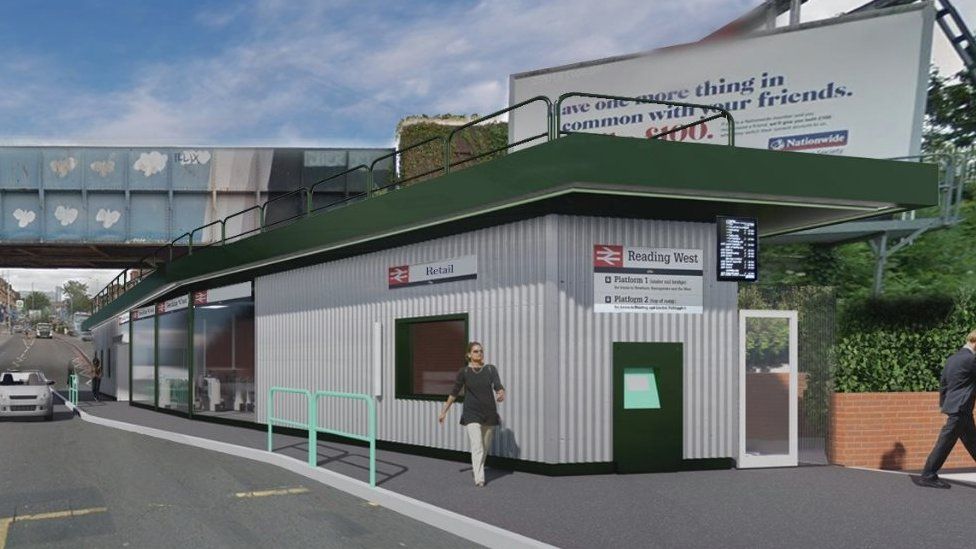
The proposed location for the new Reading West station building is an awkward site under a railway bridge with both height and width constraints. The station currently has no building at all, so it’s positive that a new station building is being proposed. However, the similarity to a shipping container aesthetic (to the extent that it is an aesthetic at all) was undeniable. Unsurprisingly, a hasty redesign saw revised plans submitted in December 2020. The shape of the building remains much the same but the corrugated metal finish has been replaced by exposed brickwork including small textured areas, a roof with a more slender appearance, and a neater approach to external signage and display of the National Rail double arrow symbol.

Because no-one ever learns anything, this was almost an action replay of events which transpired just a few weeks earlier at Perry Barr in Birmingham. The horrible old station (my local during my second year of university, so I feel fairly confident in describing it as such) is due to be rebuilt in time for the city to host the Commonwealth Games in 2022. The early visualisations were quite promising, but when the ‘final’ design was announced in September 2020 the value engineers (who of course are, in reality, fixated on cost rather than value) had clearly been hard at work.
The redevelopment of #PerryBarr railway station has taken a major step forward after plans for a new transport interchange were submitted to @bhamcitycouncil 🚉
Take a look at the proposed new station 📸
Learn more, here: https://t.co/ZaXI1JzAM0 pic.twitter.com/bQbQzyDTJa
— West Midlands CA (@WestMids_CA) September 28, 2020
https://platform.twitter.com/widgets.js
The negative reaction to this unadorned grey box sent everyone hurriedly back to their drawing boards, or rather their CAD packages. In December 2020, a much more appealing design was unveiled:
We are pleased to showcase our revised design for Perry Barr Station https://t.co/MeottNVBPj#birminghamarchitects #architecture #architects #design #perrybarr #trainstation #redesign #birmingham #birminghamarchitecture pic.twitter.com/4V7mkrBlcy
— Glancy Nicholls Architects (@GlancyNicholls) December 10, 2020
https://platform.twitter.com/widgets.js
Even this revised version had its detractors though. I gave the design a quick run over on a Twitter thread if you want to know more.
It’s Network Rail I feel sorry for. The company is often blamed when unattractive station designs are unveiled, yet ultimately the company will become the long-term owners of such station buildings. Such designs fail to live up to the company’s recent aspirations for improved design and architecture on the railway network (The Beauty of Transport, 11 March 2020). In some cases it’s been due to Network Rail’s input and challenge on design and architecture that improvements to initial designs have been made. The whole issue around the design of smaller stations is a problem that has led Network Rail to promote via RIBA Competitions a competition for new design ideas for small and medium sized stations. Hopefully the competition results will show that smaller stations can benefit from better designs at a reasonable cost.
Anyway, the irony of all this is that at one railway station in The Netherlands actual shipping containers form the majority of the station building, yet it looks rather more attractive than Reading West’s not-a-shipping-container-but-looked-like-one design. It only goes to show that with a bit of inspiration, the most unprepossessing materials can be fashioned into something that enhances the local built environment rather than detracting from it.
The new building at Barneveld Noord station was constructed in 2013 to a design by NL Architects. An output of a national campaign to improve facilities at small railway stations (the Prettig Wachten project, which wonderfully translates as “Happy Waiting”), the new station building was intended to be only temporary. In typical railway practice, it is still there and doesn’t look like going anywhere soon. And why should it? It is pretty much perfect for a small station where high capital investment would be hard to justify. The station is located on a single track railway which branches off from the main line nearby, and it is served by small local trains.
Shipping containers – their proper name is intermodal containers but hardly anyone seems to use it in day-to-day discourse, so thoroughly are they associated with their initial revolution in the global maritime cargo industry – have at least two great advantages if you want to use them to build a station building. They allow the quick construction of a substantial structure, but most importantly, they’re cheap. There are almost innumerable shipping containers which have been retired from their original use but are now enjoying a second life. You will find them absolutely everywhere, because they’re strong, waterproof and inexpensive to get hold of. People have turned them into storage units, campsite toilets, hotels, street food venues… the list is almost endless.

Modestly, NL Architects describe their repurposed shipping container station building at Barneveld Noord as, “like a bus stop. But then again, quite an intriguing bus stop.” In truth, it’s a lot more substantial than any bus stop you can think of. A bus station, perhaps, but not a bus stop. Formed from a core of four shipping containers (“minimum effort, maximum output” notes NL Architects) it is recognisably and definitely a railway station building, despite its construction materials and whatever NL Architects might say about its similarity to a bus stop.
Three containers are placed horizontally over glazed enclosures, with a fourth container placed vertically to form an offset tower. The shorter wing of the station building houses a coffee shop, with the container above being used for storage. The longer wing uses one of its containers to house services for the station, over an open-fronted waiting area where a ticket machine and information board are located, while the second container has had its base removed to form a double height space in an enclosed waiting room area.

The 12m tower, meanwhile, houses a toilet at ground level which is accessed from the open-fronted waiting area. Externally the tower sports a clock, instantly and obviously defining the building as a station. Eccentrically, it also sports a weathervane on the roof in the shape of a golden chicken. The branch line on which the station is located was at one time nicknamed the ‘Chicken line’ due to the prevalance of chicken farms in the area. Although the Chicken line has since been rebranded as the Valley line, the golden chicken ties the station to its local history.
The shipping containers are painted black, which gives them a surprisingly smart appearance. Extruded “BARNEVELD NOORD” lettering, attached to the shipping container over the enclosed waiting room, completes the building.
NL Architect’s small but perfect station complements a slightly earlier footbridge over the adjacent main line railway tracks, linking Baarneveld Noord’s platform to a two-storey park and ride car park. Transferium Barneveld-Noord, as the combined car park and footbridge is known, was designed by Netherlands architects wUrck. The steel footbridge features a particularly striking lighting scheme which brings it to life at night.
![]()
How to find Barneveld Noord station
Click here for The Beauty of Transport‘s map of featured locations
Bibliography and further reading
ISO 668 is the international standard for shipping container sizes and weights. I don’t think there’s a particular standard for railway station building shipping containers though.
NL Architects’ project page for Barneveld Noord station
wUrst’s project page for Transferium Barneveld-Noord
Reading Borough Council’s webpage for the Reading West station project
Perry Barr station rebuild, a story in three parts:
…and any source linked to in the text of the article above.

Would that class as ‘brutalist , but welcoming’?
I’ve no idea! Maybe?
I like it, certainly beats a lot of 1960s architecture that I see.
Shame the surrounding area is so uninspiring, but if there’s a demand…
Very interesting reading. I have seen beautiful and utilitarian uses of intermodal containers in Berlin and Oslo. The re-design of the Reading West station has resulted in something rather drab in my opinion.
Very interesting reading. I have seen beautiful and inventive uses of intermodal containers in Berlin and Oslo. In my opinion the re-designed Reading West building is rather drab.