Last time on The Beauty of Transport…
…we looked at the work of wayfinding, design and environmental graphics studio Spaceagency, as they developed ideas to to replace Network Rail’s existing wayfinding signage within stations. Three options were displayed at full size at a preview event, ‘Refinement’, ‘Meandering Tracks’ and ‘Minimal Design’. The latter option was chosen, but it wasn’t quite the final design. This week’s article looks at the development of the Minimal Design option and the typeface chosen for use on it.
Looked at today, the ‘Refinement’ and ‘Meandering Tracks’ options featured in last week’s article are fascinating might-have-beens (along with the earlier idea of neon-coloured station signage).
With the new Network Rail wayfinding design guidance and Rail Alphabet 2 typeface launched at the “Woman at Work” exhibition in London last October, it now seems inevitable that a new Calvert/Kubel-designed typeface, building on the legacy of Calvert and Kinneir’s original Rail Alphabet, would be used. What those other options and earlier colour scheme ideas show is that things could very easily have ended up appearing very different indeed.
Despite the Minimal Design option being selected as the preferred choice for Network Rail’s new signage, it wasn’t the final product. Spaceagency founder and director Sarah Manning takes up the story again. “We had the general sizing and grouping of text, the arrows, and the typeface, but we knew the pictograms we had weren’t really working.”
Enter Calvert and Kubel
Discussions between Spaceagency and Network Rail concluded that a completely new set of pictograms was needed, and it was decided that additional work was needed on the typeface too. Aware from the session at the Building Centre that New Rail Alphabet was a popular element of option 2, and with Network Rail technical head of buildings and architecture Anthony Dewar a long-time admirer of Margaret Calvert’s work for British Rail, they made the logical decision to visit Calvert herself, at her studio in London.
Dewar and Manning went to see Calvert and presented their designs. Both recall Calvert as approving of the use of New Rail Alphabet on the Option 2 mock-ups, but Manning remembers Calvert pointing out that New Rail Alphabet was designed as a typeface for text and screens also, not just signage.
Since the launch of Rail Alphabet 2, people have been sharing their opinions of it online (not always the most helpful way of judging the wider success of a typeface, I admit) and comparing it to Rail Alphabet. Some fans of Rail Alphabet appear disappointed by the fact that Rail Alphabet 2 is not simply a reissue of Rail Alphabet. So I wanted ask the obvious question. Why create something new rather than reusing Rail Alphabet? And best of all, I was able to ask it of Calvert herself.
“We felt it was important for Network Rail to have their own customised face, for both signs and print, as it would form a major part of their Identity. It could also prove more economical, in the long run.” Calvert also took into account the overall ‘feel’ of the signs Spaceagency was developing. “Space Agency were after a much lighter look. This spurred me on to start by drawing an ideal weight, at an 80mm x-height, relating to my original design of Rail Alphabet. It also gave me the opportunity to get away from any association with Helvetica; the important difference being in the way the curves of the bowl of the letter join the vertical strokes. This has given the face a more clear cut and compact appearance,” she explains.

Dewar adds that he thinks a re-use of Rail Alphabet wouldn’t work on today’s railway. Although he is a self-confessed fan of the original Rail Alphabet, public tastes and perceptions have moved on, he suggests. Although it turned out that Rail Safety and Standards Board held a digital version of the original Rail Alphabet due to it being mandated for lineside signage, a new interpretation of Rail Alphabet was still the better the choice, he suggests. “I think Rail Alphabet is just too authoritative for today’s passengers and today’s railway. Societal expectations of the way people are presented with information have changed since the 1960s.”
For Rail Alphabet 2, Calvert worked with her regular typeface design collaborator Henrik Kubel, partner and co-founder of A2/SW/HK + A2-TYPE. Calvert and Kubel have been working together since they first met at Royal College of Art in London, in 1998. Their first collaboration was New Rail Alphabet, and it was followed by typeface projects GDS Transport (for the gov.uk website), New Transport, Moscow Sans and New Airport DOT. Kubel explains, “The design process is one of collaboration, Margaret draws letters by hand on paper, I do that too, but my main skill is to draw letters on a screen.”
Kubel recalls that when it came to designing what would become Rail Alphabet 2, “The important and difficult part of the commission was to distinguish this new typeface from the existing source(s), chiefly New Rail Alphabet, at the same time as making it legible, and coming up with a design that was new, yet recognisable.”
Calvert always starts designing her typefaces with the lower case ‘a’ and Rail Alphabet 2 was no exception. “I always start with the lowercase a,” she explains, “the negative counters are the key.”
Compared to Rail Alphabet, Rail Alphabet 2, “has a unique weight for signs, in that the vertical stroke width is a fifth of the x-height,” explains Calvert. She describes the new typeface as, “extremely legible and, I like to think, pleasing to the eye.”
(I’m inclined to agree, and I would suggest that she is rather underselling her work here. I should note that Calvert is an extremely modest interviewee. I ask her later how she feels about having designed so many transport typefaces that so many people see so often in their day-to-day lives. She replies simply, “I feel very lucky.”)

To the interested but non-expert observer (like me), Rail Alphabet 2 appears lighter than Rail Alphabet, especially in its print versions. There is certainly something a little sharper about Rail Alphabet 2’s overall appearance, especially on letters like g, n and m, thanks to the way the curves of the bowl of the letter join the vertical strokes. But many of the distinctive elements of Rail Alphabet, like the straight leg of the number 7 and the straighter middle section of the number 2 compared to the Helvetica equivalent, remain distinctive elements of the new typeface. Calvert also notes another feature to keep a look out for, which is that, “the letter K differs in that it relates to the right angled arrow [on the new signage].”
Pictograms and hidden features
While Calvert and Kubel were busy designing Rail Alphabet 2, Spaceagency was occupied with the suite of new pictograms to be used on the new wayfinding signage. The 1960s British Rail signage had its own suite of pictograms, some of which were designed by Kinneir Calvert & Associates. The Railtrack-era blue signage had its own pictograms, but times move on and Spaceagency found that some brand new pictograms were needed (gender neutral toilets and vaping areas being two examples), while others needed updating (such as lost property, where the items depicted were beginning to look rather old-fashioned).
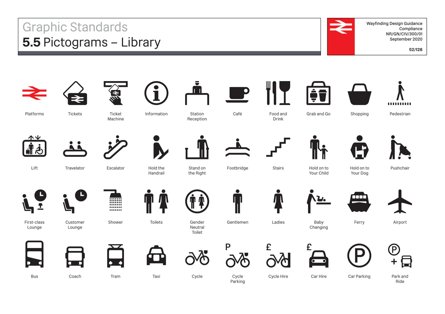
One option would have been to use standard symbols designed by the International Standards Organisation (ISO). But Spaceagency was keen to develop bespoke pictograms which were specifically British, as Manning explains. “The ISO taxi is a New York City cab, but the taxi on the new Network Rail wayfinding signage is a new London electric TX cab. The bus is a New Bus for London, and the tram is based on Manchester Metrolink.”
Another important consideration, and a reason for diverging from the ISO pictograms, was that Spaceagency wanted its pictograms to refer directly to Rail Alphabet 2. “Henrik would send us over drafts of the Rail Alphabet 2 characters, and then we would take small graphic elements from the latter forms to use in the pictograms,” she adds.
The counter from the letter P reappears frequently in the new pictograms, as luggage handles, as headlights on buses, taxis and trams, and as the basket on bikes. The spur of the letter ‘a’, meanwhile, can be found on the hand in the vaping zone pictogram.
Most of the pictograms are plain black, in line with the minimal design concept. Colours are reserved for signage relating to persons of reduced mobility (where EU standards dictate a dark blue background), ‘way out’ information (yellow text on black), the London Underground roundel, and the double arrow symbol in its traditional red. The double arrow is used to indicate station platforms on the new wayfinding signage. This too has caused some heated debate on social media as to whether it is an appropriate use for the symbol. Dewar firmly believes that in the minds of the general public, the symbol means ‘train’ and therefore indicates where passengers would expect to find trains. He also notes the challenges with the ISO symbol for train, and can recount experiences of having travelled with non-rail experts (including his young son!) who have interpreted it as the front end of a bus.
The finished design manual
The Spaceagency-authored Wayfinding Design Manual, which received its public debut at the “Woman at Work” exhibition, is the end result of all this work. It is a treasure chest of drawings, details and diagrams enough to keep any transport typophile happy for hours.
Network Rail Wayfinding Guidance from Spaceagency on Vimeo
Standards for exterior station signage are detailed in the design manual, including exterior station name signage. There is a subtle variation in the way this is specified compared to British Rail’s original Rail Alphabet signage from the 1960s. British Rail’s signage used the double arrow symbol ahead of the station name at a size where its two central horizontal bars matched the x-height of the lettering that followed. The new Network Rail signage will use the symbol at a slightly smaller size, with the symbol placed to match the capital height of the lettering that follows.

The new wayfinding design guidance contains standards and layouts for totem-based signage, perimeter ribbon signage, suspended signage, projected signage and wall mounted signage, amongst others. It also explains the process for deciding where signs should be placed, and how to integrate the new standard signs with other signage around stations.
The concept of signs showing destinations in groups, alongside a single, large directional arrow, has carried through from the concept ‘Minimal Design Option’ trialled at the Building Centre into the final design manual, although the arrow has been scaled down and thickened up slightly. No more than four destinations per group are permitted. In order to avoid the arrows pointing at each other, there is a prescribed order for their use on signage: straight ahead or up / diagonally ahead or up / left or right / down (diagonal) / down.
Supergraphics displaying platform numbers are prescribed for walls leading onto platforms, to help orient passengers quickly. At a standard 2m high, I suspect these will be an excellent showcase for Rail Alphabet 2.
Liverpool Street – Wayfinding and Signage from Spaceagency on Vimeo
The Wayfinding Design Manual brings Calvert/Kubel’s Rail Alphabet 2 together with the new pictograms on Spaceagency’s new standard wayfinding signage and has completed the project to Network Rail’s evident satisfaction.
“I think they are fabulous,” says Dewar simply, when I ask him what he thinks of Rail Alphabet 2 and the new wayfinding sign designs now that both have been completed. Manning, meanwhile, describes the new wayfinding signs as being fresher and lighter than the Railtrack-era signage, and easier to look at and use. “The new designs take some of the heaviness and clutter away. They’re future facing by being clearer.”
Kubel reflects on his satisfaction with the “clear and solid communication” that Rail Alphabet 2 provides the signage. “In the end, I think we managed to create a typeface that not only improves on the existing sign face, it also re-establishes the identity of the nation’s rail signs that once was, black lettering on white signs, with a modern sans serif typeface.” Calvert reflects positively on the new signage. “I like the lighter look, with a single large arrow relating to no more than 4 locations,” she says.

One of what will be many documents in the complete Network Rail Design Manual, Wayfinding is not only a glorious testament to the work of Spaceagency, Calvert and Kubel, it is also a very beautiful book. It is proof of Dewar’s, Frank Anatole’s (Network Rail Principal Architect) and Dewar’s team’s commitment to good design at Network Rail; even the instruction manuals for good design are well designed themselves.
A soft launch for Rail Alphabet 2
Although the Wayfinding Design Manual and Rail Alphabet 2 were officially launched at the “Woman at Work” exhibition, Rail Alphabet 2 had already had a ‘soft launch’ in July 2020 when Network Rail announced “Re-imagining Railway Stations”. This intriguing competition asked entrants to rethink the design of Britain’s small to medium-sized stations, and the winner (a beautiful proposal by Edinburgh-based 7N Architects) was announced on 11 May 2021.

The competition website, competition brief, and Hub (an accompanying book retrospective of existing small to medium-sized stations in Britain), presented a good opportunity to begin the release of Rail Alphabet 2 into the world, Dewar says. In a nice touch – a deliberate one, Dewar confirms – the “Re-imagining Railway Stations” competition brief and website make frequent use of white Rail Alphabet 2 lettering on a flame red background. This is an evocation of Design Research Unit’s double arrow symbol for British Rail, introduced as part of the same 1960s re-branding process which saw the introduction of Rail Alphabet, and which featured the symbol in white on a flame red background. As I mentioned earlier, Dewar knows his railway branding history.
The use of Rail Alphabet 2 in print form, as well as its upcoming use on signage, demonstrates the new typeface’s versatility.
Station signage into the future
That leads to an obvious question: where will Rail Alphabet 2 first appear on station wayfinding signage? Dewar has a simple answer: “It will probably be at London Paddington. It needs re-signing because of the changes to circulation and connections that Crossrail is bringing.” Work on planning and producing the new Rail Alphabet 2 signage is currently underway, with Dewar and his team keeping the work under review to ensure it meets the specifications laid out in the Wayfinding design manual.

When I was carrying out the interviews for this article, I couldn’t help feeling it was a shame that the new Rail Alphabet 2 wayfinding signage would have immediate application only in the 20 stations Network Rail operates. Although they are the biggest and busiest, that is a relatively small number of stations at which passengers would be able to benefit from the clarified wayfinding signage.
Adopting nationwide station wayfinding standards has been considered before. A couple of privatised train operating companies adopted Railtrack’s Brunel typeface, and although it was ignored at the time, a DfT-commissioned report into stations from 2009 recommended that all stations should adopt a single national signage standard.
Just last week though, the government launched the Williams-Shapps Plan for Rail. This white paper sets out a new way of running Britain’s railway infrastructure, and the passenger railway in England. Notably, it declares that the railways will return to a single brand identity – Great British Railways – with Rail Alphabet 2 as the corporate typeface. Stations will get Rail Alphabet 2 wayfinding signage in place of the current train operator-developed signage schemes.
This was made possible because of foresight in the development of Network Rail’s new wayfinding signage. Manning confirms that the standards developed by Spaceagency are equally applicable to smaller stations, where passengers would be expected to be standing closer to signage. “The design guidance for the wayfinding signage defines text size based on viewing distance, so it’s equally applicable to small stations.”
“At privatisation there was a conscious decision to let Railtrack and the train operators go their own ways on signage, to demonstrate visually that privatisation was a break with the past,” Dewar reflects. “But what was forgotten was that passengers prefer consistency of information across their journeys. It reduces stress and leads to better satisfaction with information provision, as well as making it more likely that people will return in future.”
It is evident from the white paper that the detail of how this new branding and signage approach will apply in Scotland and Wales (where the provision and presentation of passenger railway services are devolved matters) has yet to be fully resolved. And in London I think it would be a mistake to require the London Overground (part of the National Rail network after all) to ditch its Transport for London corporate identity. I expect implementation will take years to sort out and deliver. But Rail Alphabet 2 signage, in black text on white backgrounds, should bring a unified and consistent appearance to most English railway stations at the very least, restoring the sense of a national network after three decades.
There could be no better tribute to the skills of Margaret Calvert, Henrik Kubel, and Sarah Manning and her team at Spaceagency, as well as the passion for great railway design of Dewar and his team, than for this to be the case.
Acknowledgements
With grateful thanks to Network Rail for arranging introductions to the various interviewees in this article, and to them for their time.
Bibliography and Further Reading
Network Rail Buildings and Architecture Design Hub
Network Rail Buildings and Architecture Design Hub – Registration for New Users
Spaceagency Network Rail wayfinding project webpage
Woman at Work exhibition webpage
…and anything linked to in the text above

The prospect of typographical uniformity across England’s railways has made my heart soar, so thank you for that. I also highly recommend the (free) Margaret Calvert exhibition at the Design Museum , which I visited this morning.
I like the new signage *except* for those arrows. They’re too large, massively outweighing and distracting from the text they apply to; I’d prefer them to be half the size they are so that they are more balanced.
Whether the application at stations is any good remains to be seen. There’s no point having quality signage when it’s placed in a way which makes it useless; I passed through Gainsborough recently, and at Lea Road station one platform has brand new signage, all of which is placed flat on the fencing and therefore actually can’t be seen from the platform to which it applies!
This is looking really good and the lightening of the typeface gives it an elegance and modernity that the original rail alphabet doesn’t have although it was good for its time and a huge contrast to what went before – much as I love Gill Sans a change was needed.
The involvement of Margaret Calvert is both inspired and obvious and must be commended as she is one of the greatest – if not the greatest – transport typeface designer the UK has ever seen.
The pictograms are also very good and the variance to ISO is appropriate for a UK application
Whilst this works well for application to stations and building and associated wayfinding signage I hope we don’t lose the variety of train colour schemes in favour of a one size fits all scheme as whereas to me LNER and GWR are great Thameslink and Greater Anglia are not.
New bus for London as the model pictogram for Buses?
Oh Dear!
Too London centric for a country wide alphabet (that bus won’t every be in common use outside London, not even I think in the later more generic shortened 2 door form), and I predict that Rail Abphabet No.2 may well outlast New Bus for London.
Rethink please!
Is the wayfinding manual available for download? (And is Rail Alphabet 2 to be made commercially available?)
Also, the New Bus for London was a terrible design and a disastrous waste of money. A generic double decker pictogram would be a lot more appropriate IMO.
Agreed. Poor choice of bus. A Boris Bus at that!
And the typeface is similar to Tahoma, available on any office PC.
And a brand that was developed without consultation with Cardiff and Edinburgh. Bad politics. Can’t see Officina Medium disappearing from Scotland any time soon!
Signage, apart from “that bus” is excellent, but having used Liverpool St today, I note two slight niggles.
The overhead destination displays are & will remain unreadable when sunlight is reflecting off them.
And having a visual “walkthrough” of Liverpool St should NOT have a Kings Cross announcement playing in the background (!)
How can I get one of those Network Rail Wayfinding manuals?
It is available via the Network Rail Design Hub mentioned in the “Further Reading” section; there is a registration process for this.