When engineering and design company Atkins presented the city of Cambridge with a sparkling gift, it must have felt rather pleased. It had simultaneously provided a brand new station and answered the question of how to ensure that same station embodied the character of the local area even though there was barely a ‘there’ there at all. There was just one small drawback. I think we’ve all probably had the experience of handing over a gift and realising that quite by accident, some detail our gift has accidentally upset the recipient. Atkins was about to discover that some of the people of Cambridge were rather unhappy with one of the important details of their new station.
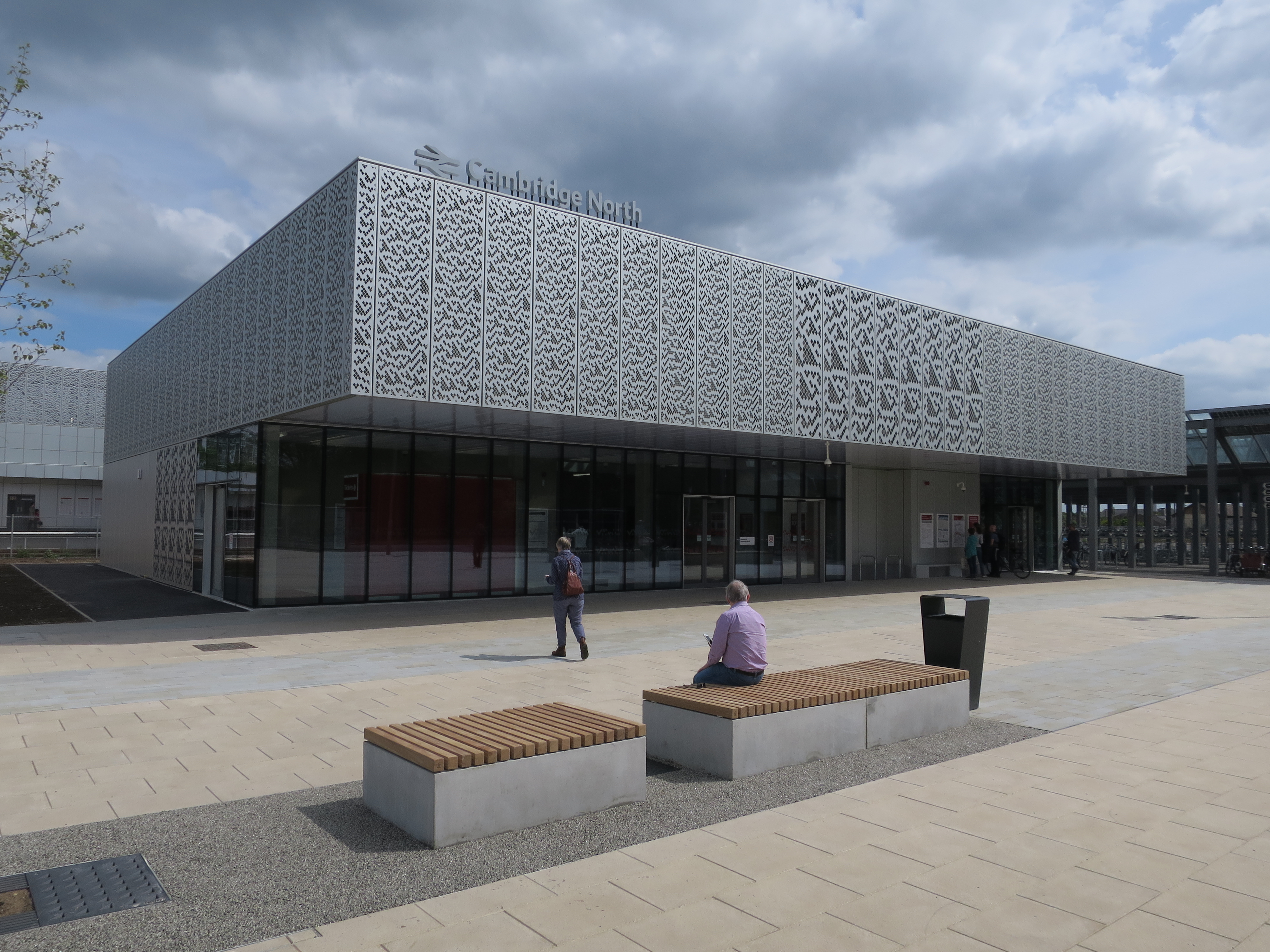
Photo cc-by-sa/2.0 – © Hugh Venables – geograph.org.uk/p/5398543
Cambridge North station opened in 2017, after a rather eventful gestation process. Originally proposed in the early 2000s, the new station was primarily designed to serve a science park founded by Cambridge University’s Trinity College in 1970, connect to the Cambridge Guided Busway, and serve other new developments both existing and potential. Various railway sidings at the site would be removed to make space for the station and the construction of some other non-railway buildings.
It took until 2013 for Cambridgeshire County Council’s plans for the station to be approved, with the council having lost funding streams on which the station had originally been predicated along the way, and having had to sort out various railway operational issues before construction could begin. And then Network Rail submitted revised plans for the station, so it had to be reapproved in 2015, a delay of two years imposed despite the new plans apparently being largely unchanged from those of Cambridgeshire County Council in 2013. Welcome to railway station development, GB-style. The name of the station had also gone through some changes, initially being referred to as Chesterton or Chesterton Interchange (after a long-closed station on the same site) and then seeing proposals to be named for local hero Professor Stephen Hawking, the nearby Science Park or Cambridge Fen. Unlike airports, British railway stations are not traditionally named after people (though maybe they should be) and in the end the rather more prosaic but typically British railway name Cambridge North was chosen.
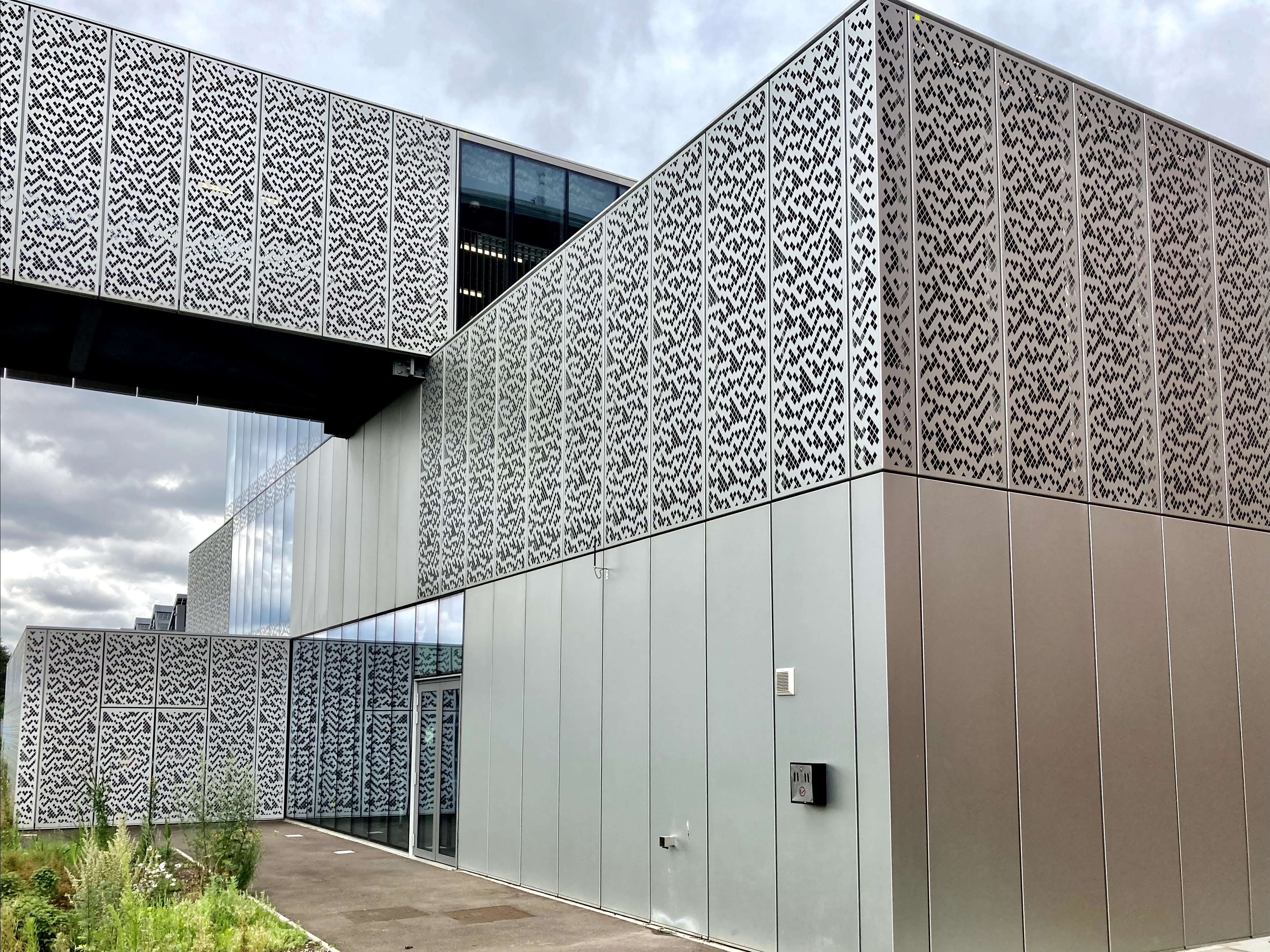
Photo by Daniel Wright [CC BY-NC-ND 4.0]
Despite the teething troubles in getting it built in the first place, the station that opened in May 2017 was (and is) a thing of quite startling beauty. Clad in three bands of mostly aluminium panels, the exterior appearance of the station is remarkably consistent across its various elements, tying together the station’s main building, footbridge and platform buildings into a single unified structure. It’s the sort of approach you normally find in design competitions rather than actually built for real.

Photo by Daniel Wright [CC BY-NC-ND 4.0]
Even at the recent Crossrail surface stations to the west of London (of which I am very fond) the station buildings, platform structures and footbridges are of distinctly different appearances; the more traditional technique.
The unified appearance of Cambridge North’s structures is enhanced by treating the footbridge stairway enclosures as full height cuboids rather than forms which slope down to the platforms to match the descent of the stairs.

Photo by Daniel Wright [CC BY-NC-ND 4.0]
The aluminium panels are in some locations replaced by glazed ones of an identical size, allowing natural light into key passenger areas like the platform waiting rooms, the station entrance, and the upper parts of the main building via a glazed box at the top level.
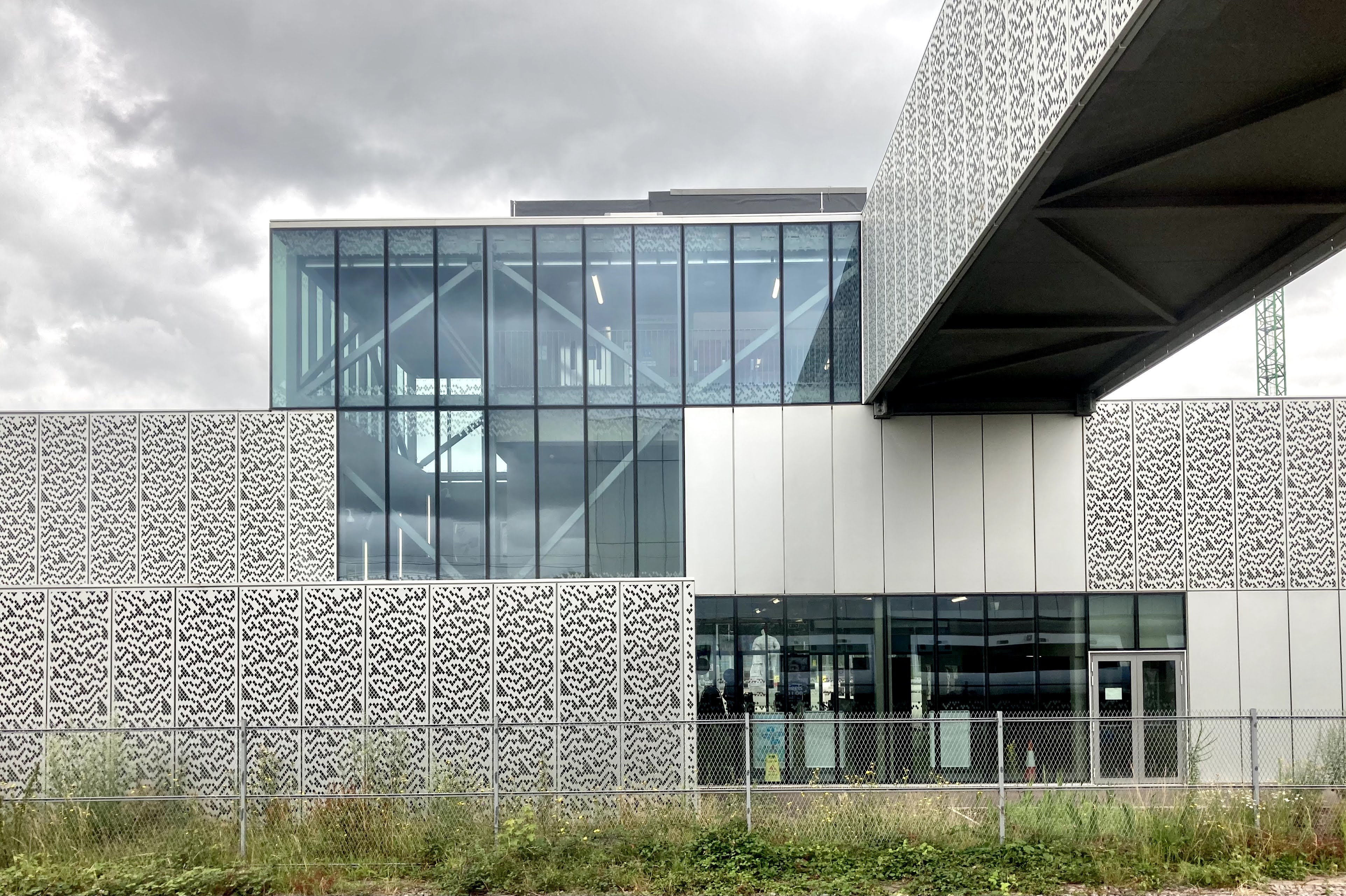
Photo by Daniel Wright [CC BY-NC-ND 4.0]
Although many of the aluminium panels are left plain, a substantial number are perforated with an intricate pattern reproduced at either large or small scale, especially (but not exclusively) along passenger routes through the station. The experience of walking through the station is unusual, with views to the outside obtained not through traditional square glass windows, but an array of rhombus-shaped holes.
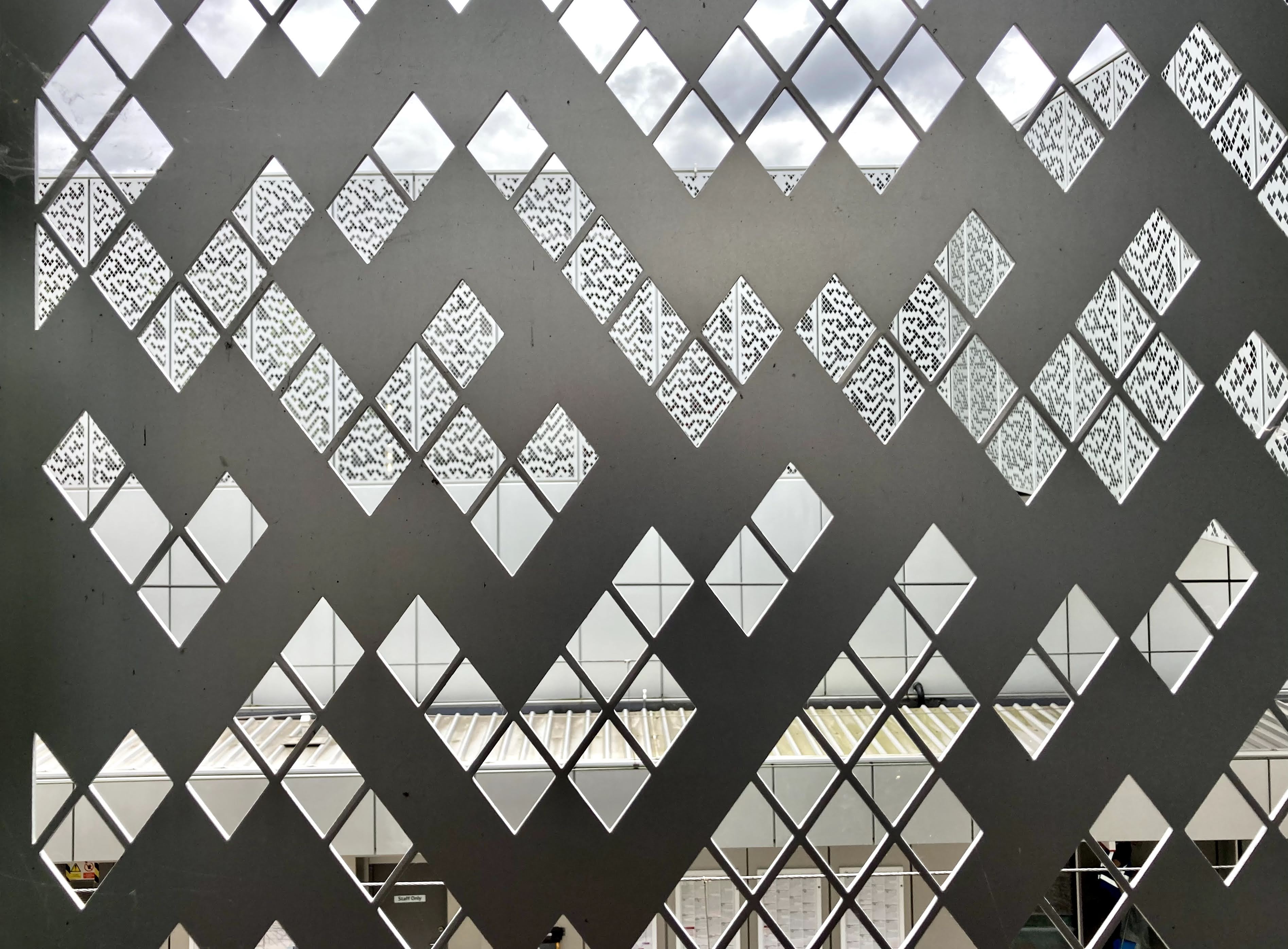
Photo by Daniel Wright [CC BY-NC-ND 4.0]
Thanks to a car-free plaza in front of the station (would that all stations had the same) it is possible to properly see the station in context, instead of obscured by serried ranks of tank-like SUVs. Sustainable transport connections are the key here instead. As well as easy interchange with the Cambridge Guided Busway, there is an enormous covered cycle parking facility next to the station. This is Cambridge, after all.

Photo by Daniel Wright [CC BY-NC-ND 4.0]
The combination of architecture and local landscaping results in a building with an imposing presence yet a simultaneously elusive quality. In the sun it hides behind the way its metallic exterior catches the light. On a cloudy day it retreats into the grey like a bank of the local fenland mist. At night the structural elements inside the building come into view through the illuminated perforations of the aluminium panelling, giving a will o’ the wisp-like semi-transparent appearance to the station.

Photo by Cmglee, CC BY-SA 4.0, via Wikimedia Commons
In a humanising (or perhaps superhumanising) touch, the station gained some public art in 2021. Artist Matthew Darbyshire’s “Hercules Meets Galatea” challenges the conventional story by depicting Galatea as youthful and powerful, while Hercules is old and blocky. Like the station’s cladding panels, they are both cast in aluminium.
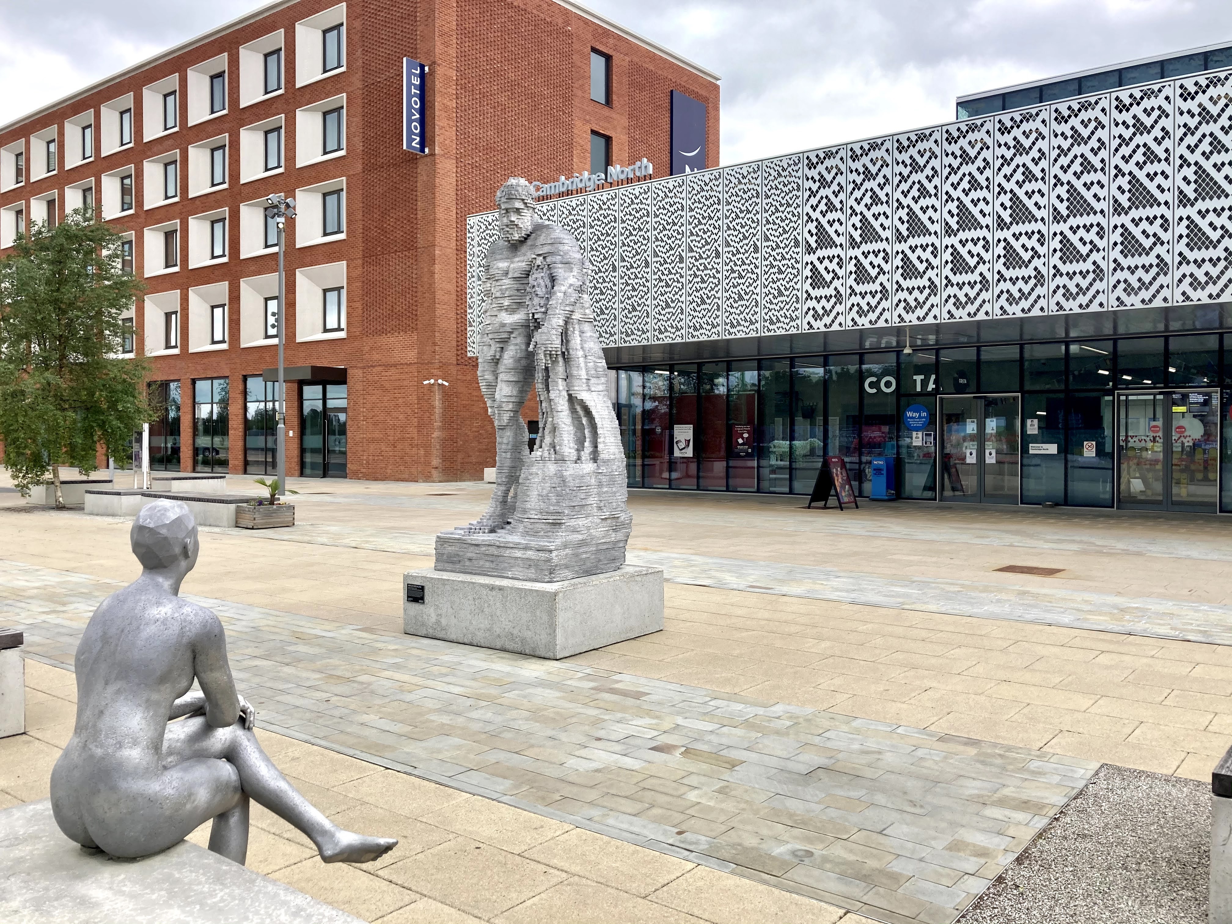
Photo by Daniel Wright [CC BY-NC-ND 4.0]
The perforated panels which are such a feature of Cambridge North were partly designed to enhance passive security, with people inside the station stucture visible to those outside (and vice versa) but also serve another purpose. The area immediately around the station is still not fully developed, and slightly further away much of the nearby area is dominated by science or business park buildings of modern, repetitive and (presumably intentionally) rather impenetrable appearance and little historical character or significance. Atkins’ clever solution was to model the panel perforations with, as it explained at the time, “a design derived from John Horton Conway’s “Game of Life” theories which he esablished while at Gonville and Caius College, Cambridge in 1970.” Even if the immediate area didn’t have a lot of history to reflect, creating a design based on the work of a local mathematician tied the station to the wider role of Cambridge as a centre for academia and science.

Photo by Daniel Wright [CC BY-NC-ND 4.0]
But here, we need to take a brief diversion into the world of cellular automata.
John Conway’s Game of Life is one such cellular automaton and uses a grid which starts off with some cells coloured in (whether they are randomly placed or more structured is up to the player). If you consider a filled cell to be “on” and an unfilled cell to be “off”, the game then evolves the pattern through the player checking the squares in the grid and then carrying out actions according to the following rules:
- If there are less than 2 or greater than 3 filled cells around a filled cell, the current cell is switched off (it ‘dies’ through being under- or overfed).
- If (a) the count is exactly 2, or (b) the count is exactly 3 and the current cell is filled, the current cell is left unchanged (i.e. it survives).
- If the current cell is off and the count is exactly 3, the current cell is switched on (the other three cells have ‘birthed’ a new one).
This video explains the process. Meanwhile, this video demonstrates how from these simple rules, extraordinarily complex patterns – including self-sustaining ones – can be generated:
These mobile, self-sustaining patterns have a quite uncanny sense of being alive in some way. If you want to have a play at making your own, you can do so here.
So far, so good. But it didn’t take very long before people started pointing out that the perforation pattern on the panels of Cambridge North station, and the patterns of Conway’s Game of Life, bore little resemblance to each other. Conway himself was reported as having a simple response to the claim that the station panelling patterns were based on his work: “They’re wrong.”
The perforation pattern did, on the other hand, look very much like another cellular automaton altogether, Rule 30, which was developed by scientist Stephen Wolfram.
A delighted-sounding Wolfram himself explained how the Rule 30 pattern has been cropped and rotated for use on the station panelling, on his own website.
Unfortunately, Wolfram studied not at Cambridge, but at Oxford, Cambridge’s long term academic rival or indeed “arch-rivals” as local newspaper the Cambridge News would have it. The Cambridge News got Atkins to confirm that the design used on Cambridge North was indeed Wolfram’s Rule 30 cellular automaton. It remains unclear to this day how it was that Atkins came to make the claim that the inspiration for the perforation patterns was Cambridge’s Conway rather than Oxford’s Wolfram. Atkins’ attribution of the design to Conway had been enthusiastically repeated at the time of the station’s opening by train operator Greater Anglia and also by Network Rail, making the later re-attribution all the more embarrassing. Local rivalries, eh?

Photo by Daniel Wright [CC BY-NC-ND 4.0]
All that said, I have no boat in this race, having attended neither Oxford nor Cambridge but having had a niece study at each. It doesn’t really bother me who originated the cellular automaton adapted for the panels at Cambridge North. I just take pleasure in the use of the fearsome beauty and cold indifference of mathematics to bring a particular kind of life to a station designed in large part to serve a science park. That feels right to me. The station will become a landmark as its nearby area is developed, playing a key role in the placemaking of a new urban extension.
Follow on Twitter
For more transport architecture, design, branding and cultural references, in between articles here, do consider following The Beauty of Transport on Twitter: @BeautyOfTranspt.
Bibliography and Further Reading
Greater Anglia promotional video for Cambridge North
Atkins webpage on Cambridge North (this is archived by the Wayback Machine, which I can’t get to load on all my browsers, so you might have to try a couple until you find one that works)
…and anything linked to in the article above.
How to Find Cambridge North station
Get there by train from London Liverpool Street and various locations across East Anglia. Click here for The Beauty of Transport‘s map.

Bit dull at platform level. Funny, how even the best architects, still can’t yet design a whole building 😂. Somewhat understandable, as the platforms are a working railway…
It should have been called John Major station because it’s so grey and boring.
Interestingly, this station does have something of a common house style with the 1960s stations at Broxbourne and Harlow Town on the same line
I’m local to Cambridge North and the biggest complaint from locals is that they installed too few ticket machines in the station.
The car-free plaza in front of the station does I’m sure allow you to properly see the station in context but it also means that in bad weather you have to scuttle across a wet and windswept space if you’ve caught the bus or got a lift to the station, rather than being dropped off under cover.
No vehicles out front is, for architects a bugbear of pretty high order almost as bad as grass or anything unadorned with the reflective quality of water. Exceptions prove the rule of course and you can understand that sans cars, any building is going to look better and more prosaically, is going to be able to be looked at in the first place.
In my experience, there are still too many designers of buildings who unforgivably poo-poo the real world problem of a rainy neck (as mentioned above) but we’re all human, even yer ‘umble architect and there must be a happy medium somewhere to be found.
Not unrelated is another side to the pretty pierced aluminium panels. Blissfully unaware until I was told of the ‘directed vision’ psychology behind similar ones such as at the Westfield shopping centre in London’s Shepherds Bush. There the “random” hole pattern is in the ceiling and where the sun shines through.
No haphazard application here apparently, but the mathematically driven design, err, designed to let you see where you’re going true, but mainly to cause you to avert your eyes away from the retina disturbing design and wherelse to go but downwards there to settle on the wares in the shop windows.
Clever, has a point, but blummin scary manipulation of the weary bill payer with spouse and cost-centres (sorry, children) in tow.
Beauty must be in the eye of the beholder! Perfectly ugly building , 60s look alike and souless . Another eyesore for Cambridge