One of the most enduringly popular articles on this website (at least in terms of clicks and re-posts) is a very early one, from 2013. It concerns the graphic identities created for Railtrack’s major stations by Citigate Lloyd Northover. These ones…

Firstly – have I really been writing this website on and off for that long? And secondly – should I have just given up there and then given that nothing I have written since seems to have been more popular? On the assumption that if you are reading this, the answer to the second question is maybe not, I thought it might be time to return to the subject, not least because I think I now have a better understanding of who did what on the project, and also because the central tenet of that original article has proven to be completely wrong. In 2013, it seemed that the station identifiers were on their way out, and I unseriously suggested that memorabilia featuring them might be a good railwayana investment. This only goes to show why you should not take advice from me, financial or otherwise. Because, in fact, the symbols have stubbornly refused to die.
Because this is that kind of website, this is the history of those logos, and I’ve found you a picture of every single one in use. Except one.
Starting in 1999/2000, Railtrack (the then-owner and operator of the British railway network’s infrastructure) began to introduce location specific logos for its ‘major stations’. Unlike most railway stations in Britain which were managed by one of the train operators, the major stations were directly managed by Railtrack itself. The arrangement persists to this day, though today’s infrastructure operator Network Rail refers to these stations as its ‘managed stations’.
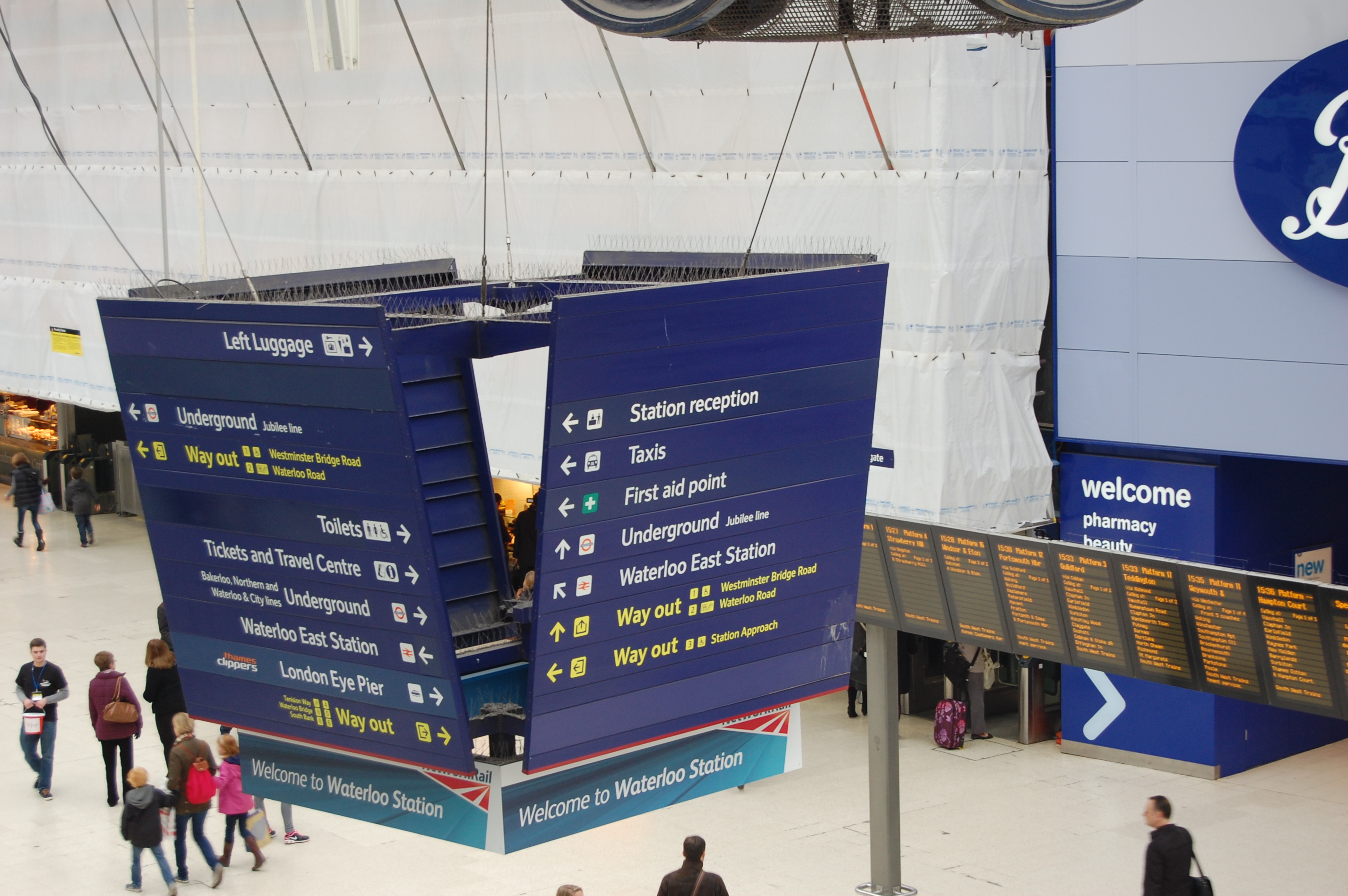
Railtrack’s station identifier logos appeared as part of a brand new signage/wayfinding system for the major stations, replacing the signage it had inherited from British Rail. Railtrack’s signage can still be found at many of the country’s largest railway stations; dark blue signs on which is white text (yellow for exit information) in a specially designed typeface called “Brunel”.
This Design Week article gives graphic designers Citigate Lloyd Northover the lion’s share of the credit for the project, describing the company as having been “commissioned to design a series of station icons and a wayfinding signage system”, as well as designing “the new typeface Brunel, in conjunction with type designer David Quay.” Quay worked at typeface design company The Foundry at the time, and although unmentioned by Design Week, co-founder Freda Sack also worked on the Brunel typeface, as she recalled in an interview reproduced on The Foundry’s website. The Brunel typeface survived Railtrack’s replacement by Network Rail in 2002, being redrawn slightly in the 2000s as NR Brunel (I cannot tell the difference between them, though typeface experts can). Meanwhile, Design Week adds that, “Implementation of the new wayfinding project in ten stations has been undertaken by Design Research Unit (DRU), which also produced a generic design manual for all stations.”
This all seems simple enough, except that a couple of ex-DRU staff feature the Railtrack major stations signage project in their portfolios (see here and here) as a DRU project and mention neither Citigate Lloyd Northover’s involvement nor that of The Foundry. In an interview with Creative Review, John Lloyd of Citigate Lloyd Northover makes no mention of DRU’s involvement. All of this leaves the exact who-did-what on the project somewhat difficult to discern, although at least the main players are clearer to me than they were in 2013 (although I did edit my original article subsequently once I discovered some of the other names).
While I think the project depended on the combination of all three elements – signage, typeface and unique station identifier logos – for its success, it is Lloyd Northover’s station identifiers that seem to exert the most ongoing fascination for enthusiasts of railway design. It is easy to understand why. There is a sort of collectability about the logos, with each station having its own example, and there is the enjoyment to be had in teasing out the meaning of each of the logos. When I first encountered them, I thought they were lovely, and I remain very fond of them to this day.
Initially, Railtrack managed 14 major stations. This original set, and an explanation of their identifiers, is as follows (you might need to click on the images or links to see the actual station identifiers at a larger size):
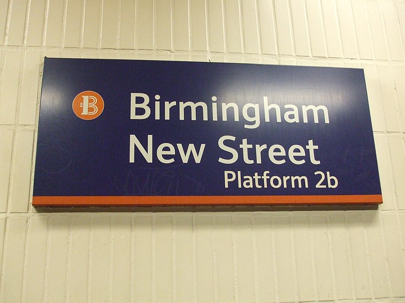

- Birmingham New Street (railway tracks (I think?) forming a B)
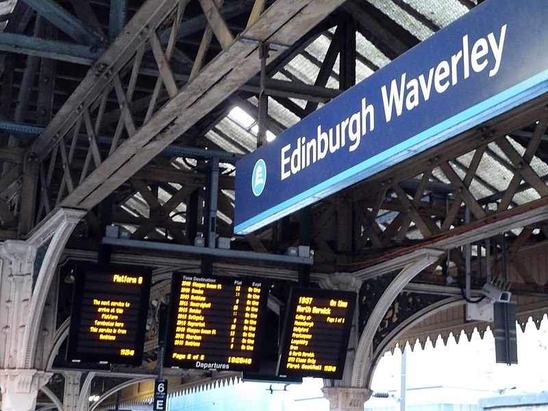
- Edinburgh Waverley (E topped with silhouette of Edinburgh Castle)
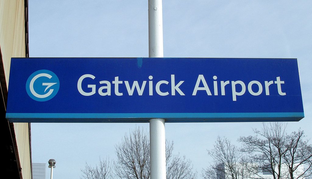
- Gatwick Airport (G with a BOAC-style speedbird forming the crossbar)
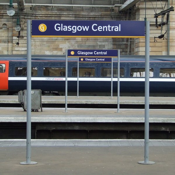
- Glasgow Central (G based on the typography developed by Glasgow artist Charles Rennie Mackintosh)
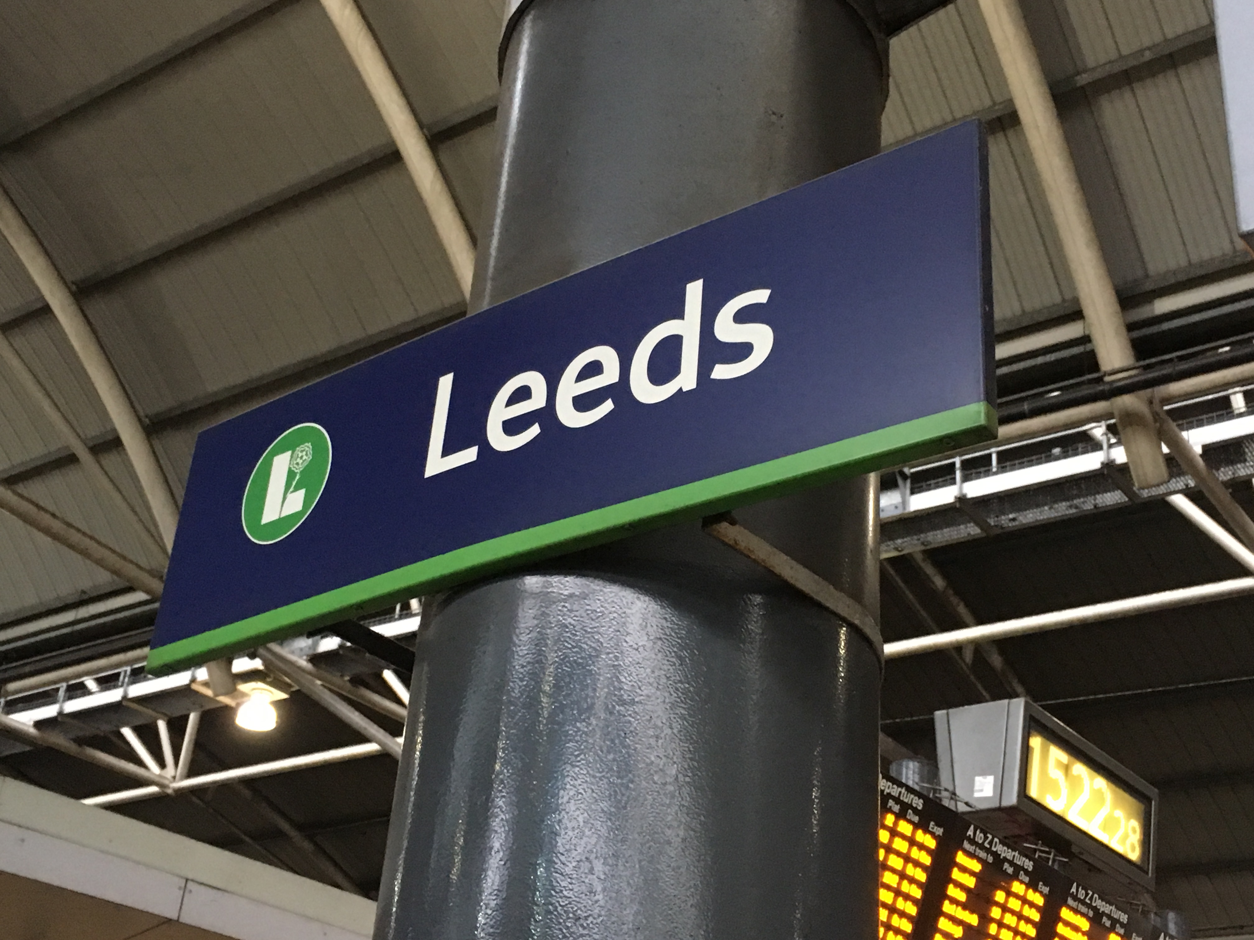
- Leeds City (the white rose of the Royal House of York, overlaid on an L)
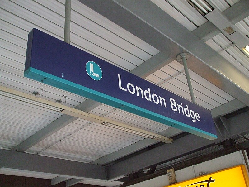
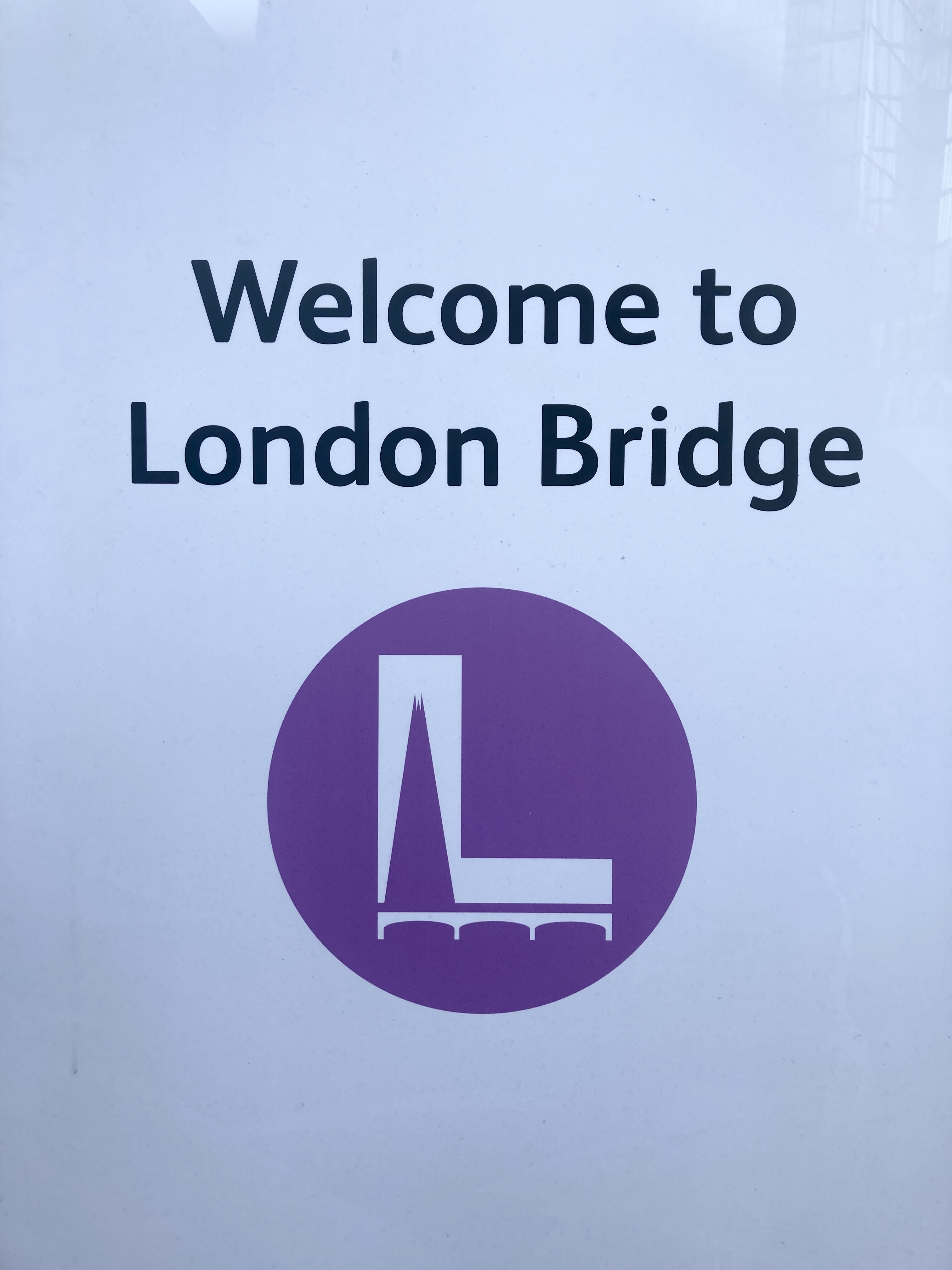
- London Bridge (L containing silhouette of St Paul’s Cathedral dome)
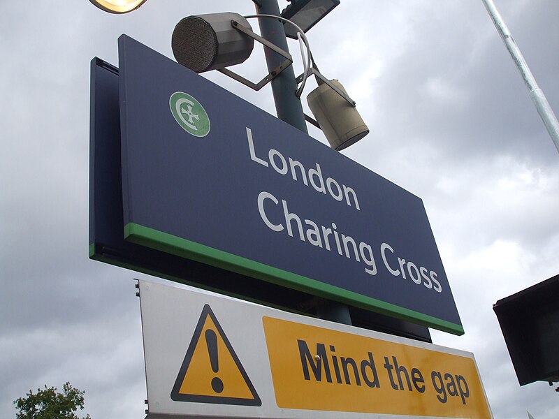
- London Charing Cross (the cross from the Eleanor Cross outside the station, within a C)
- London Euston (E in the style of the lost Euston Arch)
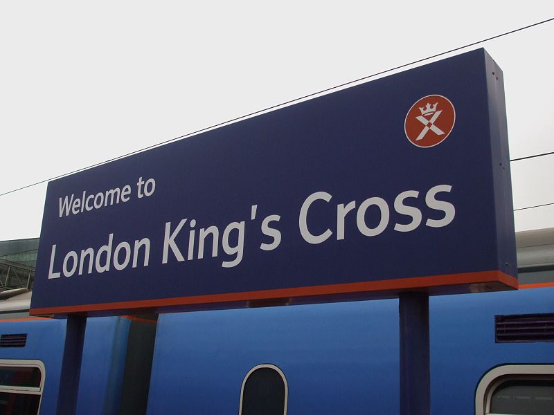
- London King’s Cross (visual pun: a cross with a crown on top)
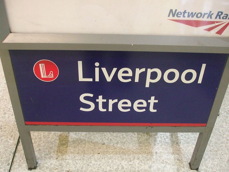
- London Liverpool Street (L reflecting the ironwork in the station roof)
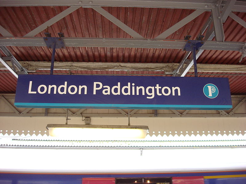
- London Paddington (P reflecting the form of the screens at the end of Brunel’s trainshed roofs at the station)
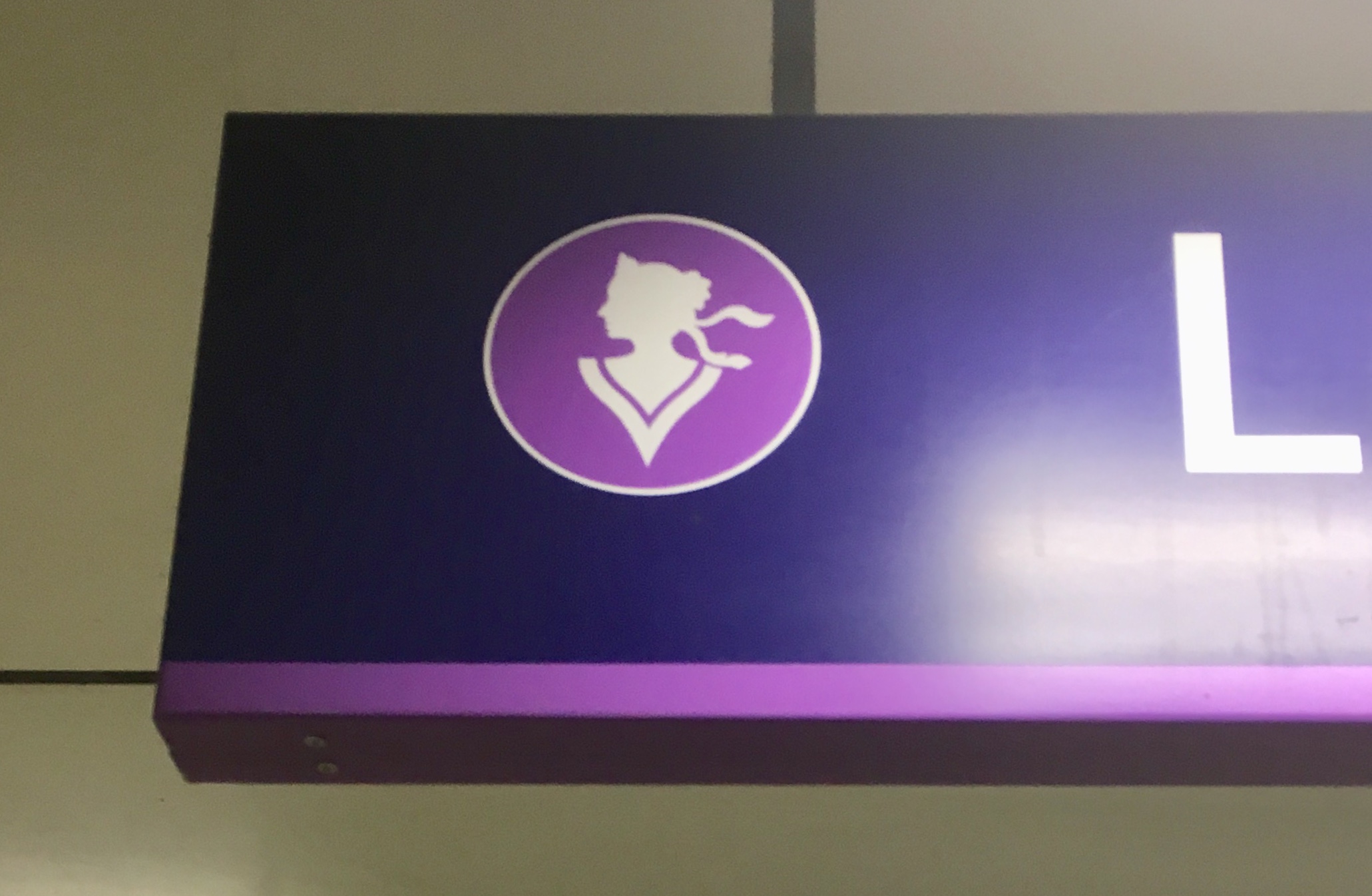
- London Victoria (silhouette of the young Queen Victoria – after whom the street on which the station stands was named – with a V forming the neckline of her dress).
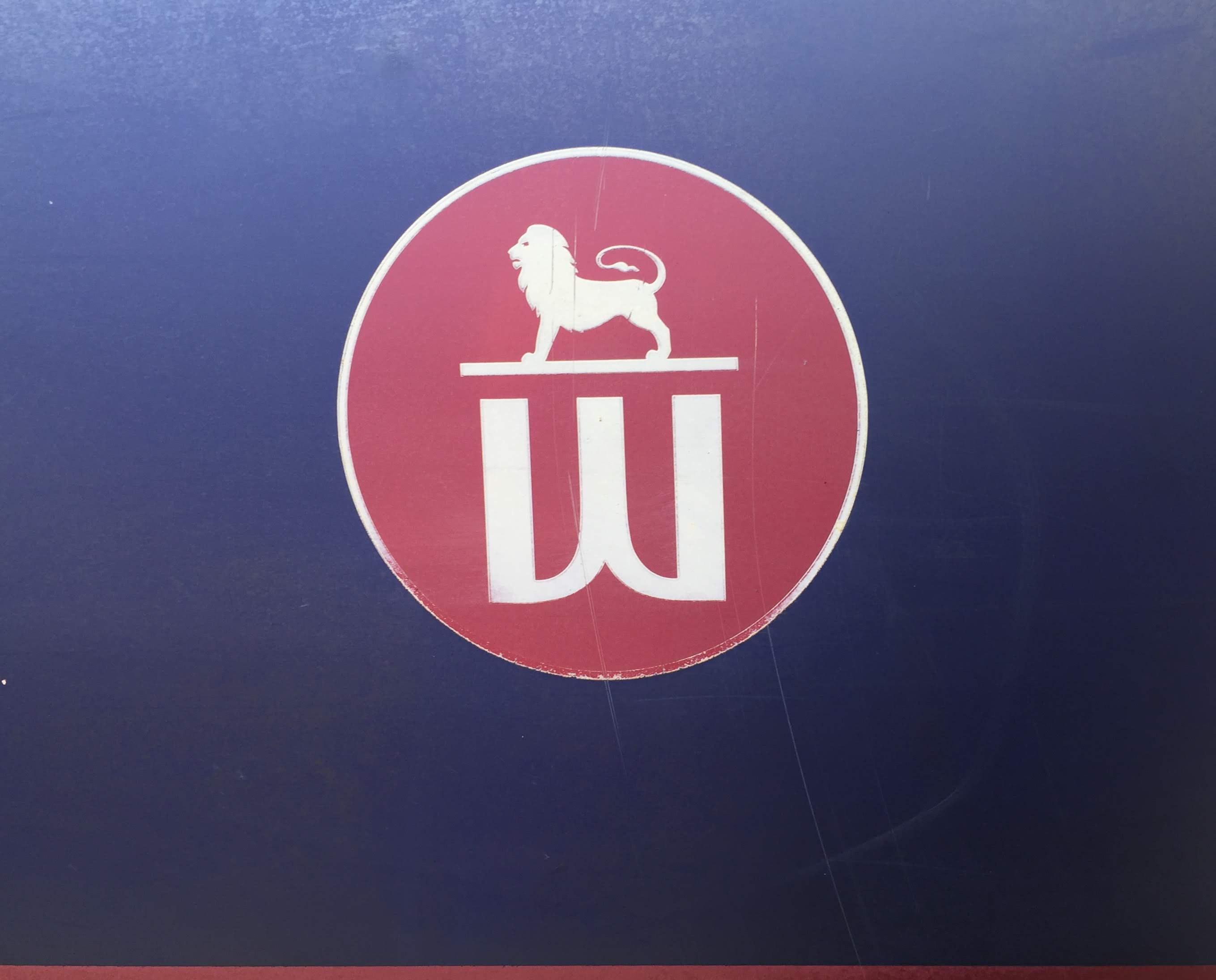
- London Waterloo (W forming the plinth for a lion sculpture which used to be outside the station before being moved a bit further down the South Bank to near County Hall)
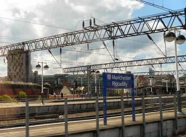
- Manchester Piccadilly (a railway viaduct’s arches forming an M)
In the early 2000s, three other large stations transferred to the direct management of Railtrack’s successor, Network Rail. These were (again, you might need to click on the images or the links to see the station identifiers at a larger size):
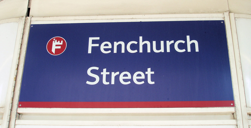

- London Fenchurch St, which transferred to Network Rail management in 2002 (F topped with a silhouette of the Tower of London)
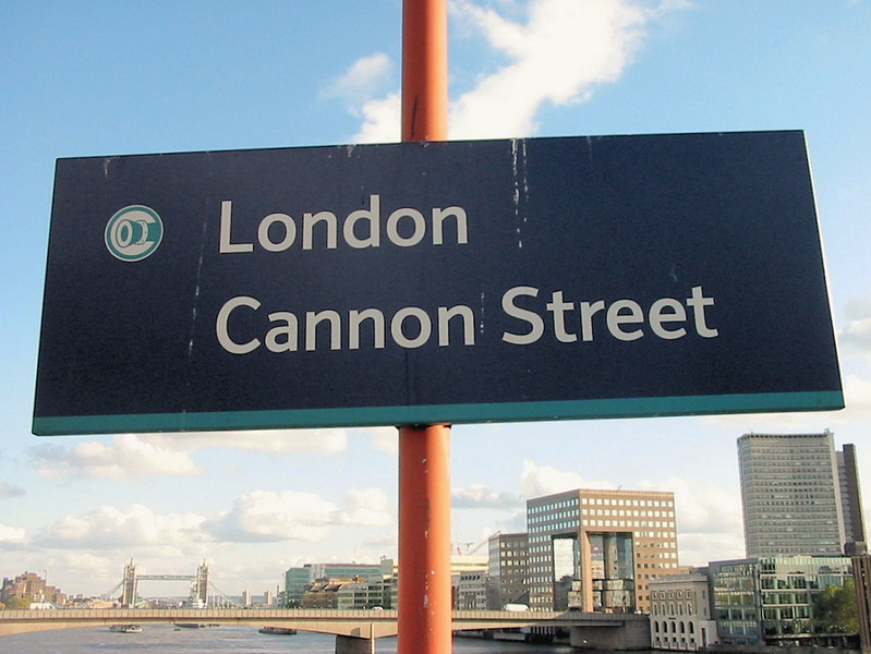
- London Cannon Street, which also transferred to Network Rail management in 2002 (C with a cannon, though Cannon Street on which the station stands is apparently a corruption of candle-makers’ street rather than having anything to do with artillery)
- Liverpool Lime Street, which transferred to Network Rail management in 2003 (L with a Liver Bird and the waves of the River Mersey)
Sadly for fans of the station identifier logos (myself included), they subsequently fell out of favour with Network Rail. I have never discovered the official reason, but it seems likely that it was partly because they were an inheritance from Network Rail’s largely unlamented predecessor Railtrack, and partly because they didn’t quite fit with the more sober corporate image Network Rail preferred to cultivate compared to Railtrack.
London St Pancras International (sub-surface Thameslink station) has been a Network Rail managed station since it opened in 2007, but it has never had a station identifier logo. Occasionally, passengers might encounter the very rare High Speed Ltd version of Network Rail’s logo at locations around the station, which confirms the station’s direct management.
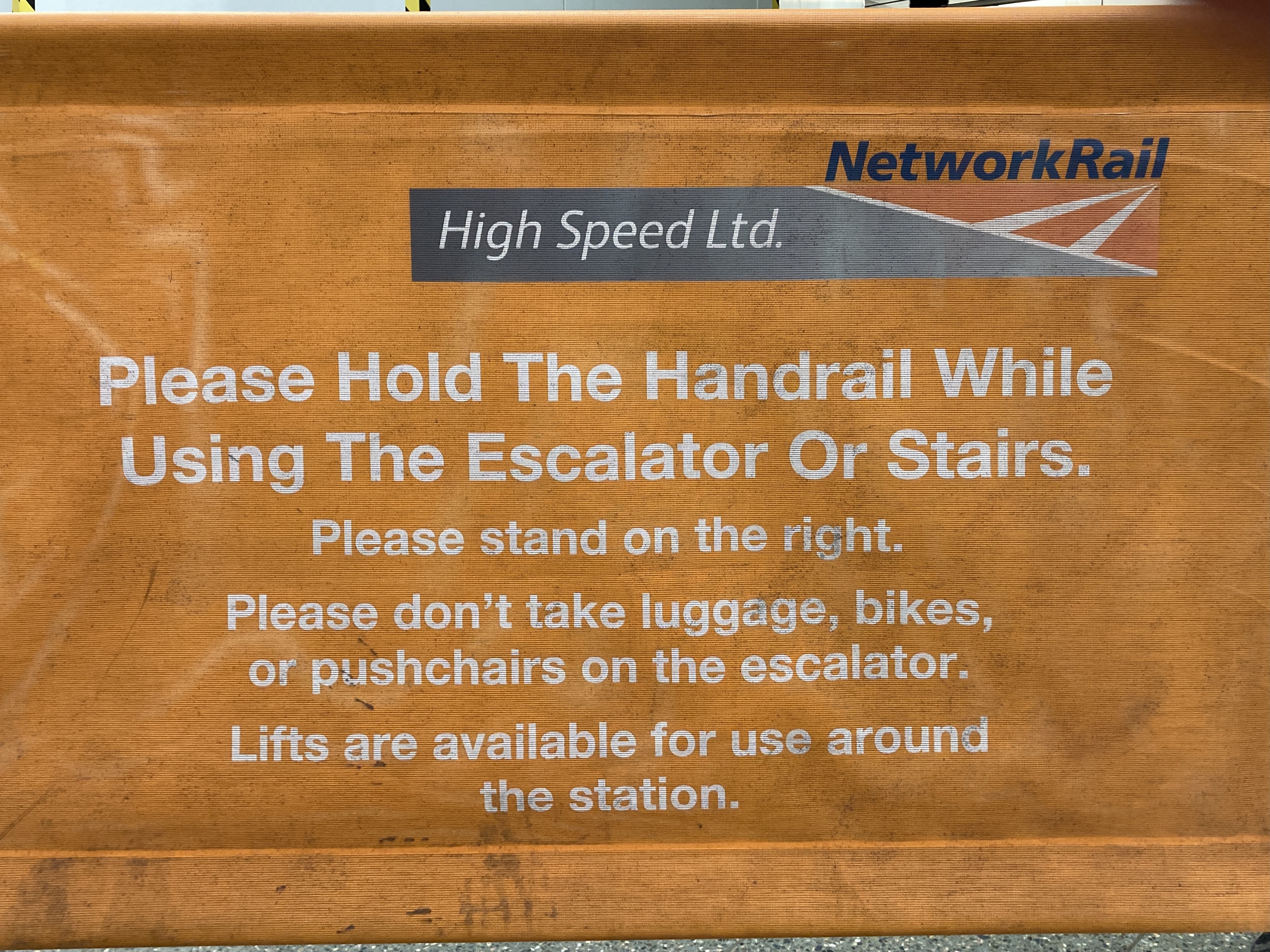
The main St Pancras International station has never been part of Network Rail’s estate. It is owned by HS1 Ltd, though managed on a day-to-day basis by Network Rail High Speed Ltd, and therefore never got a station identifier logo when the other large London termini did.
By 2010, Network Rail’s design manual Managed Stations Wayfinding, developed by Steer Davies Gleave (accessible via this Freedom of Information request), made absolutely no mention of the station identifiers. They were omitted from station signage when signs were replaced or amended at the managed stations.
In 2012, Gatwick Airport station transferred from Network Rail direct management to that of local train operator Southern, rendering that station’s unique identifier redundant in any case.
That was more or less the point the story had reached when I wrote that original article on the station identifiers in 2013. As Network Rail was no longer applying the station identifier logos, I assumed that they would slowly vanish into the mists of railway design history as signage was updated or replaced.
The situation that followed at Gatwick seemed to back this up. Initially, and unwisely, the station signage was rebranded in the visual identity of Gatwick Express (Southern’s sister brand).
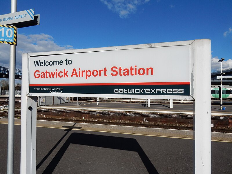
As a result of that decision, the station gained a style of signage unique on the British railway system. With the rail network constantly criticised for being fragmented and confusing, adding a one-off railway station signage system into the mix seemed like madness.
A few years later, Southern and Gatwick Express’s parent company Govia Thameslink Railway replaced the Gatwick Express-branded signage at the station, through the unfortunate mechanism of allowing the extension of Gatwick Airport’s own wayfinding signage onto the station itself.
I have nothing against Gatwick Airport’s wayfinding signage (developed by design and marketing solutions agency No Nonsense Design), which does its job perfectly well. It was design agency Mima which came up with the idea of extending the airport’s signage onto the station itself, and to be fair to Mima it engaged with Network Rail and Southern’s parent company Govia Thameslink Railway (GTR), who would have needed to sign off the plan. What were Network Rail and GTR thinking? I suppose if you don’t mind your railway station appearing to be nothing more than an adjunct of the airport, then fair enough. Personally, I think the railway industry can (and should) aspire to greater things. And of course it perpetuated the situation of Gatwick Airport station having signage unlike that at any other station on the National Rail network.
Back on Network Rail’s estate of managed stations, and quite contrary to my expectations in 2013, the station identifiers refused to die. They might have been deleted from station signage, but that didn’t stop them living on elsewhere. They appeared on printed publicity, staff uniforms, and even on station doormats. Waterloo’s identifier is used an avatar by the station’s Twitter account.
But that should have been that, really, with the station identifiers omitted from signage, albeit living on via more ephemeral material. Of course, it wasn’t the end of the story at all.
The next sign that the station identifier logos would have unexpected longevity came some time after the completion of The Shard (the big glass pointy skyscraper over London Bridge station) in 2013. London Bridge station modified its identifier logo for future service, swapping the dome of St Paul’s Cathedral for The Shard.
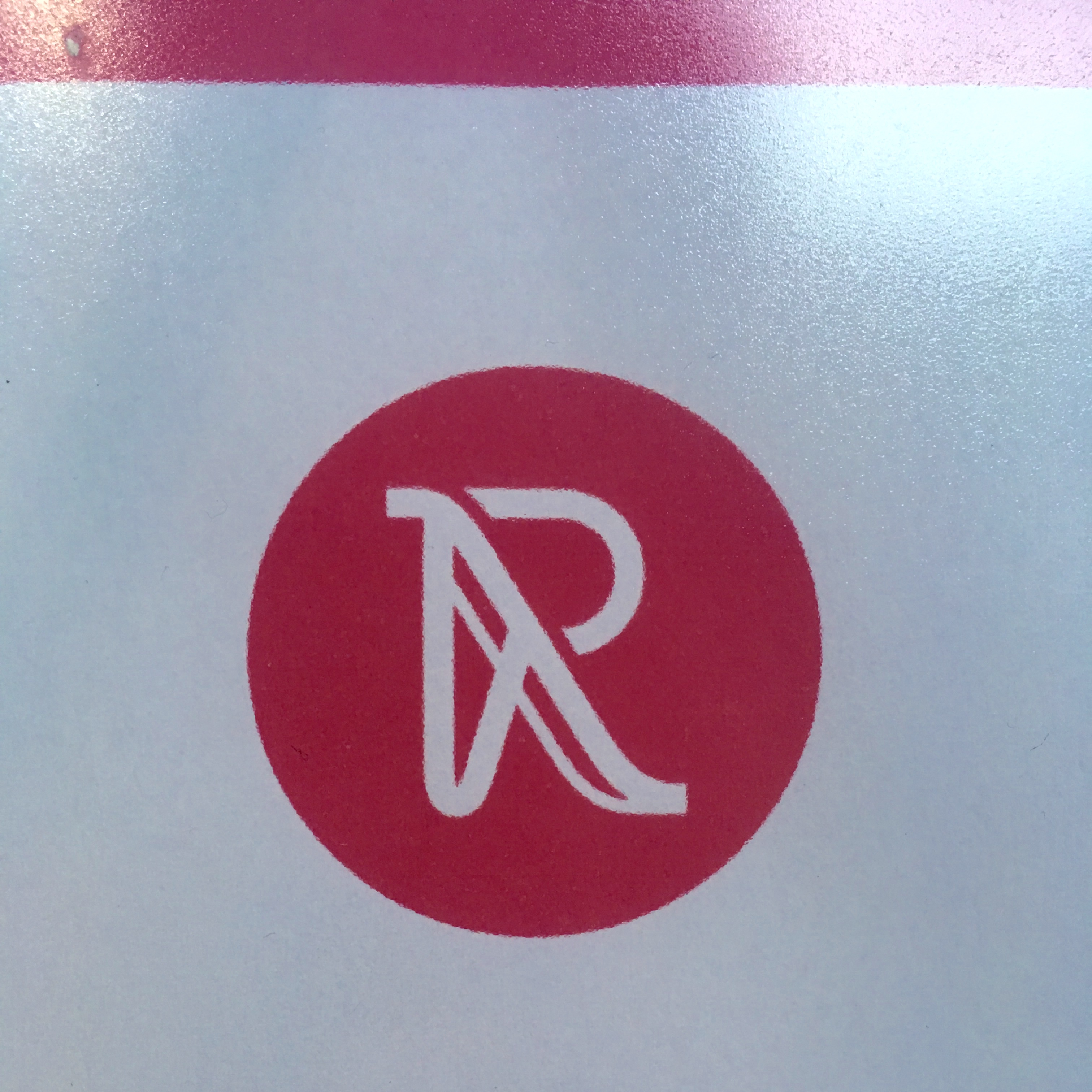
In 2014, though London Fenchurch Street returned to train operator c2c’s management (so what was the point of all that, then?), Bristol Temple Meads and Reading stations transferred from train operator to Network Rail management. There was no reason to suppose that either would gain station identifier logos of their own, it being years since Citigate Lloyd Northover had created the original set. And yet somehow, they did.
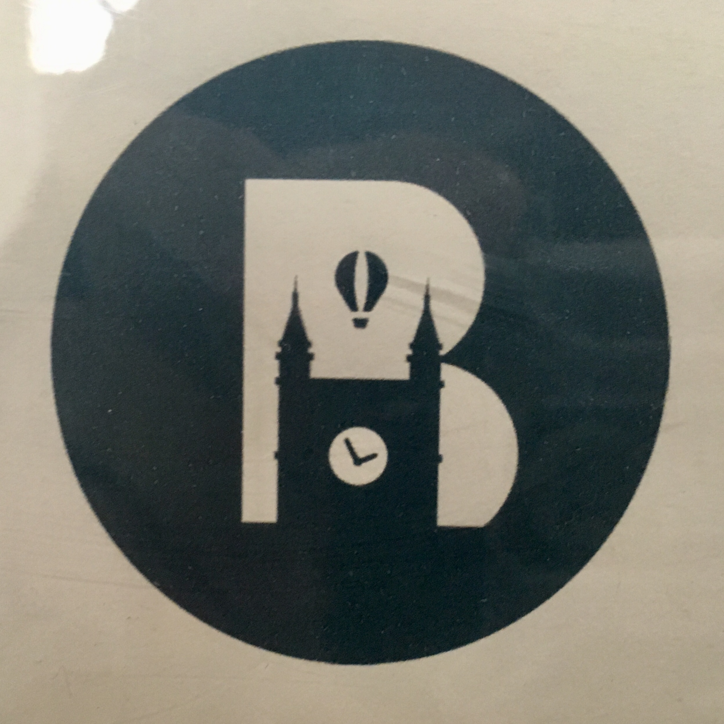
- Bristol Temple Meads (against a B, the station’s clock tower and a hot air balloon above, referencing the annual Bristol Balloon Fiesta)
- Reading (R referencing the shapes of the escalators up to the station’s recently rebuilt bridge deck)
I have the distinct impression that these were not generated or authorised by the central function which oversees Network Rail’s corporate identity, but rather something that happened as a local initiative. Network Rail has a federal structure that means the centre cannot always simply impose its will on the Network Rail regions, and it seems that this was one example. The Wayfinding design manual of the time was quite clear in omitting station identifier logos from station signage and yet at Reading…

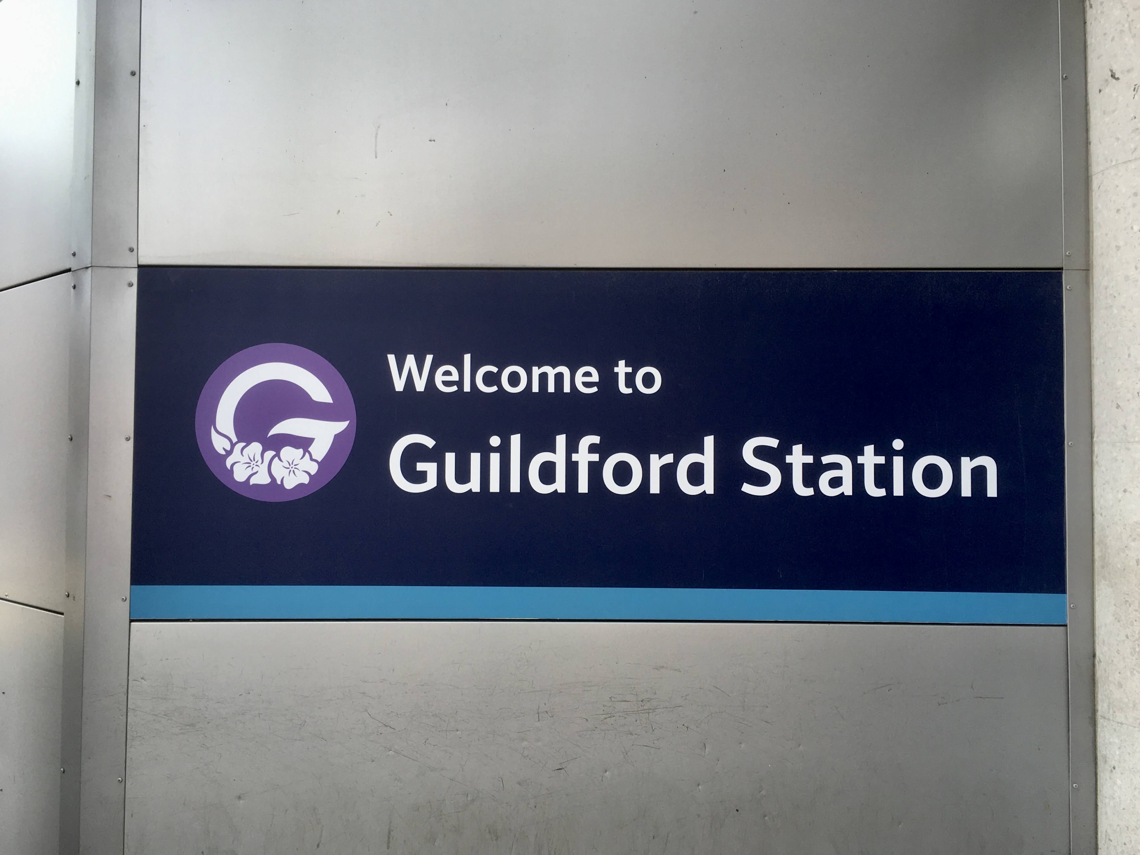
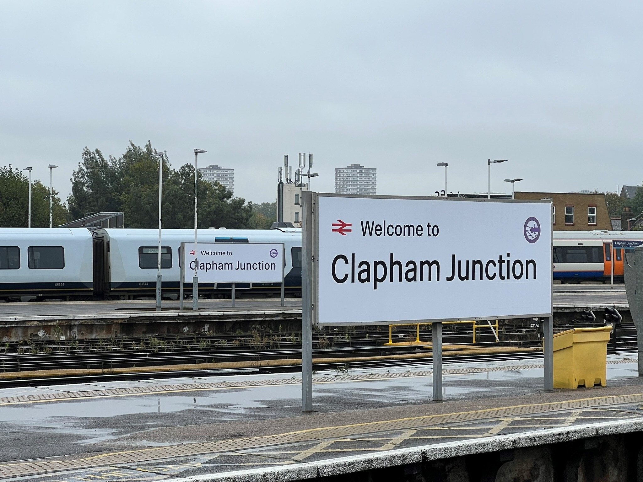
There was an air of inevitability, therefore, about what would happen following the transfer of Guildford and Clapham Junction stations to Network Rail’s managed stations portfolio in 2018. And sure enough…
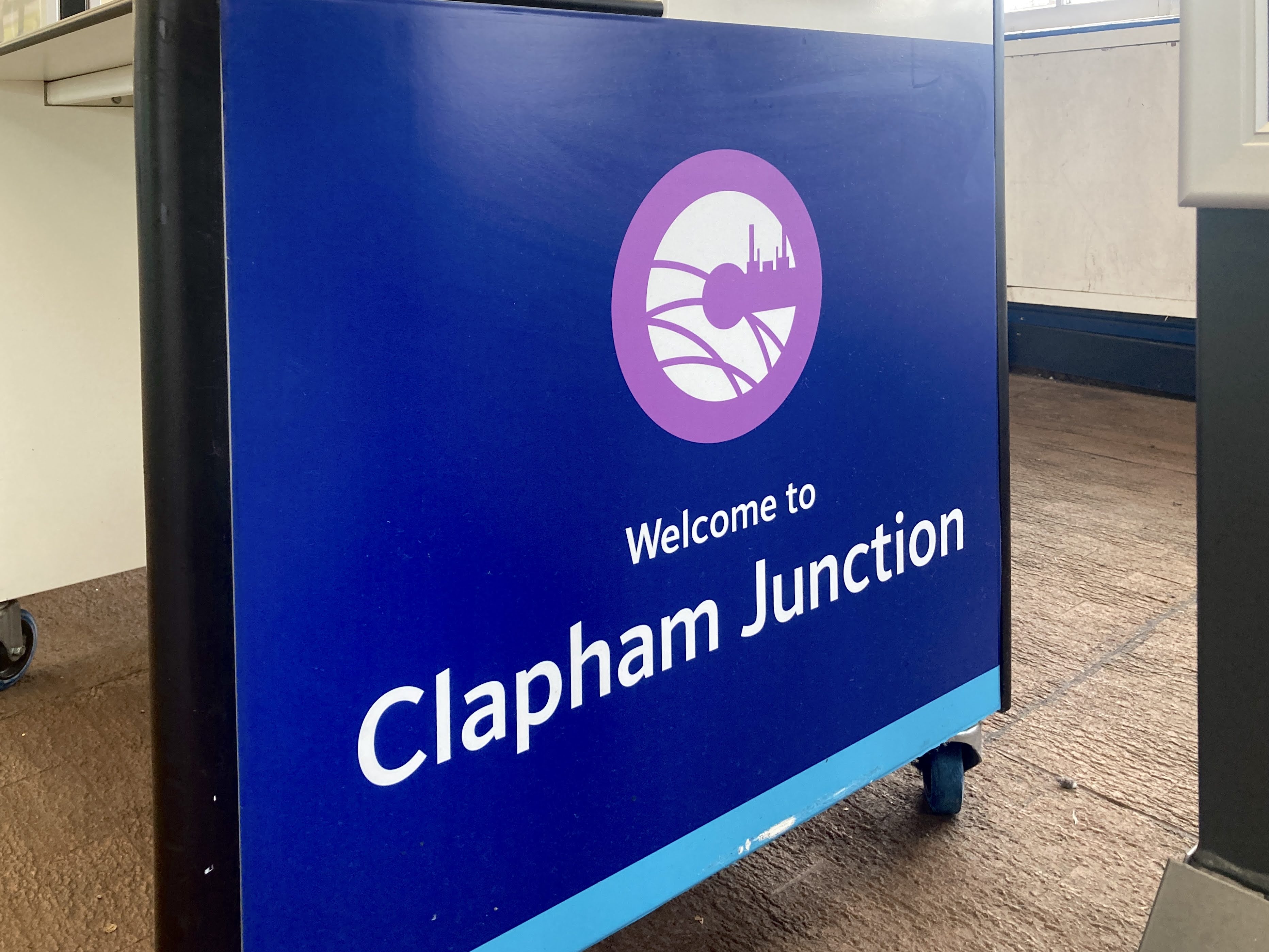
- Clapham Junction (C overlaid with railway tracks, and Thames-side cranes)
- Guildford (G with flowers – I wish I could explain this but its meaning escapes me)
At present, Guildford and Clapham Junction are the two most recent stations to have become directly managed by Network Rail, and therefore the final two (at least for now?) station identifier logos.
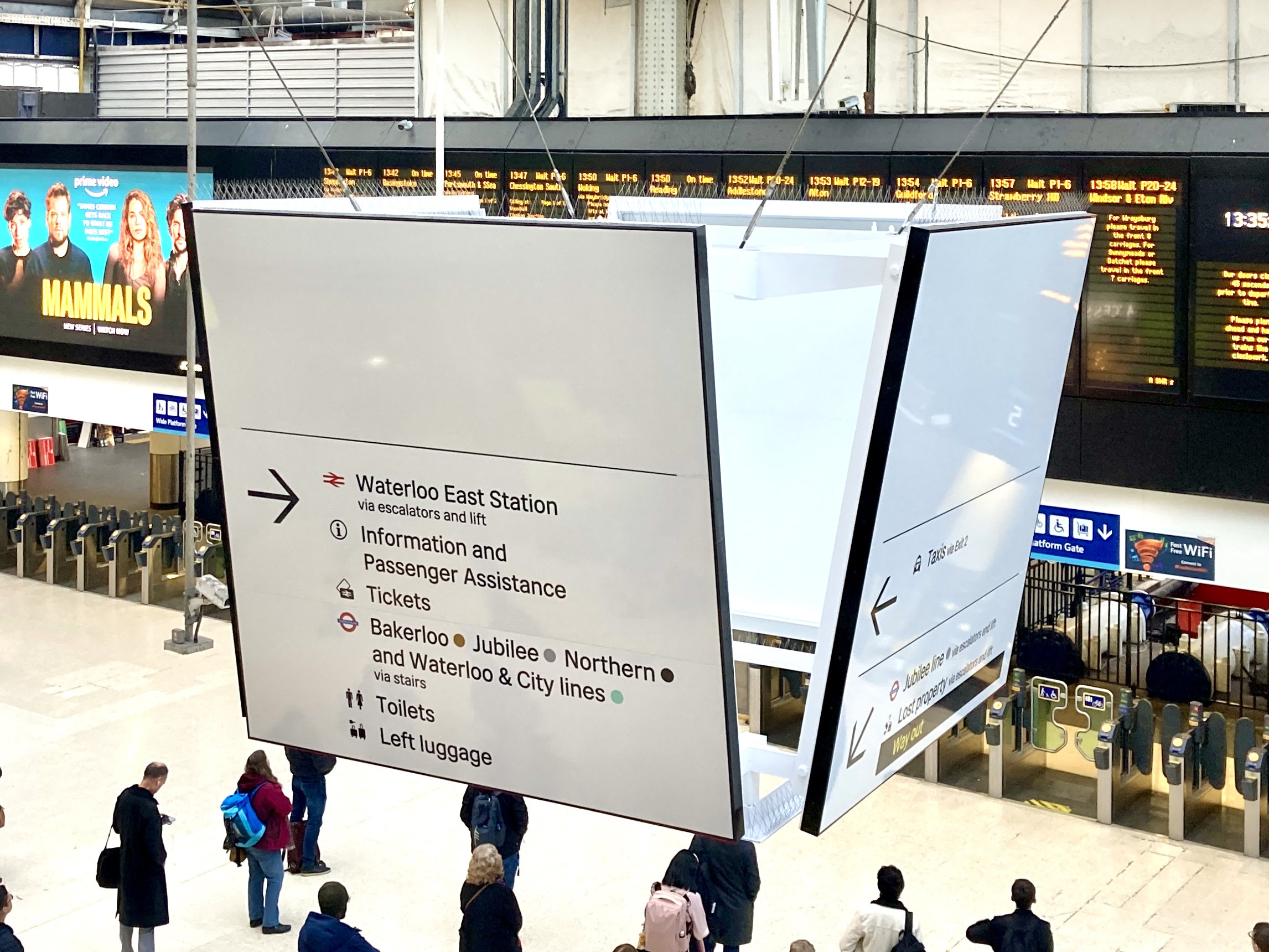
In what ought to have been the definitive end of the station identifier logos on station signage, Network Rail unveiled a brand new Wayfinding signage schema in 2021 [The Beauty of Transport 26 May 2021] featuring a new Margaret Calvert/Henrik Kubel-designed typeface, Rail Alphabet 2, applied in black on a white background and accompanied by all-new pictograms representing station functions. The station identifier logos were, again, definitively excluded from this new world of wayfinding design.
I know of a number of Network Rail people who consider the station identifiers – despite their original success – to have become somewhat dated design features, and I suspect they would be quite happy if they disappeared completely, and not just from signage. But with their propogation onto clothing, printed publicity (and not forgetting the doormats) that might be rather like attempting to put the genie back into the bottle.
Network Rail’s managed stations are seeing more and more of their blue signage replaced by the white Rail Alphabet 2 versions and (very positively and hopefully to be continued under Great British Railways) it is starting to be used at non-Network Rail managed stations too. Completely failing to learn my lesson from 2013, I assumed that surely, the new black-on-white signage would finally see the station identifier logos banished from station signage, at least.
But quite recently, this appeared at Clapham Junction…
Yes, these are white Rail Alphabet 2 signs (though I’m not sure that “Welcome to…” running-in boards are actually prescribed in the latest Network Rail Wayfinding design manual) and yes, somehow, Clapham Junction’s station identifier logo has been applied to them. I assume that this must be another local initiative, because the station identifiers are not supposed to feature on the Rail Alphabet 2 signs, and this one doesn’t really sit very comfortably on this style of sign. The station identifier logos, lovely pieces of graphic design though they might be, were designed to be part of a previous generation of station signage. That, I think, is where they should remain. But if I have learned anything over the last 11 years, it is that the station identifer logos are remarkably resilient, and very difficult to banish.
Oh! I nearly forgot. I said somewhere in the text above that there was one station identifier logo I hadn’t found a photo of. I would be amazed if it ever appeared on any actual signage, but Railtrack’s major stations also had a generic logo covering the whole portfolio. I can’t really imagine where it was ever used1, but you can find an image of it at the Project Mapping website.
Bibliography and Further Reading
Network Rail’s current Wayfinding design manual, and others
A Freedom of Information request regarding the NR Brunel typeface: https://www.whatdotheyknow.com/request/signage_and_branding#incoming-661680
…and anything linked to in the article above
Follow on social media
To be alerted to new articles, and for more transport architecture, design, branding and cultural references in between, do consider following The Beauty of Transport‘s social media channels (to which I post in accordance with my available time and energy, which varies):
Instagram: @the_beauty_of_transport
Bluesky: @thebeautyoftransport.com
Facebook: www.facebook.com/thebeautyoftransport
You’ll also find me on Bluesky for thoughts about wider transport policy and non-transport things too:
Bluesky: @danielhwright.bsky.social
- After this article was written I was contacted by Anthony Gough, who was kind enough to send me a Euston Station newsletter from 2002 which demonstrates at least one use case for the Major Stations logo… ↩︎


I really enjoyed this article, I’ll share why in a comment on the site. Here I’m attaching a photo of one the hanging scoreboards that are in every pro and serious amateur hockey arena in Canada (& US), which are what I think of when I saw your photo of the Waterloo station square hanging box sign. Despite the Waterloo sign not being a closed box the way our scoreboards are. Funny that in home analog hockey games from the 1970s onwards had this scoreboard above the play surface, through which you’d drop the puck – it’d go through some ramps to slow it down & centre it, then drop to centre ice, like a real referee does.Â
Fascinating stuff, thank you. One thought: Do we think the Clapham logo’s dockside cranes are also intended to mimic nearby Battersea Power Station?
Almost certainly yes. But as I’ve never actually had it confirmed, I was hedging my bets a bit, just in case.
Can you come and visit the Isle of Wight, and do an article on the newly completed Ryde Transport Interchange please ? 😀
Guildford’s is probably supposed to represent the Castle Grounds: https://www.google.com/search?q=guildford+castle+grounds
Never even noticed these….