Finding your way around a Network Rail station is becoming another step easier. The publication of the most recent version of Network Rail’s Wayfinding design manual represents the latest step in the company’s quest to design the best possible signage system for stations. Given the ongoing moves towards re-integrating large parts of the railway network into the new publicly-owned Great British Railways (GBR) organisation, it is a timely update. After all, if (and admittedly it is still an ‘if’ at this stage) GBR manages to impose a consistent visual identity across its operations, Network Rail’s Wayfinding design guidance manual is the obvious model to follow. GBR is, after all, being created out of Network Rail itself, with the addition of new ticketing and passenger train operation functions.
Network Rail’s suite of design guidance manuals continues to be a source of fascination for those interested in railway design and architecture. The modern-day equivalent of British Rail’s Corporate Identity Manual, it is not exactly the same thing as BR’s work. Network Rail’s collection of 30 design guidance manuals (and the number is growing over time) cover areas that BR’s Corporate Identity Manual never considered (station toilets, lighting at stations, and electric vehicle charging points to name but a few) but also exclude topics that BR’s manual covered, such as train liveries and staff uniforms.
Much as BR’s manual, which was originally issued in ring-binder format, was occasionally updated with new information sheets supplementing or superseding older ones, Network Rail’s design guidance is also updated from time to time, as passenger expectations evolve and rail industry requirements change. Wayfinding (Design Manual NR/GN/CIV/300/01) was first issued in 2021, and its third iteration was published in December 2024.
On the team developing version 3 of Wayfinding was graphic designer Nick Job, familiar to readers of this website from his work distilling British Rail’s double arrow symbol into Rail Symbol 2 (The Beauty of Transport, 14 December 2022). As part of the preparation for Wayfinding version 3, he undertook a friendly critique of the performance of the signage specifications in earlier versions of Wayfinding, then worked alongside architects Weston Williamson + Partners, wayfinding consultancy Maynard, and signage specialists Merson Group (this video shows the company installing version 3 signage at Clapham Junction) to develop the latest version.
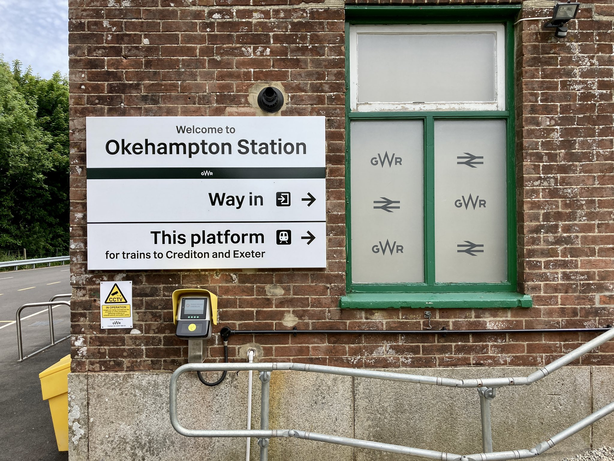
To recap earlier articles, Network Rail’s 2021-onwards wayfinding standards are based around signs with a white background and black text, the same colour combination used by British Rail, and quite different from the blue signs with white text introduced by British Rail’s successor – and Network Rail’s predecessor – Railtrack. The typeface used on the Network Rail 2021 signage is the specially commissioned Rail Alphabet 2 by Margaret Calvert and Henrik Kubel, while the double arrow symbol mandated for use on them has been Rail Symbol 2 since late 2022.
Network Rail is only able to impose its new standard wayfinding signage on the small number of major stations it directly operates, but elements of the signage have increasingly been adopted – to greater or lesser degrees of success and compliance with the standards – by a number of train operators. The spread of the new signage to several train operators gave a degree of urgency to the latest revision of Wayfinding, not least to address some issues and deviations from standards subsequently thrown up. Some train operators have adopted the black-on-white colour scheme and Rail Alphabet 2, but seem to have largely overlooked the rest of the guidance on sign layout.
↓ West Midlands Railway at Perry Barr, using Rail Alphabet 2 while ignoring practically all of the rest of the Wayfinding guidance. Photo by Daniel Wright [CC BY-NC-ND 4.0]
Others have stayed closer to the standards, but started adapting them to their own preferences, without considering how this impacts on the comprehension of information by passengers as they travel through the rail network as a whole.
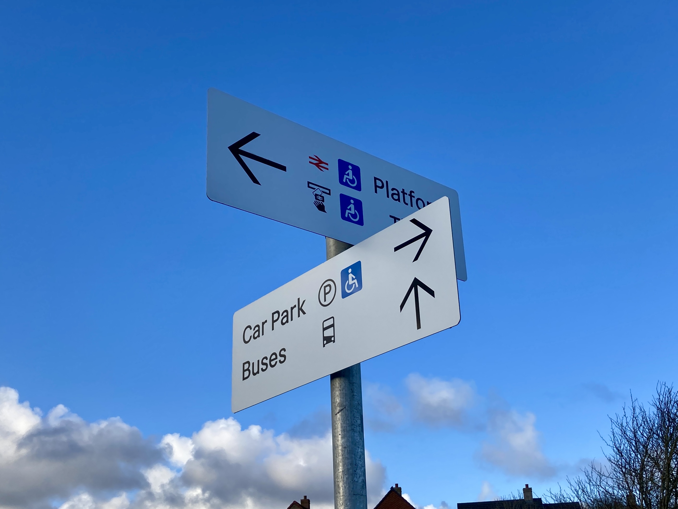
Photo by Daniel Wright [CC BY-NC-ND 4.0]
The changes to the signage design guidelines included in Wayfinding version 3 largely flow from the conclusions drawn by Job’s critique of the performance of the wayfinding signage so far. Job was eager to take me through his findings, and how they have been addressed in the new version of Wayfinding.
Arrows, Skinny or Otherwise
One of the most remarked-upon elements of the Wayfinding version 1 signage was the slender arrows used on directional signage. These ‘thin’ arrows certainly stirred up railway graphic design commentators on social media channels (though there aren’t many of us, we all have our personal hobby horses, and our views might not necessarily be representative of the wider travelling public). Notably, Job found that some recently installed station signs, despite being nominally laid out under the Wayfinding version 1 principles, were already including thicker arrows than specified, in an effort to aid visibility. This is probably the point at which you have to set aside the purity of the original concept and go for something more pragmatic. Although a few enthusiasts of British Rail’s design output have suggested reverting to the much thicker arrows seen on BR signage, Job asserts that those arrows are too thick, and simply overwhelm the Rail Alphabet 2 lettering used on Network Rail’s new signs. Instead, a heavier arrow falling somewhere between BR’s and the Wayfinding version 1 example is now mandated in version 3. While he was at it, Job made the shaft of the arrow longer in relation to the head. It’s a subtle change but he explains that it gives greater apparent weight to the head of the arrow, enabling faster comprehension of the direction the arrow is pointing.

Image © Nick Job, used with permission
Going Right – Layout of Signs
Another unconventional feature of the original Wayfinding version 1 signage was that the directional arrows were always positioned on the left-hand side of the sign, even if they were pointing rightwards. Most wayfinding signage outside of the Wayfinding version 1 standards has arrows on the right for signs which point rightwards.
Photo by Daniel Wright [CC BY-NC-ND 4.0]
As with arrow size and thickness, Job found that non Network Rail-operated stations were already adapting the Wayfinding version 1 signage and ignoring the original design principles in favour of putting rightward-pointing arrows on the right of the signs (see the Seaton Delaval photo earlier). Pragmatically, this is now carried into version 3 of Wayfinding, except on totem signage, where all arrows (no matter which direction they are pointing in) are neatly aligned on the left.
x Marks the Sweet Spot
The first version of Wayfinding specified that the vertical alignment of signage should be centred around cap-height (i.e. on a sign with a single line of text, a capital letter should have the same space above and below it). Unfortunately, when mixed case lettering is used, that places the bulk of the word-shapes on the lower part of the sign. This causes the text to look as though it has sunk slightly, an effect particularly apparent on station name signs on platforms.
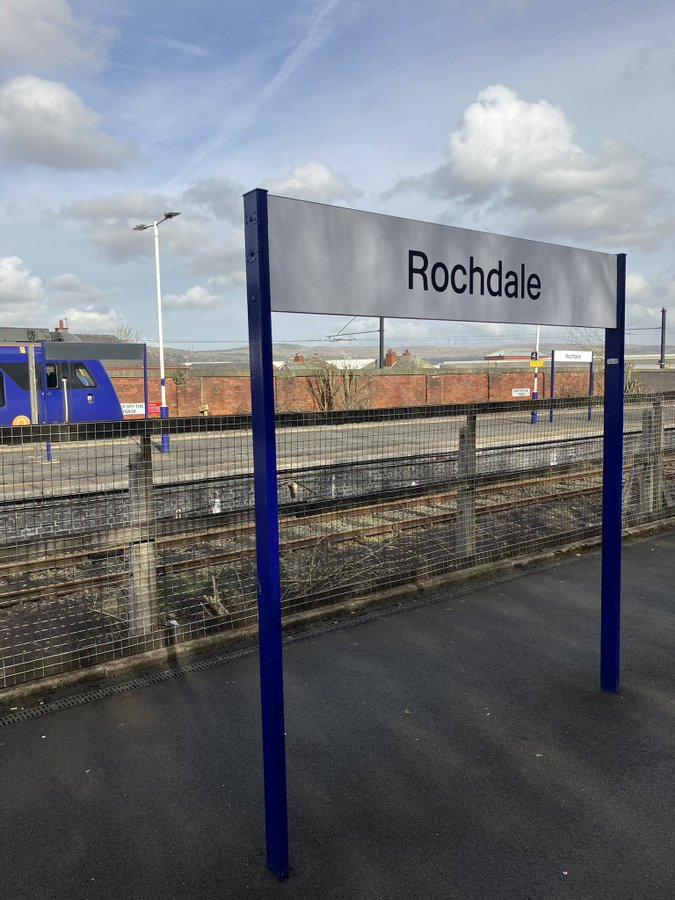
Photo © Nick Job, used with permission
Job’s review proposed altering signage to be centred on the x-height of lettering (i.e. with equal space above and below lower-case letters without ascenders or descenders, such as x, e or a). This has been incorporated into version 3 of Wayfinding. Alongside this, the new version of the guidance requires the double arrow symbol to be centred on the x-height. Version 1 of Wayfinding had the symbol sized and centred on the cap-height, which made it look rather too small.
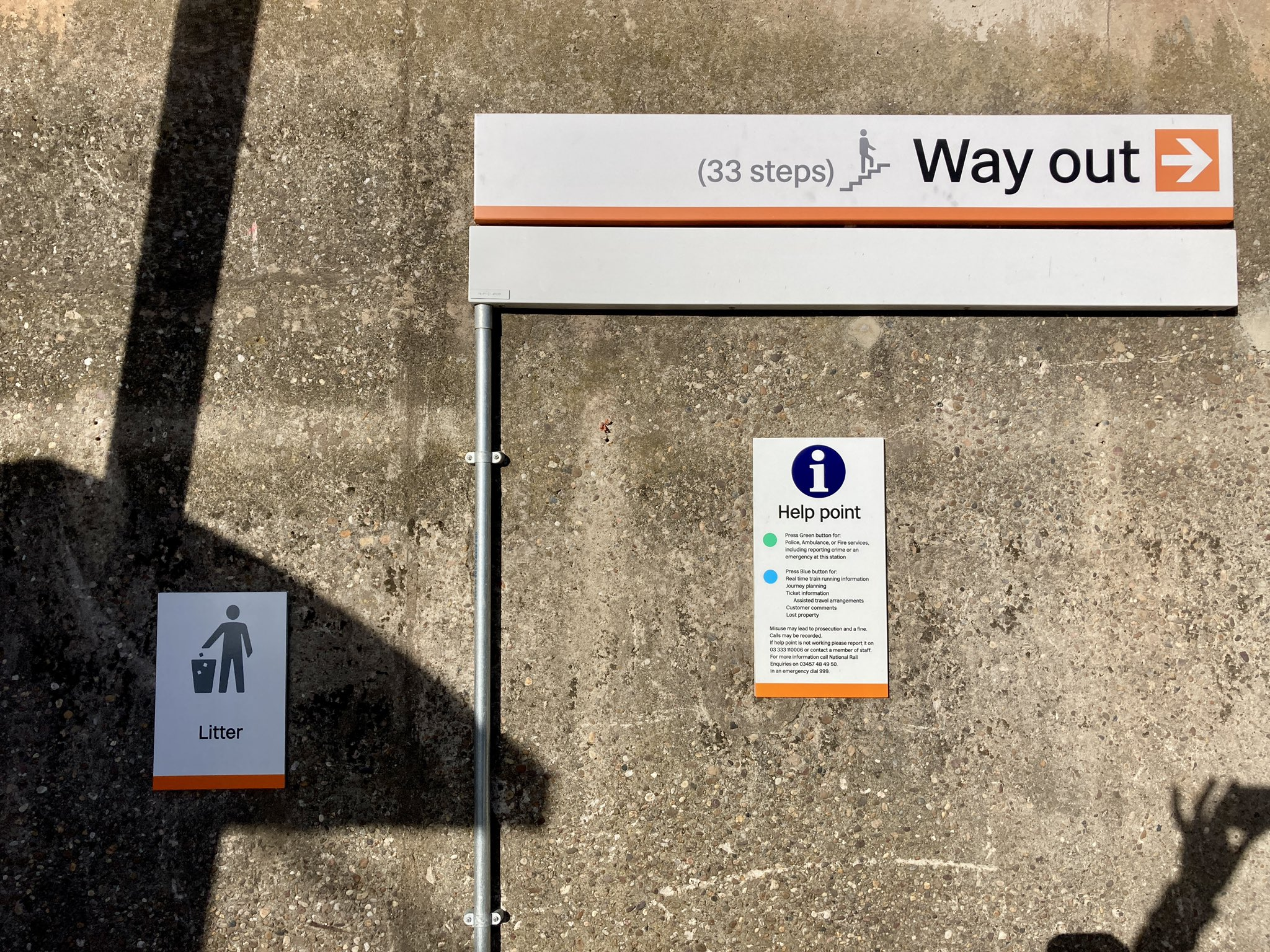
Other signage clarifications suggested by Job include changing suffix letters for platform numbers from the upper-case standard of Wayfinding version 1 (e.g. Platform 7B) to lower case (e.g. Platform 7b) to assist legibility. ‘Way out’ signage was previously afforded unique black signs with yellow text, but in practice this led to them blending into their surroundings. Now, ‘Way out’ patches are used on white signs.
Double Arrow, Double (or more) Meaning
Job’s review also considered changes made to the use of the double arrow symbol itself. In the British Rail era it represented the company itself. It survived privatisation to indicate the provision of National Rail services, and in Wayfinding version 1, it was used as a pictogram to indicate trains/platforms. Logically this gave the National Rail system an icon that could be used consistently on signage alongside other network’s icons, such as Transport for London’s various roundels, or the Tyne and Wear Metro “M”. It also replaced the previous ‘train’ icon which was not well understood because, well, it didn’t particularly look like any British train you might ever have encountered.
Wayfinding version 1 also mandated use of the double arrow symbol on station name identifier signage on platforms. In practice, this has led to something of an explosion of the use of the double arrow symbol within stations where signage has been designed in compliance with the original Wayfinding specification. Job recalls the warnings of yore in the original British Rail Corporate identity Manual about overuse of the symbol, and found that the increased use of the symbol in the Wayfinding version 1 standards was diluting its presence and meaning. Wayfinding version 3 now removes the symbol from station name signage on platforms, except for the first ‘running in’ sign on each platform.
The new Rail Symbol 2 is, of course, specified throughout.
Via Design Manual NR/GN/CIV/300/05 Rail Symbol 2 © Network Rail
Pictograms
Job looked at the pictograms included in the original Wayfinding standards, finding that the blue used for accessibility-related pictograms, while very close to British Rail’s ‘Rail Blue’, looked closer to black in most lighting conditions. Wayfinding version 3 mandates a lighter, brighter blue, whilst adhering to current accessibility legislation for colour contrast. He also suggested fine-tuning some of the pictograms, including removing the double arrow symbol from the ticket pictograms (in line with reducing over-use of the symbol), and making the hands of the clock on the customer lounge pictogram clearer.
↑ Do these accessibility pictograms appear black or blue? They’re actually the originally specified dark blue but they’re almost indistinguishable from the black pictograms.
Photos © Nick Job, used with permission
A Refined Way Forward
There is no doubt that Wayfinding version 3 is a considerable refinement on its predecessors, addressing many of the concerns people have raised about implementation of the original signage scheme standards. It also contains some other, unexpected improvements such as the inclusion of elegant coloured line separators on signage pointing to different London Underground (or other Metro system) lines.
Like all Network Rail’s design guidance documents, it is freely available on the web. That means designers of signage at non Network Rail-operated stations have access to it too. With version 3 including changes to some aspects of the standards that various train operators seem to have previously taken a dislike to – leading to some rather off-piste variations – there is no reason that future signage schemes at all stations shouldn’t look a lot more consistent.
Whether they actually will probably depends on the amount of design compliance clout that Network Rail centrally will be able to bring to bear as Network Rail evolves into Great British Railways, and train operating franchises return to the public sector.
Meanwhile, the manner in which the standards in Wayfinding version 3 will actually relate to the potential branding of Great British Railways remains unclear. The first appearance of Great British Railways branding on the rail network, in May this year, saw the double arrow symbol centred on the cap-height of “Great British Railways” rather than the x-height so, er… But that’s an article for another time.
With thanks to…
Nick Job, without whom this article would have made a lot less sense. You can find Nick at his website, with his ongoing analysis of British Rail’s corporate identity (and more recent examples) on social media. His work making available digital editions of British Rail’s corporate identity manuals can also be found on the web.
Bibliography and Further Reading
Network Rail’s design guidance manuals, including version 3 of Wayfinding are all accessible here, on its Buildings and architecture design guidance webpage
Watch this video of Wayfinding version 3 signage being installed at Clapham Junction by Merson Group.
Follow on Social Media
I’m not very active on the socials, but you’re welcome to follow me at…
Instagram: @the_beauty_of_transport
Bluesky: @thebeautyoftransport.com (or @danielhwright.bsky.social)
Facebook: www.facebook.com/thebeautyoftransport
Threads: @the_beauty_of_transport
At the very least, the automatic notifications of new posts to this website should appear there.

Replacing the train pictogram with double arrows because it allegedly doesn’t look like a British train is a frankly pathetic excuse. None of the other transport pictograms look much like the actual vehicles they purport to represent, either.
Using the double arrows to represent “train” presumably in reality follows on from the LU roundel being used for signage pointing towards the tube and is yet another example of the London-centric thinking of far too many industry managers and designers.
It would have been much better to have created a suitable train pictogram, not that there’s any one pictogram which could realistically match the majority of trains on the national network.
Absolutely fascinating read, as always. I’m straight off to read Version 3 of Wayfinding!