It takes some strange mixture of bravery, confidence, and the thickest of skins to take on the job of redesigning a national icon. Once again, the rail industry’s “double arrow”, the symbol that has come completely to mean “railway” in Britain, has been given a facelift. Previous attempts to adapt or reimagine the symbol have left railway design fans fuming, so this latest attempt to make the symbol fit for the future is no small endeavour.
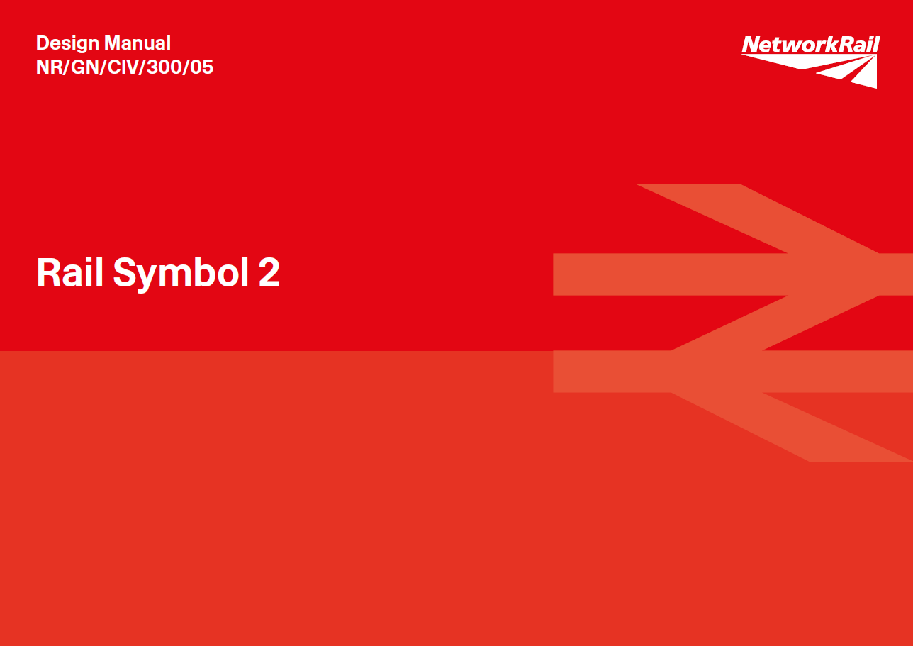
Graphic designer Nick Job, who has taken on this daunting task, certainly has the first two attributes and I think has the third too. Having spoken to him recently, I am at least confident that the double arrow is in safe hands as Network Rail unveils its latest design manual, solely concerned with defining Job’s new generation of the double arrow symbol for the rail network of the future. Its title (and the name of this revamped double arrow): Rail Symbol 2.

Via Design Manual NR/GN/CIV/300/05 Rail Symbol 2 © Network Rail, used with permission
The double arrow was originally designed by Gerry Barney of Design Research Unit, first appearing on British Railways’ XP64 concept train in 1964 and then starting a network-wide rollout the following year. Like many pieces of long-lasting graphic design it experienced the full lifecycle of a hostile initial reception due to its unfamiliarity, through ubiquity and familiarity as British Rail deployed it alongside a carefully considered corporate identity in the 1960s-80s, followed by a decline as British Rail sectors and their privatised successors sought to establish their own visual identities (with varying but often lesser degrees of success) and move away from the double arrow.
© Nick Job, used with permission
The symbol has never completely gone away though. While it might not appear on the visual identities of the various operators of today’s railway, it is still used as the symbol of the national railway. It is required to appear outside every railway station either applied to the station building or on a totem (especially where the station is not clearly visible from the nearest road). It appears on road signage directing people to stations. It appears on railcards and the National Rail website, and other initiatives of the Rail Delivery Group. Its shape and usage are detailed in Rail Delivery Group’s National Rail Design Guidelines of 2014, although Job says that even here, the double arrow isn’t quite right compared to Barney’s original.
The double arrow symbol is a trademark owned by the Secretary of State for the UK government’s Department for Transport. Or at least, the idea of it is. The trouble with the symbol is that since the privatisation of British Rail, its actual design has never really belonged to any one part of the rail industry and its appearance has become rather unruly. Under BR, its proportions and usage were carefully detailed in the company’s Corporate Identity Manual. But since privatisation there has been no single entity regulating its use and ensuring its consistent appearance. As with much of the visual identity of the railways since privatisation, the way it looks has descended into chaos.
Barney might have been the midwife of the double arrow, but Job has been its biographer. As well as being a graphic designer, he is also the leading historian of British Rail’s corporate identity. Complementing his web-based recreation of British Railways’ various corporate identity manuals, Job has traced the uses and abuses of the double arrow symbol for years on his compendious Twitter account @_doublearrow. And he’s profoundly unimpressed by the way the symbol has been treated by the privatised railway.
© Nick Job, used with permission
At least two train operators have been unintentionally using a massively thickened version of the double arrow on their signage due to an erroneous rail industry artwork file.
Meanwhile there have been many ‘creative’ reinterpretations of the double arrow by train operators. Station signage appears to be the principal offender, as seen here for instance on Wandsworth Town station.

Photo by Daniel Wright [CC BY-NC-ND 4.0]
For a while now, Rail Delivery Group has been tinkering with the double arrow too. Its recent “We Mean Green” campaign saw the double arrow recoloured with its segments in various shades of green, and its upper and lower diagonal arms considerably lengthened, giving it a very different appearance. It was not one that Barney appreciated.

© Rail Delivery Group via press release 21 September 2021, reproduced for the purposes of criticism or review
“I think that’s rubbish,” he told UK newspaper The Guardian in September last year. “I could understand it if they had just swapped red for green. But why on earth have they got that many colours? …It’s just a mess,” he added.
This is curious, because the “We Mean Green” version of the double arrow is a remix of Rail Delivery Group’s (or rather, M&C Saatchi’s on behalf of Rail Delivery Group) earlier rework of the double arrow for its “Britain Runs on Rail” campaign of 2016, which had different coloured segments but the same extended upper and lower arms. At that time, Rail Delivery Group was able to produce a quote from Barney saying, “The new version of the logo really works.” I suppose it’s possible that he may have had a change of mind in the meantime.
The recent anarchy of the double arrow’s appearance makes it a sort of railway equivalent of Plato’s chair. For an ancient Greek philosopher, it has to be said that Plato gave a surprising amount of thought to domestic furniture. According to his theory of forms, all human-made chairs (or indeed any other objects) were merely imperfect replications of the idealised ‘form’ of the perfect chair, which existed only in essence, in a realm separate from the material world. And so it seems to be with the double arrow. Its perfect distillation exists somewhere in the ether, rendered less or more imperfectly by various designers.
The most recent iteration of the double arrow symbol before Rail Symbol 2, and the catalyst for the latter’s creation, came with the Williams-Shapps Plan for Rail. Published by the Department for Transport in May 2021 the Plan for Rail is the latest in a very long line of reviews commissioned by the government with the aim of sorting out Britain’s rail industry. The big idea of the Williams-Shapps Plan is the creation of a single guiding entity for the railway industry, to be called Great British Railways (GBR). The Plan says GBR will have a single public-facing brand name and corporate identity applied to trains, stations, and publicity regardless of who is actually running any particular passenger train.
The Plan also promised the return of the double arrow as GBR’s symbol and was itself illustrated with the double arrow throughout its pages.
© Crown copyright 2021, reproduced for the purposes of criticism or review
The document – or rather the version of the double arrow symbol it contained – attracted the attention of Job. “I noticed that its use throughout the document was inconsistent, and the symbol itself was not only squashed but its original form had been altered. It was arguably a justifiable attempt to have the symbol work better electronically, but I felt there had to be a better way to do it.”
Realising that GBR would be reinvigorating the use of the double arrow across the railway network, but could be about to saddle itself with a version that he believed lacked elegance and ease of reproduction, Job wrote to Network Rail chair Sir Peter (now Lord) Hendy, suggesting that this could be the perfect opportunity for the double arrow to be redrawn to make it fit for the future.
Lord Hendy, an avowed enthusiast of good design, warmly welcomed the approach by Job and invited him to share his thoughts on how it could be done. It turns out that Job had made his pitch at the perfect moment, with Network Rail producing its new Wayfinding design manual and launching Rail Alphabet 2, a modern evolution by Margaret Calvert and Henrik Kubel of Calvert and Jock Kinneir’s original Rail Alphabet. A new version of the double arrow was the perfect complement. Job soon found himself in front of Anthony Dewar, Network Rail’s professional head, buildings and architecture, and Frank Anatole, its principal architect. Dewar and Anatole, no strangers to this website, are engaged in an ongoing process of reinvigorating Network Rail’s focus on good design, supported by Hendy and chief executive Andrew Haines.
Dewar and Anatole took little convincing, as Anatole explains. “We’d been aware for some time that there were some odd versions of the Rail Symbol circulating around the industry. The RDG ‘We Mean Green’ arrow campaign highlighted that. The final straw was discovering that the version we actually had on our CAD project database wasn’t right, which probably meant it was being replicated on new stations and signs up and down the country! Even the version on the cover of the first edition of the Wayfinding Design Manual wasn’t quite right either. All of this generated the stimulus to act.”
Here, Job interjects to explain to me that although the CAD database version of the double arrow was definitely erroneous (explaining some of the worse versions of the double arrow to have made their way onto stations in recent years) the version on the Wayfinding Design Manual was, “essentially a tweak to the original positive and negative versions by the manual’s designers and probably entirely forgivable.”
“Right about that time GBRTT also came calling asking for a copy of the symbol that they could use,” Anatole continues, “and we had to do so quite quickly when you consider how long it normally takes us to publish one of these manuals as a standard.”
Under a certain amount of time pressure therefore, Job was invited to develop his proposals for what would become Rail Symbol 2. The name matches Rail Alphabet 2, and although it’s clearly not the second version of the rail symbol, it is intended to be its second definitive version.
“Nick lives and breathes the British Rail Corporate Identity. I also consider myself a bit of a specialist on the double arrow, but he sees things I simply don’t notice,” says Anatole (and I would suggest most of us who follow Job’s @_doublearrow Twitter account would agree). “I think we had no concerns that he wouldn’t be faithful to what is a much admired international icon.”
One of the first things Job wanted to do was look at the overall proportions of the double arrow. Barney’s double arrow was (and is) a work of art, but has an idiosyncratic length to height ratio of 38:23. That might have been manageable in the days when dedicated architectural design and publicity departments were overseeing British Rail’s graphic output. Today, thanks to desktop publishing, far more people in the rail industry are self-producing signage and publicity, which is where errors in the double arrow symbol creep in. With a ratio of 38:23 it is hardly surprising that the symbol is abused from time to time.
Job’s Rail Symbol 2 is designed for the digital world and has a ratio of 8:5, achieved through a slight lengthening of the horizontal lines of the symbol. The new ratio makes it easier to increase or decrease its size while checking the proportions remain consistent, and there is a far greater range of whole number ratios available. The 8:5 ratio is also closer to the “golden ratio”, which when used in art and architecture is considered to be particularly aesthetically pleasing. It also has the advantage that Rail Symbol 2 can be reduced to a small number of pixels while retaining its shape sufficiently.
Ruminating on the difference between his and Barney’s approach, Job suggests that, “While the eye should really always be the final arbiter, that doesn’t really help when you’re wanting to specify something precisely. You want the maths to be able to do the heavy lifting for you.”
Developing that approach, Job’s Rail Symbol 2 sees the central section (the two parallel horizontal lines joined by the middle diagonal line) at a height of 20 units, flanked by the two outer arms at 10 units each. Overall then, the symbol is 40 units in height, with the central section exactly half its height, again making faithful reproduction easier; the maths is doing the work once more.
This element of the redrawing also let Job address another difficult element of the original double arrow symbol. The middle diagonal line runs not just in the opposite direction to the outer arms, but at a different, steeper angle.
© Nick Job, used with permission
As Job says, “Once you see it, you can’t unsee it.” Rail Symbol 2 addresses this and has all three diagonal strokes running at the same angle. The end result, again a useful bit of assistance for designers and helpful for lining it up against other text or graphic elements, is that Rail Symbol 2 forms a perfect square from the upper left point of the upper diagonal arm, to the lower right point of the lower diagonal arm.
Barney’s version of the double arrow was available in two weights; a slightly heavier version for use as a dark symbol on light backgrounds (positive weight) and a slightly lighter version for use as a light symbol on dark backgrounds (negative weight). The intention was that this would overcome the optical effect in which a single symbol might have looked narrower when used on a light background and fatter when used on a dark one. However, although having two weights was commendable in principle, in practice – even in British Rail days – the incorrect weight of symbol was often used.
Again to make accurate reproduction of Rail Symbol 2 easier, Job finessed it into a single version (approximately midway between the former weights) that looks good whether reproduced as dark on light, or light on dark. “In reality, one never sees the two versions next to each other anyway,” notes Job, “and having a single version rather than positive and negative versions makes it considerably more practical for designers who no longer have to worry about which version to use.”

Via Design Manual NR/GN/CIV/300/05 Rail Symbol 2 © Network Rail, used with permission
One feature carried over from Barney’s version of the double arrow to Job’s Rail Symbol 2 is that the outer diagonal arms flare out towards their ends. This counteracts an optical illusion that makes the arms appear to taper inwards when reproduced as shapes of consistent width. Even I can spot that mistake when it happens; it makes the symbol look like a pirouetting ballerina, balancing on their toes.
The end result of Job’s redesign is a double arrow which retains the elegance of Barney’s original, but one that is much easier for designers to use accurately. I ask Job if he can sum up the appearance of Barney’s rail symbol and that of his, in one word each. “Compelling,” he suggests for Barney’s original, and, “futureproof,” for his own, is his answer. I think that’s a perfect description of each one, and the difference between them.
With the proportions of Rail Symbol 2 fixed, the next step was to work up the application of the symbol into a complete design manual. Job undertook the first draft, with Calum Spence of Design Council working it up into the manual that has just been released by Network Rail; effectively a modern day version of much of Binder 1 of BR’s 1960s Corporate Identity Manual.
Via Design Manual NR/GN/CIV/300/05 Rail Symbol 2 © Network Rail, used with permission
Design Manual NR/GN/CIV/300/05 Rail Symbol 2 (to give it its full title) details not only the correct shape of Rail Symbol 2 but how to use it and perhaps just as important, how not to use it. Section 1.7 ‘Incorrect Usage’ features two whole pages of abused symbols; squashed, stretched, blurred, and turned into patterns, “All of which I’ve seen in real life!” despairs Job.
The manual also solves some issues that have plagued the use of the double arrow symbol in recent years. Free-standing and projecting signage is now prescribed as using the ‘lozenge’ version of the symbol (a white symbol on a larger solid red background). This would have addressed the slightly unfortunate application currently to be found at London Bridge station, where three dimensional versions of the symbol are used as projecting signage, which means they appear reversed from one side.

Photo by Daniel Wright [CC BY-NC-ND 4.0]
Three dimensional versions of the symbol are still permitted by the Rail Symbol 2 design manual for architectural applications, but must be positioned against a surface.
The Rail Symbol 2 manual was passed by the Great British Railways Transition Team before publication, with the intention that GBR will become Rail Symbol 2’s guardian as part of the proposed single corporate identity for the British railway network. The only thing they requested was that – now rail companies no longer operate ships – could the flag version of Rail Symbol 2 be flown the other way round, so that the symbol looks correct with the flag pole on the left (the western etiquette for flag display). This change was incorporated in the manual in the new House Flag section and is the explanation for why people will find Clapham Junction flying the flag as shown below, with the lower arrow pointing to the pole rather than the upper one as used to be the case in BR days.

Photo by Daniel Wright [CC BY-NC-ND 4.0]
Pending the creation of GBR, Network Rail’s design manuals only have to be complied with by Network Rail itself, though it is hoped that other rail industry companies will adopt Rail Symbol 2 to bring some consistency to the use of the double arrow. The situation is similar to that for Rail Alphabet 2, which is mandated for use by Network Rail as part of the Wayfinding Design Manual, but which other train operators are free to adopt (in whole or in part, and without necessarily placing it in the wayfinding schema for which it was developed), or continue with their existing typefaces.
The exact details of how Great British Railways’ will be set up are still unclear, as are plans for its logo and wider visual identity. A trademark registered in January 2022 for GBR was ridiculed for the awkward way it used blue blocks around a red double arrow to emulate a Union flag, although this was in line with the then-government’s enthusiasm for applying Union flag-inspired designs to everything it could. Two complete governments on, this might no longer be a key requirement. A simple version of Job’s Rail Symbol 2, without the distracting surrounding blocks of colour, would make a fine logo for GBR, I think.
I ask Job if he is nervous about the reaction to Rail Symbol 2 from railway design enthusiasts, after the controversies attending other attempts to redesign it. Does he have the thick skin such an endeavour requires, I wonder. “Nervous?” repeats Job. “Only of upsetting Gerry Barney. But I’m convinced the rationale of Rail Symbol 2 is sound, and I’m very excited to see that Anthony and Frank believe in it.”
I think Rail Symbol 2 is a beautiful new rendition of the double arrow, one that at last treats the original with the respect it deserves, while making it more pliable for today’s digital environment. “You could go mad trying to design the definitive version of the symbol though,” muses Job. Plato’s double arrow is still out there then, beyond mortals’ reach. But Job’s Rail Symbol 2 may be the closest we’ve come. ■
Copyright
Rail Symbol 2 is a registered trademark of the Department for Transport.
Further Reading and Bibliography
Network Rail’s Rail Symbol 2 Design Manual (and others including the Wayfinding Design Manual) are available via the Buildings and Architecture Design Guidance page on its website
Nick Job’s peerless collection of British Rail’s corporate identity documents is at doublearrow.co.uk
Calum Spence can be found at his website with a super page about the development of Network Rail’s design manuals
…and anything else linked to in the text above will have informed the writing of this article
Acknowledgements
Many thanks to Rail Symbol 2 designer Nick Job, Network Rail principal architect Frank Anatole and Network Rail professional head, buildings and architecture Anthony Dewar for their assistance in the preparation of this article. As ever, any remaining errors in the article are mine, not theirs.
Follow on Twitter
To be alerted to new articles, and for more transport architecture, design, branding and cultural references in between, do consider following The Beauty of Transport on Twitter: @BeautyOfTranspt.

Not a Rock Music pun to be seen? Fascinating stuff.
Unless I have misunderstood what is meant by the ‘hoist’ of a flag, Fig 1.2.4 in the new manual seems to contradict the flag guidance in Fig 1.5.2, which you mention here. (1.2.4 says that the top arrow should point to the hoist, rather than to the right, whereas 1.5.2 shows the symbol in its proper orientation, with the arrow pointing away from the flagstaff.)
Let’s hope he starts work on the awful microscopic RA2 next.
Although I am not a spokesperson for Network Rail… as I understand it, the instruction in Fig 1.2.4 is the incorrect one, replaced by the request from GBRTT for the bottom arrow to point towards the flagpole (per Fig 1.5.2). The info in 1.2.4 is a legacy of the older approach which wasn’t caught, and the next revision of the Rail Symbol 2 design manual will correct this.
It’s fun to see that the Rail Symbol 2 1.7 Incorrect usage section includes both an example used in the Rail-Symbol-2.pdf document.
“it should not be placed on a continuous strip (J)” is in every page of the specification and “1.7.3 The symbol should not be combined with other graphic elements. The symbol should not be enclosed (I) is the logo for National Rail Enquires (owned by the Rail Delivery Group).
The campaign group Bring Back British Rail use the symbol in reverse so that the leftwards arrow is on top. I guess that’s a political choice. Not sure it works though. It could be interpreted as once the left have made a mess of things it needs a rightwards direction to bring things back to where we started.