This is the story of a transport typeface gone rogue. It has escaped its original confines and spread out into the wider world, finding itself in a variety of places its original designers could never have expected. Yet it started off as an all-but-anonymous typeface on the road signs of that great automobile country, America.
A great automobile country needs great signage on its roads. Luckily America does. Defined by the Federal Highway Administration (FHWA) in its Manual of Uniform Traffic Control Devices, these include all the symbols that mark out typically American road signage. I could rave all day about the iconic Railroad Crossing and other brilliant road signs in the manual, but I’ll try to keep things more focussed by examining one of the elements that has the greatest impact on the character of American road signage: the typeface employed. Here it is:
![A sample from the FHWA Series [Public Domain] vai Wikimedia Commons](https://thebeautyoftransport.com/wp-content/uploads/2015/09/highway_gothic_sample-svg.png)
So anonymous was it when developed, it has never had a proper name. Its official title is the FHWA Series, though you will sometimes see it called Highway Gothic, a strictly unofficial name. It is based on lettering developed originally for Californian road signs by Theodore Forbes, before being developed into a national standard by the FHWA (as explained here). Forbes was an engineering psychologist who worked on various traffic projects including overtaking behaviour by drivers. He started work on road sign legibility in 1939 and eventually designed the typeface which effectively became Series E of the FHWA Series (Robinson (2011): p23).
Altogether there have been seven different versions of the typeface, Series A (now discontinued in America) through to Series F, via E(M) – the first version to gain a lower case version. Each uses the same base letter shape but gradually extends it (makes it wider, in other words) from series A, with the narrowest letters, to series F, with the widest. You can see them in Chapter 6 of the FHWA’s Standard Highway Signs, Standard Alphabets for Traffic Signs (here).
![By User:MPD01605 (Own work) [GFDL, CC-BY-SA-3.0 or CC BY-SA 2.5-2.0-1.0], via Wikimedia Commons](https://thebeautyoftransport.com/wp-content/uploads/2015/09/640px-95-to_newyork.jpg)
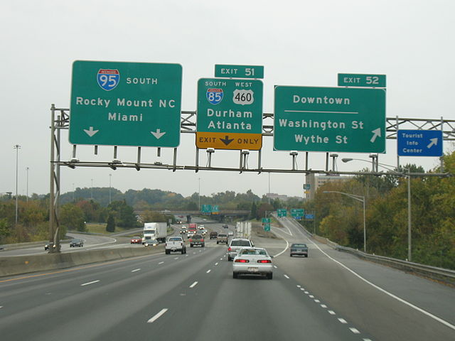
American road signs tend to use more text than those in Europe, and this is often formed of all-upper case words. This gives them a forcefulness that ensures a slightly different feel to the driving experience. Mixed case signage tends to be used on signs where place names are given (such as mileage or directional signs).
Street names in American towns and cities are often displayed as road signs at intersections, so the FHWA Series have become much more integral to the local identity of streets than the British equivalent typeface, Transport, has in Britain. While Transport is used for road signs, street names tend to be signed by local planning authorities (rather than local transport authorities) using completely different fonts.
![By Ammodramus (Own work) [CC0], via Wikimedia Commons](https://thebeautyoftransport.com/wp-content/uploads/2015/09/629px-malcolm_x_av_sign_omaha.jpg)
A road trip in America is therefore very much an experience in the FHWA Series. Much like Transport feels like the handwriting of Britain, so the FHWA Series feel like they capture and represent something of America’s national identity; even more so because the letterforms of the FHWA Series appear even more often on America’s roads than those of Transport do on Britain’s.
Designed in an era before modern scientific rigour was applied to typeface visibility, the FHWA Series are idiosyncratic in many ways. You wouldn’t expect that a sans-serif (without the points at the corners of letters) typeface could be quite so distinctive, yet if you compare it to Transport, it gives up some of the quirks that contribute to its unique feel. FHWA Series letters are quite ‘closed’ – the loops (or counters, to give them their proper name) of letters such as “B”, “d” or “p” have smaller internal areas than those of Transport. It’s not completely consistent as a typeface; letters like “l” and “g” have a much smaller curve (or none at all) at the bottom than their equivalents in Transport, yet letters like “J” are just the opposite, having a much larger curve. But the most distinctive element is probably the angled cut-offs on the ascenders and descenders of letters like “d”, “p” and “t”. The typeface is also unusually widely spaced, adding to its distinctive appearance.
![By Patricius Augustus (Own work) [CC0], via Wikimedia Commons](https://thebeautyoftransport.com/wp-content/uploads/2015/09/640px-destinations_from_interstate_40-65_exit_209_209a_209b_in_nashville.jpg)
The FHWA Series are a very American typeface, and often displayed in a very American manner. For instance, the identity numbers of Interstates and US Routes are presented on brilliant and thoroughly idiosyncratic shield-shaped backgrounds.
Speed limit signs, meanwhile, use extended number forms from Series E or F to show the maximum permitted speed. Unlike European road signs which display only a number, American speed limit signs have text explaining what the number is telling you. American readers might be interested or amused to know that most British people think Americans drive everywhere at 55mph. The truth is that there is a wide variety of maximum speed limits in America, just as in Britain, so there is plenty of need for speed limit signs.
There is something big and confident about an American speed limit sign which positively encourages you to click on the cruise control, set the radio for a Country music station (well that’s what I’d do) and drive off over the horizon on a road trip. It helps that American roads are extremely civilised. Although you can overtake and undertake on multi-lane highways, somehow it’s a less stressful experience than the bad-tempered jostling for space on British motorways. It’s a big country with more space than Britain has, and that must surely find itself reflected in driving behaviour.
![By Famartin (Own work) [CC BY-SA 4.0], via Wikimedia Commons](https://thebeautyoftransport.com/wp-content/uploads/2015/09/2014-08-19_11_59_11_speed_limit_65_miles_per_hour_sign_along_northbound_nevada_state_route_225_mountain_city_highway_about_10-9_miles_north_of_nevada_state_route_535_idaho_street_in_.jpg)
The FHWA Series recently found themselves under threat. Graphic designer Don Meeker, concerned about the FHWA Series’s legibility especially at night on reflective signs, developed an alternative typeface for signage called Clearview. In much the same manner as Calvert and Kinneir’s work developing Transport in the 1960s, Meeker worked with typeface designer James Montalbano to comprehensively review road sign lettering in the hope of achieving much improved visibility, working on aspects like making letters more ‘open’ to include more space within loops, and raising the height of ascenders. This New York Times magazine article explains the genesis of Clearview in detail, as well as applying a number of slightly rude adjectives to the FHWA Series.
The FHWA undertook trials of Clearview to see whether it had better legibility characteristics than the FHWA Series, and allowed limited application of the new typeface on road signs. However, it has since decided that reflectivity of road sign backgrounds, rather than letter shape is a more important design consideration, not to mention that it thinks Clearview is not well-suited to street name signs. It has decided that the FHWA Series will remain the standard and will not be approving any further application of Clearview (see here, for instance), so the FHWA Series will continue to serve America’s roads in its distinctive, if slightly quirky, fashion. I must admit I’m rather pleased.
So how did the FHWA Series escape the American road network and find their way out into the world? For that we can thank typeface designer Tobias Frere-Jones. Although he admits its imperfections (see that New York Times magazine article again), he obviously has considerable fondness for it. In 1993-94 he turned it into a proper typeface which could be used by designers across the world, adding all the necessary punctuation marks missing from the FHWA Series and ensuring it remained legible when reproduced at smaller size. He called this ‘new’ typeface, very appropriately, Interstate. You can find it at typeface company The Font Bureau, here (and as a splendid .pdf document here).
![By No machine readable author provided. GearedBull assumed (based on copyright claims). [CC BY-SA 2.5], via Wikimedia Commons](https://thebeautyoftransport.com/wp-content/uploads/2015/09/fbinter-svg.png)
In a stroke of supreme irony, one of the places Interstate ended up was the signage of British train operators c2c and Wagn, which used to run trains between London and Essex, and London and its north-eastern commuter belt (as is the way of British train operating franchises they have changed hands since then and the corporate identity and typefaces have changed). Given that America doesn’t really ‘do’ trains, certainly for long-distance travel, and given that the typeface was designed for America’s road network, its use at c2c and Wagn was rather startling. But it looked great.
![By Sunil060902 (Own work) [CC BY-SA 3.0 or GFDL], via Wikimedia Commons](https://thebeautyoftransport.com/wp-content/uploads/2015/09/640px-cambridge_heath_stn_signage.jpg)
If a train operator was a considerable change of scene for Interstate, how about a supermarket? British chain Sainsbury’s also adopted Interstate, and its publicity, signage and shelf-edge information used the typeface, explaining a long-term confusion on my part about the fact that the typeface seemed familiar and also slightly out-of-place. It’s now moving to a new slab serif typeface which is not nearly as attractive, especially when you can see signs in both typefaces in a single supermarket.
![Interstate in use on a sign at Sainsbury's supermarket in Farnha, Surrey. Photo by Daniel Wright [CC BY-NC-ND 2.0]](https://thebeautyoftransport.com/wp-content/uploads/2015/10/sainsburys-sign-in-interstate-e1441915104996.jpg)
Interstate has also made its way onto television channels and magazines (see here for examples), proving the enduring popularity of this escapee transport typeface.
Regular readers will have clocked by now that I’m a fully signed-up Americophile, so I love finding Interstate in interesting new places away from American roads. My local authority uses Interstate for signage at its public-housing sites. Every time I see it, I’m momentarily transported to America, and my day is all the better for it.
![Signage in Farnham, Surrey. This uses Interstate's bold compressed weight in upper case, so looks quite different from the Sainsbury's signage. Photo by Daniel Wright [CC BY-NC-ND 2.0]](https://thebeautyoftransport.com/wp-content/uploads/2015/09/image.jpeg)
Bibliography and further reading
Federal Highway Administration (2012): 2009 Manual on Uniform Traffic Control Devices with Revisions 1 and 2. US Department of Transportation, Washington. Here
Federal Highway Administration (2004): Standard Highway Signs. US Department of Transportation, Washington: here. This contains detailed design diagrams of US road signs, and Chapter 6 is the Standard Alphabets for Traffic Control Devices. That contains the design drawings for all the FHWA Series. You can find it here
The FHWA’s page of information about Clearview, here
Robinson, Carlton C (2011): Pioneers of Transportation. Institute of Transportation Engineers Washington
Richard C. Moeur’s website of American traffic signs, here
Yaffa, Josha (August 12, 2007): The Road to Clarity. The New York Times magazine, here
The official website of Clearview, here

_in_Nashville.JPG)
_about_10.9_miles_north_of_Nevada_State_Route_535_(Idaho_Street)_in_Elko_County%2C_Nevada.JPG)
Roads in america civilised? That’s certainly not my experience. The connecticut cutters lived up to their nickname!
It was a generalisation, of course, but that was my impression. Mind you I’ve seen more of the roads in the west, so maybe that’s where the difference comes from?
I’m sure theres vast differences in everything from east to west. Even state to state can often be different. But the road signage is reassuringly the same wherever you go!