On the wall of Britain’s National Railway Museum in York, you can find a display of what might be considered wall art, might be thought of as ingredients in a transport company’s corporate identity, or maybe considered neat graphic design turned into cast metal components. It’s all three, and here it is:
![Depot plates at the National Railway Museum in 2013. From left to right, top to bottom; row one: Buxton, Eastfield and Knottingley; row two: Cardiff and Crewe Diesel; row three: Stewarts Lane, Stratford and Hither Green; row four: Immingham and Grangemouth; row five: Toton. There were further plates, not illustrated here. Photo by Paul Wright [used with permission]](https://thebeautyoftransport.com/wp-content/uploads/2015/08/depot-plates-at-nrm-may-2013-copy.jpg)
These are depot plaques, cast aluminium plates which were part of the best British Rail corporate identity of them all. Each one represents a different Railfreight depot, using local history and motifs to inform their design.
So where were we the last time we looked at what the corporate identities of British Rail told us about the changing fortunes of the company? We’d got to the end of the Rail Blue era, the point at which British Rail was reorganised into several business sectors: InterCity, Network SouthEast, Regional Railways, Railfreight and Parcels. British Rail was still a nationalised company, but this sectorisation process saw its various parts acting as almost separate subsidiaries, overseen by the British Rail Board at a high level. As part of the process of establishing themselves, the sectors launched their own corporate identities. InterCity was early with its APT-derived livery but the others soon followed suit.
That Railfreight would gain the most attractive and interesting corporate identity was something of a surprise at the time, because the sector was not an especially glamorous part of the system and had been in long term decline. The economics of railfreight operation in the UK were (and actually still are) difficult. The UK is a small country, and the loading gauge of the network is smaller than most other western countries. That means you can’t run piggyback trains which would otherwise take the pain out of transhipment operations, and regular wagons are smaller than in other countries which reduces profit per vehicle.
The state of Railfreight in the 1970s and 80s, before sectorisation, could be deduced from its then corporate identity. After British Rail introduced its “large logo” version of the Rail Blue livery (which featured a full-height double arrow logo and a massive set of identification numbers in the Rail Alphabet typeface), Railfreight locomotives subsequently received a modified version in which the base blue colour was replaced by a rather muddy grey. Railfreight locomotives got dirty thanks to their working environment, and this was the perfect solution. But it hardly spoke of pride and ambition when the corporate identity was essentially there to hide the dirt. That’s not to say there wasn’t pride and ambition amongst Railfreight’s staff, but it took until sectorisation, and a greater degree of autonomy for the business, for it to be realised.
By 1986, and now established as a semi-autonomous business sector, Railfreight called in the corporate identity experts. Such firms get a bad press in some parts of the transport industry to this day, being seen as a bit airy-fairy, and not really anything to do with the serious business of big vehicles and heavy engineering. Roundel Design Group, however, showed precisely why an attractive corporate identity can be key to the whole culture of a business, when the new Railfreight identity it had designed was unveiled in 1987. The work was overseen by Roundel Design creative director Michael Denny.
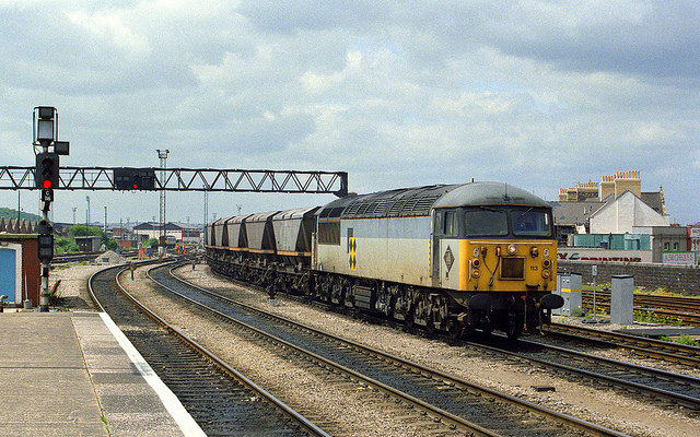
It shocked the industry. It was a complicated, modern identity which nevertheless drew on a lot of railway heritage. Once everyone was over the initial shock, it became a firm favourite and is remembered fondly today by many industry observers. It’s generally known as the “triple grey” identity after the base of the livery seen on locomotives, but in terms of corporate pride, other elements were actually more important.
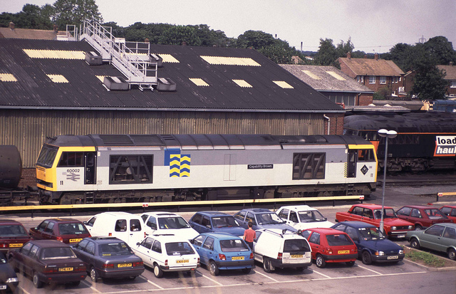
As seen on Railfreight’s locomotives (which was where most rail travellers would see the new corporate identity), there was a base of three shades of grey: dark grey on the roof, mid grey on the upper bodysides and light grey on the lower bodysides. Although grey again, this was not the sort of paint scheme that was going to suffer dirt gladly. There was an expectation that Railfreight’s staff would be willing and able to keep their locomotives clean, and over the following years it was very largely fulfilled. For Railfreight, seeking to retain and gain customers, having a smart clean train was a small but important way of demonstrating the professionalism to which it aspired, matching that of its competing road hauliers, who also took pride in the cleanliness of their vehicles.
Within Railfreight, the business subdivided itself into six sub-sectors. Rather than working for a large, somewhat distant or aloof organistation, staff found themselves working for smaller components which were easier to identify with. Roundel Design’s corporate identity featured a different emblem for each one. In bold colours and geometric shapes, these were more reminiscent of the bright patterning of mediaeval jousting tents and fluttering pennants than they were of anything to do with the railway, though the inspiration was apparently drawn from Second World War aircraft insignia. Each sub-sector emblem comprised two overlapping rectangles. The lower rectangle was a stylised version of the sub-sector’s main freight, while the top one created a stylised “F” for freight as its colour linked to those in the lower rectangle.
![By Goose (Own work) [GFDL, CC-BY-SA-3.0 or CC BY-SA 2.5-2.0-1.0], via Wikimedia Commons](https://thebeautyoftransport.com/wp-content/uploads/2015/08/railfreight_sub_sectors-svg.png)
Railfreight Petroleum had a wavy, liquid design in blue and yellow for its emblem. The emblem for Railfreight Metals had sharp blue and yellow chevrons. Railfreight Construction’s sported blue and yellow blocks, while Railfreight Coal’s had four stylised lumps of coal in black on yellow. Railfreight Distribution, which handled non-trainload (or mixed traffic) and container trains, had an emblem which sported red diamonds on a yellow background. No-one seems completely sure what this represented, especially as the sub-sector’s main freight was almost impossible to depict, though I once read that the diamonds represented the four corners of the country. Finally there was a red and yellow striped design for Railfreight General, a kind of ‘parent’ emblem and one which was also used for everything which didn’t fit into the five sub-sectors. As well as the main sub-sector emblem, there was a complementary vertical strip of similar design behind the cab doors of locomotives, a small but very neat detail. As well as appearing on locomotives, these emblems appeared on wagons, road vehicles, signage at Railfreight buildings, as well as appearing on stationery and all manner of other sundries.
There were ties to the British Rail corporate identity of 1966, too. Rail Alphabet was retained as Railfreight’s corporate typeface, and so was the double arrow logo, in a small polished cast metal version. Although cast versions of the double arrow had been tried by British Rail on and off since the 1960s, this was the first comprehensive application of such a version, which brought to mind the cast metal number and name plates of long-gone steam locomotives.
In terms of employee pride, the most crucial element was the depot plaques which locomotives sported (some wagons also received small versions and printed versions could also be found on location-specific signage). The cast aluminium plates comprised a black background and a polished metal logo. The use of local motifs embodied the pride staff felt about their place of work, and the depot plaques were also reproduced as lapel pins for staff. Stratford Depot, for instance, which had long used a sparrow as its mascot, gained a depot plate with a sparrow. Tinsley, in Yorkshire, had a traditional White Rose of Yorkshire. No longer were Railfreight’s locomotives anonymous amongst an unvarying corporate image. Now each one was part of a small fleet which could be identified as belonging to a particular depot. There was every incentive for depot staff to turn out their locomotives smartly, and keep them running sweetly. That translated upwards into a more professional and more reliable Railfreight. And that’s why good corporate design and branding matters.
The plates remain highly collectible items to this day, and you can see them fetching large sums of money at railwayana auctions to this day, one of the few later additions to the railway scene that can rival the coveted “hot dog sausage” station name totems of the 1950-60s.
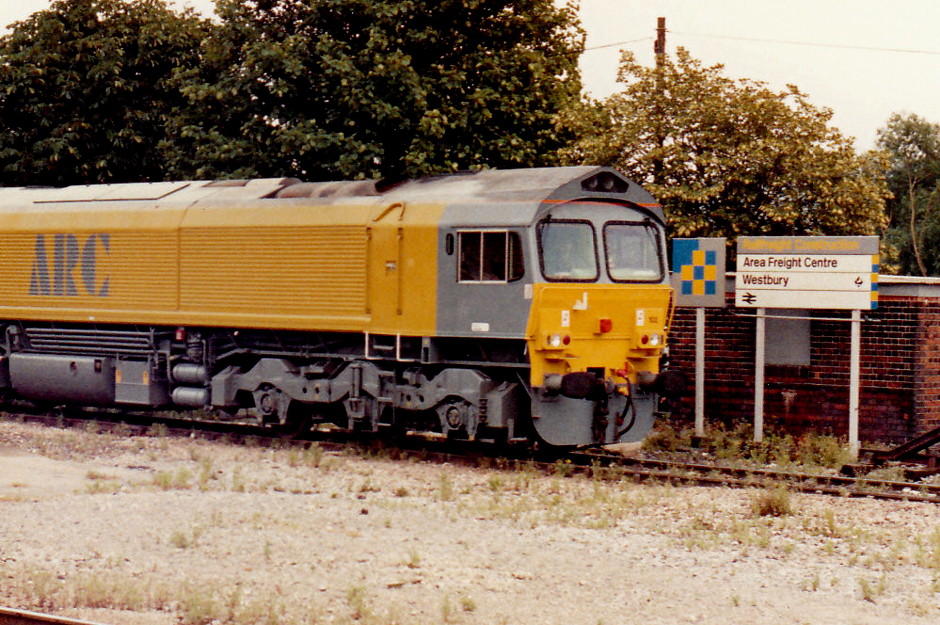
The opening of the Channel Tunnel saw the introduction of a seventh Railfreight sub-sector identity for the new European services through the tunnel, which appeared in 1993 as the new Channel Tunnel freight locomotives to be used on these services began their test runs. This was not the work of Roundel Design, but was developed by Transport Design Consultancy. It replaced the dark grey roof with dark blue, matching the blue roofs of the Eurostar passenger trains and abortive Nightstar sleeper carriages. To this day I have no idea how blue roofs emerged as some sort of standard for Channel Tunnel-traversing trains. Instead of Roundel Design’s colourful sub-sector emblems, the bodysides of the Channel Tunnel freight locomotives featured cast metal circles, representative of traversing the tunnel. It was smart, but it lacked impact slightly compared to Roundel Design’s work. The locomotives were named, but in an oddly widely spaced version of what was probably Rail Alphabet. The depot plaques and cast British Rail double arrows were retained.
Railfreight’s corporate identity had settled down into a respected and admired part of the railway scene. There had even been television programmes about the creation of the corporate identity, a revelation given that appearances by British Rail on the television until that point had generally been about overcrowded and late-running commuter trains, strikes, or troubled tilting trains.
Then privatisation came along and messed everything up.
As the Railways Bill made its way through parliament (it received Royal Assent on 5 November 1993), forming the legal basis for privatisation, decisions were being taken on breaking up British Rail for sale to the private sector.
Railfreight’s subsectors, each of which had brilliantly concentrated on developing its speciality, were to be done away with. Railfreight was reformed into three area-based general railfreight companies which operated all the different types of trainload freight, ready for selling off. In 1994 their new names and logos were introduced; Loadhaul, Transrail and Mainline removed Roundel Design’s subsector logos and plopped down their new ones instead. Loadhaul and Mainline swiftly developed new corporate identities and colour schemes of their own, based on black (designed by Venture Design) and mid-blue (designed by Halpin Grey Vermeer) respectively. Only Transrail stuck with triple-grey on its locomotives, using a T in a circle as its logo designed by Peartree Design Associates, and failing completely to replicate the impact of Roundel Design’s original identity.
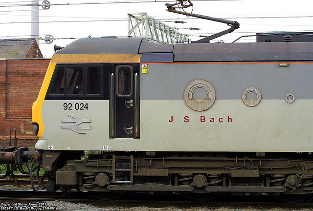
Slightly earlier, in 1993, Railfreight Distribution adopted a revised version of the triple grey corporate identity. The company was to be focussed on cross-channel traffic and its distribution within Britain, with the container train business expected to be carved out and moved to Freightliner Ltd (this eventually happened in 1995 and again in both cases was to prepare these companies for sale). As such, the ‘European’ blue roof phenomenon spread to Railfreight Distribution, replacing the dark grey of Roundel Design’s original colour scheme, and in a nod to the one-time British Rail large logo colour scheme the words “Railfreight Distribution” were emblazoned in large (Rail Alphabet, naturally) letters on the side of locomotives.
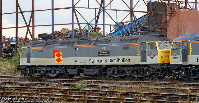
The proportions of the bodyside grey bands were changed, closely following those on a one-off SNCF-inspired livery applied to a Railfreight Distribution locomotive in 1992. This seemed somehow appropriate. The SNCF-liveried locomotive had been painted in those colours as part of an international railfreight exhibition in which Britain’s Railfreight had played a key role. The once insular British Rail, reluctant to learn from practice abroad, had transformed into a much more outward-looking and confident company. The construction of the Channel Tunnel was partly responsible, but so was the pride in the company that Roundel Design’s corporate identity had helped to foster.
I haven’t yet discovered who was responsible for Railfreight Distribution’s reinterpretation of the triple grey corporate identity. While the fact that it represented a more outward-looking and less insular company was positive, the reception it got in some quarters certainly wasn’t. According to the RailExclusive website, the designer of the original Railfreight triple-grey colour scheme (Denny, I assume) described the revisions as a “complete bastardisation” of his original concept.
Freightliner hung on to the triple grey base colours for its locomotives but with a new logo instead of Roundel Design’s sub-sector emblems, much as Transrail did. Freightliner’s replacement for the striking sub-sector emblems was a weak, red triangular motif at one end of its locomotives, with the name of the company underneath in a strange italic font. I can’t imagine Denny was any more impressed by that than he was by Railfreight Distribution’s interpretation.
Roundel Design’s Railfreight corporate identity quickly disappeared from signage and wagons too, while locomotives began to lose their depot plaques and British Rail double arrows, often leaving behind ragged bolt holes, presenting a sad appearance.
British Rail’s railfreight business, once unified under a single brilliant corporate identity, had fractured into a clash of different corporate identities. Some were new and some were weak reinterpretations of Roundel Design’s original. All this was in the name of preparing these businesses for privatisation and competition. And you know what? In the end it was all virtually pointless. Railfreight Distribution, Loadhaul, Mainline and Transrail (not to mention British Rail’s Parcels sector) were all bought by one company, becoming English Welsh & Scottish Railway, united once again under a single corporate identity. Roundel Design was reported as being no more impressed by that one. Only Freightliner and the small specialist nuclear fuels railfreight operation remained separate.
Denny and Roundel Design’s Railfreight corporate identity lasted for only seven years, but has had a completely disproportionate impact. It seems like it was around for far longer than it actually was. It hugely improved the culture of Railfreight, and won a Financial Times award for doing so. It has featured in design magazines (see here) and in the Super Contemporary exhibition at the Design Museum in London as an exemplar of corporate identity design.
Article updated
Article updated in January 2017 to include designer of Transrail corporate identity, from Lawrence (2016).
Bibliography and further reading
Eye Magazine feature on the Railfreight corporate identity, here
A complete guide to all those gorgeous depot plaques, via railway-centre.com, here
Railfreight corporate identity information sheets, via the excellent doublearrrow.co.uk website, here
Class 58 Locomotive Group website, for several details of the post-Railfreight corporate identities, here
Lawrence, David (2016): British Rail Designed 1948-97. Ian Allan: Addlestone, Surrey
…And, as usual, anything linked to in the text above

Reblogged this on Calling All Stations and commented:
Fantastic Article from The Beauty of Transport on BR Railfreight corporate identity.
i used to work with the roundel gang in the 90s as a free lance type designer. i’d love to track (oho) them down.