You mess with an icon at your peril. For a certain section of society British Rail’s double arrow logo is one such icon. That’s why there was a minor Twitter storm when the double arrow made an unexpected comeback in autumn last year as the cornerstone of a new rail industry campaign which is trying to start some different conversations about Britain’s railway, its future, and the massive changes which are already taking place on it. But my favourite thing about that campaign? There’s not a train in sight…

The ‘new’ double arrow unveiled by the Britain Runs on Rail campaign looks slightly different to the old one, and those differences tell you a great deal about the way the rail industry has changed since privatisation. For those familiar with the old logo, there are two obvious differences: it is now multi-coloured, and its arms at the top and bottom are longer than the original. It was redrawn by Simon Warden, head of design at advertising and communications agency M&C Saatchi. It was one of the elements of a pitch that helped M&C Saatchi win the contract to oversee the Britain Runs on Rail campaign. The multiple colours stand for something important; the whole rail industry working together. Rather like the colours on the flag of the Olympic Games, in which at least one colour from the flag of every competing nation can be found, the new double arrow includes a colour that every part of the rail industry can point to and say, “that’s ours”.
Getting to the point where the British Rail logo could be re-used in this way has been a long story.
When British Rail was privatised in the 1990s, its design-related intellectual property went in a number of directions. Some of it simply became defunct (like the Network SouthEast or Railfreight corporate identities). Some of it was taken on by train operators, like Great Western Trains’ ill-fated attempt to continue the use of the Intercity wordmark by registering it as a trademark, to absolutely zero interest from any other long distance intercity train operator.
Wisely, the rights to the double arrow logo were retained by the government, and in particular the secretary of state for transport. This guaranteed its continued use on traffic signs without fear of rights issues, and the secretary of state licensed it back to the Association of Train Operating Companies (ATOC) for use on printed publicity, tickets and station signage, via the “National Rail” brand it used for public facing activities. Generally shown as a white double arrow on a circular blue background (or the reverse), the logo was otherwise unchanged from British Rail days.
One of the criticisms of the early privatised railway and its structure was that it was so fragmented that there seemed to be no guiding mind behind its development. Railtrack had little interest in passengers, who were instead the customers of train operators, while ATOC represented only passenger train operators. There were times when passenger train operators seemed to be at war with freight train operators over scarce track capacity, and Railtrack’s activities were poorly aligned with the railway’s end purpose of allowing freight producers or passengers to buy efficient and easy train transport. The Hatfield accident of 2001 (see more on its relationship to the downfall of Railtrack in this earlier article) was the catalyst for change, and the beginning of a slow process by which different parts of the rail industry began to work more closely together. Even though the various companies might all remain separate, they have found new ways to work cooperatively as the industry has matured. Arguably one of the most significant moves in this direction was the creation of the Rail Delivery Group (RDG) in 2011, with a wider remit to represent most of the companies which make up the privatised railway. Having worked alongside it for several years, in 2016 RDG absorbed ATOC and its responsibilities for ticket revenue allocation and National Rail-branded information services. RDG’s membership now comprises passenger train operators (both franchised and open access) alongside Network Rail, freight train operators and owning groups.
Although there have been various calls over the years since privatisation for a pan-rail industry advertising campaign, not least to combat the fact that the national media loves nothing better than giving the industry a good kicking whenever it can, it has taken the creation of RDG to make those calls a reality. The last campaign of any similar nature took place in 2001, a year after Hatfield. It was commissioned by ATOC to tempt back to the trains passengers who had abandoned the railway in the wake of post-Hatfield chaos. It’s not well-remembered today, probably because it was slightly underwhelming. Produced by McCann-Erickson, it was based on the pictography of train tickets, and the tagline “It’s Time to Return”, a pun probably appreciated more by railway cognoscenti than regular passengers. Here’s an article from Transit (written by me in my transport journalism days) trailing the concept:
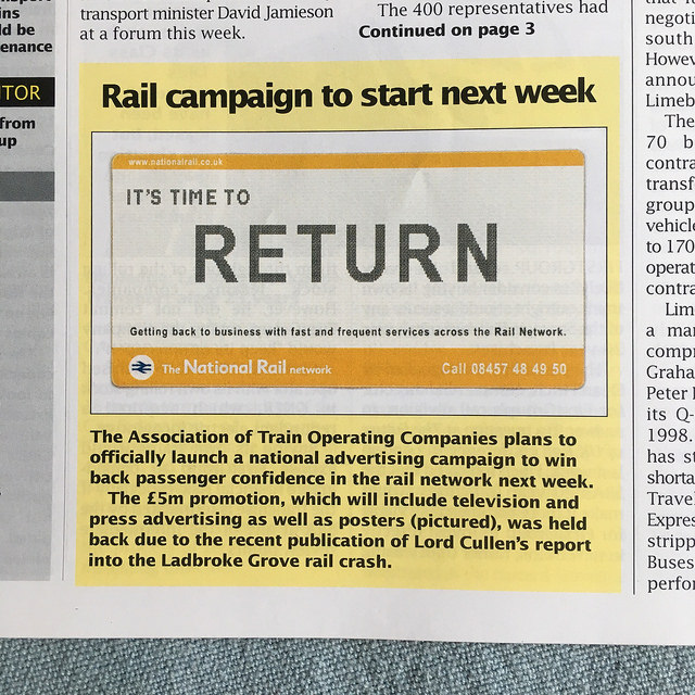
It wasn’t McCann-Erickson’s most persuasive piece of work, and because it was commissioned by ATOC, it could only promote passenger train services. What was probably needed at the time was a campaign which reassured passengers that both train and track were safe, and that the railways were open for business. At the time, though, Railtrack was completely distracted, and wasn’t part of ATOC anyway. This damp squib remained, until recently, the most high profile coordinated campaign the privatised rail industry has put on. Given that it has been thoroughly outclassed by the advertising campaigns of many individual train operators promoting only their own services, it tells you a lot about how effectively train operators could work together at the time.
Fast forward to autumn 2016, when the Britain Runs on Rail campaign was launched, and there was a very different feel behind the scenes of the rail industry, more mature and more cooperative. The visual result of these new behaviours is the very different double arrow which was unveiled as the campaign’s logo.
Given that the reinterpretation of the double arrow is quite radical, you might think it would cause Gerry Barney, the designer who conceived the original, some upset. Not a bit of it. “The new version of the logo really works,” he says. “It reinforces the totality of Britain’s rail industry working together, and the diversity of the different companies and Network Rail. It’s a faithful adaptation of my original 1963 design”. The secretary of state for transport was very willing to agree to the use of the logo by Britain Runs on Rail too.
So why all the fuss about the new version of the double arrow? The thing about the original version is that it’s become preserved in aspic, and has become a venerated icon, almost untouchable as far as its fans are concerned. That perhaps explains the outrage at its adaptation. Comments on Twitter included “my eyes are burning“, “I’ve been trying to pretend that this logo doesn’t exist” and “an abomination“. Ouch. (It’s worth noting that the pin badges with the Britain Runs on Rail logo have proved very popular with railway staff though, with frequent requests to RDG for more supplies.)
Having been dropped by the privatised railway apart from its use in National Rail publicity, the BR double arrow never evolved as other corporate logos have done from time to time. Supposing British Rail had never been privatised, or had been privatised as a single company. Mightn’t it have ended up redrawing the double arrow at some point anyway? For most non-rail enthusiasts, their memory of the double arrow logo is likely to be somewhat hazier, and to them the new version is simply ‘that symbol that means railways’. They wouldn’t have been particularly surprised by its more colourful reinterpretation or the tweaks to its dimensions, if they even noticed them at all.
That’s an important consideration. The Britain Runs on Rail campaign isn’t actually targeted at anyone with any in-depth knowledge of the rail industry. Frankly, if you’re the sort of person who noticed the changes to the double arrow, then you’re not the sort of person Britain Runs on Rail is trying to reach. Instead it’s targeted at regular people who might use the train for work, occasionally for leisure, or perhaps who aren’t train users at all. They might, however, have heard about the billions being spent on the railways, as well as the annual news stories about fares increases and how expensive train travel has become. Britain Runs on Rail is an attempt, no more and no less, to begin to encourage people to think about what those billions of pounds are doing and what rail fares are actually paying for; to start a conversation about the role the railway plays in Britain’s economy and prosperity. RDG is smart enough to know that the regular bad news stories aren’t going to go away overnight, but Britain Runs on Rail is an attempt to get some other stories moving alongside them.
September 2016 not only saw the unveiling of the new double arrow logo, but also a series of pictorial adverts designed to highlight some of the things the railway does, and some of the improvements that are being delivered in the next few years – the gain that will come after the current pain of engineering works and inadequate numbers of carriages on many overcrowded train services. While the railway enthusiasts were fretting over the multi-coloured double arrow, the general population was being treated to some exquisite photography and post-production work spread over five posters.

Each poster tells a story about one element of the work being undertaken to improve Britain’s railways. The skeleton of the posters is identical, the abstract presentation of a railway line as a linear feature made up of repeated elements, against a landscape, and with a brief caption giving a key message about the deliverables arising from the railway upgrade plan. Sometimes the lines are made up from railway elements (a green signal, train seats, station clocks), and sometimes they are non-railway objects (restaurant tables or deckchairs). They stretch across landscapes which represent different railway markets; the coast in the case of a poster promoting days out, suburban housing in the case of a poster promoting increased frequencies of train services.
The photographs were taken by Todd Antony (see his gallery here) with post production work undertaken by Curious Productions. The changes made to the original photos are sometimes quite subtle. If you look carefully though, you’ll notice things like the colour of the train seats being red on Antony’s original photograph and blue in the finished poster.

And I have to say I think they’re also gorgeous pieces of photographic art in their own right. They’re not trying to emulate classic railway poster advertising, but they’re just as beautiful in a whole new way, entirely appropriate to today’s market. There’s an air of Storm Thorgerson’s album cover art for groups like Pink Floyd, in which everyday objects take on an elusive and elliptical new meaning. Best of all, there are no trains to be seen anywhere. Aimed at the general public who, frankly, couldn’t care less about the different kinds of train which run on the national rail network, they are all about outcomes that might make a difference to their journeys. The posters instead draw on images that non-rail enthusiasts have a fighting chance of recognising. A green signal might be a piece of railway equipment, but it’s also universally understood as a positive image for moving forward. Anyone who’s ever sat in on an argument about whether it’s a good idea or not to feature a large picture of an old double-decker bus on the cover of a bus timetable, and been on the ‘or not’ side, will be grateful for the design choices made for the Britain Runs on Rail posters. You can find all five on the Britain Runs on Rail website, here.
The second stage of the Britain Runs on Rail campaign kicked off in March this year, when a short advertising film screened on television, in cinemas, and online via targeted adverts on websites (clever). Again, there’s not a train to be seen, but this time there is one to be heard. To a soundtrack of the stereotypical clickety-clack of trains on track (which is actually a bit of a cheat because the modern railway is all about continuously welded rail which doesn’t produce this noise), shops are filled with goods, a seaside pier is filled with visitors, and cars disappear from a road. The pier is in Hastings, notable on the pages of this blog for its bus shelters, underground car park, and for being the town where I grew up. Hastings Borough Council, bless it, couldn’t have been happier for the town to appear on screen. “We were very pleased to feature in this campaign. Hastings is well served by three different rail routes, and is easy to get to by train. Hastings station is very central to our main attractions, and with pressure on car parking in town it makes sense to encourage people to travel here by train,” said the council. Also, the advert includes a rather fabulous seagull at 0:06, apparently making the sound of a train horn.
Commentators like transport design and communications consultancy the MHD Partnership have questioned what the point of the advert is, whether it is to make viewers feel good about the railway, feel good about expenditure on rail improvements, or go out and try the railway. I think the answer is none of those. It exists to say, ‘this is the railway, these are some of the things it does, and it’s going through some big changes – you might be interested in finding out more’. The posters and film encourage viewers to search out the associated Britain Runs on Rail website.
The website is designed as a primer regarding the railway’s big issues, and includes regional breakdowns of rail investment projects and improvements. RDG has bundled up Network Rail schemes and franchise commitments into a £50bn package it calls the “Railway Upgrade Plan”. This isn’t a formal rail industry project, but rather something a bit more digestible for members of the general public who don’t understand (and shouldn’t really need to care) about the structure of the privatised railway, and who don’t distinguish between new carriages being delivered through franchise agreements and infrastructure schemes delivered by Network Rail. The website also gives some headline facts and figures about the socio-economic benefits of the rail industry and its funding sources.
RDG isn’t ready yet to start talking about the success of Britain Runs on Rail in terms of actual numbers. However, the tracking software that such websites use behind the scenes is reassuring RDG that the posters and film are prompting good numbers of people to become interested enough to visit the Britain Runs on Rail website, and that those visitors are the kind of people who aren’t otherwise particularly interested in railways. In fact, RDG has been very keen to talk as little as possible about the way the campaign works, instead preferring the story to be about the message the campaign is putting across. It’s an entirely sensible policy that keeps the focus on the Railway Upgrade Plan, and one that I’m rather undermining in this article (sorry, RDG).
Britain Runs on Rail isn’t going to make bad news about the railway go away, and no-one involved with Britain Runs on Rail is so naive as to think so. It might, however, mark the start of a process of helping people with little understanding of the rail industry realise that there’s more to the story than disruption to train services and annual hikes in ticket prices. The fact that the campaign is doing so with beautiful imagery is an unexpected bonus for anyone who remembers ATOC’s It’s Time to Return. But perhaps the most important thing for the railway industry is the idea represented by the reinterpretation of British Rail’s double arrow. The rail industry is working together on this campaign, and it’s only that kind of cooperative effort which has any chance of turning round the supertanker of negative media coverage of railway issues.
Bibliography and Further Reading
The Britain Runs on Rail website (obvs), here
RDG’s website, here
…and anything linked to in the text above

As a one-off and part of a campaign, the idea of reinterpreting the double-arrow in multi-colours is brilliant. But not as a long-term change; it lacks coherence and authority and declares the fragmentation of the industry.
That said, other and unfamiliar colourways could work, eg light green-on-dark green or First Group’s lilac/purple. I once experimented on this as part of a graphic design project.
Different colourway options for the BR arrow might be a way of getting the TOCs to present the railways as an integrated whole. The imposition of a restriction of this kind can be a useful challenge to graphic designers.
I have lived abroad for the best part of a decade, and still miss the reassurance provided by the logo its most familiar form, red-on-white, on direction signs to stations, etc.
It’s a bit like the BR double arrow had a baby with the Channel 4 logo from the 80s and 90s… But seriously, it’s a good reinterpretation of the logo and does hint at the fact that although our trains might be run by countless regional franchises they should nonetheless form a coherent national network.
In this vein I do sometimes think that National Rail is a bit of a missed opportunity. No-one really knows what the Rail Delivery Group is (and it’s not a very sexy name either) but many more people have at least heard of National Rail. It makes do with a meek little logo, a very dated website and app – but it could be so much more. It should look amazing – a real ‘shop window’ for the railway and a unifying brand – and there is plenty in the BR archive from where design inspiration could be found.
Is it just my eyesight or is there another variation of the double arrow on new(-ish) station signs? It seems to have fatter lines, or is it just the addition of bevelled edges? I noticed this example recently – apologies for the quality of photo in my choice of link but the vernacular bus station article showed me that others are much better than me at illustrating particular locations!
http://www.nationalrail.co.uk/stations/LLC/details.html
I agree, this poster campaign is an intelligent, original and modern way to promote rail travel without nostalgia. Most refreshing.
Right, now I’ve had the meaning explained… ‘all the fragments working together’ I can kind of see why someone would do this to such an iconic piece of graphic design. But still, why choose such ugly colours? It’s like the ITV logo, such a group of ugly and dull colours combined. Honestly I don’t think that using the logo in a solid white would have lost much of the meaning, and would have looked a lot better. It’s a shame though, because I share your fondness for the photography and poster work on the campaign, as well as the TV advert. The logo is just what lets it down!