In a blaze of publicity, the branding for Great British Railways, state-owned future operator of some of the privatised British railway network, was unexpectedly launched earlier this month, a mere four years after Great British Railways was first announced. In typical British transport policy tradition, the government almost immediately undermined its own efforts to create a unifying visual identity for the English railway network, having long since ceded the battle to brand the British railway network.
It has been 0.64 Moon landing projects (this website’s preferred measurement of time for getting big things done) since the first announcement of a Great British Railways brand. Join us on board the very slow train that has taken us from that announcement to the uneviling of the actual branding and – if you missed the big reveal – prepare to be amazed at where the journey has ended up.
In case you are not an obsessive watcher of the (very) slow motion car crash which is transport policy in this country, Great British Railways (GBR) is the current government’s, and indeed the last government’s, and depending on your definition several earlier governments’, solution to fixing the “broken” franchising system introduced in the 1990s for the operation of passenger rail services.
The Public Accounts Committee told the government that rail franchising was “broken” in 2018 and although the Conservative government of the time studiously avoided using the word ‘broken’, the more recent Labour government (elected 2024) has had no such compunction talking about Britain’s “broken railways“. All the various governments wanting to fix the broken railway franchising system are still looking really hard for the people who broke it, or indeed created such a breakable system in the first place, or who failed to fix it years ago when they had the chance. More on that when we have it.
Great British Railways was unveiled as a concept in 2021, the lynchpin of the Department for Transport (DfT)-commissioned Williams-Shapps Plan for Rail, named for its author Keith Williams (who did all the work) and then-transport secretary Grant Shapps (whose degree of input and resultant claim to co-authorship remain mysteriously unquantified to this day).
The Plan for Rail was a very typical product of the late and unlamented Boris Johnson omnishambles government of 2019-22. For a start, it included some outright – and easily disprovable – lies as early as the inside front cover, claiming to be the first publication “to use the new typeface, Rail Alphabet 2.” The actual first publications to use Rail Alphabet 2 were the brief for Network Rail/RIBA’s “Re-imagining Railway Stations” competition, and the competition’s accompanying book “HUB Making Places for People and Trains” – published simultaneously a whole year earlier. To be fair, the inaccurate claim seems very un-Keith Williams-like, leaving one to wonder if his co-‘author’ might have been responsible for it. The Plan for Rail also fitted right into the Johnson government’s desire to plaster Union Flags everywhere, and prefix everything it could with “Great British”.
It is unclear whether Johnson and his cabinet colleagues understood that “Great Britain” gained its “Great” simply as a marker of its size, to distinguish it from the smaller Brittany in France, rather than as a description of its brilliance. The Johnson government had a rather vibes-based approach to intelligence (“we went to the right schools and universities therefore we must be clever”) rather than demonstrating any great actual intelligence. Having performed a hard Brexit which essentially failed to deliver a single one of the advantages claimed for it, the Johnson government felt the need to convince voters of how ‘great’ everything was in a fully independent Britain (except for all the other remaining international treaty obligations). It seemed pretty sure that the “great” in Great Britain meant “great” in the “fantastic” sense. While that makes a fun title for TV shows like The Great British Bake Off or The Great British Sewing Bee, it’s rather less satisfactory as actual government policy.
As a result, the country was blessed/burdened (delete as applicable) with the GREAT Britain and Northern Ireland international brand marketing campaign of 2021 [their upper case, not mine], the crass £900,000 Union Flag repaint of the RAF’s government/royal family transport plane in 2022 (that’s about the cost of keeping open four or five good size libraries for a year), nuclear energy company Great British Nuclear in 2023 (renamed Great British Energy – Nuclear in 2025 by a later government) and, of course, our new best friend Great British Railways.
So what did the Plan for Rail propose? I’ve pulled out some of the key points from the document, below.
“A new public body, Great British Railways, will own the infrastructure, receive the fare revenue, run and plan the network and set most fares and timetables. Network Rail, the current infrastructure owner, will be absorbed into this new organisation, as will many functions from the Rail Delivery Group and Department for Transport.”
…
“Great British Railways will draw up timetables and set most fares. It will not operate most trains directly but will contract with private companies to operate them on its behalf under Passenger Service Contracts.”
…
“Great British Railways will simplify the current confusing mass of tickets, standardising mobile and online ticketing.”
…
“Trains will be better coordinated with other forms of transport, such as buses and bikes.”
I only included that last one because it was the first and last time anyone heard of the suggestion that GBR would actively promote more coordinated sustainable transport journeys.
Of more particular interest to this website were the following comments:
“There will be a new brand and identity for the whole system, built upon the double arrow, with national and regional sub-identities.”
The Plan for Rail expanded on this later, saying:
“Variants to the national brand will be developed to reflect the English regions, Scotland and Wales, while emphasising that the railway is one network serving the whole of Great Britain.”
All the above might not sound quite like the GBR that you’ve heard about recently, and this is why it’s sometimes been difficult to get a handle on how GBR will actually work. The original Plan for Rail proposals have been considerably altered by subsequent governments.
Sometimes, that has been for pragmatic reasons. You can imagine how the Plan for Rail‘s suggestion that Scotland and Wales would have to adopt a variant of the national GBR brand went down in Scotland and Wales (like a bucket of cold sick, if you can’t). The Scottish and Welsh governments, both of which have devolved responsibility for transport, have painstakingly developed national brands of their own for their railway networks, over many years, and they weren’t about to let the UK government’s Department for Transport ruin all that hard work with a London-led branding exercise that they strongly suspected wouldn’t be as good as their own. None of the UK governments since the Plan for Rail was published have had sufficient political capital to insist on this point and it now seems to have been conveniently forgotten by DfT ministers that this was ever proposed.
Meanwhile, the proposition outlined in the Plan for Rail has also been altered for ideological reasons.
It was updated in December 2023 by the Conservative government of Rishi Sunak to reflect that it was in fact no longer the intention that GBR would run the single rail ticketing website which was the logical outcome of the Plan’s original proposal that GBR standardise online ticketing. Instead, then-transport secretary Mark Harper (they come and go with such rapidity that practically every announcement about GBR seems to have been made by a different one) said that individual train operators (operated by private companies, remember) would in fact continue to retail to passengers alongside existing third-party retailers. He had, earlier in the same year, promised to enhance the role of the private sector in the rail industry. This all seemed like a step back from Shapps’/Johnson’s enthusiasm for greater state control of the rail network.
But no matter! The revolving door of people and priorities at DfT continued apace with the election of a Labour government in July 2024, appointment of Louise Haigh as transport secretary, resignation of Haigh in November 2024, and appointment of current transport secretary Heidi Alexander, who has since achieved the not inconsiderable feat of staying in post for more than a year.
With the change in ruling party has come further change regarding what GBR actually is, and its transmutation into something a great deal more publicly owned than the original Plan for Rail envisaged. Haigh announced that, rather than GBR awarding concessions to private sector operators, it would instead operate trains itself as a public body, and the Passenger Railway Services (Public Ownership) Bill was introduced to Parliament in July 2024 to effect this.
With GBR requiring additional legislation before it can begin operations, as an interim measure train operating franchises are transferring on their expiry to DfT Operator (DFTO), a DfT subsidiary already operating Northern, Southeastern and LNER due to some local difficulties with those franchises over the preceding years (franchising being broken, as you will recall).
In January this year, Alexander announced that GBR would, after all, operate a single ticketing website for all its operations. It’s never going to be the only rail ticketing website though – I don’t see ScotRail, Transport for London or Transport for Wales giving up their online presences, and third-party retailers will still be able to retail tickets. In an example of some of the fun and games that might lie ahead, in June this year thetrainline.com launched a legal action against the government, alleging that the government had extended LNER’s ticketing sales contract without giving thetrainline.com a chance to bid for it.
Despite these bumps in the iron road, the first train operating franchises have returned to public sector operation under DFTO: South Western Railway in May 2025, c2c in July 2025 and Greater Anglia in October 2025. West Midlands Trains comes next, in February 2026.
But although they are now part of proto-GBR, little has changed so far in the way South Western Railway, c2c and Greater Anglia present themselves to the travelling public. This reflects established practice at Northern, Southeastern and LNER, where continued use of the previous operators’ branding would cause most travellers to believe that their trains remain operated by the private sector rather than DFTO. To be fair, DFTO doesn’t really have a corporate identity to apply, and its logo is, well…

The current visual continuity of DFTO-operated franchises with their previous private sector existences is, in fact, deliberate. The government never intended DfT-operated train operators to rebrand as GBR with any urgency.
In summer 2025, transport secretary Heidi Alexander explained why. “Public sector operators will have to meet rigorous performance standards and earn the right to be called ‘Great British Railways’. Public sector operators will be set bespoke standards on things like punctuality, cancellation and passenger experience, so we can rebuild a world class public service. These will be set out in due course.“
This was a somewhat puzzling statement as it gave every impression that these ‘public sector operators’ were nothing to do with the government, rather than in fact being fully owned creatures of the government. It was rather akin to an incompetent lion tamer announcing that they would award their own lion-taming company “Accredited Lion Tamer” status just as soon as (a) the lions stopped eating innocent passers-by, and (b) they found out who it was that was supposed to be taming the lions in the first place.
In fact, nothing need change at all. The various train operator visual identities already effectively belong to the Department for Transport. The intention a few years ago was that any incoming new franchisees would be able to take over the existing visual identity of a train operator, avoiding the cost (or as other people would put it, “waste of taxpayers’ money”) of creating a new branding for the franchise and then applying it across stations and trains.
So franchise agreements made the visual identities of train operating companies assets which remained with the franchise rather than being the property of the operating company, with the possible exception of Chiltern Railways, which pre-dates the arrangement. It didn’t always work out that way. The East Coast branding of 2009 was DfT-owned and, in theory, transferable to Virgin Trains East Coast when the latter took over long distance express services from London King’s Cross to Scotland in 2015. However, Virgin Trains East Coast preferred to develop its own corporate identity to put its own visual stamp on the operation. This was unsurprising given the East Coast silver and pink branding wasn’t a particularly happy combination of colours, their arrangement as a livery lacked flair and the logo was somewhat ‘meh’. Only peak 1980s fashion doll Space Fantasy Sindy has ever really pulled off the silver and pink look successfully IMHO.
But, nevertheless, there is a world in which GBR could bring the operation of existing franchises in house, and leave their branding untouched.
Indeed, a few weeks after the Plan for Rail was published, one train operator MD told a meeting I was in that the branding of his franchise was here to stay forever. Airily dismissing the idea that passengers would notice any difference once GBR was up and running, he told his audience that his brand was so attractive (are any TOC brands so attractive that the travelling public would be bereft at their loss?) that GBR would have no interest in changing it.
Some people, however, are offended on principle by the wide range of corporate branding, visual identities, signage standards and typefaces to be found across different train operating franchises. If it’s been called the “National Rail” system since privatisation, then why does it look and feel so radically different depending where in the country you are? Sometimes, thanks to half-hearted rebranding efforts after franchises have changed hands, it looks and feels radically different even within franchise areas.
Inside government, whether or not civil servants are offended on principle, it surely can’t have escaped the notice of those with budget responsibilities for rail that if you are transferring trains around the country for operational reasons, you can save some money repainting/revinyling them if they all look the same in the first place. Train repainting facilities might find it easier (i.e. cheaper) to repaint trains if they’re all the same colour, and bulk orders of the same paint colours might be cheaper than short runs of lots of different paints across various franchises. And if you have to order rolls of moquette for train seats, you might see savings from ordering in bulk if all seats have the same moquette across the fleet. You don’t have to hold stores of lots of different moquette designs either. And if all the directional signage at stations is the same, then you could do bulk orders for that too and maybe get a discount? Ker-ching!
As a more political consideration, if you were, say, a government facing a general election in 2029 and by then rather desperate for something – anything – you could point to as something you had actually achieved over the preceding five years, then Great British Railways might be one of those somethings. But unless the trains, stations, and tickets/timetable website are noticeably Great British Railways in appearance by then, convincing the electorate that you have actually delivered this thing called Great British Railways might be somewhat challenging.
So both practical and policy considerations have created the conditions for the implementation of a national GBR corporate identity.
Having watched the British rail network degenerate into an absolute mess of different visual identities, with newer ones often only partially implemented, and older ones hanging on where overlooked, I’ve become increasingly of the opinion that it is time for some sort of consistent approach, rather than each train operator having its own corporate identity and various exceptions (Network Rail’s large stations, sub-brands for places like the West Midlands and the Isle of Wight, Gatwick Airport station doing its own thing) jostling for position. But having some experience of working for the public sector and procuring brands for transport operation, I’ve also had my doubts about the likely effectiveness of a DfT-led branding exercise.
For a while now, we have been teased by little snippets of detail about how GBR might be branded. One of the earliest pieces of news (in late 2021) was the creation of the Great British Railways Transition Team, a railway industry body set up to implement the proposals of the Plan for Rail in advance of the actual creation of GBR. It had a surprisingly not-too-awful logo, too, which seemed like it might indicate the direction of travel when it came to actual GBR branding.

But, as ever with the railways, with one hand the branding gods giveth, and with the other they taketh away. In January 2022 the logos for GBR proper were lodged with the Intellectual Property Office. And they were dreadful.
As a number of commentators pointed out at the time, the double arrow boxed in by blue bits bore a marked resemblance to the British Rail International logo from the 1980s. Both that and the GBR 2022 logo have an awkward and unbalanced appearance stemming from a desire to make the logo resemble the Union Flag. Unfortunately the Union Flag is eccentric in design, to say the least, and the offsetting of the St Patrick’s Cross within it means that the white lines of the St Andrew’s Cross are of different widths either side. And when you try to shoehorn that into a GBR logo, you get blue blocks that simply appear not to have been aligned properly.
This version of the logo was quietly dumped and the election of the Labour government in 2024 saw a new approach to the GBR logo developed, teased with some “coming soon” graphics on trains and at stations in summer 2025. While less terrible than the 2022 versions of the logo, the 2025 teasers were not entirely satisfactory either, as expert graphic designer Nick Job’s authoritative doublearrow.co.uk account noted.
But in December 2025, for no apparent reason at all, the full GBR branding was suddenly revealed. At this point, I would normally credit the design agency which developed the branding. But in this case, explained the DfT, “the brand was designed in-house to maximise value for money.” Although in-house design isn’t always bad – most of the Transport for Wales Rail branding was done in-house too and is both restrained and clever (an article for another time) – design agencies do exist for a reason. Because GBR’s branding looks like this:
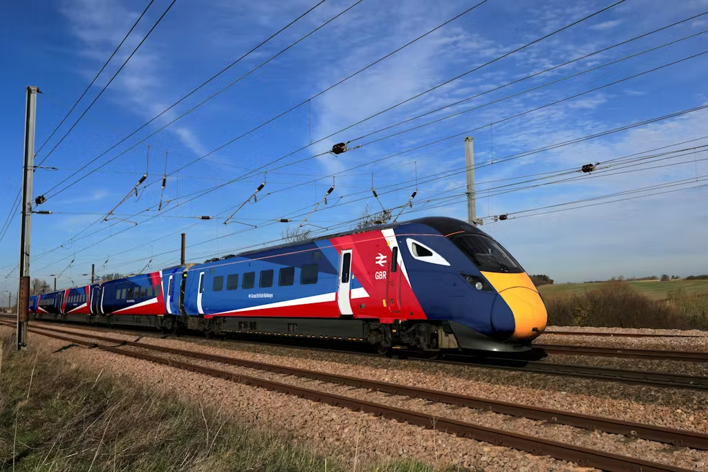
It would have been nice to think that the end of Boris Johnson’s premiership might also have meant the end of government trying to drape Union Flags all over everything. For one thing, the Union Flag is being put to some pretty problematic uses at the moment, displayed as a means to oppress minority ethnic citizens rather than celebrate whatever might be great about Great Britain, spurred on by the fact that the actual UK government seems to have nothing to say about such actions.
“The design features a red, white and blue colour scheme and sharp angles to create a striking and memorable design mirroring the Union Flag,” said the DfT in its press release. Well, yes, I suppose it is memorable, if not perhaps for the reasons that DfT might have hoped. But if it’s mirroring the Union Flag, why does it have two different shades of red and two different shades of blue?
I’m struggling to think of any other major railway that so crudely uses a national flag for its train livery. German operator DB and Dutch operator NS both have incredibly strong visual identities for their state-run train operators, but those identities have nothing to do with their national flags (such an approach is hindered for GBR because the UK government has a basic policy of trying not to learn anything from mainland Europe). Russia does use its national flag colours of red, white and blue on trains, notably its Sapsan fleet, but the livery isn’t just a reproduction of the flag (and is that really company you want to be in at the moment?). ScotRail is the only brand I can currently think of that adapts the national flag onto its trains, and it does so in a manner more subtle (and satisfactory) than GBR’s approach.
Away from the railways, I suppose British Airways uses the Union Flag on its aircraft, but its version is a much more stylised – and stylish – interpretation, and a lot less of the body of the aircraft is taken up with it.
GBR’s version, in contrast, is HUGE and is also just sort of plopped carelessly on the side of the train, without any apparent attempt to integrate it onto the architecture of the train, its blocks of colour cutting randomly across windows and doors. The nose of the train looks a bit British Rail-ish with a white surround to the cab window on a dark blue body. Yet that detail is found only on the cab windows, and not around any others, complicating an already fussy-looking livery.
The livery is also problematic because it is ‘directional’, in that it points towards the end of the train. Because trains have two ends, and because the livery is repeated on each carriage, that means it has to flip over at some point. On a train with an odd number of carriages (as in the image above) that gives an uneven appearance. This could have been mitigated had the pointy red bits appeared only on the end carriages, with a non-directional version of the livery on the intermediate carriages. (The same problem also affects TransPennine Express’s trains and it grates with me every time I see it).

And of course, even though Network Rail’s latest Wayfinding design manual (revised by Nick Job) patiently explains that the double arrow symbol works best when it is centred on the x-height of text, in the GBR branding the double arrow is centred on the cap-height of the words “Great British Railways” so it looks too small. One might have thought that the design team at the government’s Department for Transport would have taken a look at the guidance from government-owned Network Rail on how to use the symbol and text alongside each other, but I guess that’s just too much to hope for.
The lettering isn’t even set in Rail Alphabet 2, the new typeface commissioned by Network Rail a few years ago and designed by typeface experts Margaret Calvert and Henrik Kubel specifically for the British rail network (thank you to one of my correspondents for pointing this out). All the “coming soon” versions of the GBR logotype used Rail Alphabet 2, but now it has morphed into some new variant. The lower case ‘l’ now has a hook while the upper case ‘R’ has a straight leg instead of a slightly curved one – the latter change so subtle it seems hardly worth the effot. Whispers in the industry suggest this modified typeface is called Rail Alphabet 3. But imagine having all the expertise that went into Rail Alphabet 2 and then the DfT just deciding on a whim that it wants a new variant. It’s the start of slippery slope in which the client starts requesting more and more changes, believing it knows more about typeface design than experienced typeface designers. The typeface drifts further and further from the purity of its original concept. How many more Rail Alphabets are there to come?
Meanwhile, another of the Plan for Rail‘s ideas that seems to have been forgotten since publication is that of “national and regional sub-identities” for GBR branding. Instead, it now seems to be the proposition that long-distance national services, and local/regional services, will have the same branding.

It is not obvious from the visualisations how, or even if, the GBR livery will denote First Class and accessible areas of trains, and doorways where cycle storage is available (what with GBR better coordinating with bikes and all). On such a complicated livery, this information will be hard to pick out even if eventually provided.
On a minor matter that is of disproportionate interest to rail design folk, it remains unclear whether all GBR trains will have yellow ends (as pictured in the visualisations) or whether this will only apply to trains which already have them. New trains sport headlights which are so bright they can be seen from much further away than a yellow panel is visible, and as a result they are no longer required to have yellow ends. Many TOCs now operate trains without the yellow ends.
My own personal biggest unanswered question is about the interior of the trains and what the seat moquette will look like (I do love a seat moquette). Surely the seats won’t be decorated with giant vertical Union Flags? At this point, nothing would surprise me.
We also don’t know how the stations will be branded and signed. One would hope that they will follow the painstakingly developed standards set out in Network Rail’s Wayfinding design manual, but given that no-one at DfT with responsibility for GBR’s branding seems even to be aware of Wayfinding‘s existence, that’s very much open to doubt.
The GBR branding actually looks less awful on the visualisations of the new website/ticketing app and its icon. It is, then, perhaps best seen in 2D and in small quantities.
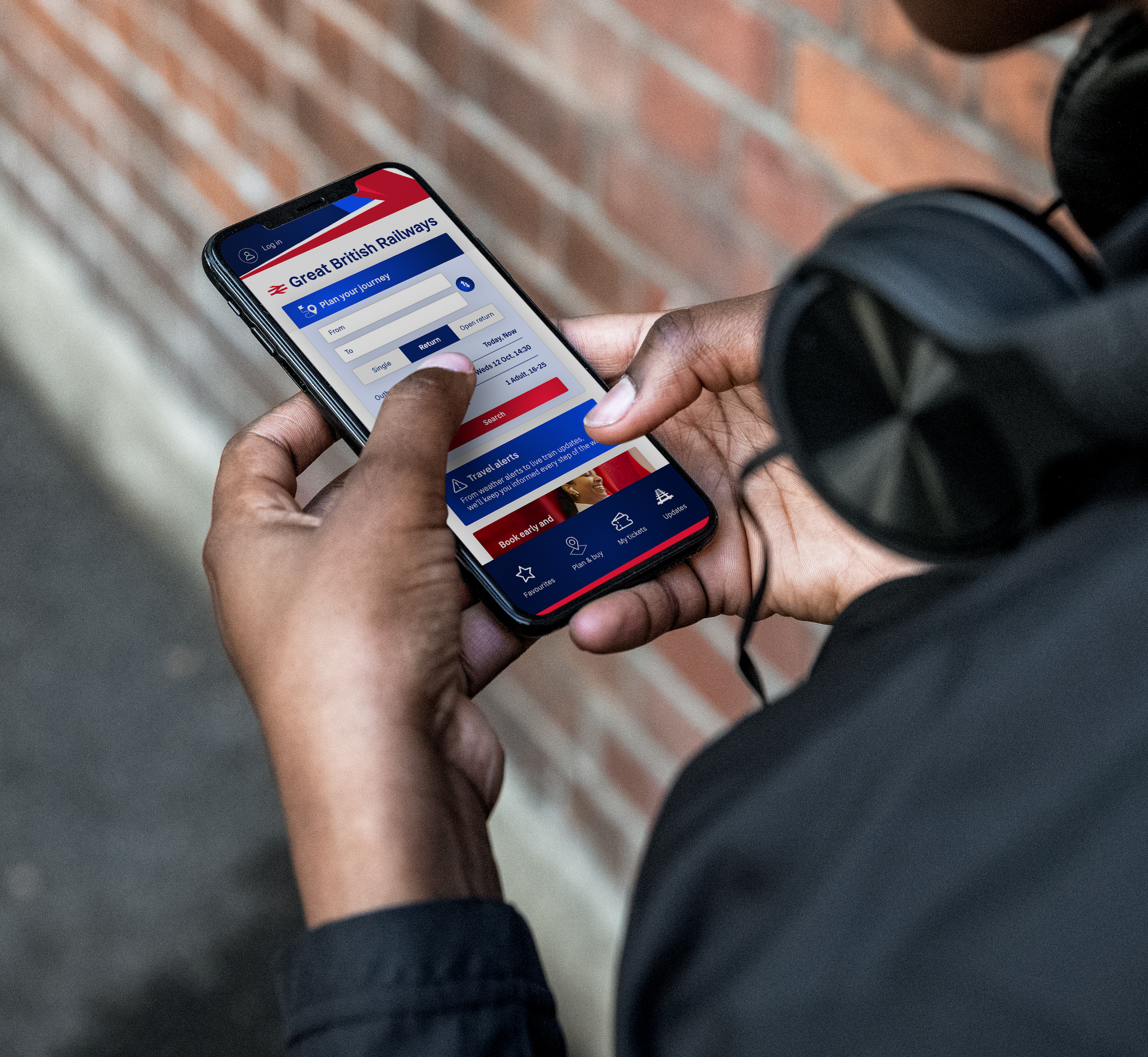
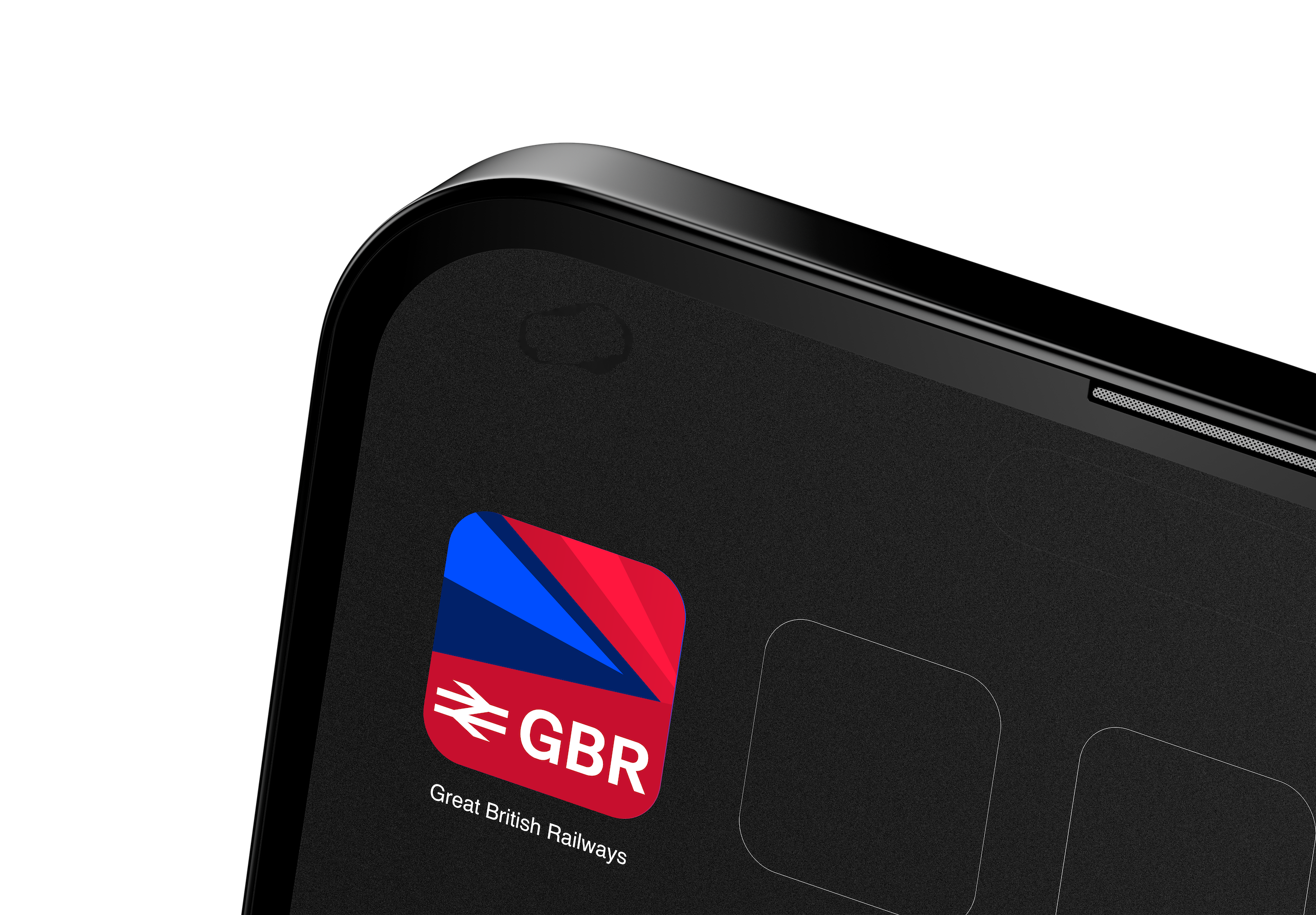
↑ GBR mobile ticketing app and icon (© Department for Transport)
If you think I’m being harsh about the GBR livery, best not to read the reaction of Stephen Bayley, co-founder of the Design Museum and trustee of the Royal Fine Arts Commission. While one would expect The Spectator to be critical of an initiative of a Labour government, Bayley’s views there are nevertheless very entertaining, and very entertainingly put.
There is, one might hope, time for the GBR livery to be refined before it actually appears on trains (at least get the double arrow centred on the x-height in the GBR logos and revert to Rail Alphabet 2?), but it probably won’t be. The rollout will begin soon, according to the DfT: “The logo and train livery for GBR will be rolled out from next spring to trains, websites, stations and more.” We do, at least, seem to have moved on from the nonsensical idea that train operators will have to “earn the right” to brand themselves as GBR, not least because doing so would probably take longer than the time until the next general election.
Although Alexander claimed that GBR’s new look would be “bringing the railway together under one brand,” the truth is that it will be doing nothing of the sort. That horse bolted so long ago that the lock has gone rusty and fallen off the stable door in the meantime.
For a start, and despite the assertions to the contrary in the original Plan for Rail, the Scottish and Welsh railway network brandings aren’t going anywhere, and they are certainly not going to become variants of the GBR branding (especially not now the Scottish and Welsh governments have actually seen it). Neither, for that matter, is the Transport for London branding to be found on London Overground and Elizabeth line trains going to be replaced by GBR branding, even though these are also part of the National Rail network. The same goes for Merseyrail, where Merseytravel awards the concession for train operations rather than the DfT, and has a local branding.
With the GBR branding having launched to great fanfare on 8 December, just three days later on December 11, Manchester mayor Andy Burnham undermined it even further (did he do it deliberately? I would love to know). He unveiled a promotional yellow Bee Network train as part of an announcement about Manchester local train services being brought into Transport for Greater Manchester’s locally branded, locally specified public transport system from December 2026. We can assume that other local Manchester trains will get a similar colour scheme from then on.

The DfT followed that up the very next day by making it even easier for yet more parts of the railway network to opt out of GBR branding. It published an invitation for areas of England with Mayoral Strategic Authorities (the same set up as in Manchester) to apply for the right to commission their local rail services. Although the presumption is that GBR will operate the trains, the DfT says that local branding can be considered as part of the new partnerships between Mayoral Strategic Authorities. We are moving towards a recreation of the days when the Passenger Transport Executives worked with British Rail to fund and specify local train services, and branded their trains with local identities. That might be no bad thing, but it is another nail in the coffin of the idea that GBR will be “bringing the railway together under one brand”.
In fact, the GBR branding already seems destined to be little more than a brand for English long-distance intercity train services (except the ones operated by open-access companies), and local trains on bits of the network where political arrangements don’t allow mayors to commission and brand their own rail networks. A sort of “fast trains, and forgotten trains” brand, if you will.
But I must admit to at least the possibility that I could yet be completely wrong. And so might all the other commentators whose reaction to the GBR branding reveal has ranged from a wince, to abject fury (I’m about halfway between these, not least because I live in Scotland where we have a perfectly satisfactory railway brand already).
For a start, the GBR branding might look better in real life than it does as visualisations? It does happen. And, as I mentioned earlier, there is at least the opportunity to refine it before it does appear on trains for real, in the unlikely event the DfT chooses to take it. There is also this:
“Graphic designers with no railway interest have been let loose on machinery in a way that recalls Coca Cola tins and tubes of toothpaste.”
That was respected railway author Brian Haresnape in 1986, writing about the newly revealed Network SouthEast livery. And lots of us really like the Network SouthEast livery now. The shock of the new is a real thing. Only time will tell if the new GBR branding is just too much of a shock ever to take to heart. ■
Article updated 23rd December 2025 to note that GBR’s logo no longer uses Rail Alphabet 2.
Subscribe to The Beauty of Transport
Enjoyed this post? Want to read more of the same without the hassle of checking the website for updates? Then enter your email below:
Follow on Social Media
I’m not very active on the socials, but you’re welcome to follow me at…
At the very least, automatic notifications of new posts to this website should appear there.

Thank you for a gloriously frustrated article: the truth hurts. The nonsense around Great is just the start of the problem with this, in principle laudable, attempt at branding.
It could improve before deployment, but it’s hard to think this identity will mature when it has so many of the basics wrong at birth.
I think/hope in the end pragmatism will play out. The fact that it’s been designed at the DfT does mean that it’s been designed by people with no idea how train liveries are actually applied hence an incredibly fussy livery that’s going to be hard work to apply. At very least I expect the mid-train carriages to lose the pointy bits. Probably replaced by an all over blue with horizontal red line relief.
The challenge between local and national branding is also not a new one. In the 1980s Greater Manchester had trains running around in orange and brown to match the local buses. And in Tyne and Wear there was a bit of a mess by the local PTE trying to bring in a yellow based local livery. Their buses were fine but they wanted the National Bus Company to use the same livery. Except this clashed with the NBC’s own attempts to have a standard livery and branding. So they ended up in a state where the NBC’s vehicles had a different livery (based on its national one) using a completely different shade of yellow plucked from the NBC’s branding manual.
Ultimately though, where you have mayors with money to invest in local trains and who want to present a unified transport system (and show their voters what they’re doing!) local branding in major cities is always going to win. Just as long as the trains don’t “escape”. I always remember riding a Merseyrail branded train that was running a Manchester to Sheffield service through the Peak District…
“A sort of “fast trains, and forgotten trains” brand, if you will.”
Of course that pretty much describes InterCity and Regional Railways to begin with! In fact since I don’t believe the devolution to Strategic Authorities will affect London no doubt the GBR livery will be plastered over every one of the neither forgotten nor fast London commuter trains.
As an alternative, how about a version of British Airways current blue/red/silver-gray “speedbird swoop” constructed out of steam train smoke/vapour with a streamlined steam loco underneath 😆
or a picture of a HST like train in BR blue with double arrows on side of a white pearlescent background (c.f. BA’s use of heritage BOAC livery/logo on a 747).