The early days of the privatised British rail network were visual chaos, perhaps unsurprising given the organisational chaos going on behind the scenes. Before too long though, things began to calm down a little. That, or we just got used to the fact that the railways no longer had relatively few, sector-based visual identities (InterCity, Network SouthEast, Regional Railways and so on). Instead, there would now be many different visual identities based on geography; the areas covered by the many new passenger train operating companies.
Two important changes to the way the railway looked started to become evident in the early 2000s. The first was the corporatisation of visual identity as large bus-owning companies which had bought into the railway increasingly started to impose their corporate branding on the railway network. The other big change – and not necessarily a change for the better – was the result of an increasing involvement on the part of the state.
The privatised railway has always presented the government with a real headache, chiefly in that it had given away control of the rail network while still funding it to the tune of millions and eventually billions of pounds in subsidy and investment. For the incoming Labour government of 1997, inheriting a newly privatised railway, this was a difficult problem to address. In an example of supreme cynicism it instantly ditched a pre-election promise to re-privatise the railway, but it wasn’t content to adopt a hands-off approach either. Its first move was to set up, in shadow form at first, and formally from 2001, a quango called the Strategic Rail Authority, to give strategic direction to the railway.
The SRA’s logo was the first major piece of state sponsored visual identity work on the privatised railway. And it was, in all honesty, a bit naff.

As someone who worked (and still works) in the state sector, and is occasionally proud of it, I can assure you that visual identity is generally something the state is very bad at. Just occasionally you will get a Frank Pick who understands and promotes the importance of the way things look as an integral component of the way things work. But all too often, visual design in the state sector is an afterthought, knocked up by someone with little or no training in graphic design, last thing on a wet Friday. How else do you explain most local authority bus timetable booklet front covers? At best, state authorities will recognise the need to get in a proper designer, but then often hamstring them with appalling briefs, or by rejecting interesting design solutions as, well, too interesting for the public sector. Part of Frank Pick’s fame stems from the fact that he’s the only state transport employee most of us can think of who knew what good design looked like, and implemented it, too.
Over the next few years, until it was put out of its misery five years later, the SRA (amongst other high/lowlights)…
- tinkered endlessly with the shape of railway franchises it was supposed to be awarding,
- dreamt up and then largely failed to award long-term 20 year franchises featuring Special Purpose Vehicles formed of train operators and engineering companies,
- Hacked several routes off a newly expanded Virgin CrossCountry network within a few months of their introduction (Haslemere and Petersfield were on the CrossCountry network for less than a year)
- Set up (at government behest) a Rail Passenger Partnership (RPP) fund to pump-prime new train services or facilities which might not be immediately commercial propositions but which delivered wider benefits (more here)
- withdrew RPP funding from its highest-profile scheme (Anglia Crosslink) and then scrapped RPP altogether
- bailed out several train operators which were struggling with their finances, without any apparent concern for the use of public monies
…which is quite the resumé. It did some good things too, and many of the people who worked there were top-notch, but its approach to most of the organisations it dealt with was so hostile that most of us now remember only the bad things.
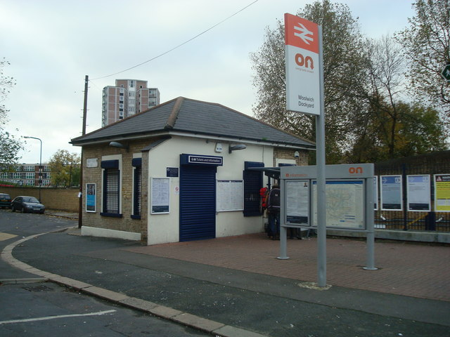
For passengers in south London, the first evidence that the state was taking a greater interest in their railways came with the entirely inept Overground Network of 2003. It was a joint initiative between the SRA and Transport for London (TfL), several south of London train operators (who gave every impression of not caring about it at all) and local authorities. By the early 2000s it was becoming increasingly apparent that devolving to TfL control of suburban rail services would deliver considerable integration benefits with its other transport modes. But the Department for Transport (DfT) was not at all keen on the idea, suggesting “full devolution would result in unacceptable fragmentation” (see page 57 of the 2004 White Paper The Future of Rail); ironic given that privatisation had already fragmented the railway. Instead, the solution was thought to be the Overground Network, or ‘ON’, as it was branded.
ON was, I think, intended to make it seem as though the south London suburban rail network was a single entity, a bit like the Underground, despite being operated by several different train operators. It was rolled out at stations on various routes in south London with a minimum service frequency of four trains per hour. New standard ON signs were installed, and newly designed maps showed the ON network. The design work was undertaken by retail and brand consultancy Fitch, but it was all rather underwhelming. The route diagram signs on station platforms were arguably the best bit, but the actual ON logo was an insipid and tricksy thing, with the N formed of linked arrows. See? Never let the government (or its quango in this case) manage a branding exercise.
But back to the story.
In 2004, the SRA took upon itself to develop a railway visual identity after it diverted most of a desperately needed order for additional South West Trains Desiro trains to West Coast Main Line operators Central Trains and Silverlink. Painting them to match the existing visual identity of either operator was a non-starter because the trains were shared between them, and any individual train might find itself working for Central Trains one day and Silverlink the next. So the SRA dictated the colour scheme, the first one dreamt up by the state since privatisation. Unfortunately, it was one of the most uninspiring visual identities to grace a train fleet on the privatised railway, featuring pale grey bodies, blue doors and blue between the windows. The Desiros themselves tended towards the boxy, but this visual identity accentuated rather than disguised the fact. Somehow, the SRA chose perhaps the only colour scheme imaginable that could result in passengers not noticing that their service was being operated by a brand new train, so drab was it.
![Hugh Llewelyn [CC BY-SA 2.0], via Wikimedia Commons](https://thebeautyoftransport.com/wp-content/uploads/2015/10/640px-hugh_llewelyn_350_101_6314709436.jpg?w=768)
The interiors were a little better, but lacking entirely in any kind of personality:

Towards the end of its life, in 2005, the SRA awarded a new franchise to operate intercity trains on the East Coast Main Line to incumbent operator GNER. Unfortunately the company had overbid for the contract and when the wider economic situation proved less favourable than expected the company was unable to keep to its premium payment promises. The SRA was abolished in December 2006 and just days later the DfT announced that GNER would be stripped of the franchise. With the abolition of the SRA, the DfT was now responsible for awarding franchises. It eventually gave the new East Coast contract to National Express in 2007. Because no-one ever learns anything, it seems, National Express also overbid for the contract, and walked away two years later. Operation of services passed to Directly Operated Railways (DOR), the DfT’s state-owned operator of last resort.
DOR had previously stepped in to run London commuter operation South Eastern, when that franchise had been removed from Connex in 2003 over financial management concerns. Hopes that this might see the miserably boring Connex South Eastern visual identity brightened up were dashed when DOR left it alone, doing no more than rebranding trains “South Eastern” with a dinky little logo formed of three squares. Unfortunately for DOR, this approach was untenable at East Coast. Some of its trains were already in National Express colours, while others were in a cack-handed National Express modification of the GNER colour scheme. On these, a white stripe and National Express logo replaced the GNER red stripe, but not the red doors. At first, DOR added simple cerise and white “East Coast” logos to the trains, but in some cases this led to trains running in a mash-up of no less than three different corporate identities at once. It was a visual disaster, the look of the company demonstrating the chaos of the various mismanaged franchises. Eventually, the bullet was bitten and East Coast’s new visual identity was unleashed on the network in 2010. It wasn’t exactly mould-breaking:
![The East Coast visual identity as seen on one of its trains in 2012. Photo by Daniel Wright [CC BY-NC-ND 2.0] via this flickr page](https://thebeautyoftransport.com/wp-content/uploads/2016/11/91103-kings-cross-8-mar-2012.jpg?w=640&h=480)
Plain silver with a cerise stripe, it included the existing “East Coast” logo, which used a blocky, condensed typeface, a world away from suggesting stylish high-speed transport. Above the logo, the cerise stripe faded through blue (suggesting the fading away of GNER perhaps?) and two cerise spots.
The idea was that the plain base livery could be adapted by a new private sector operator when the operation was eventually refranchised. The DfT had been stung by criticism over the amount of money train operators were spending on rebranding when franchises changed hands, as though this was something that was unique to the railways, instead of being standard practice when private sector companies take one another over. Needless to say, after a Virgin/Stagecoach joint venture eventually won the rights to operate the East Coast franchise in 2014, it dumped the silver colours as fast as corporately possible once it formally took control, in favour of a very stylish interpretation of the Virgin colour scheme by design agency Best Impressions.
Unfortunately, however, the DfT had clearly got a taste for deciding on (boring) train colours.
For vastly complicated reasons that would double the word count of this article if we got into them, the DfT (rather than train operators) ended up ordering two new fleets of trains in the late 2000s – the Class 700s for Thameslink, and the Class 800/801 Intercity Express Trains for Great Western and East Coast.
The livery for the Thameslink trains, as agreed with the DfT (see here) was a prime example of why the government should stay well away from branding exercises. The final design was light grey, with white flashes at carriage ends (in reality, the difference is so slight that it’s often invisible) and pale blue doors (sounds familiar…). The chilly, uninteresting colour scheme extends inside. For passengers, arguably more serious concerns are the spartan seats, hard floors, and lack of Wi-Fi and power points; the kind of basic facilities for the modern passenger that only the state could overlook, because the private sector wouldn’t dare offend its paying customers by doing so.
![A Class 700 Thameslink train at Norwood Junction. Photo by John Ray [CC BY-NC-ND 2.0] via this flickr page](https://thebeautyoftransport.com/wp-content/uploads/2016/11/25216383559_962e50e06c_z.jpg?w=768)
Meanwhile, the Intercity Express Trains are also being delivered in plain white, and there was considerable discussion within the DfT about whether recipient train operators should be allowed to paint or vinyl them up in the corporate colours of the relevant franchise. Fortunately, the train operators were able to convince the DfT that this was an essential part of their marketing efforts, so the Great Western ones will be dark green, and the Virgin East Coast ones will be in a colour scheme yet to be unveiled.
It’s not just the UK government that has an inexplicable fondness for white trains. The Greater Anglia franchise is operated by Abellio, a subsidiary of Dutch state railway company Nederlandse Spoorwegen (NS). The visual identity, such as it is, has been plain white trains with red doors with the occasional grey and/or red stripe added to refurbished stock. It’s as though the trains are running in a basecoat, waiting for the visually exciting part of the brand to be applied, except it never is. Yet NS’s own trains back in the Netherlands run in bold combinations of blue and yellow, which form part of a long-standing corporate identity which commands respect amongst its passengers. It’s a curious difference in approach which has never been satisfactorily explained.
The only other state railway to fully operate a British franchise is Germany’s DB, via its Arriva subsidiary, which it bought in 2010. It has generally left alone the visual identities of Arriva’s existing British train operations, barring the addition of the occasional DB logo. However, Arriva’s new Northern franchise, which began in 2016, has recently unveiled a visual identity based yet again on trains painted largely in white (with blue ends) looking strangely unfinished and somewhat underwhelming. The curse of state railway white trains strikes again.
It will be interesting to see what Italian state railway operator Trenitalia does with the c2c franchise it is buying from National Express, once the sale is finalised. c2c’s trains are already running in a basecoat-like plain white with blue doors, and little thought appears to have been given to visual identity anywhere at the operation.
If the UK and some overseas governments have been hopeless at dressing up the British railway network to attract passengers, the Scottish and Welsh devolved administrations have also tried, to mixed results. Once made responsible for the ScotRail franchise, the Scottish government decided it would mandate the corporate identity of ScotRail, with the actual operator allowed only to add a small identification logo. To no-one’s great surprise, when unveiled in 2008, the Scottish government went for a Saltire-based identity. The trains are dark blue with the Saltire formed of many silver-white dots, across carriage ends, while the typeface used comes from the Officina family.
![ScotRail's visual identity as seen on a train and signage at Dumbreck. Photo by Daniel Wright [CC BY-NC-ND 2.0] via this flickr page](https://thebeautyoftransport.com/wp-content/uploads/2016/11/9816964854_91878ea3f7_z.jpg?w=768)
The final result is effective, but the spots are slightly fussy, and the Saltire is a somewhat obvious choice; only a tartan could have been more stereotypical. I’ve never been a big fan of the fading light blue spots along the base of the carriages, which seems to add unnecessary clutter. The very first ScotRail visual identity on the privatised railway drew inspiration from the shape of Scotland itself (as described in this article), presenting it in an interesting new way, using attention-grabbing colours. It’s a pity that the Scottish government couldn’t have been just a little more adventurous with this latest ScotRail visual identity. Pleasingly though, it extends to all parts of the operation including signage and publicity, not just the trains. The design manual was drawn up by Edinburgh-based design consultancy Redpath. The brand identity guidelines are available on the Transport Scotland website, here.
The Welsh government has yet to award its first train operating franchise, so it remains to be seen whether it will take the Scottish approach of specifying a visual identity throughout, or letting private sector operators develop one. However, the Valley Lines around Cardiff are intended to become part of the South Wales Metro, a network which will comprise traditional rail, light rail and/or bus rapid transit routes. When the proposed visual identity was unveiled for the first time in 2015, it provoked surprise and horror in equal measure. On a pale grey base (of course), trains, trams and buses were shown as sporting a bold/brash (take your pick) chevron pattern in orange and red, a colour combination which looks a bit awkward to me. At one end of the train/tram/bus is cartoon-style running hare/rabbit, a device planned to be repeated elsewhere on the Metro, including on smart card tickets.

Since privatisation, the British railway network has generally calmed down a bit from its early visual excesses. But in areas where that calming down has morphed into boredom or awkwardness, you can bet that governments (from the UK or abroad) have had a hand in it. Another time, I’ll tell you about how the changing influence of local authorities in and around Britain’s biggest cities changed how the railways there looked, too.
Bibliography
I’ll have read anything linked to in the text above.

.jpg)
In the earliest days of privatisation there seemed to be a lot of money available for re-branding. I remember getting letters from RAILTRACK with beautiful engraved copper lettering in Gill at the head of the letter. Similarly the original “Office of the Rail Regulator” had a logo that looked like it meant business (the Crown of authority within a cogged wheel of the rail industry) — example here: http://www.suttonyoung.com/images/brandmarks/rail-regulators-identity.gif Their paper-based consultations arrived in blue covers with a lighter blue varnished logo.
In terms of a successor to British Rail, Wallace Henning’s ‘National Network’ always appealed to me: https://www.flickr.com/photos/wallacehenning/6163273976/in/photostream/
Ben
White/Grey train syndrome seems to be increasing on the network, although wasn’t it the private sector that started the rot, with hideous Connex grey/yellow and National Express grey/white in East Anglia ?
I’m disappointed with the new Virgin Trains East Coast livery. I was hoping for a return of “Classic” Virgin red and black as seen on the West Coast Mainline Mk3’s and 2’s in the 1990’s. Instead we god more white trains with a bit of red at the end.
What? No reference to how local West Midlands trains “could” look under partial devolution?
http://westmidlandsrail.com/news/new-look-for-local-trains-unveiled/
Coming back to the contents of the article, I’m sure I remember that the DOR East Coast livery applied to the first few trains was a genuine shiny silver (presumably conceived as a step towards an inter-city norm, common with the Virgin Trains base colour) but it was deemed too expensive and the awful light grey took its place.
Yorksrob – I’m actually amazed that anyone thinks the original Virgin Trains colour scheme had any merit; it was dire. Passenger access via dirty dark grey carriage ends, complete vertical break twice on every vehicle… ugh. Just shows how subjective these things are (I liked the NatEx livery on the Anglia and East Coast inter-city stock)!
There is an article on PTE visual identities on the way. Interesting (but perhaps not surprising) that they reflect wider changes to PTE roles and responsibilities. And the new West Midlands Rail identity comes right near the end of that. Hang in there…