So, where were we? Before we got diverted into considering how central and local governments have influenced the appearance of Britain’s railway network in recent years, we were looking at the visual chaos of the early privatised British railway network. It looked chaotic because, essentially, it was chaotic.
But the heady days of the early privatised railway calmed down after a few years. Like any new industry, which was essentially what the privatised railway was, a maturation process was inevitable. Most (not all, but most) of the railway ended up in the hands of the so-called ‘Big Five’, Britain’s largest bus and/or coach operators: Arriva, FirstBus, Go-Ahead, National Express and Stagecoach.
Most had gained an initial presence in the early days of rail privatisation, but as the years went by they were able to increase that presence through further acquisitions. Some of the newly franchised train operators were management buy-outs, while others were smaller and somewhat undercapitalised companies which made mistakes in their business forecasts for operating their franchises. Both types were easy targets for the Big Five. These bus companies which had had the temerity to start running trains were initially derided by rail-snobs as the “bus bandits”. But it was this process that turned them into true transport operators with the multi-modal businesses they operated today.
That process of change gave each of the Big Five the same challenge: how to represent their increasing power and influence through the visual identities they used. Each would approach the challenge differently, and those approaches would have a significant impact on the way Britain’s railway looked. At various points four of the five would attempt to introduce a single corporate identity for their train operations. Only one would actually succeed. One would never try. For the other three, this is the story of how they tried – and ultimately failed – to impose their corporate identities on Britain’s railway.
Stagecoach: corporate identity success
Bus operator Stagecoach, still known at the time of rail privatisation mostly for its predatory tactics in various bus wars, initially secured only the South West Trains and Island Line franchises, but a few years later entered into partnership with Virgin on the West Coast and CrossCountry franchises which Virgin had won off its own bat.
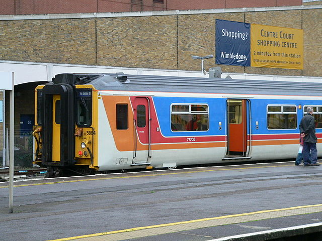
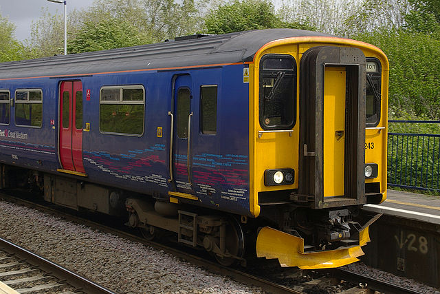
With the charismatic Brian Souter at the helm, Stagecoach operated a strong head office which imposed strategic direction on all its subsidiaries. It had created a bold corporate identity for its buses, and applied it wherever they operated. It comprised bright red, mid-blue and orange stripes over a white base. At South West Trains, the initial approach was a visual identity that used similar paintlines to the exisiting Network SouthEast livery, but with Stagecoach colours. With its very pale-grey base and Stagecoach-coloured stripes, it owed a lot to the bus colour scheme. Here they are.

This, however, was only an interim measure.
In 1998, to mark the refurbishment of South West Trains’ Class 442 trains, Stagecoach launched a new visual identity which would eventually spread to all its other trains. Designed by Best Impressions, it took Stagecoach’s colours but used them in a whole new way. Over a white base, widening bands of colour curved outwards from a point low down on the front of the train. It’s hard now to recall just how revolutionary an approach this was, but it amazed the industry at the time. “Swooshes” had arrived. They would be much emulated over the years, but rarely (if ever) bettered.
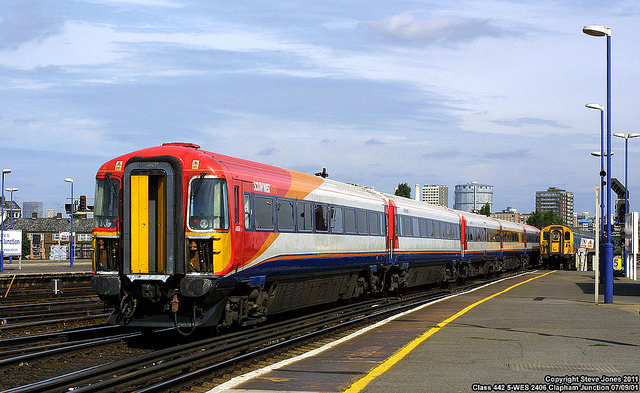
Had Stagecoach secured any other franchises apart from the tiny Island Line (a bizarre anomaly on the British rail network, which got a bizarre dinosaur livery to match), I’m sure they would have received the same visual identity, just as Stagecoach’s buses wore the same colours wherever they operated. But in a sign that the Big Five bus companies were now well and truly invested in rail as much as in their original bus businesses, it would now be Stagecoach’s rail business which influenced its bus business. When a new visual identity for its buses was launched in 2000, it was to Best Impressions that Stagecoach again turned, and the result bore a strong familial resemblance to South West Trains’ new look.

Over the years, what Stagecoach has done with its railway company visual identities has been rather interesting. While retaining a single corporate image, it has introduced colour variations depending on the market sector served by the trains. These were first seen at South West Trains. The original white-base visual identity is still going strong, and is used for long-distance services. Subsequently, a blue variant was introduced for outer-suburban operations, and it was followed by a red variant for inner-suburban metro operations. It’s a small thing, but if you’re rushing for a train, it’s really reassuring to jump onto a red train and know that you’re on an inner-suburban service and not about to be whisked off to somewhere far distant. You’d think it couldn’t happen with all the announcements and information screens, but I once ended up in High Brooms instead of at New Cross Gate after misjudging what sort of train I’d just jumped on at London Bridge.

As a believer in a strong company-wide corporate identity, it was no surprise that when Stagecoach added the East Midlands franchise to its operations in 2007, it applied essentially the same visual identity as South West Trains already used. There are some detail differences, in particular a ‘bump’ in the blue stripe at the front of the white trains, but for all intents and purposes it’s Stagecoach’s standard rail corporate identity all over again (East Midlands Trains even has both white long distance trains and blue local trains).

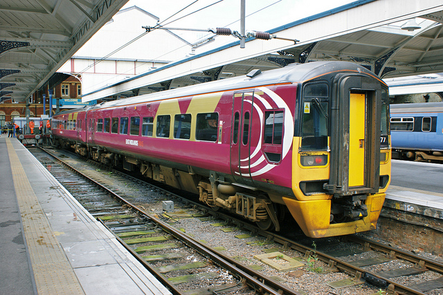
As an aside, thanks to various franchise re-organisations and rolling stock redeployments along the way, one of East Midlands Trains’ notable early features was trains which sported the old Northern Spirit colours, overlayed with a set of white Central Trains crescents, and now with the addition of Stagecoach’s East Midland Trains logo. If you ever wanted a visual summation of the confusion caused by franchise remapping in the late 2000s, it was right there.
Stagecoach has, sort of, added one other variation to its railway corporate identities, which is that of Virgin Trains. When Stagecoach bought into Virgin’s West Coast and CrossCountry operations, it did so with a 49% stake in the business. No surprise then that Virgin’s visual identity continued to be applied, as the majority stakeholder. But when it came to the East Coast franchise bid, the split was 90% Stagecoach and 10% Virgin. Yet Virgin Trains East Coast is branded as just that: Virgin. There is clearly a recognition that Virgin’s brand works better for very long distance intercity services than Stagecoach’s does. It’s worth noting, as an aside, that East Midlands Trains is owned 100% by Stagecoach, which rules out using the Virgin brand there, and its intercity services are much shorter-distance affairs than those at Virgin Trains East or West Coast.
Stagecoach has never been able to leave its centralising tendencies behind, though. Over recent years its bus business has introduced several variations to the standard corporate identity, for instance for Stagecoach Gold, Coastliner, Aberdeen Airport Jet 727 and various college services, not to mention a green version for buses with hybrid engines, and a red version for its Unibus operation. Then there are its express coach X5, X24 and Falcon visual identities too, to name but a few. It shouldn’t be a surprise that things seem to have gone a bit too Go-Ahead for the liking of Stagecoach’s head office. It is now apparently considering a new corporate identity which would cull many of the livery variations which have emerged since 2000.
Go-Ahead: multiple personalities
As the railway was privatised, local bus operator Go-Ahead, which had its roots in the north-east of England’s bus network, secured the Thames Trains franchise in partnership with a management buy out team. It worked with French state railway operator SNCF’s overseas commercial arm VIA-GTI (now called Keolis) to form the Govia joint venture, securing the Thameslink franchise and others as the years went on. At about the same time, Go-Ahead also got into airport ground handling operations, for reasons no-one seems able to satisfactorily explain with the benefit of hindsight but which luckily need not detain us any further here.
Since its creation, Go-Ahead has pursued a policy of allowing its bus subsidiaries to retain individual company visual identities, and to no-one’s great surprise it extended this policy to its train operations. At Thames Trains it took an almost Chiltern Railways-esque amount of time to replace the Network SouthEast colours on its train fleet, but it eventually started doing so in 2000.

It was a lot quicker off the mark at Thameslink, where the shadow franchise set up before privatisation had introduced a widely derided grey livery with stylised blue graphics. I have to say I was never a fan of the dark blue and yellow visual identity which was Govia’s replacement. The paint lines had some awkward angles on the cabsides and the whole faded to drabness too quickly for it to be truly successful, but it was applied with admirable speed, obliterating the earlier grey/blue colour scheme in short order.

The different visual identities were a graphical reflection of Go-Ahead’s company ethos. It had a tiny head office, and was content for most decisions to be made by its highly devolved subsidiaries. Although its head office has grown in size and influence since then, and now exerts more control over its subsidiaries, it has never wavered from its approach of allowing its subsidiaries to use bespoke, localised, visual identities pitched at their own distinct markets. With the exception, that is, of the DfT-specified visual identity for the Thameslink and Great Northern parts of the massive Thameslink, Southern, Great Northern franchise. Which is awful.
Govia took on from the late and unlamented Connex the South Central franchise (in 2001) and South Eastern (in 2006, after a period of operation by Directly Operated Railways, the government’s operator of last resort). Two contrasting approaches were displayed. At South Central Govia brought in a green visual identity for what became known as Southern; an attractive look which was much admired. At least it was before it became inextricably linked with the reputational disaster Govia is currently facing, of long-term and ongoing strike action over whether train door buttons should be pressed by Southern’s guards or its drivers.

At Southeastern, for many years Govia did little but tinker with what was basically the Connex white, yellow and grey visual identity, but with a change of logos. You’d have thought you’d want to obliterate all trace of the much disliked Connex as soon as possible, but apparently not. Southeastern has now started – very slowly – repainting its trains in an all-over blue colour scheme which originated on its high speed trains, but has now spread to its more conventional stock. Developed by Creactive Design, it is part of a complete interior and exterior overhaul. It features small blocks of other colours: light blue for doors, traditional yellow to indicate first class areas, and burgundy to indicate more accessible areas of the train. But ‘blocks’ is the word; they are all applied as rectangular features with little concession to smoothing anything off. Moreover, at no point does anyone at Southeastern seem to have remembered that British Rail tried all-over blue for its non-intercity trains and subsequently abandoned it, reasoning the all-over blue was too drab even for its unlovely secondary services. Indeed, while Southeastern’s trains look smart when freshly outshopped and sparkly, they tend towards the dark and dull once they get dirty. But as far as Go-Ahead’s head office is concerned, Southeastern’s visual appearance is entirely its own concern.
The branding of Govia’s London Midland franchise, which started operations in 2007, has meanwhile been a great success. Another visual identity produced by Best Impressions, the branding has an ultra-modern look that owes little to anything else on the railway. Gone are the swooshes, in favour of blocks of colour with rounded ends. The black block surrounding the windows drops a long way below the actual glass, and from a distance this makes it look as though the trains have absolutely huge windows. It also breaks up what would otherwise be a large expanse of silver/grey on the lower bodies. Best Impressions even created a bespoke typeface for the operator, which enhanced its modern appearance and provided an all-too-rare example of consistency of typeface throughout trains, station signage and publicity.

It’s not a streamlined high-speed look, but a clean, efficient style for a bustling commuter franchise. Although one of the most successful and ‘complete’ brandings on the railway, it’s about to disappear, with Govia having lost the franchise to an Abellio/Mitsui/Japan Railways East joint venture which commences in December.
FirstGroup: The Rise and Fall of Barbie
FirstBus (as it was then) won the Great Eastern franchise outright at rail privatisation and was a part owner of Great Western Trains and North Western Trains, along with management buy out teams and financiers 3i. Its arrival in the rail industry saw it change its name to FirstGroup, and before long it bought out the other shareholders at Great Western and North Western Trains.
Like Stagecoach, it was a company with a strong head office based in Scotland, and headed by a strong character in the shape of its chief executive Moir Lockhead. Having broken into the rail market, he had a vision of First Group as a fully integrated transport company covering many modes but appearing to the public as a single company – First. It was this process that saw the invention of the “First: Transforming Travel” tagline, which you might remember. The introduction of a single visual identity was very much part of Lockhead’s plan, and he oversaw the introduction of the white, pink and blue so-called ‘Barbie’ colours on the bus fleet from 1998. Initially it was applied only to more modern buses that met a defined quality standard, older vehicles getting the terrible ‘Barbie 2‘ version which was so bad that it was eventually replaced with standard Barbie colours on all buses, no matter their age. Barbie was distinctive, but slightly clumsy in trying to make a flowing ‘f’ shape (on the left-hand side of the buses, anyway), with some oddly sharp corners at various points on the paint lines.

Yet despite all this corporate branding activity, First Group’s head office seemed at first to forget to deal with its trains. First Great Eastern had an awkward blue and green colour scheme, with the complicated paint lines trying to represent a vague ‘f’ shape. First Great Western had a green and gold livery, while First North Western inherited North Western Trains’ dark blue colour scheme with big gold stars. I thought the latter was quite ridiculous but having expressed this opinion once before, lots of people subsequently told me they really liked it. FirstGroup’s open access rail operation, First Hull Trains, had a vastly complicated green, silver and gold colour scheme that virtually defies written description.
The delivery of new trains to First’s three franchises eventually provided the impetus for the introduction of the rail equivalent of Barbie colours to the railway, but it took a long time to spread. First Great Eastern’s new trains might have been blue and pink, but the older ones remained green and blue until First eventually lost the franchise to National Express. First Great Western’s older trains remained green for some time too, until the venerable Intercity 125s/HSTs got the blue and pink rail-Barbie treatment. An early experiment with a white-fronted HST failed because it was too difficult to keep clean, as FirstGroup should have known, British Rail’s Intercity sector having tried the same thing years earlier. Those who forget the past are condemned to repeat it, after all…

Nevertheless, rail-Barbie eventually appeared on trains at First Great Western, First North Western, First Great Eastern and First ScotRail, making the colour scheme one of the most widespread the privatised railway has seen. But more pressingly than the fact it was taking an age to rail-Barbie FirstGroup’s trains was that rail-Barbie didn’t actually sit very well on them. The trains looked, frankly, a bit amateur; hardly the image First was trying to project.
The solution was the ‘dynamic lines’ visual identity for First’s trains. Instead of complicated stripes and blocks of plain colour, ‘dynamic lines’ saw the trains painted deep purplish-blue all over, with intertwining neon stripes in the FirstGroup corporate colours applied by vinyls.

There were several variations on this theme. The actual ‘dynamic lines’ colours appeared on First Great Western’s intercity and Thames Valley trains, the HST power cars gaining them at first, then losing them in favour of plain blue. First/Keolis’s TransPennine Express also got the ‘dynamic lines’, as did Hull Trains following a fleet reshuffle. Though the original ‘dynamic lines’ was easily the concept’s most successful interpretation, later on a ‘local lines’ version appeared on First Great Western’s west of England local trains, with the coloured lines this time made up of the names of local places of interest.
Finally, the ‘urban lights’ version was used on First Capital Connect trains, indicating its status as a focussed London commuter network, but lacking the attractively speedy effect of the original ‘dynamic lines’.
Lockhead had, more or less, got what he wanted – a comprehensive corporate identity for FirstGroup, even if the bus side of the operation looked somewhat different to the rail side. Even a Croydon Tramlink tram sported the FirstGroup colours at one point.
Behind the scenes, though, change was afoot. Lockhead announced his retirement and was replaced in 2010 by Tim O’Toole. The bus business soon hit trouble and Giles Fearnley was brought in as managing director of UK Bus to try to restore its fortunes. After some consideration, Fearnley and O’Toole decided that localised identities would help FirstGroup’s various bus companies appeal more directly to their customers than the monolithic “First” brand allowed. That’s how FirstGroup’s experiment with a unified corporate identity came to an end, and how brands like ‘The Buses of Somerset‘, which you’d hardly know was a FirstGroup operation at all, have come about.
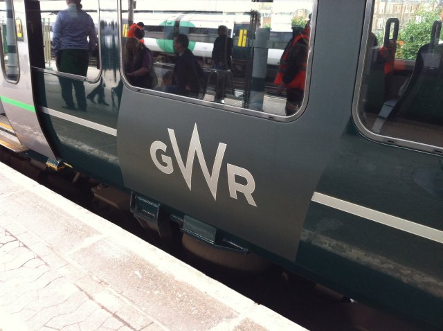
The same thinking has now spread to FirstGroup’s rail operations. In 2015, a new identity for Great Western was launched. Designed by Pentagram, it took cues from the pre-nationalisation Great Western Railway, not least in an updated version of the circular GWR monogram. This has been applied in unarguably gorgeous cast metal lettering to the sides of some HST powercars.

The overall look is sufficiently different from the old Great Western Railway to avoid cheap pastiche, with dark green trains sporting a silver stripe and diagonal panels of matt green, which break up what would otherwise be large areas of plain gloss green. I can’t help feeling the chosen shade of green verges on being too dark, and can look a bit funereal at times. Someone’s also missed a trick by applying a crude rectangular yellow panel to the front of Great Western’s new Intercity Express Trains. It’s no longer a technical requirement for new trains, and there must have been more attractive front end treatments if additional thought had been given to the problem. I’m still a bit undecided about the matt panels, but for the purposes of balance I should add that the new look generally seems to have been very well received, and is almost universally preferred over the previous ‘dynamic lines’ branding with its closer links to FirstGroup. Indeed, you really have to go looking to find that Great Western Railway is operated by FirstGroup.
Personally, I prefer the bespoke corporate identity DGDESIGN’s created for FirstGroup’s new TransPennine Express franchise, which began in 2016, and which I’ve mentioned before. But here it is again:

Spiky, exciting and looking like nothing else on the railway, it suits the feel of this operator, which is that of a slightly upstart challenger to the longer-established intercity operators. At least, that’s what I’ve always felt about it. Again, like First’s Great Western Railway, the branding avoids significant mention of the identity of FirstGroup as parent company. While the previous name of the company in First/Keolis days was always given as “First TransPennine Express” now it is “TransPennine Express” plain and simple.
While FirstGroup was moving towards local identities anyway, as proved by their bus division, over on Transport Designed, Virgin Trains group design manager Sam Jessup has identified some additional factors that are pushing train operators towards franchise-specific branding rather than using a parent company’s corporate branding. For a start, distancing such brands from their parent company reduces reputational damage in the event that a franchise hits trouble. Also, stung by criticism over the money spent by train operators on rebranding as franchises change hands, the DfT’s recent franchise specifications have encouraged operators to develop unique franchise-specific branding which can be re-used by subsequent franchisees if they so wish. That seems like a reasonable enough idea in the case of well-designed franchise visual identities like those of Great Western Railway and TransPennine Express, but not so much in the case of the under-developed and underwhelming ones to be found at Abellio Greater Anglia and Arriva’s latest Northern franchise (of which more later).
FirstGroup has also launched a franchise-specific identity for the South Western franchise it (along with partner MTR of Hong Kong) has recently wrested from Stagecoach. Unveiled on 20th August, South Western Railway will be sporting a new blue-based visual identity. So far we’ve seen the operation’s new logo, which uses the Weissenhof typeface and has an arrow/network map device that looks slightly retro (though I don’t mind that), with Rubik (I think) used for other written communications. We haven’t seen a train or station fully branded at the time of writing. Leaked images, which I’m loathe to rely on, suggest a simpler design than TransPennine Express or GWR, with areas of stripy blue, but I’m not going to come to any conclusions until I’ve seen the new branding close-up and in detail.
It’s fair to say that FirstGroup’s dalliance with a single corporate identity, in both its bus or train divisions, is well and truly over. Only First Hull Trains hasn’t yet had a replacement for the ‘dynamic lines’ branding, making it the last link to FirstGroup’s one time monolithic rail division visual identity. I wonder how long it will last before it gets a branding of its own? If its new trains, due in 2019, don’t have a unique Hull Trains branding, I shall be very surprised.
To be continued…
Next week, National Express makes a complete disaster of its attempts at a single corporate visual identity while Arriva does rather better. That was mean to make you wait, wasn’t it? But there was no way I was going to get all the Big Five into a reasonable word count.
Visit a Website Friend
For an expert insight from people who actually work in transport design and branding on a daily basis, go and visit the excellent Transport Designed website. I’ve already mentioned Sam Jessup’s recent article, which covers some of the same ground as this one. That article, and Transport Designed in general, are very much worth your time.
Bibliography and Further Reading
Boocock, Colin (2001): Railway Liveries Privatisation 1995-2000. Ian Allan: Shepperton, Surrey
Cable, David (2009): Lost Liveries of Privatisation in Colour. Ian Allan: Hersham, Surrey
Knight, S. (2017). From Our Archives: Giving the Railways an Image. Railway Magazine. [online] Available at: https://www.railwaymagazine.co.uk/from-our-archives-giving-the-railways-an-image/ [Accessed 21 August 2017].
Pentagram’s project page for the GWR rebrand, here
Creactive Design’s project page for Southeastern rebrand, here
DGDESIGN’s news page for its work on TransPennine Express, here (see April 2016)
…and anything linked to in the text above.
Enjoyed this article?
It’s one of a series looking at the way that the changing appearance of Britain’s railways illustrates their history. Here are the others:
- Lions and Wheels (British Railways’ lion emblems, 1949-1964)
- The Full XP (British Railways’ Corporate Identity 1964-1986, part 1)
- The Decline and Fall of the Rail Blue Empire (British Railways’ corporate identity 1964-1986, part 2)
- Three Shades of Grey (Railfreight 1987 corporate identity, Roundel Design Group, UK)
- The Rolling Art Galleries of Network SouthEast (Edward Pond murals and NSE route badges)
- The Train on Kaleidoscope Lines (British Passenger Railway Post-Privatisation Visual Identities)
- Along the Line, Blue and Gold (GNER’s corporate visual identity, Vignelli Associates, 1997)
- Papering Over the Cracks (Railtrack’s Corporate Graphic Design and Annual Reports, UK)
- They Used to Shout our Name, Now they Whisper it (Railtrack’s Corporate Graphic Design and Annual Reports, UK, part 2)
- The Dead Hand of State Design (State-Sponsored Visual Identities on Britain’s Railway, 2000-)
- Local Heroes (PTE Mainline Rail Visual Identities 1970-1994)
- Don’t Give in to Their Goodbyes, Northern Stars (PTE Mainline Rail Visual Identities 1995-2017)

.JPG)
.jpg)
.jpg)
.jpg)
Yes, I remember the impact when the first “swoosh” Class 442 unit was released. (But then I remember when a schoolfriend showed me a copy of the very first Network SouthEast brochure and I looked at the image of a train in NSE colours and thought “you can’t paint a train like that!”). Incidentally, I’ve always assumed that SWT’s different-colours-for different-service-groups concept must have come quite a bit later on, after the delivery of the Class 458s, as these were outer suburban units but painted in the white version of SWT colours – then only applied to the 442s – so implying that at the time it was thought of as a single standard livery for the franchise.
As regards the (original) Govia Thameslink colours, I seem to recall that if one of each of the two Class 319 subfleets were coupled together you could see that their blues were slightly different shades and the stripes at slightly different heights and angles; they had been repainted at different works.
The rebranding of First as more than a bus operator did not quite coincide with the launch of rail operations: extraordinarily, the earliest trains reliveried under First Great Eastern announced on their doors: “Welcome to FirstBus”!
Final point – well, opinion: I don’t really see cause for complaint about the Class 80X yellow front end when the biggest sinner is surely the ghastly GNER-derived HST split panel, which has inexplicably spread to multiple operators, spreading across Great Britain its horrible straight lines and awkward corners (admittedly those latter seem to have been somewhat improved for the GWR version) that are completely out of keeping with the lines of the HST power car. And to think that the previous FGW colour scheme had the best HST yellow panel ever (yes, I mean that – let’s be honest, yellow cab roofs were never a particularly great idea, were they?)… OK, rant over!
I love a good rant! You go right ahead. You’re quite right on your points of fact. The 458s did come in white, because the colour-coding of service groups was thought of later. I’d just got to the point where I felt the article was long enough already… And I’d forgotten (but now remember) the FirstBus signs at First Great Eastern. They didn’t last very long before the parent became FirstGroup, I think?
My personal favourite HST yellow end was the curvy Midland Mainline one (the earlier version) as I’ve mentioned before. I was never a fan of GNER’s visual image – I thought it was tricksy and faux. That was a very unpopular opinion at the time!
Thanks for this great post. I have become a great fan of SWT corporate image over the last 3 years of travelling the UK rail network. I started grabbing shots on my little Kindle HD6 long before the loss of the franchise occurred, and I was glad I did.
Regardless of what was delivered in performance, the SWT has added some great fresh colour and style to the countries transport system, well beyond what was needed to ensure corporate identity. The full legacy of style extends beyond the rolling stock. Posters, leaflets, time tables, maps and notices are all a visual delight. I have just seen the first SWR leaflets, and they are poor, drab and unimaginative in comparison.
For some examples of SWT style see my pinitrest board
I will continue to add images until the final splashes of SWT colour depart from our transport system.
I agree with you about GNER. But not about old-MML – a very odd effort, but of course Best Impressions went on to much better things so maybe it was necessary practice!
The HST livery that I think had the best yellow front end was the newer Midland Mainline livery (which is odd considering I vastly preferred the older one). The worst was obviously Intercity Swallow, with the yellow slapped on the lower front like a cheap cover-up and a ghastly yellow roof specially designed to show the engine grime.
I don’t think yellow on the front of trains is a bad thing, especially when the only efforts with other colours so far have been terrible (with one exception). I say other colours, when actually I mean black as this seems to be the only colour TOCs are willing to use. And it looks awful, and just does not work. The exception to this is the LO class 710s, which have a very attractive orange front which suits the brand and works well. Maybe something to learn from.