In the run up to rail privatisation in the late 1990s, Strathclyde Passenger Transport Executive (SPT) made a change to its visual identity that appeared to be a direct challenge to the whole ethos of privatisation itself. In one of the most unexpected changes of direction to the branding of a recent British train operation, SPT decided to repaint its trains in one of the earliest colour schemes that the newly nationalised British Railways used. It was a near faithful recreation of one of the 1950s coaching stock schemes, carmine and cream (or blood and custard as you’ll also see it called), complete with black and yellow lining around the edge of the cream area. It sat slightly awkwardly on some of the trains on the SPT network, but looked lovely on others. Here it is, in all its retro glory:
![A SPT Class 170 in its carmine and cream colour scheme. Photo by Ad Meskens (Own work) [Attribution, CC BY-SA 3.0 or GFDL], via Wikimedia Commons](https://thebeautyoftransport.com/wp-content/uploads/2017/02/640px-waverley_station_016.jpg?w=768)
So, was SPT a hotbed of socialist resistance to rail privatisation, and its new colours a two-fingered riposte to the process? I don’t suppose we’ll ever know for certain, but what we do know is that SPT launched a judicial review of Railtrack’s flotation, after the government told SPT to hand over a couple of hundred million pounds worth of SPT-funded rail infrastructure assets to Railtrack. SPT also threatened judicial reviews in response to suggestions that trains it had financed might be moved away from Glasgow (Pettitt and Comfort, 2015).
The introduction of SPT’s carmine and cream visual identity, which even spread to the Glasgow Subway stock, was one of those moments of geeky wonder that leave me completely conflicted in response. I love a nice carmine and cream carriage because I love railway history, but I’m really not sure it was the sort of thing a modern railway ought to be going in for. The black and yellow lining in particular must have been particularly fiddly. Later on, some trains gained (for no reason for which I have ever seen a truly satisfactory explanation) a broad turquoise band, but lost the complicated lining, thus compromising the retro effect somewhat.
Ultimately, SPT’s challenge to rail privatisation didn’t stop the process, and with privatisation the role and visibility of the PTEs changed. While state-owned British Rail’s Provincial / Regional Railways sector might have been happy to abrogate its corporate identity in favour of those of the PTEs, some of the new private sector train operators found this more difficult. After all, their corporate identities and branding were part of their marketing plan.
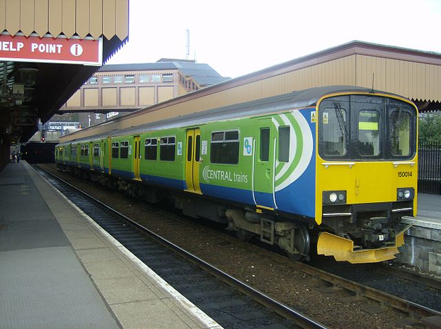
In the first round of privatisation, the PTEs were co-signatories of the local train operating franchise that provided their services. That meant that the new franchised operators needed to pay some heed to their involvement. Centro’s green colours lasted for a long time under franchisee Central Trains as a result, as did GMPTE’s grey and red stripes, initially under North Western Trains and then First North Western, though with the logos of the new franchisees replacing that of Regional Railways.
Northern Spirit took a slightly different approach to the PTEs in its area. It had an unusually distinctive visual identity, with an enormous “N” emblazoned on the side of its trains, and the trains themselves sported various colourways depending on their allocation. TransPennine Express trains were purple/maroon with a gold N, while the local trains were an eye-burning turquoise with an acid green N.
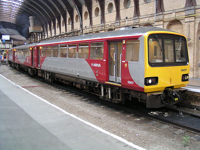
When it came to the PTEs there was no great problem with SYPTE, which had never had much visual impact on its supported train services, apart from signage at stations. But Metro (West Yorkshire PTE) presented a problem. As well as being a substantial funder of its local train services, it outright owned quite a few of the trains operating them too, all of which had run in Metro’s maroon and ivory colours under British Rail. The compromise was a Metro-specific version of the Northern Spirit visual identity with a red background and a grey N, and the addition of Metro logos.
Tyne and Wear PTE’s colours lingered on for a while on some Pacer trains, until replaced by Northern Spirit’s colours; not surprising given that the PTE’s rail interests were mostly in its Tyne and Wear Metro rather than the heavy rail network. After rail privatisation, the PTE (rebranded as Nexus in 1996) would work with the newly privatised infrastructure operator Railtrack to extend the Metro over a National Rail line, sharing tracks with conventional trains, for its extension to Sunderland which opened in 2002. This was real ground-breaking stuff for the UK, and it’s worth noting that it was a public sector PTE that initiated this innovative project and kept it going.
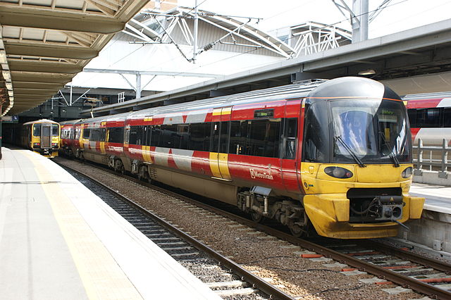
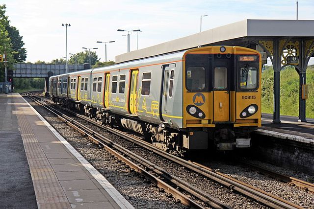
Northern Spirit’s parent company, MTL, also owned the Merseyrail Electrics franchise, a self-contained operation comprising the “loop and link” routes centred on Liverpool, which had been championed by PTE Merseytravel in the first place. Here, though, MTL took a different approach, and left the existing PTE-inspired visual identity well alone. Whether Merseytravel had unusually persuasive staff, or whether MTL got distracted by its increasingly difficult financial position, I suspect we’ll never know. Before too long though, MTL found it had got all its sums wrongs in its franchise bids, and it effectively went bust in 2000.
To the rescue came bus group Arriva, taking over MTL’s franchises and entering the UK rail market for the first time (it hasn’t left since and is now a subsidiary of German state railway DB). It swiftly began to apply its corporate colours of turquoise with a cream scoop to its ex-Northern Spirit trains, modified on the single car Class 153 units where a scoop at both ends would have looked odd. Again, though, Metro’s trains needed something specific, and they were eventually turned out in a slightly odd colour scheme which compromised grey semi-circles placed horizontally on dark red body sides in alternating fashion, and vertically at the cab ends.
It was one of those moments you get when the public sector does graphic design and someone involved settles for ‘good enough’ rather than actually ‘good’. The visual identity obviously drew some inspiration from Metro’s circular logo, but it definitely lacked finesse compared to many of the others being introduced across the privatised rail network, including Arriva Trains Northern’s own colours.
Once again, Merseytravel was able to use its extraordinary powers of persuasion to ensure Arriva retained the existing Merseyrail visual identity, though at least one carriage was apparently given the standard Arriva colours in a short-lived experiment (more on that here). Just a few years later, in 2003, the Strategic Rail Authority (SRA) made the unexpected decision to devolve responsibility for the Merseyrail Electrics network to Merseytravel, one of the handful of good decisions the SRA ever made. The logic was all but inescapable as the network was self-contained, technologically distinct (an isolated pocket of third-rail electrification) and almost entirely within the Merseytravel area. But then again, when has logic ever played much part in transport policy? It went against the SRA’s stated intention at the time of having fewer and larger franchises, but one suspects that the SRA (and the government) were only too pleased to have this high-subsidy operation off their hands.
Merseytravel has, however, proved to be an extremely competent custodian of its railway. It awarded Merseyrail to operator Serco-Abellio as a concession, rather than a franchise, and thereby ensured that the PTE continued to have ultimate responsibilty for timetables, ticket prices and the network’s corporate identity. Although there had been minor tweaks to it under Arriva, the visual identity was revolutionised for the new concession.
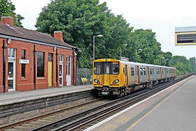
A striking new yellow and silver-grey livery, clearly drawing inspiration from Merseytravel’s M-in-a-circle logo, appeared on trains along with a stonking great M-in-a-circle on the front. The first thing passengers saw when their train approached was Merseytravel’s logo, if they hadnt already noticed it on station signage. The new look said that this was a railway being run for local people, with the local PTE firmly in charge. In 2014, local communications agency Good Communications revamped the visual identity. Although it covered posters, adverts, information and apps, the new look was probably most evident on the trains, which are now yellow on one side and grey on the other.
Six different designs highlight reasons for travelling by Merseyrail, once again demonstrating Merseytravel’s local focus, while the Merseyrail ‘M’ remains prominent on the front.
If the devolution of Merseyrail seemed to be recognition at last that central government had realised that local railways might be better run, well, locally, it proved a false dawn for the other PTEs.
The writing had been on the wall since the Transport Act (2000). The Act allowed PTEs to continue specifying train services, fares and quality standards, but such specifications would be written into franchises by the SRA only if they did not compromise the SRA’s national strategy (whatever that was). Worse was to follow in the Railways Act (2005), which stripped the PTEs of their co-signatory rights over new franchises, and removed their right to specify their local train services in such franchises. The Act, passed after the Hatfield crash had seen rail industry finances go completely haywire, wound up the SRA and passed strategic control of the railway network back to the Department for Transport, where ministers were determined to exert much stronger control on the industry. The PTEs were the unfortunate victims of a desire for greater government control of what was supposed to be have been a privatised industry.
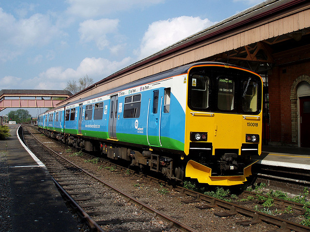
As far as the West Midlands railway network was concerned, the Railways Act (2005) would come to scupper an interesting idea that Centro (WMPTE) started trying out in 2005. Although Centro itself continued to exist, it rebranded its public-facing activities as “Network West Midlands” (think I’ve heard something similar to that somewhere before…), with a very mid-2000s lower case ‘n’ attached to pictograms for various modes of transport. So bus stops had [bus]-n signage (see one here, it makes more sense as a picture), trams had [tram]-n, and railway stations had [train]-n signage (see one here). Central Trains produced a modified version of its visual identity for trains operating Centro-sponsored services, and this included the [train]-n logos.
It wasn’t as stylish as the original version of Central Trains’ colours, nor the green Centro colour scheme it replaced, being a slightly awkward compromise between both, but it was probably better than this train, outshopped for promotional reasons in full Network West Midlands colours, which turned out to be rather boring when applied:
Just a couple of years after the launch of Network West Midlands, Central Trains was split and refranchised in 2007, at which point new operator London Midland took over. With no co-signatory powers for Centro, and no service specification from the PTE in the new franchise, there was no need for London Midland to paint its trains in PTE colours. The reduced role of the PTEs in the railway industry became clear as London Midland’s visual identity (which is admittedly absolutely great) swamped Centro-land. In terms of the rail network, Network West Midlands now remains only on station signage and as small logos on a small number of London Midland-liveried trains.
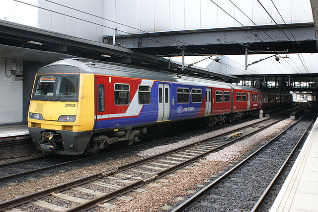
There was a similar situation at Northern Rail, a new franchise which began in 2004 and which replaced First North Western and Arriva Trains Northern. Although the PTEs remained co-signatories because the franchise was signed before the Railways Act (2005), its visual identity told a rather different story. The various PTE liveries which had lingered on during First North Western and Northern Spirit days were subsumed as Northern Rail’s new visual identity spread. Metro (WYPTE) was an exception as a train owner. The unfortunate solution was this abomination, a most unhappy marriage of Metro’s and the angular early version of Northern Rail’s visual identity:
Sadly for Metro, worse indignities were to be visited upon it. In an extraordinarily spiteful move, the DfT would find a way of helping to end the anomaly of a public sector PTE owning trains when all the others had been sold off to the rolling stock leasing companies during the privatisation process. In 2010/11-ish, the DfT indicated that it would require a greater local contribution towards the Metro-sponsored Leeds Rail Growth Package if it was also to commit government funding. At the time, the DfT was spending vast sums of money on various rail schemes in the south-east of England, and the Leeds Rail Growth Package budget would have been pocket money by comparison. Yet the DfT demanded more money towards the Leeds scheme from Metro. And where should that money come from? Well, there were rolling stock leasing companies willing to buy Metro’s trains, and then lease them back for continued operation in the area. That was how Porterbrook came to own what used to be Metro’s fleet of Sprinter and Pacer trains. Although there is a good deal of confusion out there about exactly when it happened (and if someone could point me in the direction of a definitive announcement on the subject I’d be very grateful) Metro’s Class 158s and 321s were also eventually sold, this time to Eversholt Rail (see here and here).
If the trains weren’t Metro’s any longer, then they too could be painted in Northern Rail’s colours. The only way of knowing that PTEs were involved in local rail networks was now on station signage, and in the application of their logos to trains running in Northern Rail’s livery. It was a return to the days when PTEs only had their names and logos applied to British Rail’s standard blue and grey trains.
Northern Rail’s eventual policy was the application of PTE logos to trains operating PTE services, without any attempt to link particular PTEs to particular trains. Pacer trains in the Yorkshire area had both Metro and SYPTE logos applied, the latter a surprise return to trains for a PTE which has otherwise made a relatively small impact on the appearance of the railways.

SYPTE’s logo can also be found on its own on some single-car trains (see an example here). Meanwhile, Metro’s one-time fully owned fleet of Class 155 Sprinters, which used to wear Metro’s maroon and ivory colours with all due civic pride, were repainted into a promotional version of Northern Rail’s colours, with a tiny Metro logo tucked in amongst images of Yorkshire (see this picture).
Thus the emasculation of the English PTEs’ visible role in the railway was complete. They could, and did, continue to work with train operators and Network Rail on station and service improvements. They could, and did, continue to provide multi-modal ticketing across their areas. But the DfT had ensured that when it came to the railways, they received precious little credit obvious to members of the travelling public.
Things didn’t go much better for Scotland’s PTE, either. The 2005 Railways Act devolved the funding and specification of Scottish passenger services (ScotRail and the Anglo-Scottish sleeper trains, in other words) to the Scottish Government. Once again, you sort of suspected that the DfT didn’t really want to be responsible for ScotRail anyway and was quite content to let the Scottish Government, via its transport body Transport Scotland, take it off its hands. Rather like Merseyrail, Transport Scotland awarded ScotRail as a concession, but on a national basis. There was to be a single corporate image for the whole of ScotRail, including within the SPT area. The Scottish Government converted SPT into one of a number of regional transport partnerships (as Strathclyde Partnership for Transport, this efficiently meant that all the SPT signage could be left in place), and although SPT would continue to do great work on public transport, its direct powers over the Strathclyde rail network were removed. So SPT’s carmine and cream colours vanished. Even the Subway trains eventually went back to being (mostly) orange, described at the time as “a dramatic change from our old ‘carmine and cream’ livery”.
Yet one sort-of-PTE bucked the trend. London Transport/Transport for London (TfL) pre-dated the other PTEs by decades. While the PTEs had originally been given powers over both buses and trains, but lost their buses to deregulation, London Transport had never had any formal powers over mainline railways in the capital but had retained ownership of its bus network, the only city in Britain where buses were not deregulated.
The SRA had already had one go at trying to derail the eminently logical idea that TfL could usefully run suburban train services in London, via the ghastly Overground Network (or “ON”) branding exercise. Being utterly useless, that idea foundered. The Railways Act (2005) allowed TfL to become franchising authority for selected train services in London. It sounded great …until the DfT revealed that the routes it had selected were Silverlink’s London suburban operations. Although TfL and others had long proposed that the West London, North London (and South London) lines could be usefully linked with London Underground’s East London line to form some sort of outer Circle line, in practice the Silverlink routes were an absolute basket case. They didn’t include the South London line, which made the outer Circle line a difficult proposition, but they did include the Euston-Watford stopping service, and worst of all, the Gospel Oak to Barking line. Along with the North London line, the latter two were memorably described to me at the time by one user as running, “…the sort of trains where the passengers have dogs on bits of string, instead of leads.” With run-down stations, fare evasion at astronomical levels, and terrible trains, it looked rather like the DfT was setting TfL up to fail, because the culture change required to make the ex-Silverlink routes something to be proud of was going to be absolutely massive.
As with the other devolved franchises, TfL awarded the operation of the ex-Silverlink routes as a concession, retaining ticket revenue and imposing its own corporate identity on the operation. Relaunched as London Overground, TfL defied the DfT’s expectations and made a success of its problem child. Stations were fully refurbished and staffed throughout the day. New trains were ordered and TfL’s Oyster smart card ticket was made available across the Overground. With the East London Line transferred from Underground to Overground, the south London line would follow, completing the outer Circle route, and so eventually would suburban lines out of Liverpool Street station. At long last, one of the most well established transport corporate identities of all time found its way onto the National Rail network.
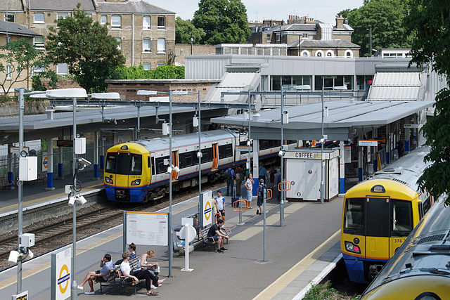
An orange version of TfL’s roundel (a regular list-topper of the best transport logos of all time, as here on Transport Designed) appeared at stations and on trains, and so did its elegant New Johnston typeface. As with other concessions, the message the visual identity was selling was that this was a railway being run by a local organisation for the benefit of local people. The only thing that spoiled the new look was the safety standards-mandated custard yellow end, which London Underground trains running over National Rail tracks have managed to do perfectly well without for as long as they’ve been operating…
Away from London, the remaining six PTEs faced further changes in 2008 as the political Passenger Transport Authorities which set their policies were converted into Integrated Transport Authorities. Central government loves fiddling with local government structures and funding – as I’m all too aware, having been on the receiving end. Further change came in the early 2010s as “Combined Authorities” were created. In these, local authorities pool their powers over certain functions including transport, in a defined area. Needless to say, the city regions served by the PTEs have been the obvious cores of such combined authorities. Where combined authorities are created, the ITAs have been replaced by the combined authority governance structure and the PTEs have become a delivery body of the combined authority. Confused? You should be.
With this transition to combined authorities, some of the PTEs have changed their names. GMPTE became Transport for Greater Manchester in 2011 (TfGM), reworking its double M logo slightly, making it more curvy and losing the serifs.
Centro became Transport for West Midlands (TfWM) in 2016, though it retained the Network West Midlands branding as its public face. Similarly, Metro, Nexus, Travel South Yorkshire (SYPTE’s long-standing public facing trading name) and Merseytravel have retained their well-established identities in public, despite the behind-the-scenes changes.
In 2014, then-chancellor George Osborne unexpectedly announced that Greater Manchester would get a directly elected mayor and powers over various functions including transport. That would include bus franchising if desired, restoring to GMPTE the bus operations it had lost control of with bus deregulation in 1986.
He followed it up by proposing that other cities could get similar deals. Suddenly it looked as though transport devolution was flavour of the month. That included the railway network too, with the pragmatic transport secretary Patrick McLoughlin (one of the good ones) generally supportive of the idea. The question was how. Although the PTEs did wonders for their city rail networks in the 1970s onwards, some anomalies cruelly exposed the fact that PTEs were not big enough to match the operations of the rail network in many areas. Passengers would find that a few stations before the end of the line, the quality of stations would suddenly take a nosedive and intermodal tickets were no longer valid, because the PTE boundary didn’t correlate with the natural reach of a city’s rail network.
The size of most train operating franchises (Merseyrail Electrics excepted) means a single PTE cannot easily be expected to take responsibility for them. The same has turned out to be true of many other transport projects and strategic transport developments in particular.
The answer has been the formation of new partnerships of local authorities and business representatives. So in the north, Transport for the North has been formed to consider strategic transport initiatives which will underpin economic development, while Rail North has been formed to work with the DfT on the letting and management of the newly re-awarded Northern and TransPennine franchises, which started in 2016. Rail North partners include the combined authorities with their ex-PTE transport delivery organisations, showing how rail devolution is requiring larger scale local authority partnerships. In the West Midlands local authorities have come together to form West Midlands Rail with similar intentions.
Rail North has longer term aspirations to manage the whole of its local train operating franchises. Northern and TransPennine were awarded under a new arrangement where the franchise specification was jointly developed by Rail North and the DfT, and is being managed by both organisations. The new London Midland franchise contains a separable business unit for the West Midlands rail network, and this part is again being developed jointly by the DfT and West Midlands Rail with the latter hoping eventually to take complete responsibility for it.
It’s only recently, with the appointment of dreadful transport secretary Chris Grayling, that the PTEs’ and TfL’s seemingly unstoppable progress in taking on responsibility for their local train services has come to a shuddering halt. But we’ve been here before. “ON” was supposed to head off TfL from managing suburban trains, which the SRA didn’t want to happen. It failed because of the inexorable logic of TfL managing London suburban services. Grayling’s stupidly ideological position, driven by a desire to keep London’s trains out of the hands of a Labour London mayor, will eventually fail too when more sensible people are making decisions a few years down the line. The same argument applies to the PTEs.
It’s not yet entirely clear what greater rail devolution in the north will mean for the appearance of the rail network. Rail North wanted the new Northern and TransPennine Express franchises to include long-term branding which would increase trust in local train operations (see page 17 of this Rail North document) but the DfT only required the franchisees to “develop a strong identity within the market place to limit de-branding at the end of the franchise term.” I think I’m right in interpreting that as meaning that they can do what they want. Sadly, one of the two franchise operators seems to have rather wasted this opportunity.
The new Northern franchise (with Arriva back again as operator) was launched with an unprepossessing appearance comprising mainly white trains with dark blue ends, and a typeface which looks suspiciously like VAG Rounded, the Comic Sans of the transport industry.
On the other hand, TransPennine Express franchisee FirstGroup employed DGDESIGN to deliver a radical rebranding based around a new star-shaped logo. Re-using the familiar FirstGroup corporate colours in a new way, it’s a spiky but dynamic colour scheme to match TransPennine Express’s ambitious development plans. The brand has also been developed through the “Where Next?” campaign. This includes TV ads that thankfully take train travel proposition seriously (the work of WRCS/Engine, see it here) and some gorgeous print advertising (see some examples here).
It’s possible that the appearance of these two operations might change as Rail North exerts its influence, especially in regards to the under-developed Northern branding. Other franchises have seen the inclusion of sub-brands within the wider operation, and this might be a useful model going forward for Northern in particular. One could imagine each of the major city rail networks regaining their own visual identities for trains, stations and ticketing, with promotional work targeted at the specific demographics of each city. Could the old PTE identities make a suitably updated reappearance? We’ll have to wait and see.
Although the new London Midland franchise has yet to be awarded, West Midlands Rail has got further than Rail North on image issues by developing a unique branding which operators will be required to employ in the West Midlands Rail area. It employed McCann Erickson to create a whole new look, and one which is a lot more modern than the Network West Midlands train identity. On a base colour of silver, the West Midlands Railway branding uses orange and purple as key colours. By placing a W and M on top of each other, a logo of diamond shapes has been created, and this shape recurs across the new identity, including on seat moquettes. For font fans, the typeface involved is Foundry Sans (with Foundry Form Serif on heritage elements).
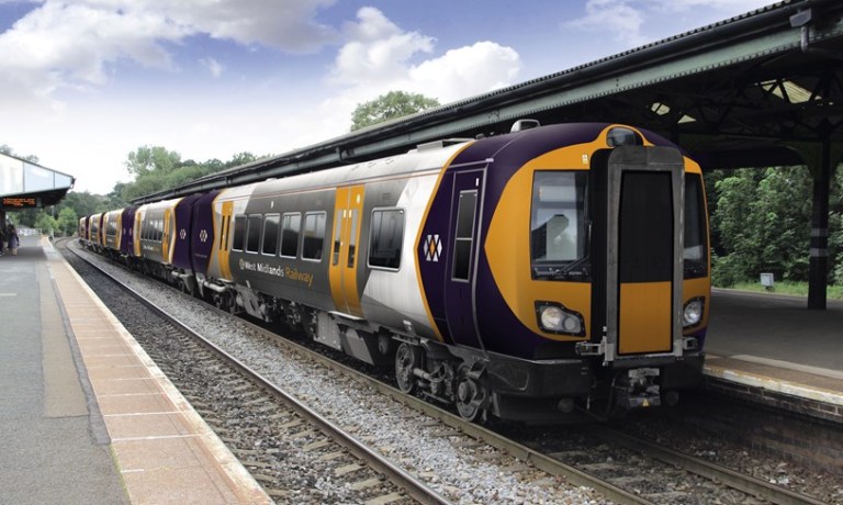
It’s fair to say that reaction to the bold new identity was mixed. Opinions ranged from the positive to the negative, via the wait-and-see. The usual criticisms were made that it doesn’t matter what the visual identity of a train company is, and that the only focus should be on punctuality and reliability. I can only reiterate the Railfreight triple grey argument; that if you want a step change in quality, sometimes you have to rebrand first so that staff and customers have something tangible to buy into. Whatever you think of the new West Midlands Rail visual identity it shows that local government in and around England’s big cities remains willing and able to drive forward the development of its local railways, continuing the legacy of the PTEs in a new form.
Bibliography and Further Reading
Boocock, Colin (2001): Railway Liveries Privatisation 1995-2000. Ian Allen: Shepperton, Surrey
Lawrence, David (2016): British Rail Designed 1948-97. Ian Allan: Addlestone, Surrey
Pettit, Gordon and Comfort, Nicholas (2015): The Regional Railways Story. Oxford Publishing Company: Addlestone, Surrey
Good Communications’ website page on the 2014 Merseyrail identity, here
Two useful briefings/reports on the role of PTEs post-privatisation. One from the UTG, here, and one a parliamentary research note, here
The DfT’s West Midlands rail franchise stakeholder briefing document 2016 which details the West Midlands separable business unit, here
…and anything linked to in the text above.
Enjoyed this article?
It’s one of a series looking at the way that the changing appearance of Britain’s railways illustrates their history. Here are the others:
- Lions and Wheels (British Railways’ lion emblems, 1949-1964)
- The Full XP (British Railways’ Corporate Identity 1964-1986, part 1)
- The Decline and Fall of the Rail Blue Empire (British Railways’ corporate identity 1964-1986, part 2)
- Three Shades of Grey (Railfreight 1987 corporate identity, Roundel Design Group, UK)
- The Rolling Art Galleries of Network SouthEast (Edward Pond murals and NSE route badges)
- The Train on Kaleidoscope Lines (British Passenger Railway Post-Privatisation Visual Identities)
- Along the Line, Blue and Gold (GNER’s corporate visual identity, Vignelli Associates, 1997)
- Papering Over the Cracks (Railtrack’s Corporate Graphic Design and Annual Reports, UK)
- They Used to Shout our Name, Now they Whisper it (Railtrack’s Corporate Graphic Design and Annual Reports, UK, part 2)
- The Dead Hand of State Design (State-Sponsored Visual Identities on Britain’s Railway, 2000-)
- Local Heroes (PTE Mainline Rail Visual Identities 1970-1994)

.jpg)
.jpg)
.jpg)
.jpg)
One notable point in the evolution was the cessation of Section 20 funding by GMPTE when they very unhappy with service level by North West Trains / RRNW at the time of the Airport Line opening and indeed at the time this occurred when trains were in RRNW/GMPTE livery – GMPTE branding was simply stuck over with an Airport links logo.
Moving forward I remember working on to graft the PTE branding on to the last ‘Northern’ franchise and let’s say a lot of hostility came from the PTE towards the TOC with the move to do this. It was decided that West Yorkshire could retain red but only on the EMUs as they weren’t going to form a common pool, of which the DMUs were to become – which slowly saw 144s operate into Manchester Victoria.
Rail North and TfN currently are basically co-signatory to the new Northern and TPE setup but have little clout this time round, however in the next future award time they will do – so it is likely at that point the reference made within the Rail North document may come to pass
The new Northern font is VAG Rounded, of which Network West Midlands is too – however it, in my opinion it is as bad as Comic Sans, and as many will say doesn’t portray a professional setup unlike Virgin’s Neo Sans, First’s Helvetica / Gotham do.
With West Midlands Rail, again in the same vein as Rail North and TfN, they wouldn’t have the clout until the next future franchise, and therefore WMR livery is currently concept. If it were come to pass in this next franchise, it would only apply to the DMU fleet and the 323 as the 350 fleet is technically in the West Coast pool – even though the operate turn in turn locals in the West Midlands. However, given the Marston Vale Line, between Bletchley and Bedford, is operated out of a pool of West Midlands DMUs ‘a West Midlands livery’ could well be seen very close to London!
But as we all know, ultimately stranger things happen on the railways.
Er, should that be Chris Grayling, not Philip Hammond?
Oh yes. What can I say? Hammond was in an earlier draft of the article, earlier on, and once you’ve got one duff transport secretary on the brain, they’re hard to shift. Thanks for pointing out, all corrected now. Off to employ a proof-reader (I keep saying this)…
You really should write all this up. I’m first in line to read it.
Your Hammond should be Stephen, not Phillip. Stephen, an ex banker of no discernible talent, was at DFT for a time at which his only distinction was to top the chauffeur driver mileage table for all ministers.
Oh, well remembered. That’s all coming back to me now. Someone should do a league table of UK transport secretaries and ministers. It probably still wouldn’t stop me muddling them up from time to time though.
Not sure exactly what is meant by “therefore WMR livery is currently concept” but paragraph 5.9.1 (g) on page 88 of the Invitation to Tender for the current West Midlands competition (bids submitted by Govia and Abellio, award decision this June, start of franchise this October) expects the winning bidder to:
“Follow the approach for the WMR brand for the West Midlands Separable Business Unit as set out in the documents located in folder 02.06 WMSBU Branding in the Data Site and introduce a distinctly separate non-corporate brand for the West Coast Separable Business Unit that retains its value to the Franchise beyond the franchise term.”
It is not necessarily the case that the Marston Vale Line will continue to be operated by rolling stock that is part of the local West Midlands pool in the forthcoming franchise.
Not quite. What follows is written from memory so may have some errors:
Prior to the 2010 general election, S Hammond was a transport spokesman while P Hammond was shadow first secretary to the Treasury.
P Hammond, however, became Transport Secretary in the first form of the coalition government, although it was a rather brief tenure.
S Hammond did subsequently become a Transport Minister (not Secretary of State) for a while.
(I believe that S Hammond shares with Grayling, Adonis and indeed Prescott the characteristic of actively having sought a ministerial position with transport responsibility.)
The livery that was proposed by WMR is not the final article and is subject to change as at first glance debatable whether it meets the RVAR requirements on the various contrasts. Unfortunately, the Data Site is not a public area where we mear mortals have access to unless we were part of a bid team so what the exact detail the new operator will have to abide with is unknown. But one thing we do know is that the business units will not be set up from day 1 but during the life of the franchise.
With the Marston Vale, all current units are cycled as part of the West Midlands DMU allocation – they cycle every week between Bletchley and Tyseley for servicing purposes. So even in the next franchise, this will continue until such time enough DMU / DMMU / DEMU become available to split the Marston Vale away from the West Midlands pool – however, they’ll be serving issues as the nearest suitable depot is then back at Willesden . There are no current plans to remove the local service out of the West Coast Busines Unit, but ultimately the Marston Vale will – in time – become part of East-West Rail
Rather surprised to find an illustrated “spirit guide” (is that a thing?) in the public domain here.
http://westmidlandsrail.com/strategy/west-midlands-railway-brand-and-identity/
And the second of the three pictures in this report appears to show the livery from the “spirit guide” applied to the new Cross-City stock.
http://www.railwaygazette.com/news/traction-rolling-stock/single-view/view/bombardier-and-caf-win-west-midlands-train-contracts.html
Rather different to the previous artist’s impression – imagine my surprise…
And to complete the series, the actual livery has been revealed (and has wrecked my most recent theory):
Click to access 171027_london_northwest_railway_and_west_midlands_railway_liveries.pdf
To answer a point that was raised upthread, the Marston Vale line will be operated by locally-maintained Vivarail D Trains, so there will be no excursions of WMR-liveried DMUs to Bletchley.
I don’t actually think anyone is reading this but it does give me a sense of closure!
Oh, I read them all, even though I probably shouldn’t. So, D Trains then. I’ve missed that nugget so far. How interesting…