In the dying days of British Rail, later even than the Rail Express Systems branding exercise (The Beauty of Transport 18 April 2018), Railfreight Distribution boldly adapted one the most admired visual identities unleashed on the nationalised railway. Design consultancy Roundel Design’s triple-grey visual identity for Railfreight, launched in 1987, remains a transport design classic. It was celebrated earlier this year at the Design for Rail exhibition at D&AD in London.
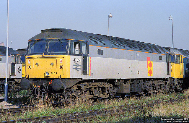
In 1993 Railfreight Distribution significantly evolved that visual identity. But the story of how and why that evolution took place isn’t widely known. When I wrote up Roundel Design’s Railfreight visual identity project (The Beauty of Transport 9 September 2015), I ended the piece by lamenting that I had been unable to find out who was responsible for Railfreight Distribution’s later reinterpretation.
And then, a few weeks ago, an email appeared in my inbox. “You say you’ve never been able to identify who was responsible for altering the RfD triple-grey livery in 1993. I can answer that: it was me.” The email came from James Wiggins, a marketing communications specialist, who in the early 1990s was Railfreight Distribution’s design and advertising manager.

I’d assumed that the livery had been revised to mark Railfreight distribution’s focus on cross-Channel operations. “I have always been a little amused when I read about the new “European” livery and the reason RfD chose to develop it,” said Wiggins. “There’s an obvious assumption that it was done strategically to celebrate/promote its pan-European nature post the Channel Tunnel opening. And while this certainly did influence the ultimate design of the livery, this wasn’t the reason the re-design came about.”
Roundel Design creative director Mike Denny reportedly wasn’t keen on Railfreight Distribution’s reinterpretation of the Railfreight visual identity, so what business requirements had prompted the need for it? I asked Wiggins if he would be prepared to tell the story. So far as I know, it’s not one that’s ever had any significant coverage before. I’m very glad to report, therefore, that he said yes. At this point, I’ll hand over to him for…
The RfD “European” livery design story
The Freight Connection 92 Exhibition in September 1992 in Birmingham was hosted to build interest in the rail haulage option between the UK and mainland Europe in preparation for the opening of the channel Tunnel. As part of the exhibition, three Class 90s were repainted into DB, SNCB and SNCF liveries to draw attention to the seamless rail network the Channel Tunnel would connect BR services with, and so the seamless European transport system available with rail. These three Class 90s were repainted at Crewe Depot.
The team that did this repainting took a particular liking to the SNCF version (90130) and in October 1992 suggested to then Director Traction & Rolling Stock, David Russell, there was some merit in adopting some aspects of its livery onto all RfD liveries.
Everybody loved the new Roundel liveries introduced in 1987, but I do recall the maintenance crews disliked the fact that they easily became dirty – or at least looked dirty. This was both because of the particular way dirt clung to the large expanse of the lower light grey panels of the initial RfD livery, and the way dirt rendered the low-sheen finished tops a furry matt finish. This actually added to the frequency of washing required, and because of the acid solution required to wash the rolling stock, reduced the serviceable lifetime/repainting schedule of the livery. And of course, this added to maintenance costs. I can’t now recall the exact numbers, but the locomotives needed washing and repainting around 30%-40% more frequently than the previous livery.
I also know the business development managers weren’t happy about the absence of an RfD logotype as they were trying to meet hefty new business targets. They didn’t share Mike Denny’s view that the public would immediately recognise a Railfreight livery without the operating name on the livery. In my opinion, they quite rightly saw this as a lost advertising/brand recognition opportunity to connect with their more traditional sales and marketing activities. In addition, by this time, RfD essentially had nothing to do with the other Railfreight Divisions. In fact, one of our commercial priorities was not only to grow the number of rail freight customers and freight volumes but increase the awareness of RfD and its operating areas and carve them out of the main business in order to find commercial buyers for them.
In the end, David Russell agreed to let the maintenance crew repaint one of RfD’s locos (90136) putting their likes/ideas onto it, with many of the factors explained above acting as influences on them.

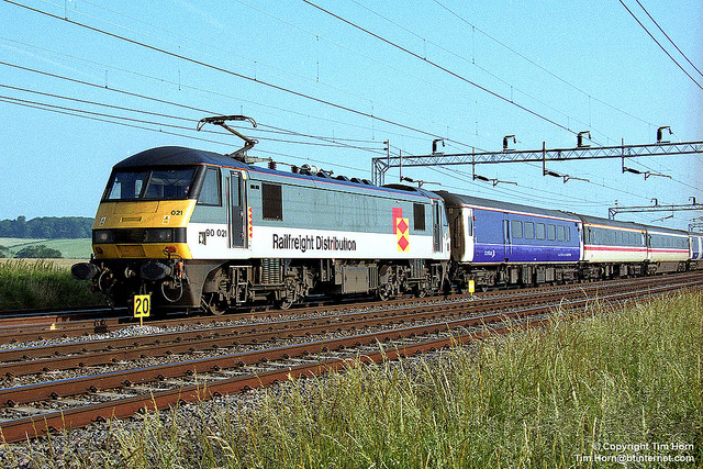
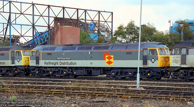
The main changes from the Roundel Design’s Railfreight visual identity were the yellow front extending across the sides and the lowered break between dark and light grey panels (as in the RfD/SNCF 90030 livery) and a completely yellow roof (adapted from the orange in the RfD/SNCF 90130 livery). The newly repainted 90136 locomotive was quietly introduced back into service.
The first I was aware of this experimental re-painting was seeing an image of it, together with an original RfD liveried loco, in a rail magazine in mid-December 1992. As RfD’s Advertising & Design Manager, apart from the creative design issues I felt the experimental livery had, I immediately recognised some problems David hadn’t. For a start, visible inconsistencies like this in any brand identity subconsciously make viewers – including customers and potential customers – believe a service is disorganised and inefficient, which was not good for a new business trying to promote how much more efficient and effective it was compared to other freight options. Also, the completely yellow roof would quickly become noticeably dirty and detract from the intended “quality” and “efficient” brand attributes we wanted to convey to customers.
Prior to this point, a livery re-design was not only not on my priority list, it wasn’t on any of my lists to do. At the time I was primarily focused on more tactical advertising, marketing and design programs focused on winning new freight customers, and developing new identities for parts of the RfD business we were preparing to sell off (e.g. Autologistic and Haulmark).
So, this experimental livery resulted in a couple of “spirited discussions” between David and I, culminating in a meeting between David, Ian Brown (RfD Managing Director) and me, on Christmas Eve 1992. It was actually a good, productive meeting: David was actually doing what he genuinely felt was the right thing for the business – and was a really good guy – and Ian was very mindful of the operational and commercial issues that needed to be resolved, that I mentioned earlier. I was tasked at this meeting with both developing the program to systematically, correctly, modify the RfD locomotive liveries, according to defined objectives – and to create the new designs. The brief we developed was based on a modification of the Roundel livery, rather than a complete re-design.
I began the program in late-January 1993 and it included research of international transport design trends – with a particular emphasis on European ones – as we did actually want RfD to have a “pan-European” personality – not just a British one. We also conducted research to verify the level of recognition RfD locomotives really had outside of the rail/rail enthusiast community among our commercial audience (there was actually little to none). I also worked with Keith Handy – then BR Industrial Design Manager – on front-end recognition schemes, as they’d just completed new safety testing of alternate front-end colour schemes. I presented three design options to Ian Brown for a final choice on 11 March 1993.

The chosen designs were then input into computers at Derby for Classes 37, 47, 86, 87 and 90, ready to be implemented by the end of March. I worked with a then very young, newly graduated engineer, Richard Birkhead, to finalise and develop the working drawings for the new design.
The design scope was only for the locomotive liveries – rather than for a full RfD rebrand – so there was no design manual produced: only my initial drawings and the engineering drawings produced at Crewe.

The key objectives identified for the re-design, and the related design decisions/inputs were:
- RfD is perceived as a solid, reliable, efficient, streamlined, experienced operator
- RfD is perceived as a pan-European organisation (not just a British one)
- RfD is perceived as a forward-looking organisation
- RfD is understood to be a wholesale operator (not a retail operator)
- RfD is perceived as a quality service offering a premium product
And in addition to these corporate identity objectives, it was required that the new design must better hide the dirt than the existing livery.

Some of the key design choices I made to achieve these objectives were:
- European design tended to use larger blocks of darker colours resulting in a more “elegant” and then-contemporary look. This was adopted as it created a “higher-quality” feel while also achieving the objective of better hiding the dirt longer as it gradually crept down the side of a locomotive from the top. The light/dark colour break was moved even further down; that made the locomotives appear lower and longer than they were, accentuating their sleekness and speed. The larger dark areas also conveyed a more solid feeling than the previously larger light grey areas. When seen from a distance, the result was two large dark bands (the top Flint grey panel and the wheels/undercarriage, separated by a relatively thin, light band that further accentuated sleekness and speed.
- The locomotive roofs were changed from Executive Dark Grey to Executive Dark Blue in a direct reference to European colour palettes, and also because they oddly hid the dirt better than Executive Dark Grey. I added a 25mm orange tape dividing the blue roof and dark grey body as a contrast to both, further accentuating the horizontal look of the locomotives – adding to the streamlined look. This was mirrored on a limited number of horizontal mechanical elements beneath the light grey band and wheels – again to accentuate the horizontal nature of the locomotives.
- From a design perspective, I personally preferred a smaller, more elegant “Railfreight Distribution” lettering within the light grey panel, that could be centred beneath locomotive nameplates, but chose a larger, more dramatic version to increase visual awareness of the service name, lend a more wholesale, rather than retail feel to the designs, and to create a more asymmetric vertical balance that added to the sense of movement.
- The front-end warning yellow was extended around the front corners and up the pillars largely for increased recognition, but this also added a little to the sense of movement – particularly on the Class 90s but even a little on the less-raked fronts of the other classes.
I actually left RfD the following month, but know from my contacts still there that the design revision was really well-received internally, and did succeed in positively influencing customer/potential customer perceptions of RfD and its services. As part of this livery re-design process, I also designed a proposed new logo for RfD, but even in 1993 there were serious discussions underway about the sale of the main part of RfD to the private sector, so this would have been an unnecessary exercise. I can understand that Denny had reservations about the adaptation of his earlier work: he and Roundel did a wonderful job with the initial corporate identity and I know he was frustrated by anything that diluted the initial Railfreight identity, even though each of the businesses quickly became very different organisations with very different objectives fairly soon after the new identity launched.
So, in the end, while the design objective of the re-design was very much influenced by wanting to be perceived as pan-European, progressive and open-minded, the reason for the re-design happening in the first place, was a more complex mix of the design preferences of the team at Crewe Depot, and the quickly emerging commercial needs of RfD to be noticed and differentiated from other freight transport options and from the rest of Railfreight itself.
James Wiggins is a Marketing Communications specialist. In the 1990s he was based in London, and worked with Railfreight Distribution between 1990 and 1993, for much of this time as their Design & Advertising Manager. He is now Managing Partner with Employer Brand consultancy, Engaged Associates, based in Sydney, Australia.
Enjoyed this article?
It’s one in a series looking at the way that the changing appearance of Britain’s railway illustrates its history. Here are the others:
- Lions and Wheels (British Railways’ lion emblems, 1949-1964)
- The Full XP (British Railways’ Corporate Identity 1964-1986, part 1)
- The Decline and Fall of the Rail Blue Empire (British Railways’ corporate identity 1964-1986, part 2)
- Three Shades of Grey (Railfreight 1987 corporate identity, Roundel Design Group, UK)
- The Rolling Art Galleries of Network SouthEast (Edward Pond murals and NSE route badges)
- Resplendence (Rail express systems 1991 Corporate Identity, Roundel Design Group, UK)
- The Train on Kaleidoscope Lines (British Passenger Railway Post-Privatisation Visual Identities)
- Mainlining Style (Midland Mainline visual identity 1996-2004)
- Along the Line, Blue and Gold (GNER’s corporate visual identity, Vignelli Associates, 1997)
- Papering Over the Cracks (Railtrack’s Corporate Graphic Design and Annual Reports, UK)
- They Used to Shout our Name, Now they Whisper it (Railtrack’s Corporate Graphic Design and Annual Reports, UK, part 2)
- The Dead Hand of State Design (State-Sponsored Visual Identities on Britain’s Railway, 2000 – )
- Local Heroes (PTE Mainline Rail Visual Identities 1970-1994)
- Don’t Give in to Their Goodbyes, Northern Stars (PTE Mainline Rail Visual Identities 1995-2017)
- Corporatisation, and its Undoing, Part 1 (Visual Identities of Britain’s ‘Big Five’ Transport Operators on the railway, 1997 – )
- Corporatisation, and its Undoing, Part 2 (Visual Identities of Britain’s ‘Big Five’ Transport Operators on the railway, 1997 – )
- Red Hot (Virgin Trains East Coast branding, 2015- )

The last piece of the puzzle
The class 90 painted in DB livery was a bit prescient…